Today I’m sharing some of my favorite art sources I use in our home.
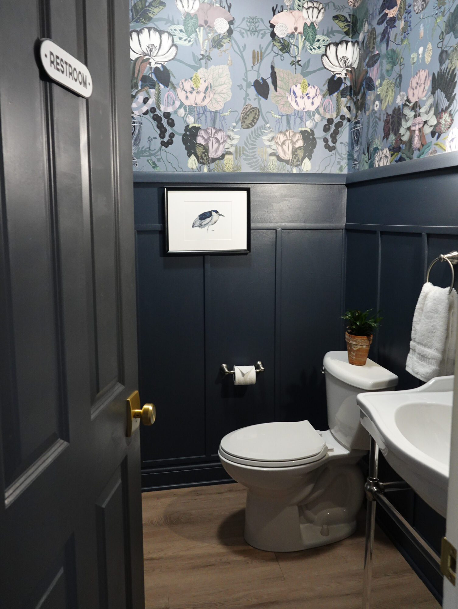
In our bathroom, we have a piece from Christine Sweet Fine Art. Christine is a Charleston-based watercolor artist best known for her modern renderings of coastal creatures. “Presence” is hanging in our half bath, and it’s a print that comes hand-signed on heavyweight archival paper.
One of my most recent favorite sources for art is a shop on Etsy called Heirloom Print Shop. They provide art prints to your door in a variety of sizes and papers – including canvas. The printing is so well done, and if you frame your art without glass, it looks almost like an actual oil painting.
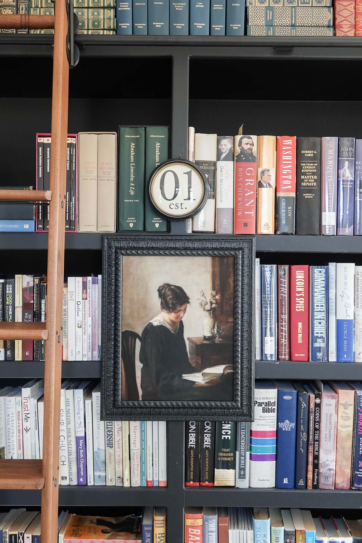
In our library, I have this Woman Portrait which is so elegant and timeless.
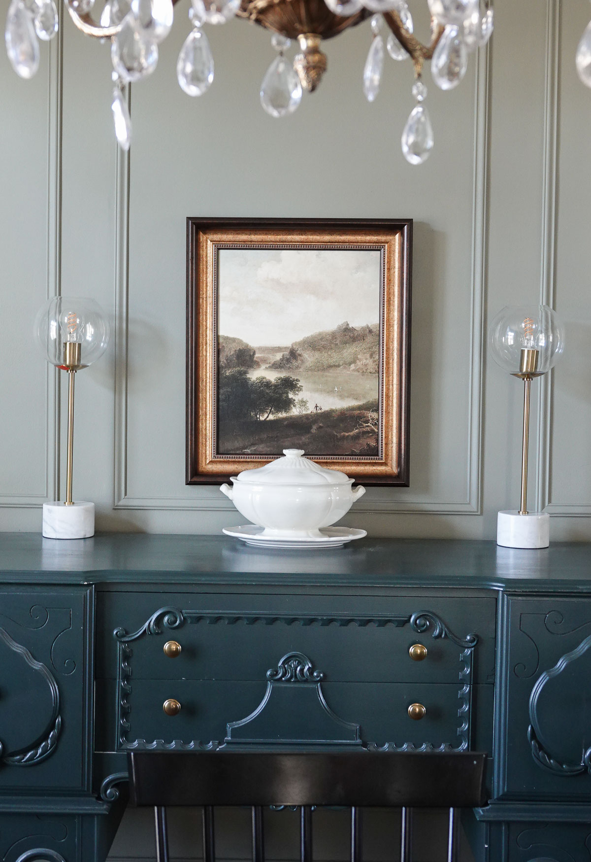
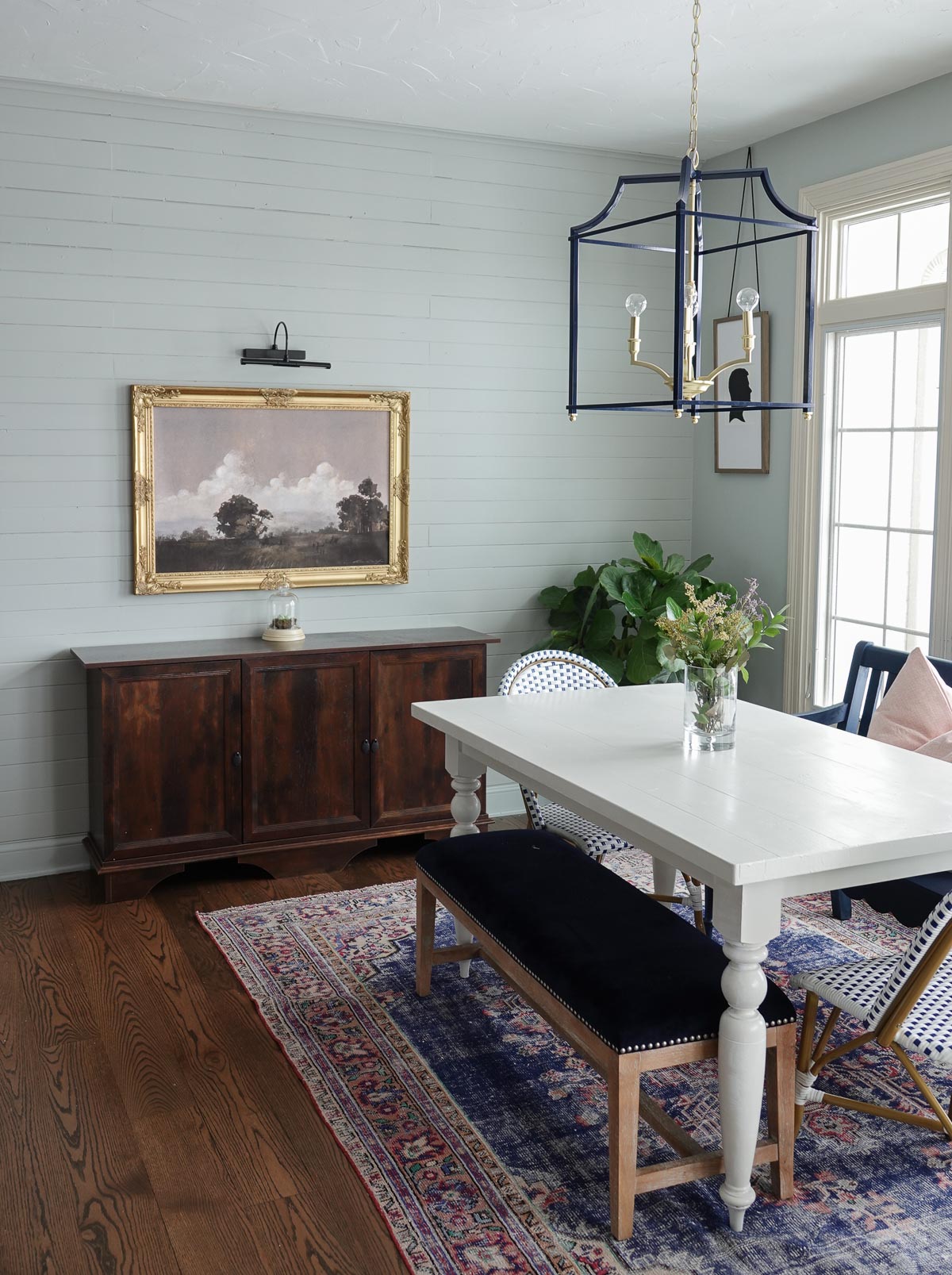
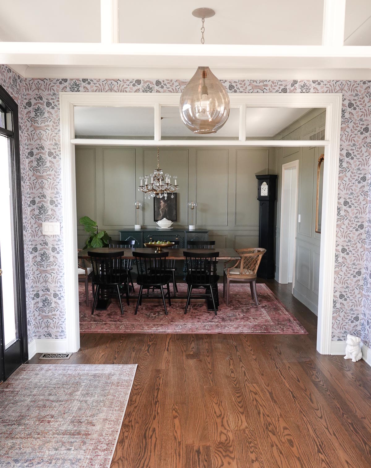
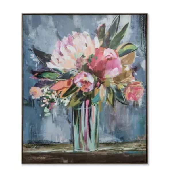
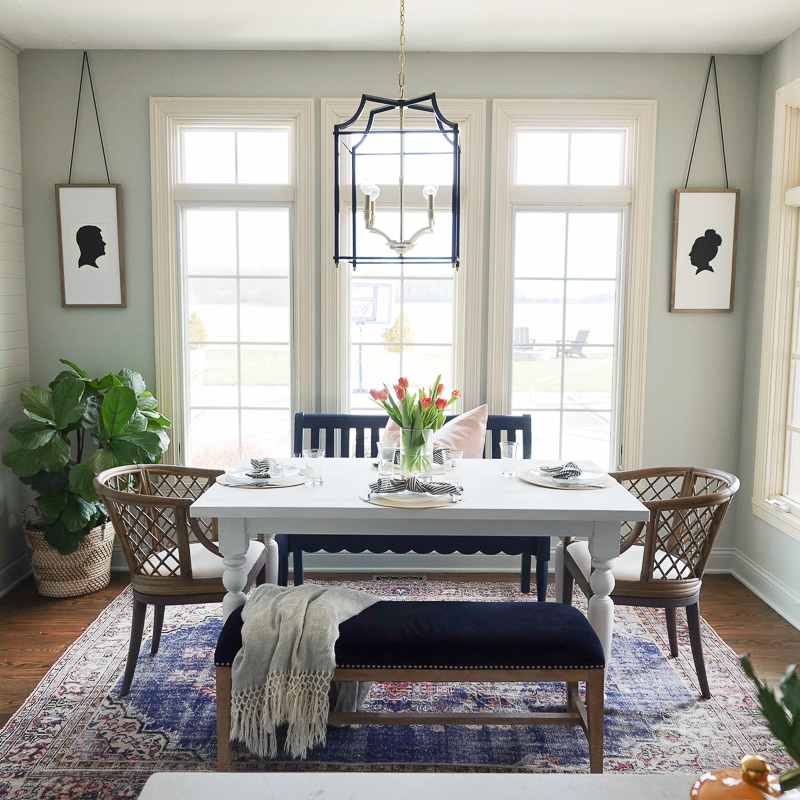
In our dining room, this stunning landscape hangs. I selected the textured premium paper for my prints, and I couldn’t be more pleased with the quality.
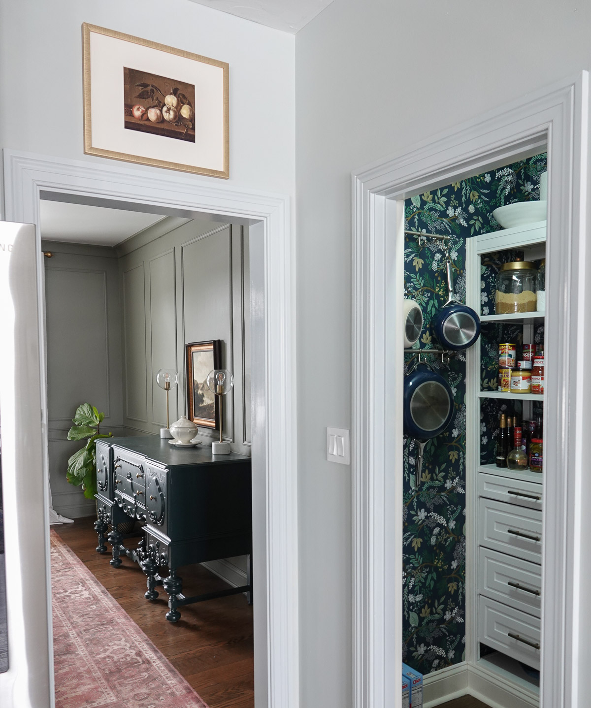
This still life is perfect for the kitchen, and the colors would work in almost any space.
I am a huge fan of home portraits, and we have a painting of our previous home (top) and our current home (bottom).
The top portrait is by Katie of Me and Mary , and she specializes in watercolor home portraits.
The bottom portrait is by my friend John of John Keeling Paintings. I had the honor of working for John years ago at a Hallmark subsidiary. John is extremely talented and you should definitely check out his work.
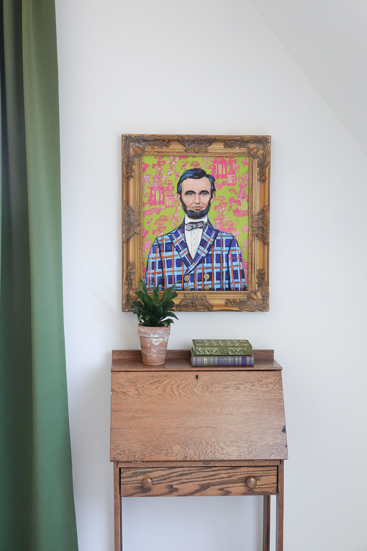
If you’re looking for artwork that is unique and fun, Check out this Lincoln portrait we have hanging in our bonus room.
It is by Mel Remmers Studio, and I’m slightly obsessed with her colorful and gorgeous work.
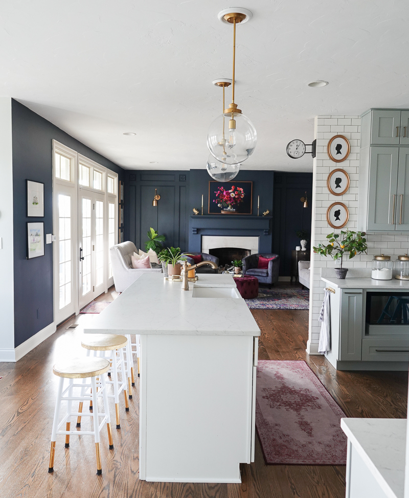
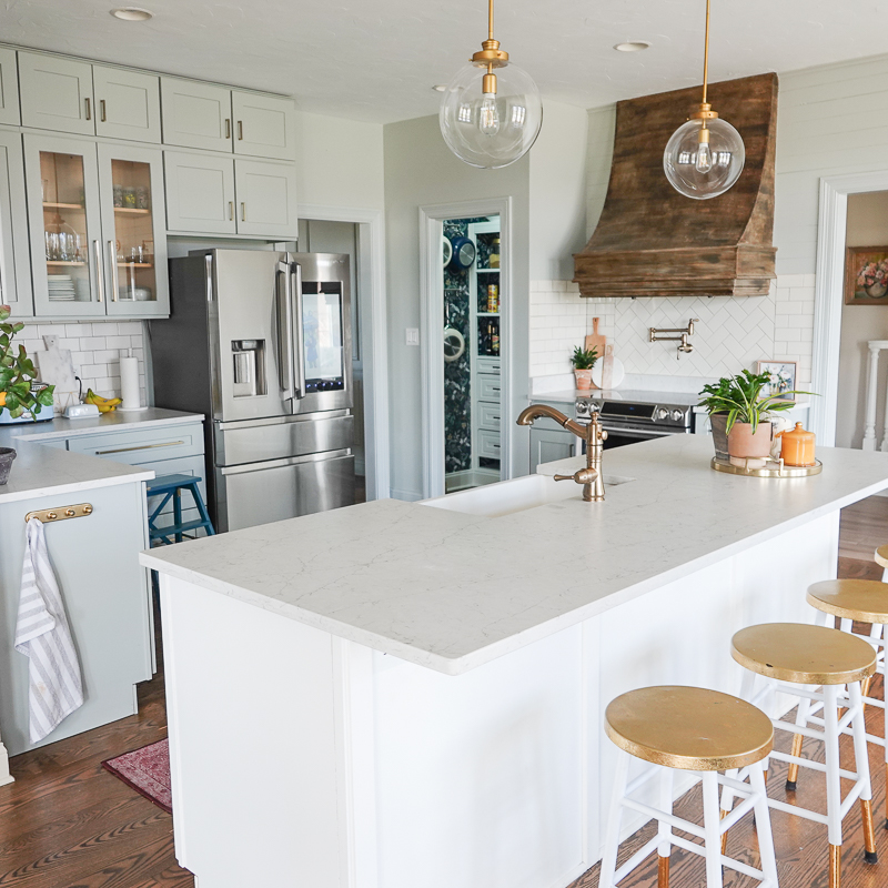
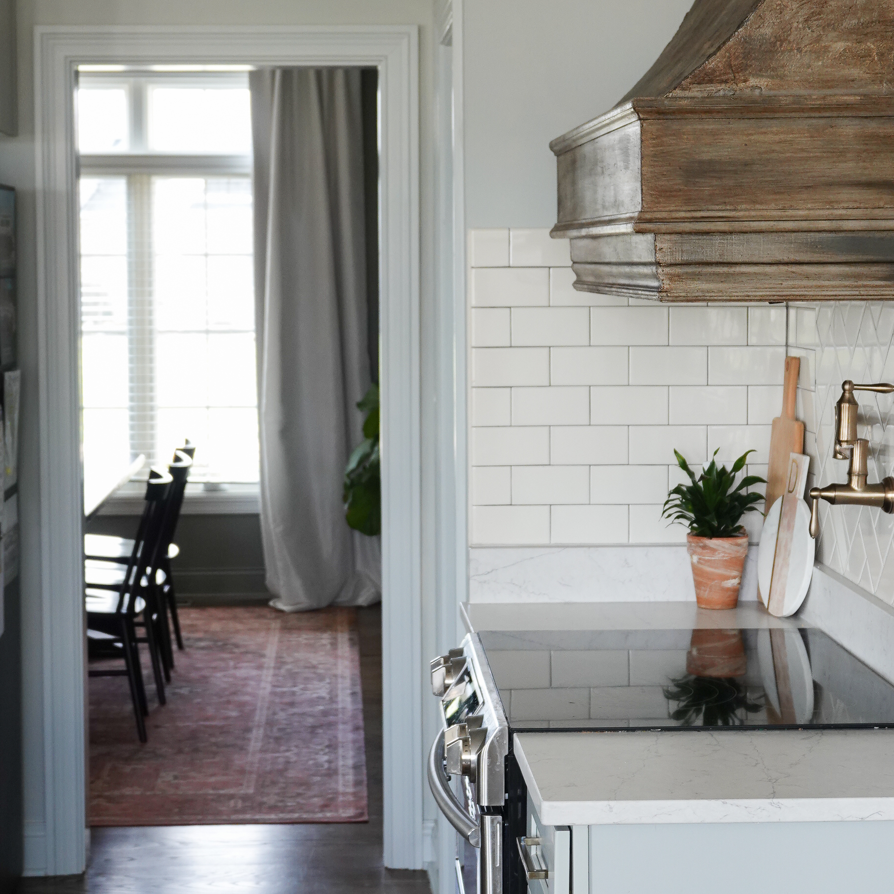
In our kitchen, I have this studding original from Elisabeth Neil Art. Her work is a mix of realistic and impressionistic, and I’m a huge fan.
If you’re looking for larger art pieces, then you need to check out Juniper Print Shop. I purchased Oak Park, and you can purchase it in sizes ranging from 8×10 to 55×79!
The light I have hanging above the piece in our kitchen is an inexpensive battery-operated picture light you can purchase here.
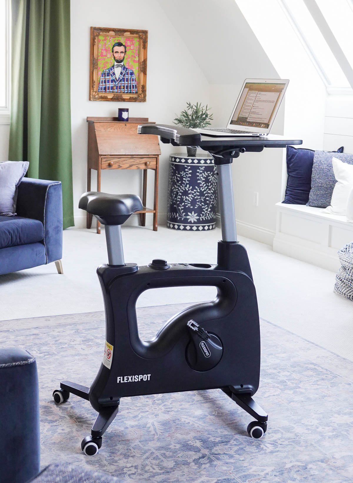
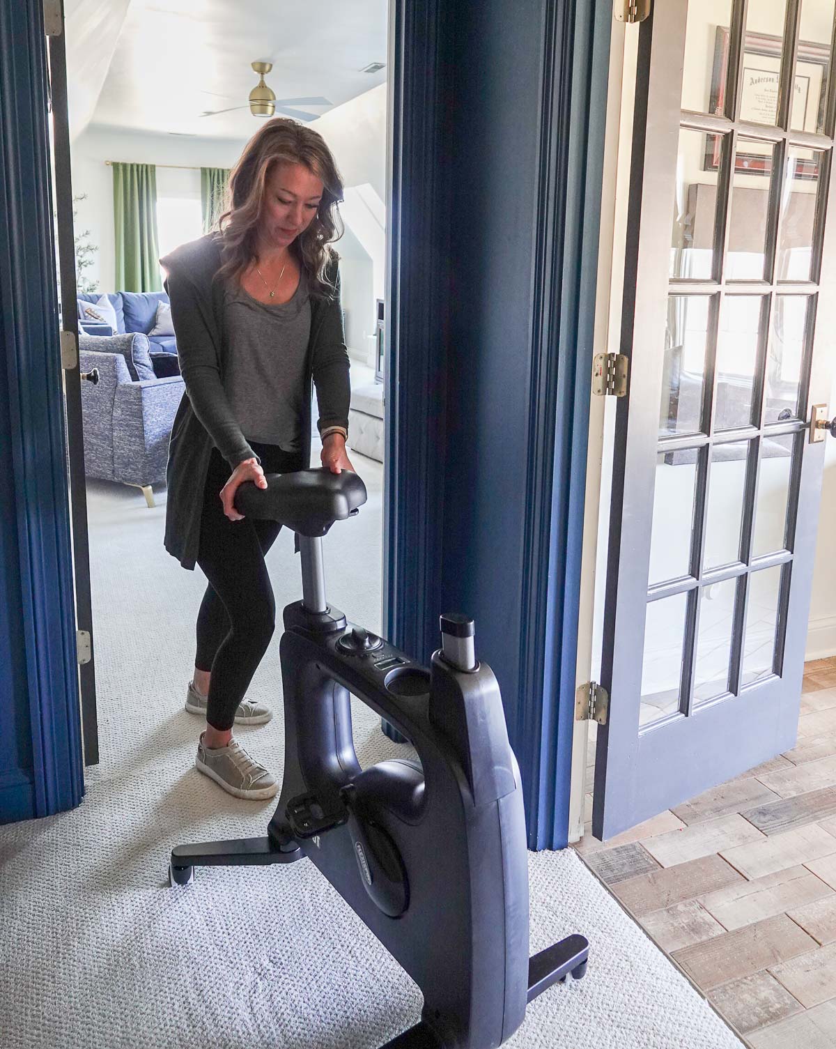
Flexispot recently sent us a desk bike and standing desk, and I am obsessed! Both these products are perfect for home offices, and I honestly can’t say enough great this about them.
This is a sponsored post written by me on behalf of FlexiSpot. All opinions are 100% mine.
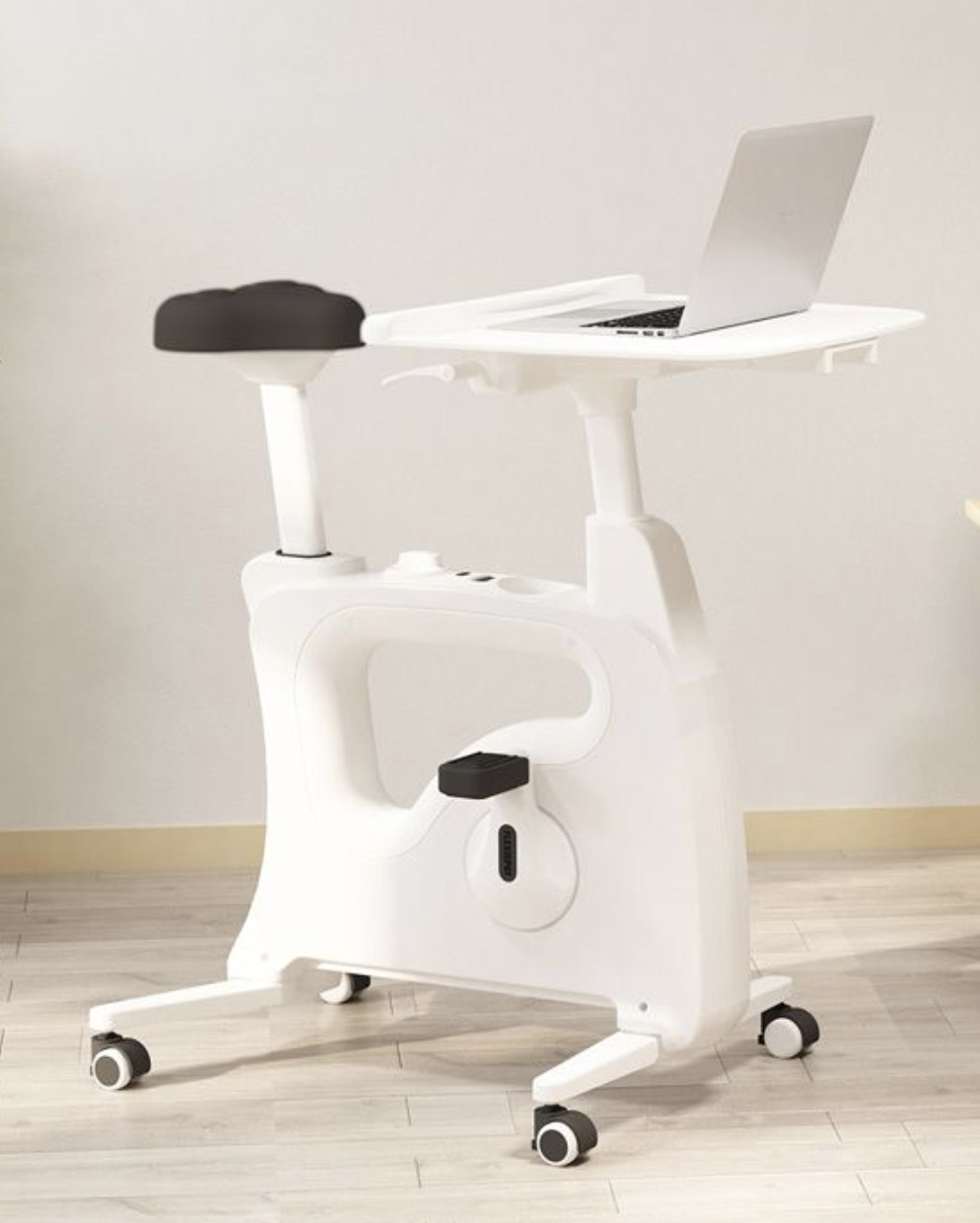
Desk Bike
This desk bike has won its way into everyone in my family’s hearts. As a mom, it’s hard to juggle everything at once, but this desk bike allows me to work, exercise, and even throw in a little tv watching while I’m at it. Talk about major productivity (and fun)!
My middle recently biked 11 miles while playing video games – maybe something good can from video gaming?
The Flexispot desk bike was very easy to assemble, and the seat is comfortable and adjustable. The desk also adjusts as well, so you can find the perfect setting.
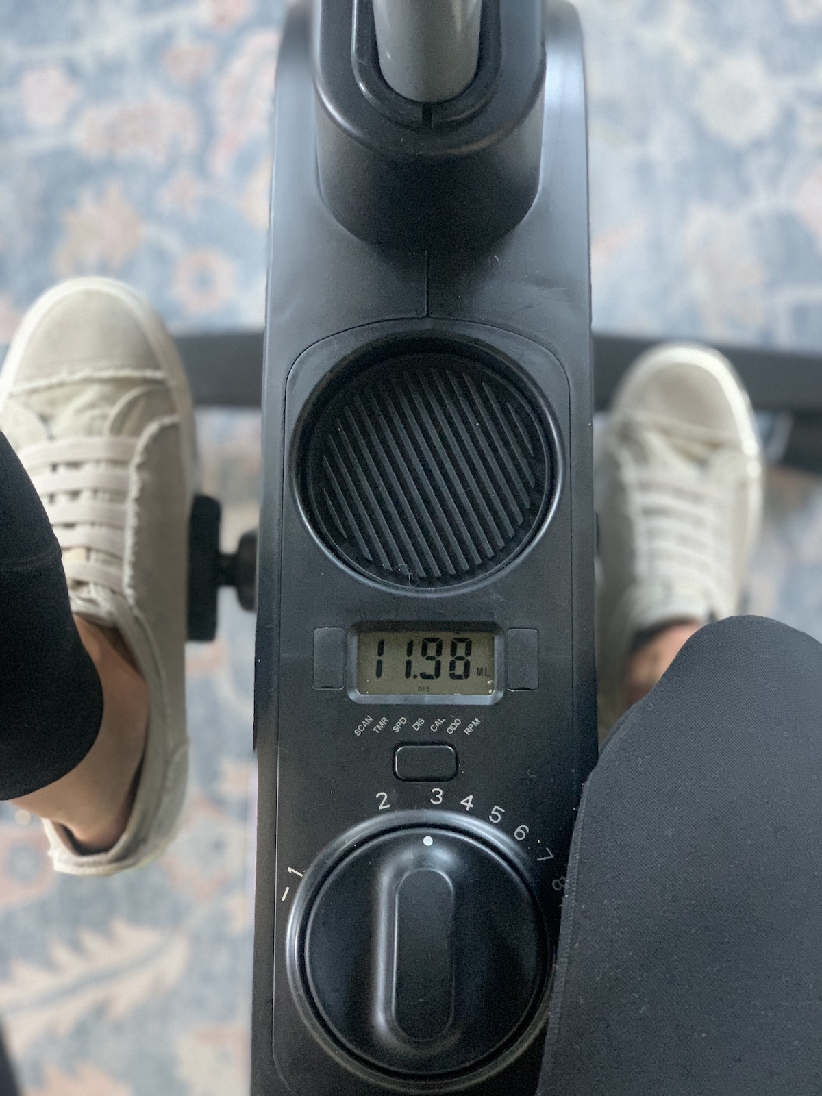
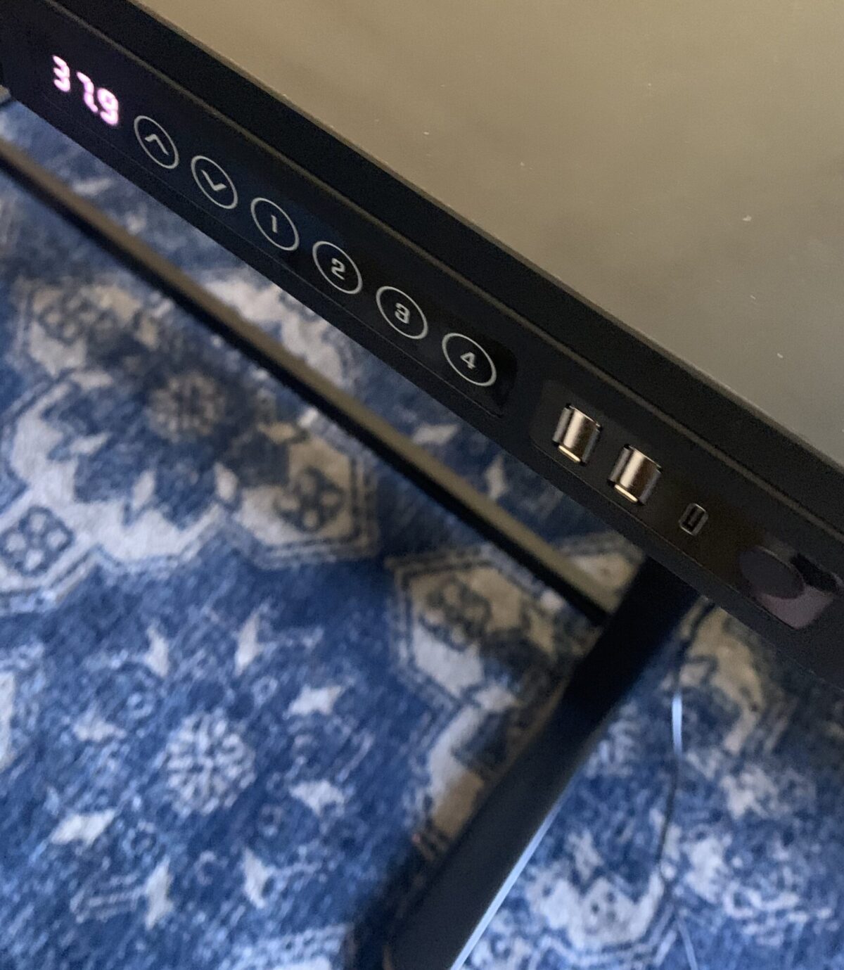
There are several settings so you can adjust how hard the pedals are with eight resistance levels, and the display shows readouts for mileage, workout time, calories burned, and speed.
The bike operates very quietly and is substantial.
The bike desktop is removable if you want to slide it under a standing desk, and the bike is easy to move from room to room.
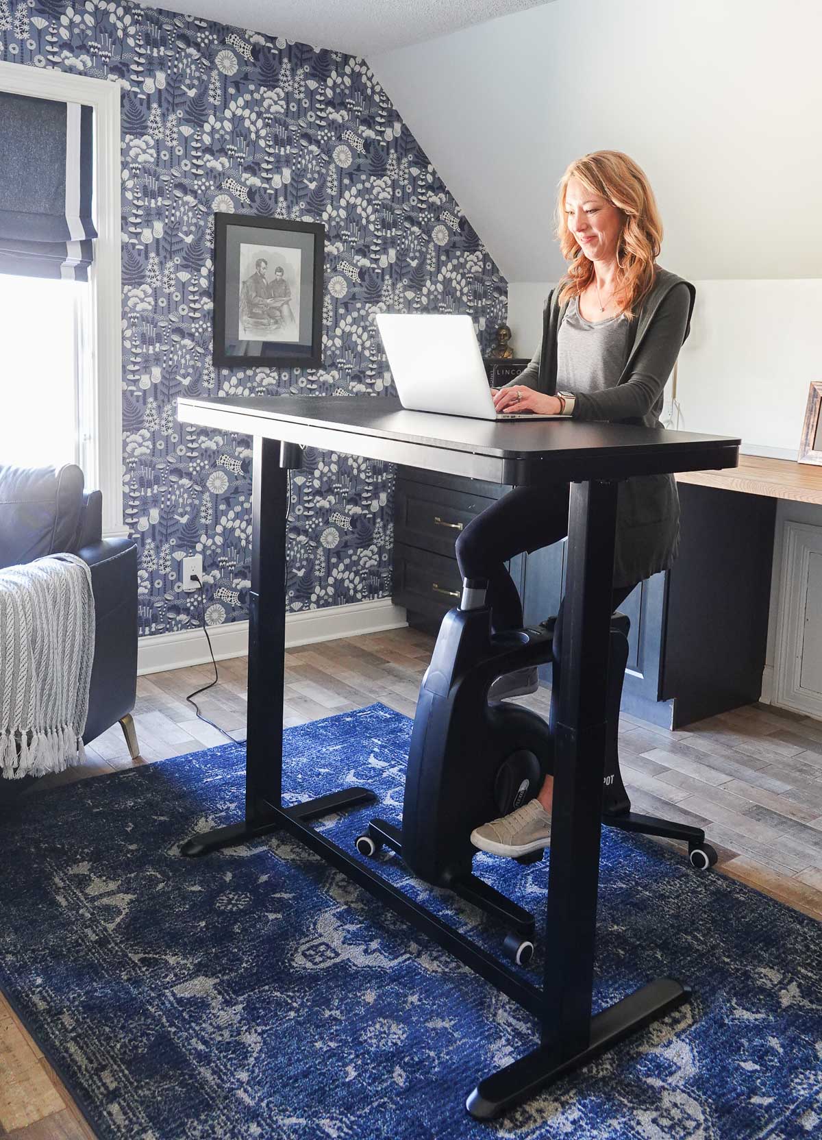
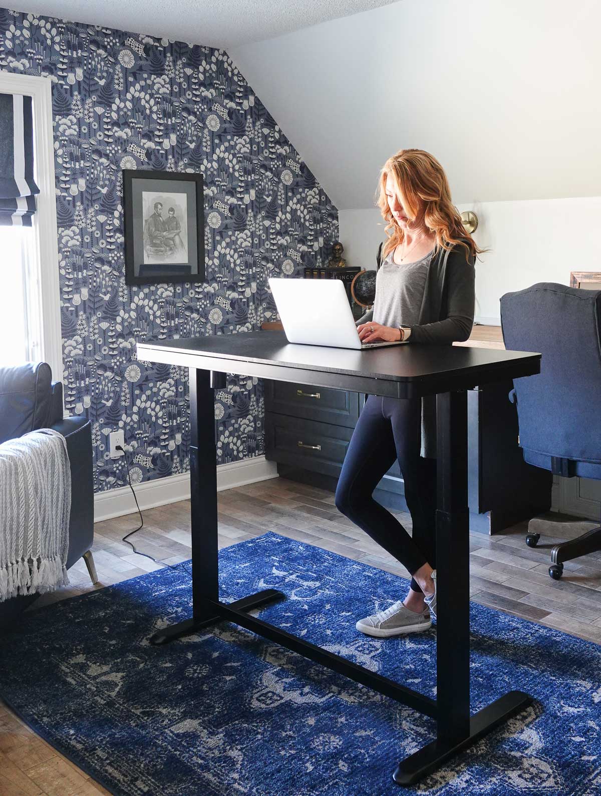
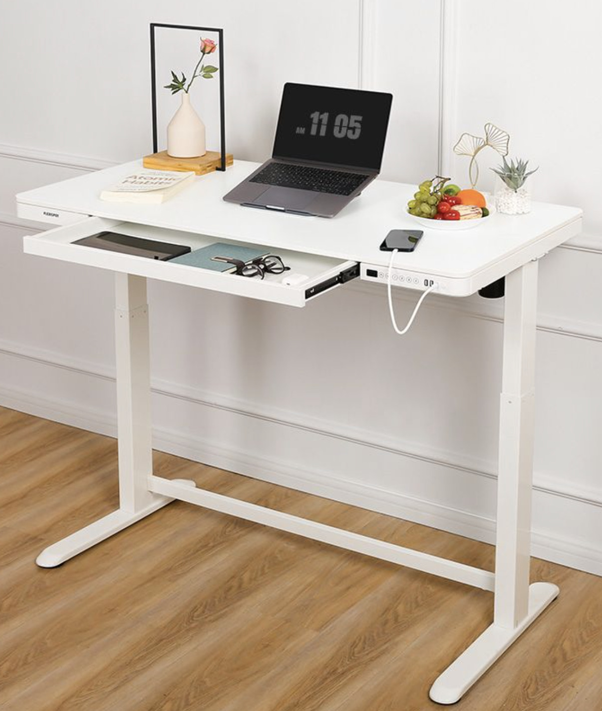
Standing Desk
We use our desk bike with Flexispot’s COMHAR standing desk. Like the desk bike, it was easy to assemble. The desk comes in several different colors and is very substantial.
It has an integrated control panel that allows for up and down movement along with height memory presets. It also has USBs and a child lock.
It works well with the desk bike and also functions well on its own.
With the push of a button and seconds later, the desk transforms from a standing desk to a traditional desk.
What do you think? Could you use a desk bike and/or standing desk in your home or office?
Are you new to my blog? Go HERE to see my home tour and HERE to shop for items I use in our home.
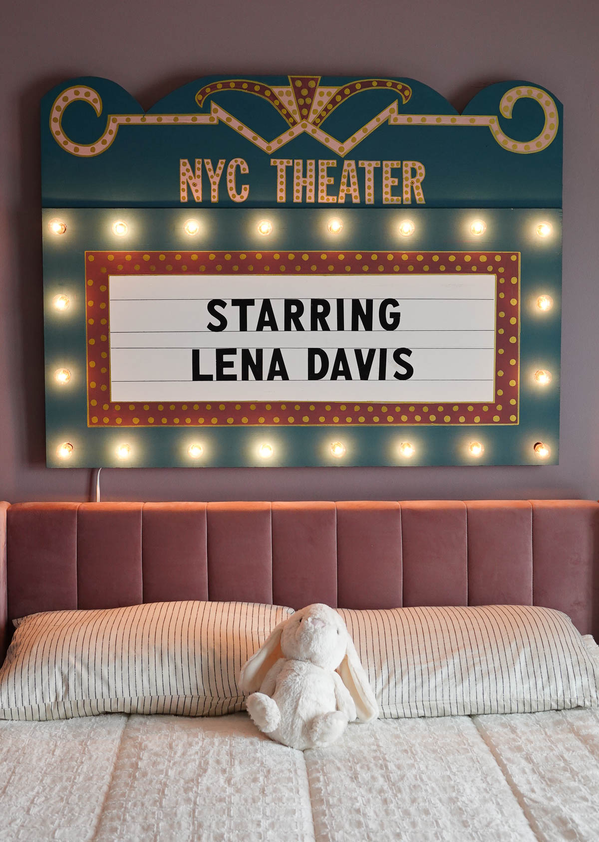
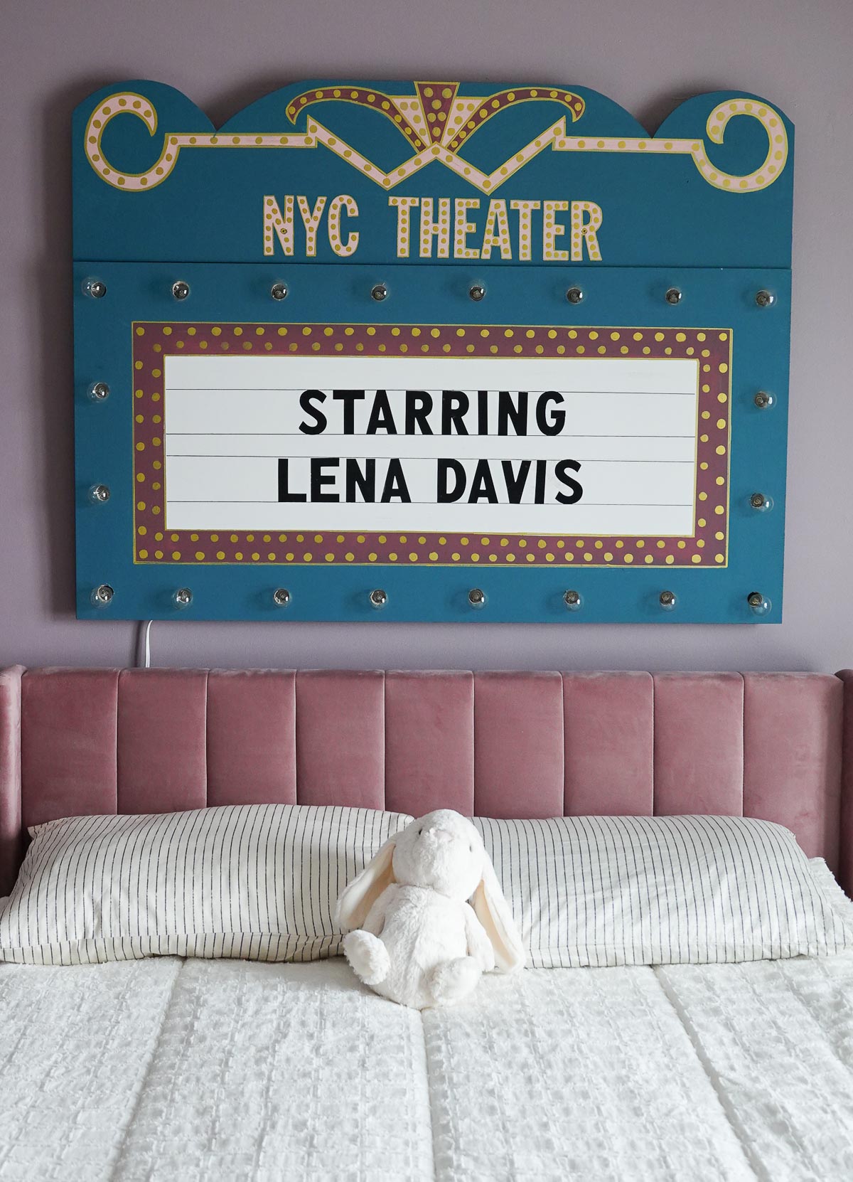
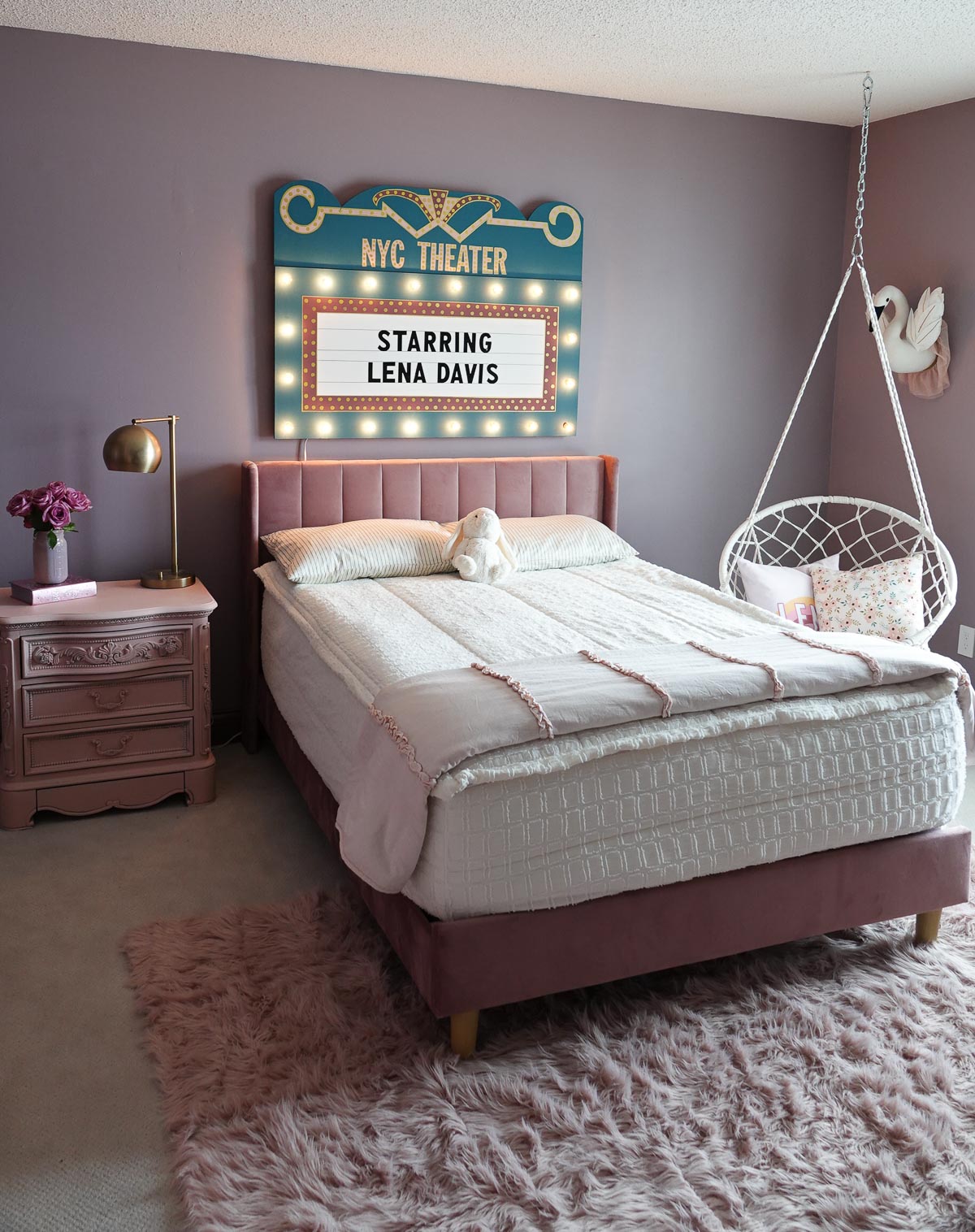
My daughter LOVES the stage and performing and has been dreaming up her theatre room for some time now. I wanted a centerpiece for the room, so I decided I would surprise her with a DIY Marquee Sign.
We recently saw Frozen the musical in Chicago, so I was feeling extra inspired and knew I definitely wanted the sign to light up.
I started by searching google images, and found this piece to be my inspiration:
Supplies for DIY Marquee Sign:
2’x4′ half inch board
2’x2′ quarter inch board
Small Cafe Lights
Die Cut Letter Stickers
Painter’s Tape
Paint
Paint Brushes
Paint Pens
Duck Tape
Drill
Jigsaw
Tutorial for DIY Marquee Sign:
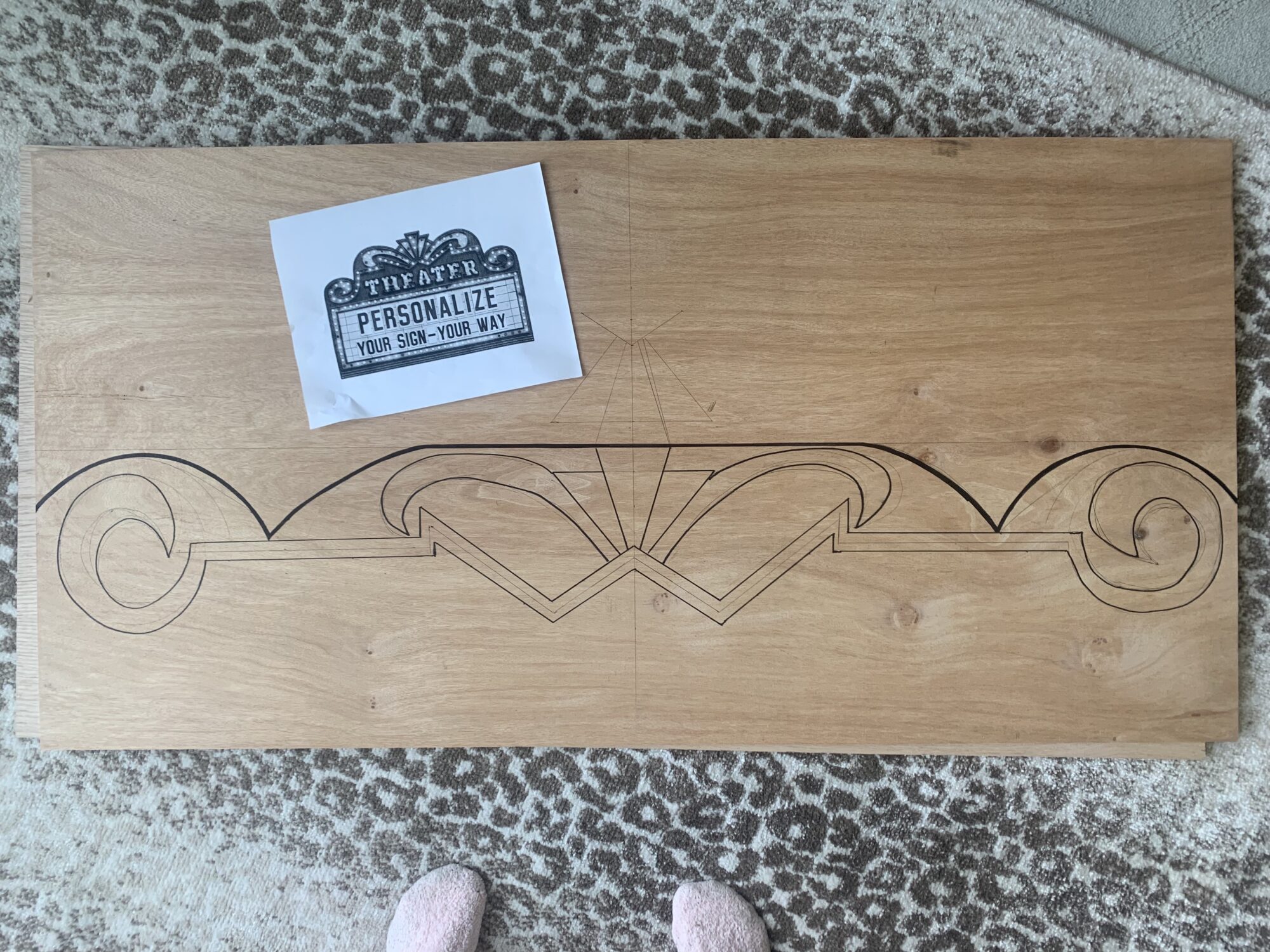
To begin, you will need a 2’x4′ half-inch board for the main marquee sign. I was able to buy in already cut at Menards, but some of the other hardware stores may require you to buy a full sheet, BUT they should be able to cut it to size for you.
For the top piece, I used a 2’x’2 quarter-inch board, but you can also use a piece from the half-inch board if you had to buy a full sheet. I went thinner since it was easier to cut with the jigsaw and I saved some money. I drew out a pattern:
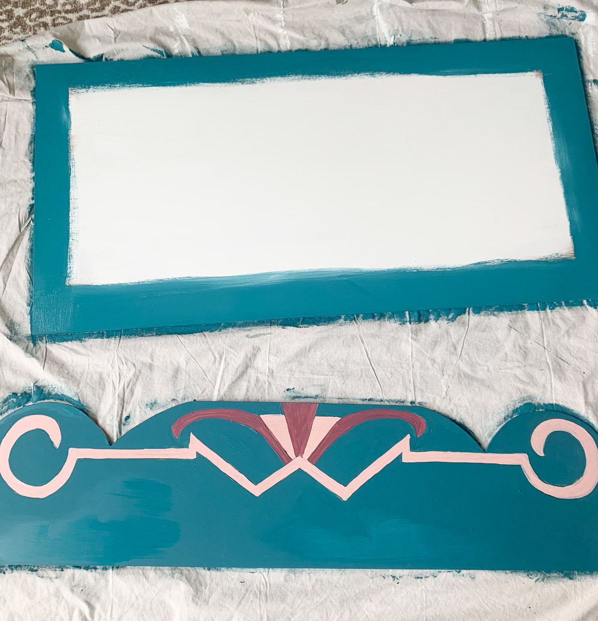
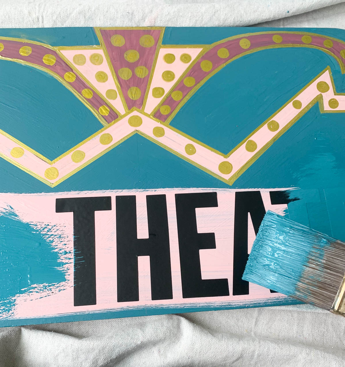
Once the top piece was cut out, I went to work painting both pieces.
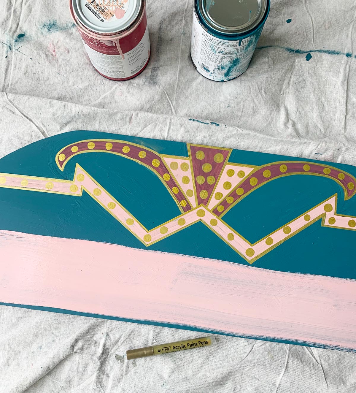
I used extra paint I found in our paint closet and used a gold paint pen to outline everything and add “lighting.”
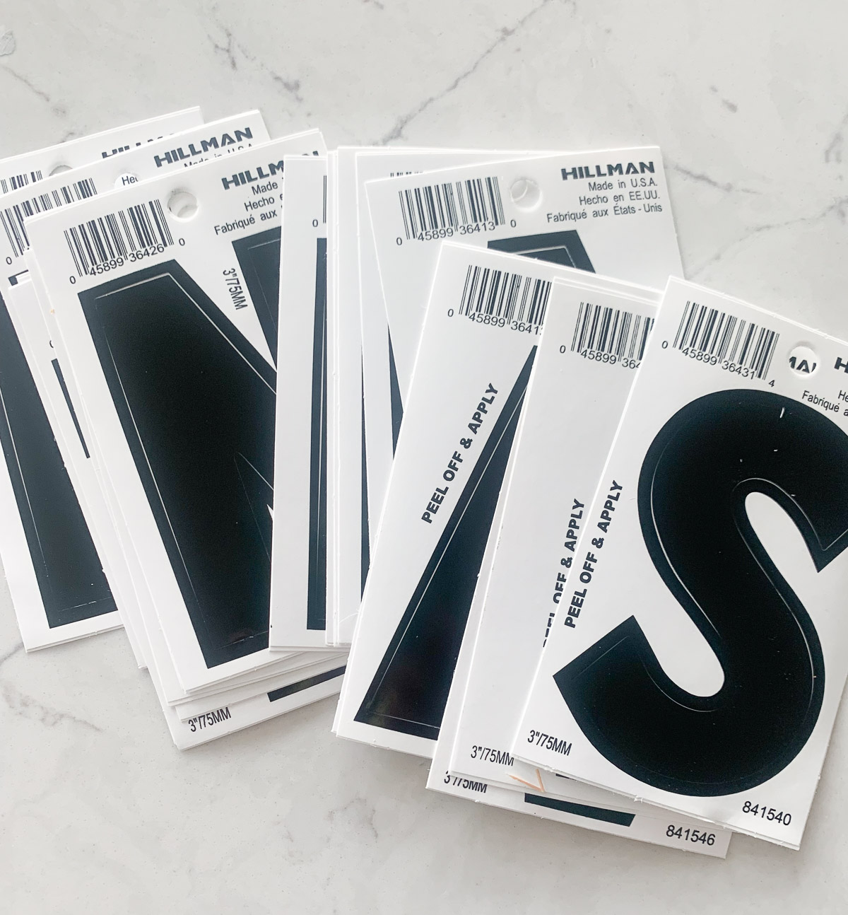
I bought die-cut letter stickers (found at any hardware store) and used them as a stencil. For the Theatre’s name, I painted over the sign with the light pink – the color I wanted the lettering to be.
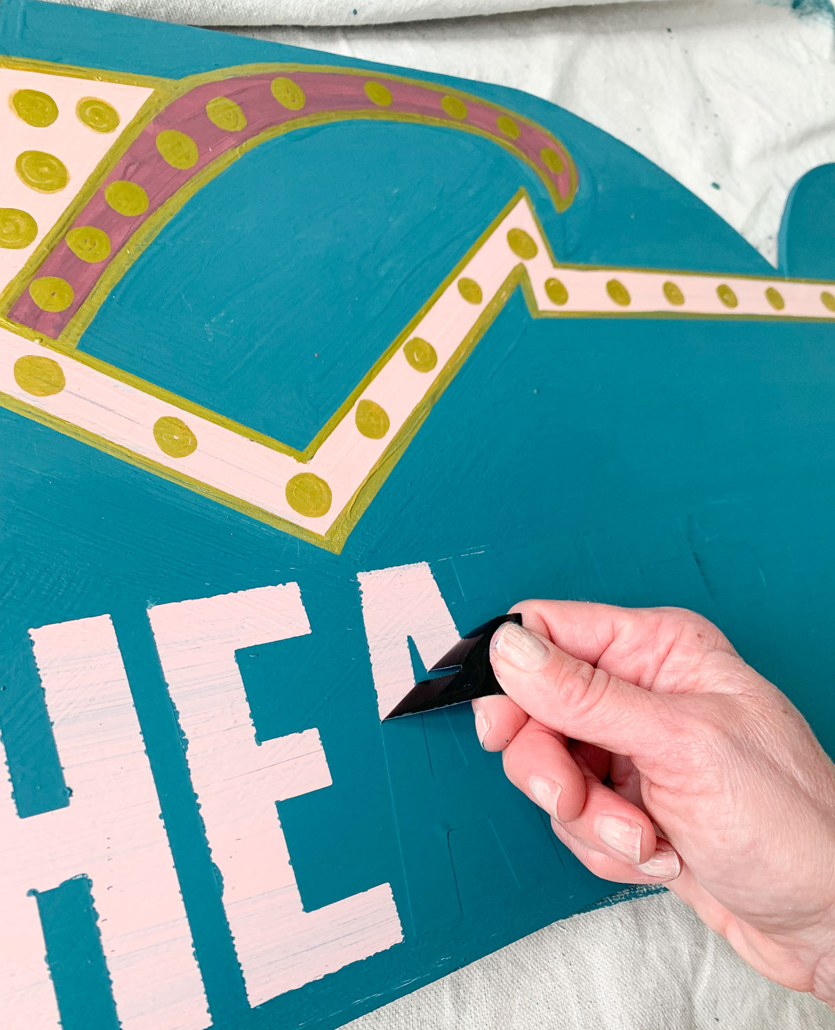
Once the pink paint dried, I added my letter stickers and painted back over them in the sign background color.
After the paint is dry, the letters can be pulled off.
There was paint seepage, but I outlined the letters with the gold paint pen.
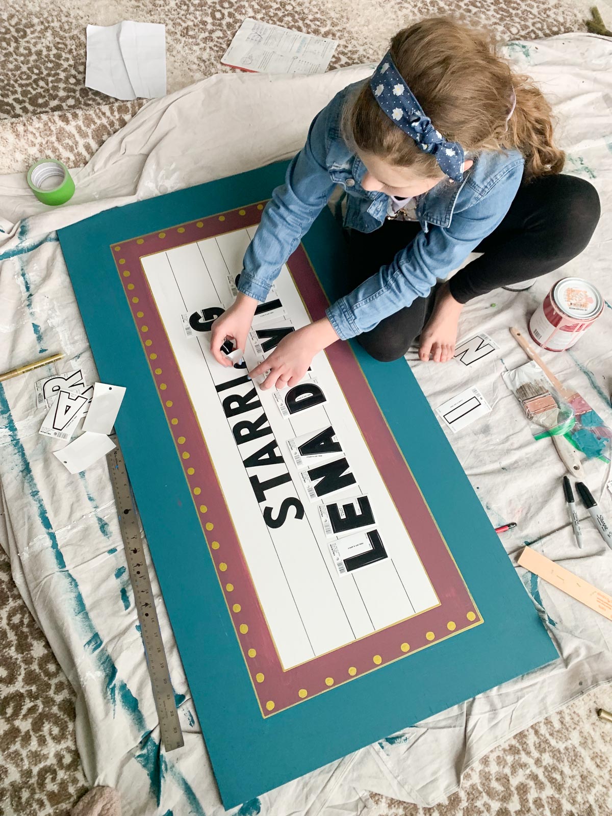
Next, I went to work creating the main sign. I had Lena help me with what the sign would say, and she of course wanted it to mention starring her…
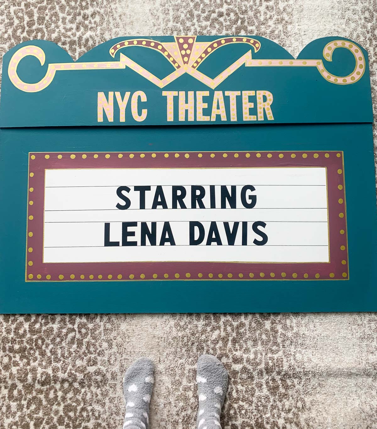
Here’s a look at the finished sign. Now it was time to add the actual lights!
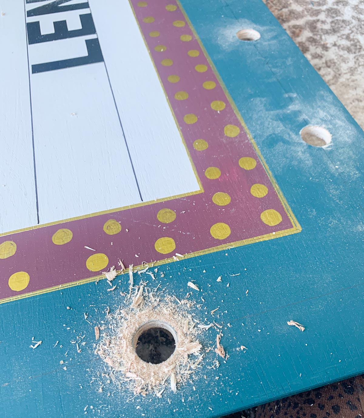
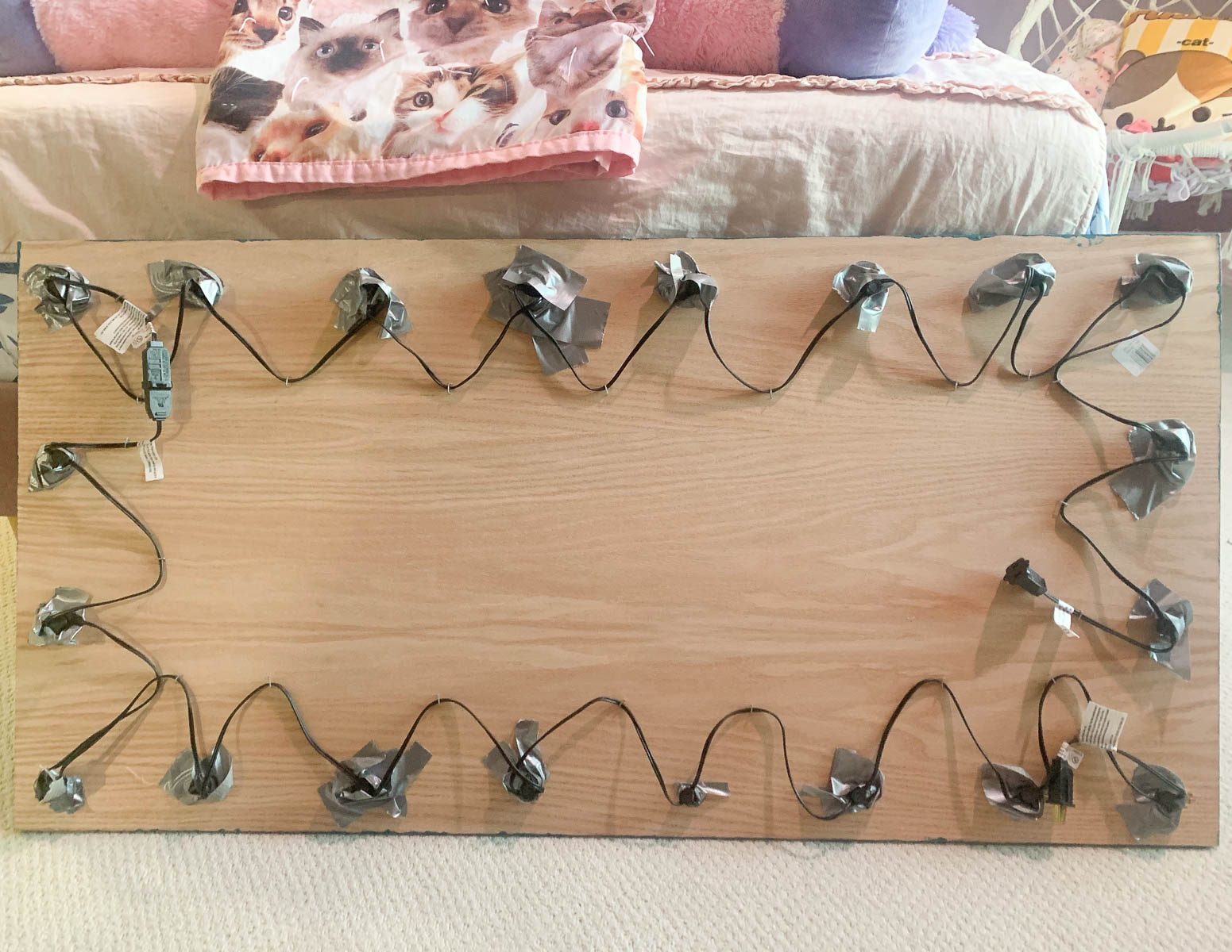
I drilled holes around the sign that were large enough to hold the base of the bulb but not too large that the bulbs fell through.
I had 20 lights, so I drilled 20 holes. I used duck tape to hold the bulbs in place and carefully staple the wires to the board to keep them from sticking out all over.
The result is magical. We have it hooked up to Alexa so when Lena says, “Alexa, it’s showtime,”
Alexa responds with “Lights, camera, action” and turns on the marquee sign.
Are you new to my blog? Go HERE to see my home tour and HERE to shop for items I use in our home.
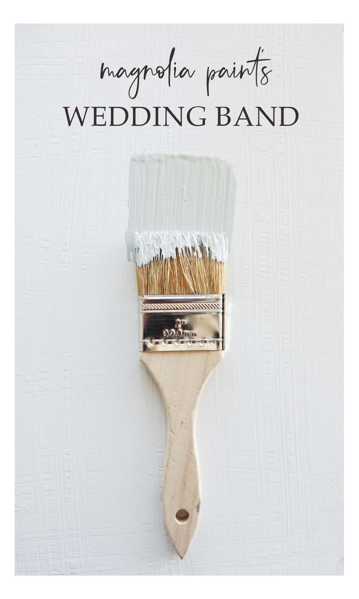
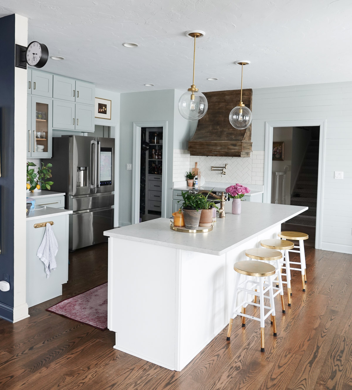
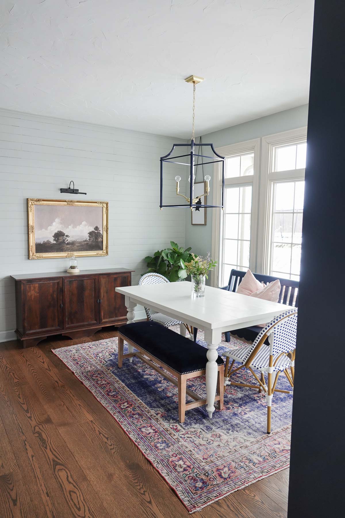
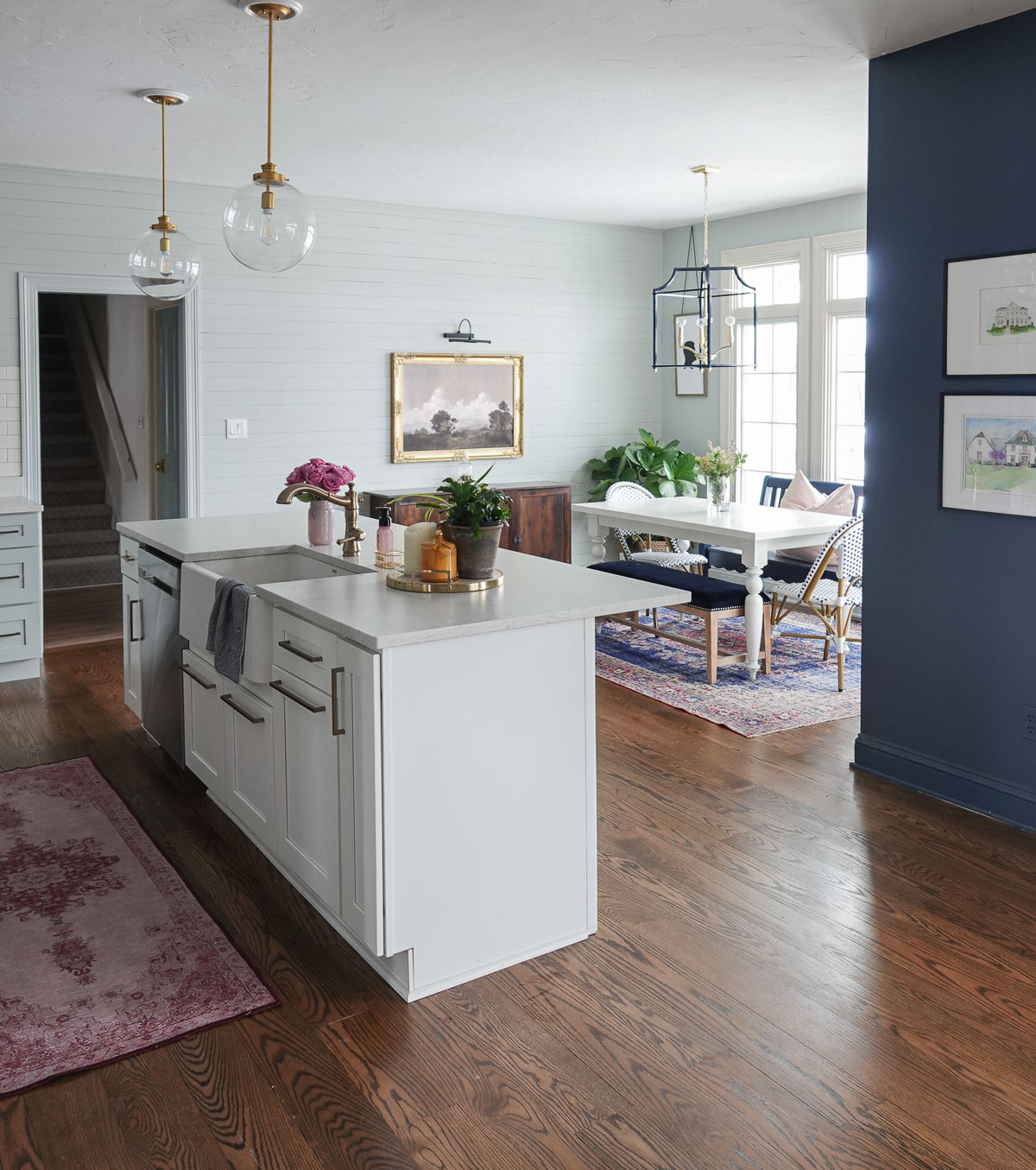
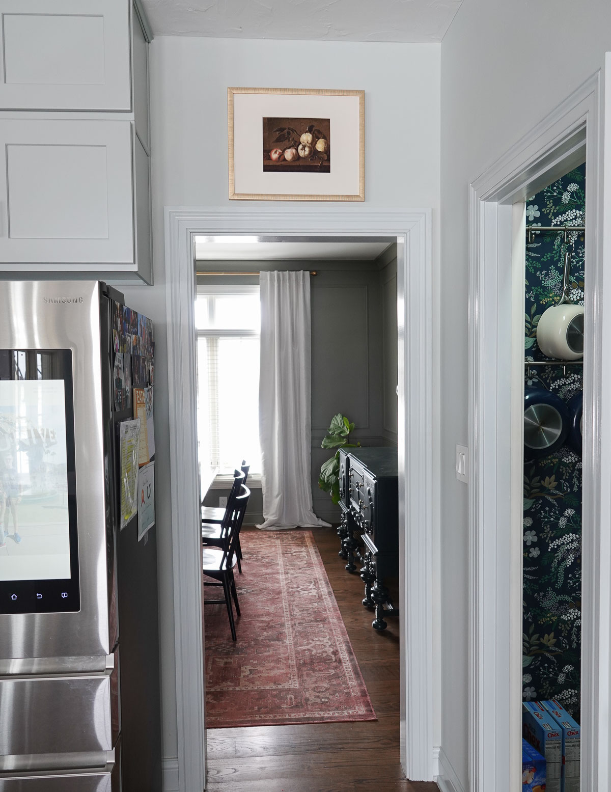
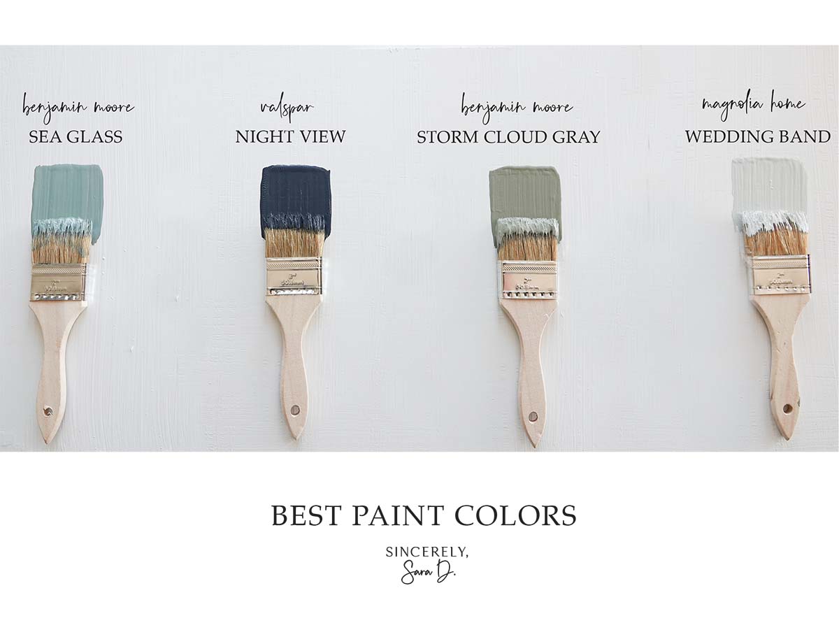
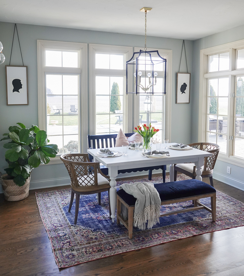
If you are looking for a neutral backdrop for your home, this blue-gray paint color may be the perfect choice.
This blue-gray paint color is Magnolia Paint’s Wedding Band.
I have struggled with what to paint our kitchen area for some time now, and one day it hit me. The monochromatic look is so popular right now (painting your walls and trim the same color), so I decided to find a color similar to our kitchen cabinets.
Our cabinets came finished in this color, but I had them color matched. You can see more on that HERE.
Our kitchen cabinets have beautiful blue and green undertones that change with the lighting. Wedding Band has slightly more blue and less green (yellow) undertones than my cabinets, but they pair beautifully together.
The paint color also worked well in our kitchen nook and looks pretty with the deep navy of our living room.
I painted our walls with a matte finish and our trim with the same color but in a semi-gloss.
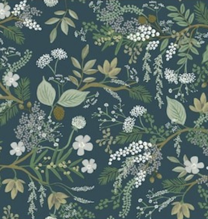
The color even transitions well into our green dining room and with our green floral pantry wallpaper.
This paint color is soft, subtle, and very soothing.
I love adding deep moody colors to our home, but I also love contrasting them with lighter colors that help brighten up our home.
What do you think of this week’s color of the week? Comment below and also share your favorite paint colors. I’m always looking for paint color suggestions!
Want to learn more about other great paint colors? Check out the previous colors of the week:
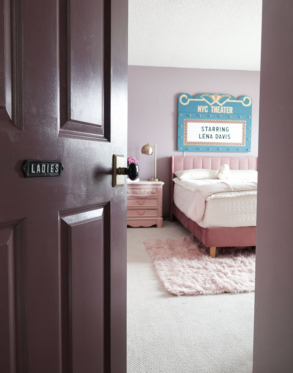
Lena is ten and has been asking me for over a year to redesign her room. She LOVES musical theatre, and she wanted the new space to have theater room decor.
Lena was one of my more difficult design clients. She is pretty opinionated – can you guess where she gets it?! It took a while to get to the end result, but we did it! And, we both absolutely LOVE it!
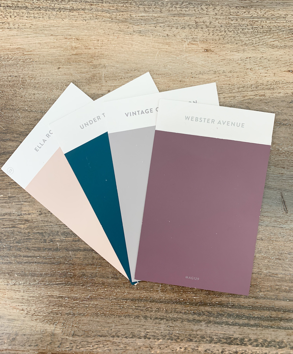
To begin, I took her to look at paint samples. She left with probably close to twenty colors, but she narrowed it down to four beautiful colors. The inspiration was old performance theatres that are full of sophistication and color.
Trim & Doors:
Webster Avenue by Magnolia Home (available at Ace Hardware)
Walls:
Casual Elegance by Clark + Kensington (available at Ace Hardware)
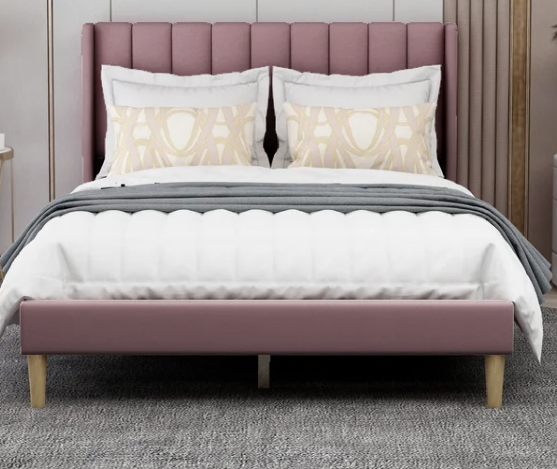
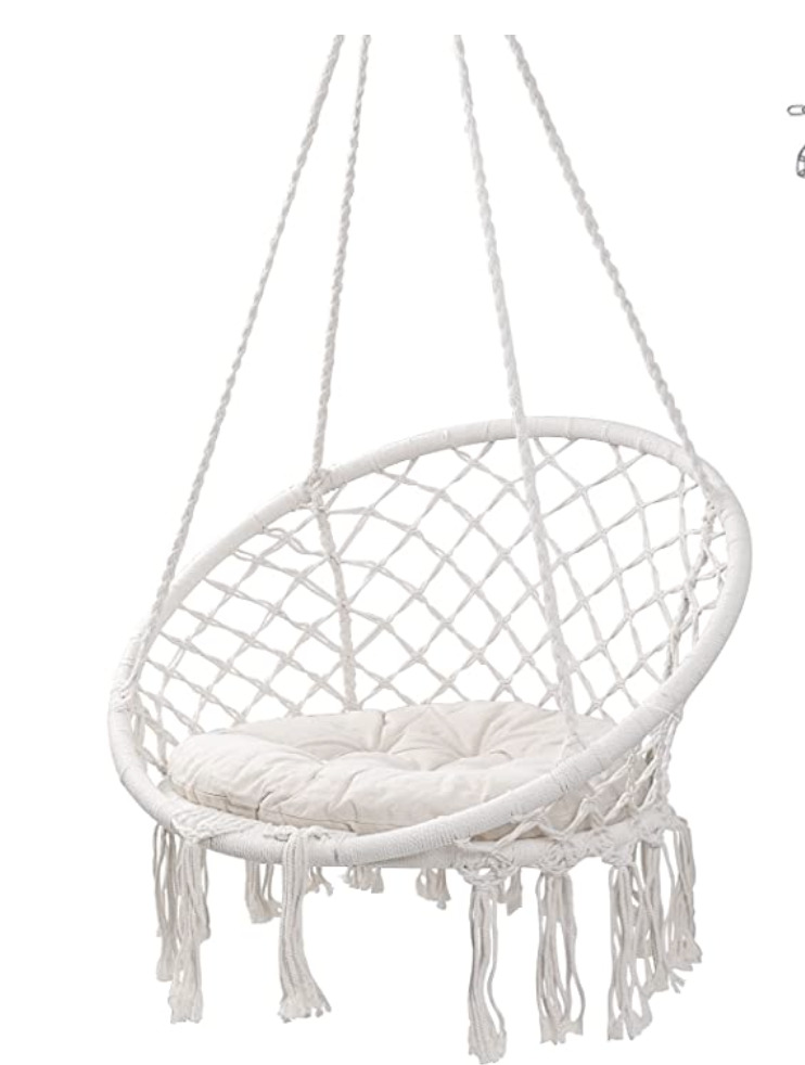
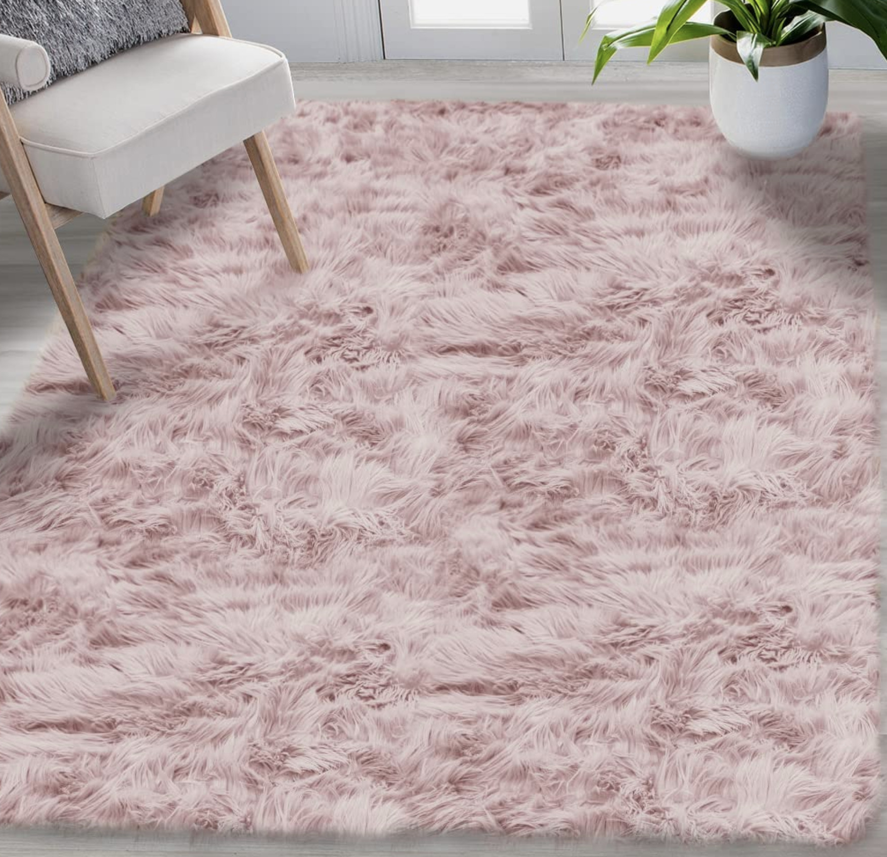
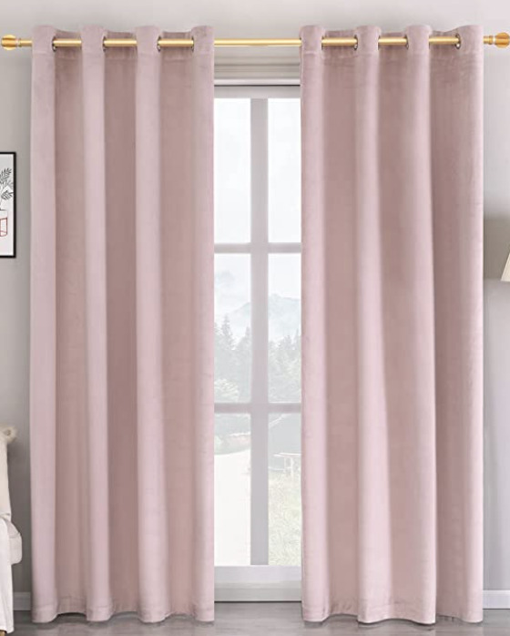
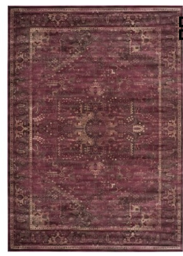
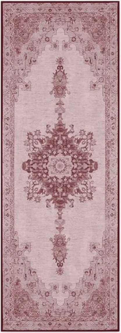
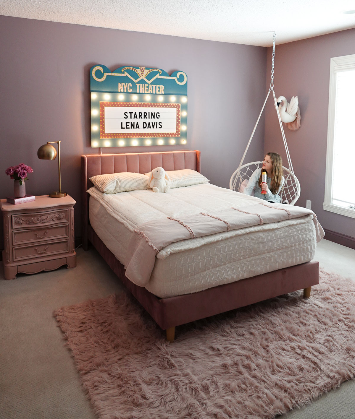
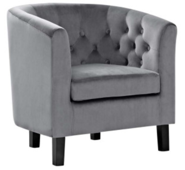
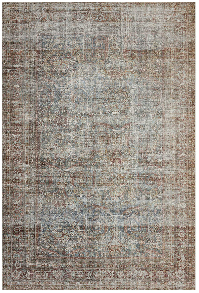
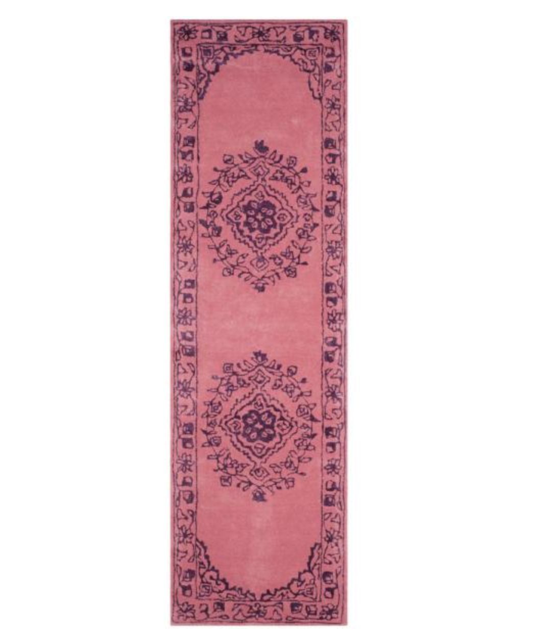
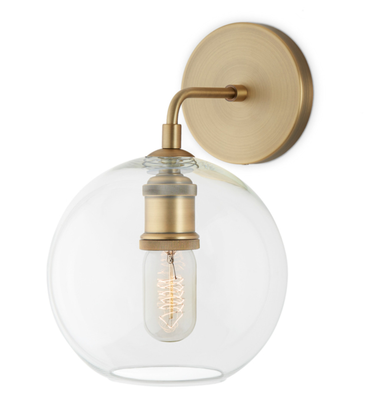
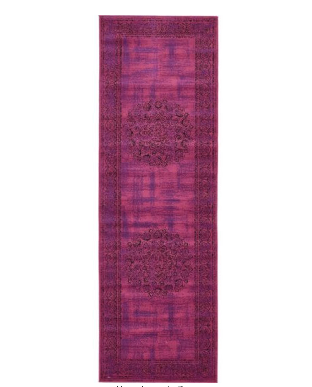
Once we had a color palette, we got to work designing the room. You can shop her room at the bottom of this post where I give the sources for the rug, bed, swing, and curtains. The bedding is our go-to zip-up bedding (seriously, the BEST), and you can see their full collection HERE.
I dreamed up this marquee sign and knew it had to be the focal point of the room. We have it hooked up to Alexa, so when we ask her to turn on “showtime”, she turns it on and responds with, “lights, camera, action.” It really is the coolest thing. I have a tutorial for this sign, and I will share it soon! It’s made from using a board, paint, and cafe lights.
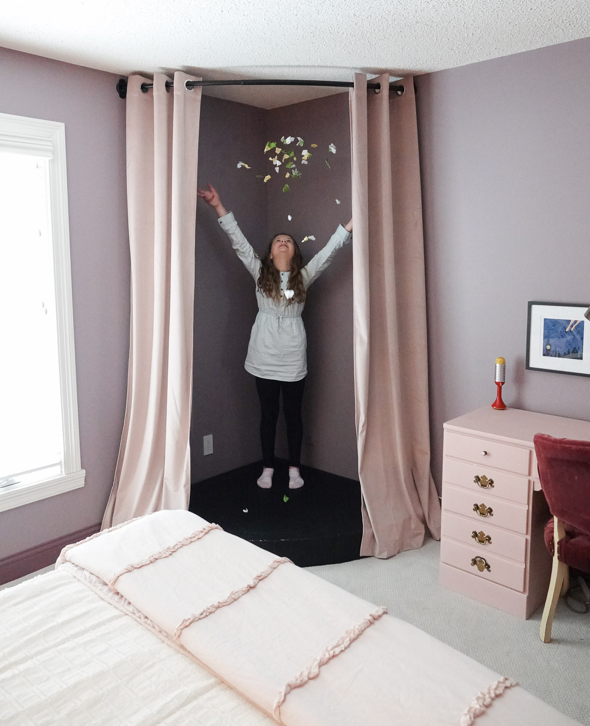
Lena dreamed of having a stage in the room, so my dad helped me out with this corner circular stage. I’ll also have the tutorial for it very soon, and I added a rounded shower curtain rod with some curtains to complete the look.
The updated design is perfect for my little tween, and now we’ll see if she holds her end of the new room design bargain – actually keeping it clean!
Are you new to my blog? Go HERE to see my home tour and HERE to shop for items I use in our home.
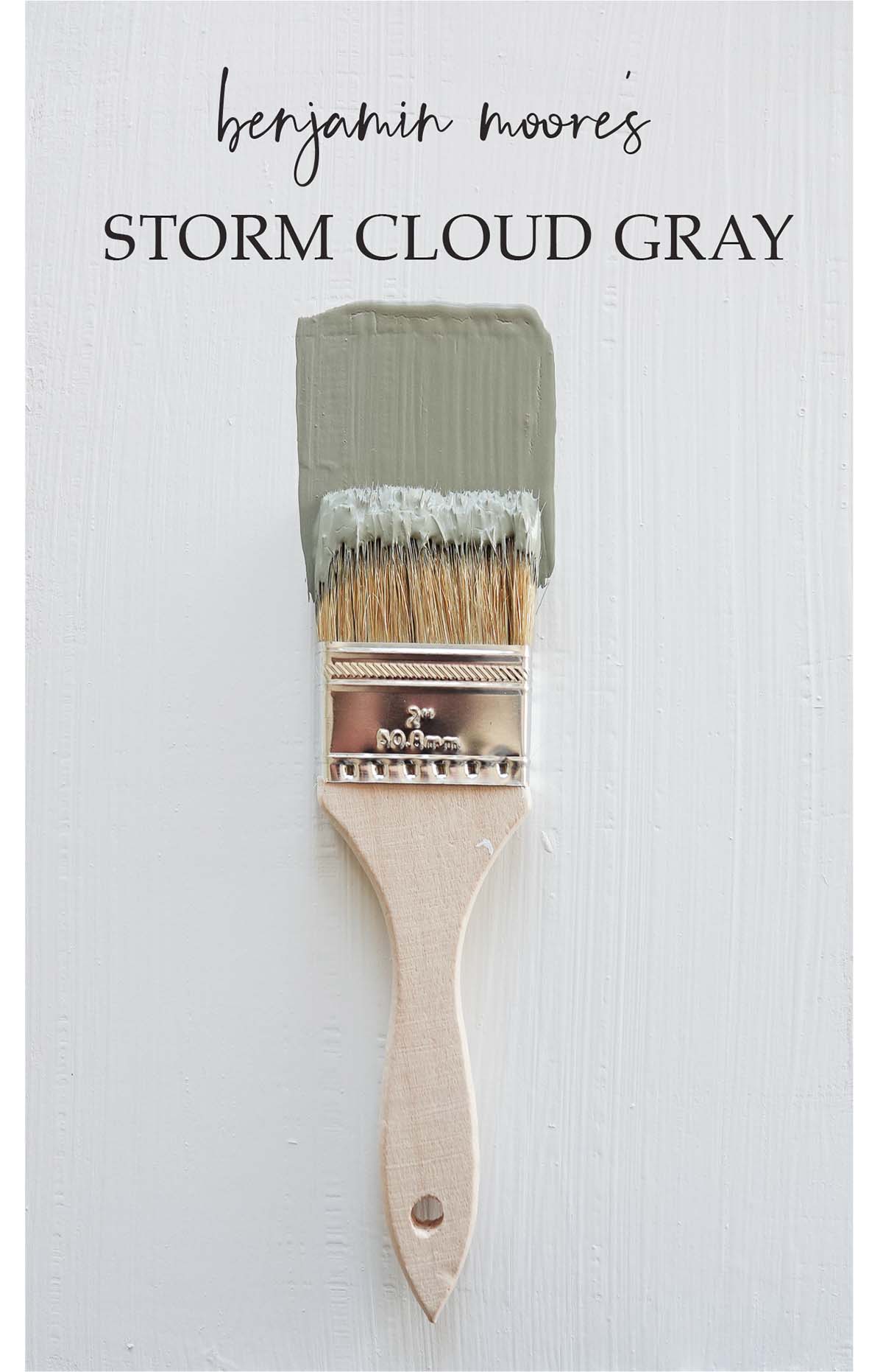
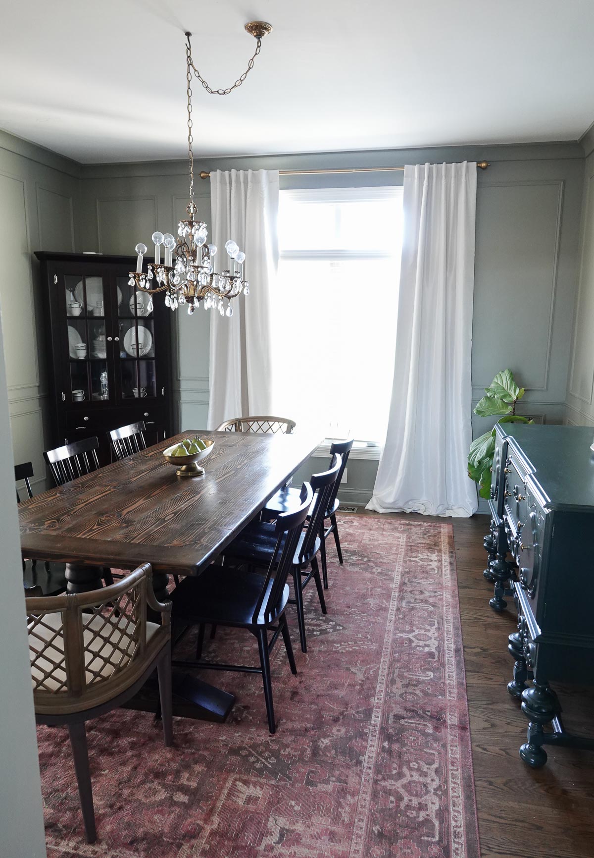
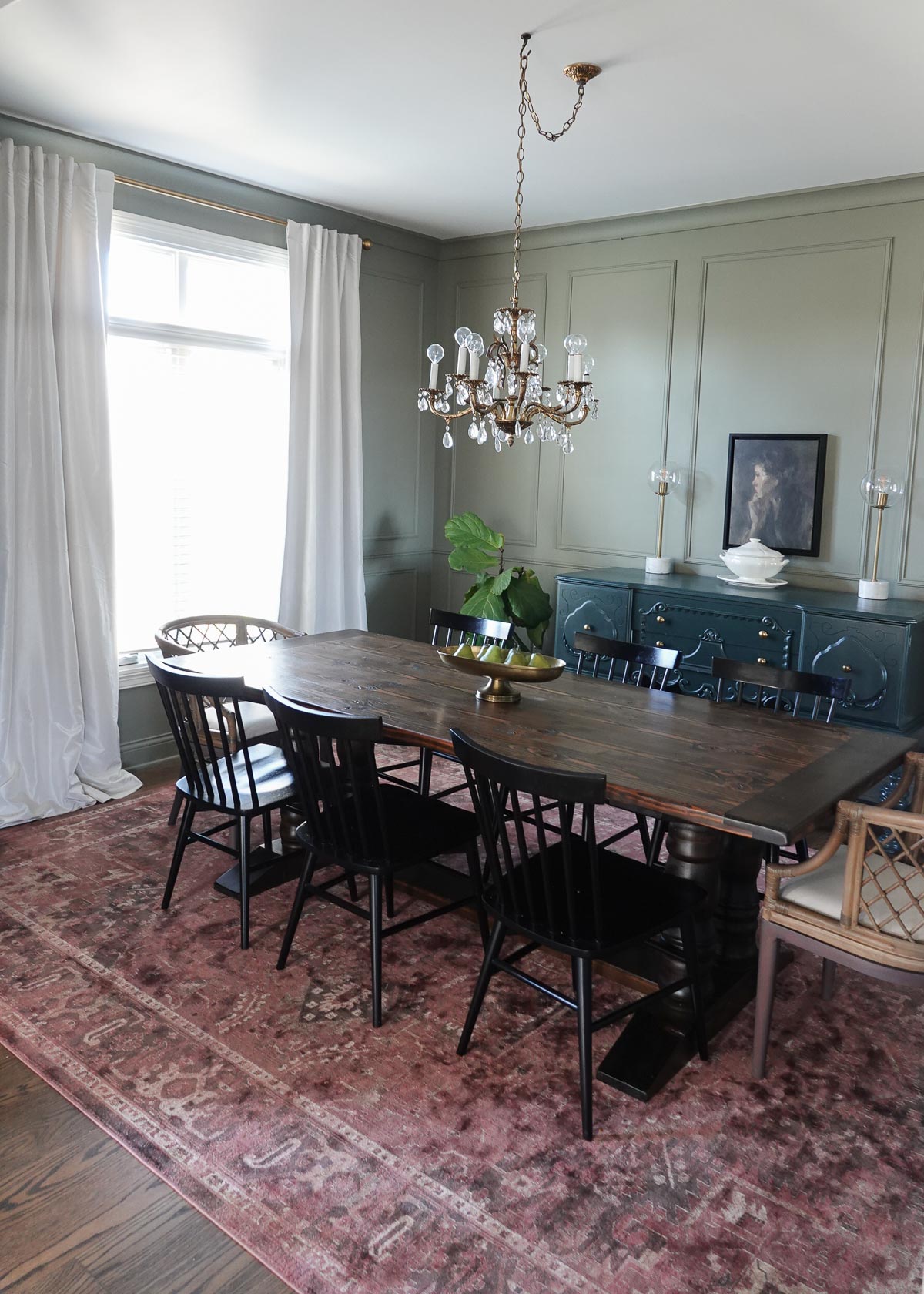
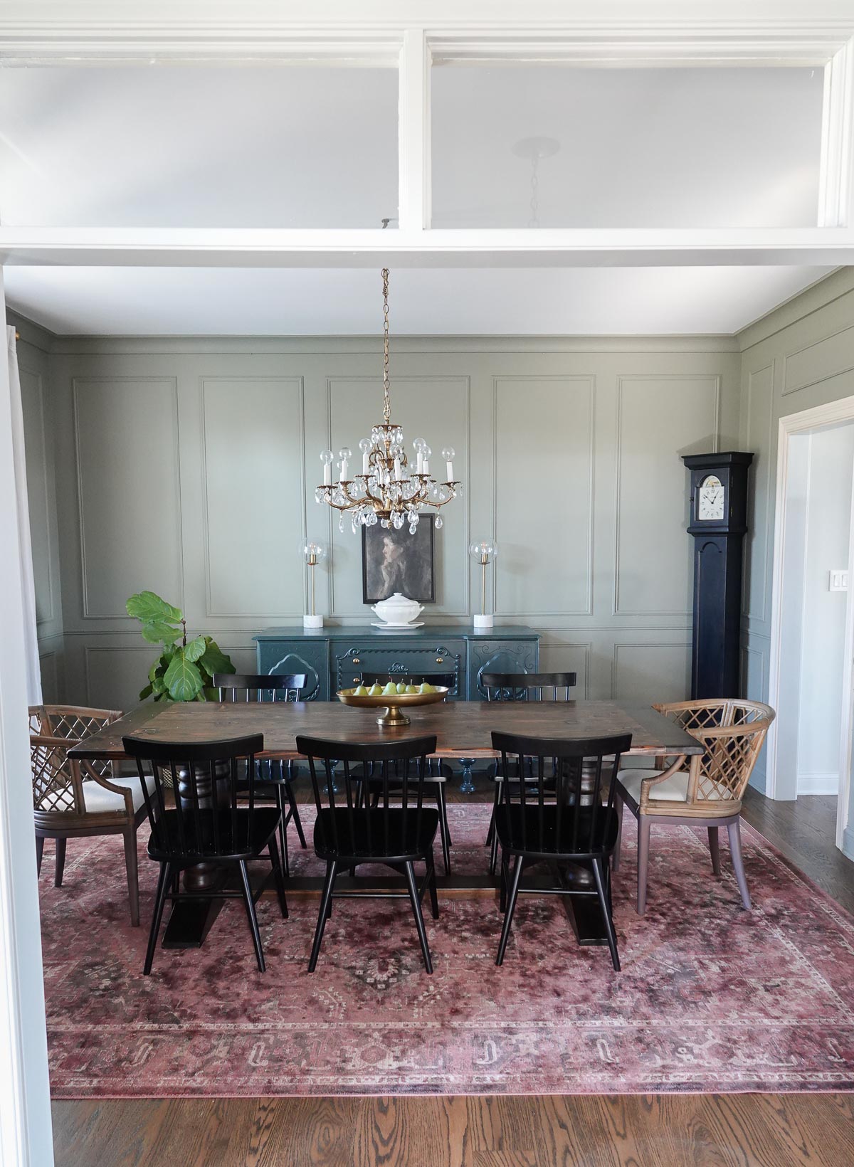
This week’s color of the week is a moody green paint color from Benjamin Moore, and it is called Storm Cloud Gray.
I don’t love the name because it really doesn’t appear gray with its yellow and green undertones. The saturated color will provide timeless sophistication to any space.
I love pairing Storm Cloud Gray with other shades of green and pops of raspberry.
Why You Should Use Green in Decor
Decorating with green has been a design favorite for centuries – the Victorians favored deeper green tones like sage and brunswick green for their interiors. In the 1950s, aqua and mint green were paired with baby pink to achieve the ideal Americana aesthetic for kitchens and Cadillacs. In the 1970s, avocado became the height of fashion and enjoyed immense popularity (even in appliances).
Green is a color of balance and harmony. It lends us a clearer sense of right from wrong since green incorporates a balance of both the logical and emotional. Green is one of the most-seen colors in nature reflecting life, rest, and peace. It is also a sign of growth, whether that’s in a physical object like plants or in our income and wealth.
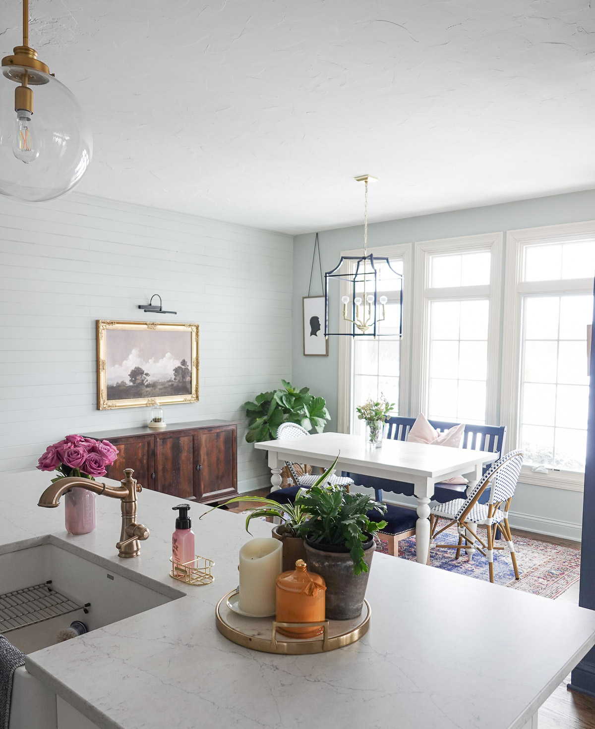
My dad and I added these paneled walls last year, and you can see the full tutorial here. I love how much character it brings to our dining room and how it feels like it has always been there.
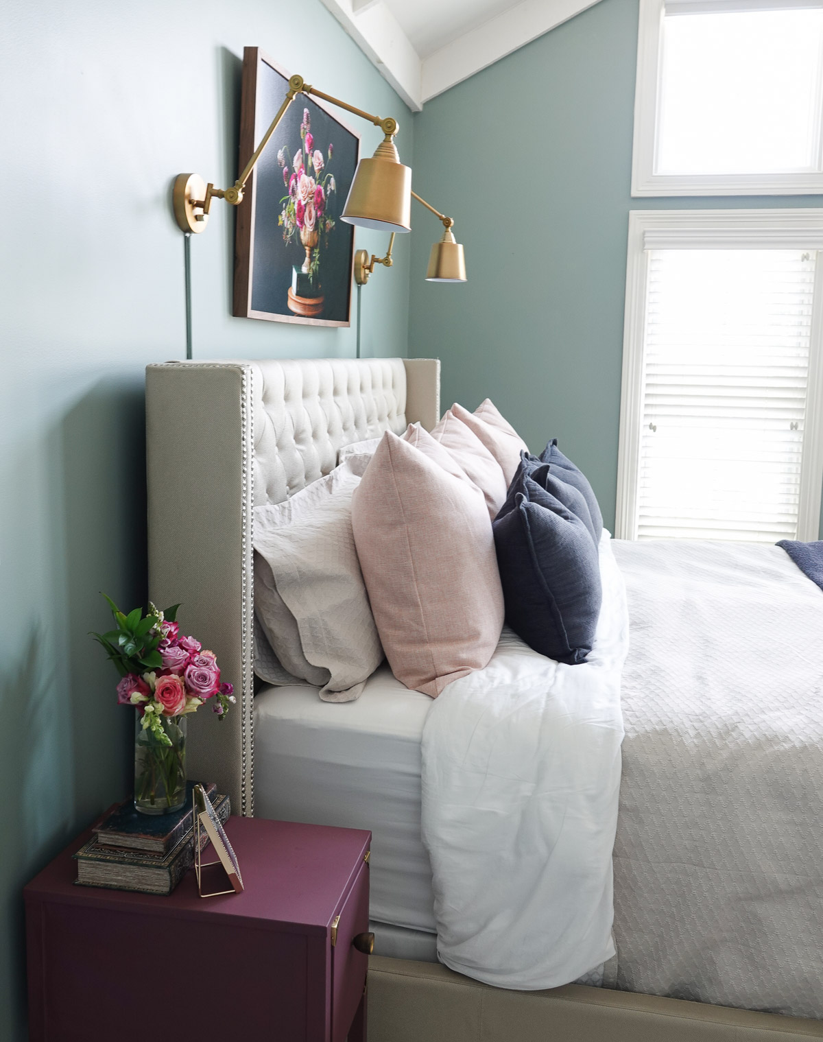
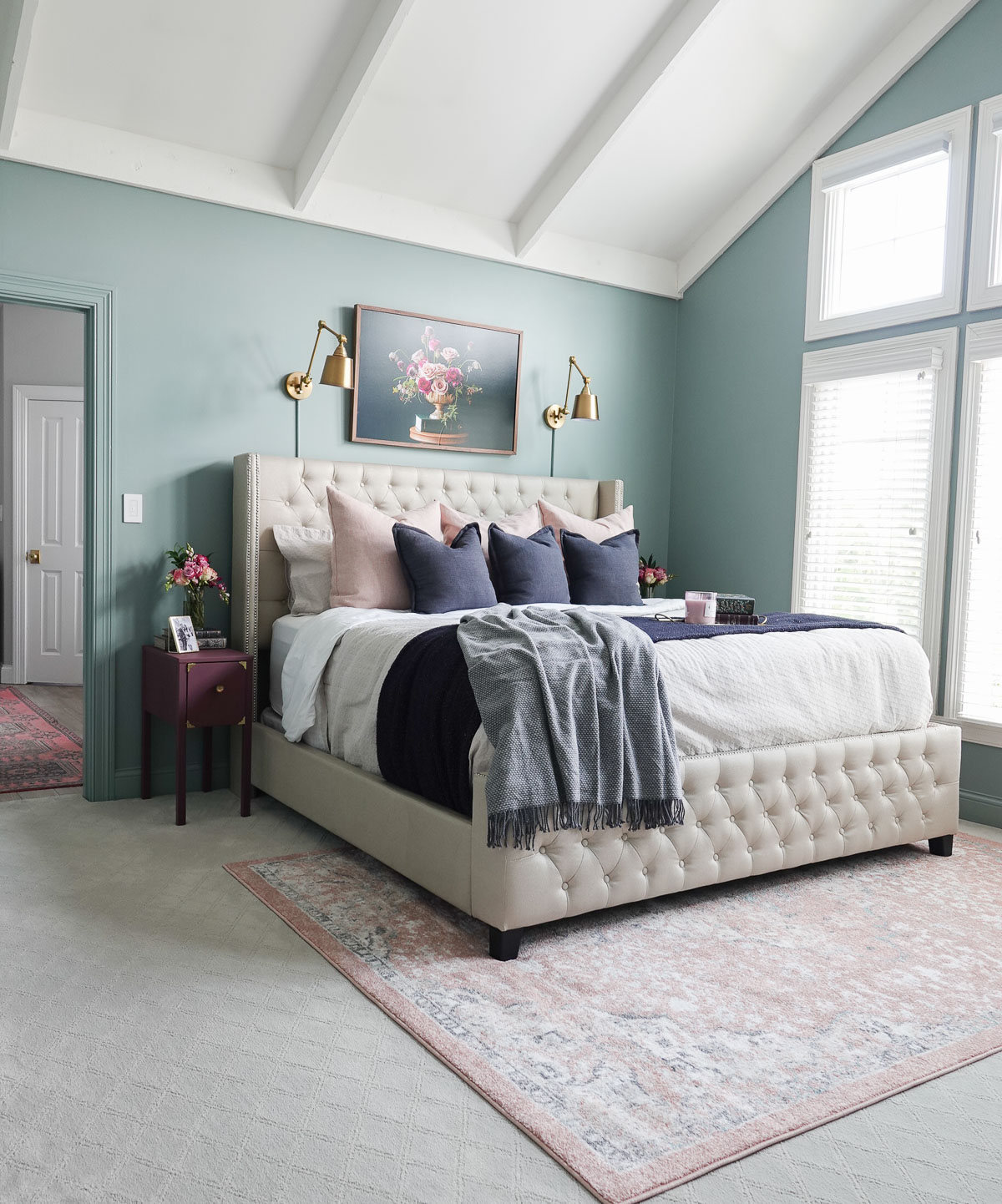
This week’s paint color is a blue-green paint color, and it is Sea Glass by Benjamin Moore.
Polls show that blue and green are Americans’ favorite colors, and this color is the happy medium. Sea Glass combines the stable tranquility of blue with the optimism and nature that are inherent in green.
It is a tricky color because it changes throughout the day with lighting. It is also a color that is subjective to the viewer. One half sees blue-green and the other insists it’s green-blue. And the great thing is that both sides are right because color is always subjective – what you see is what you get!
I painted our bedroom in Sea Glass, and it made a bold statement from the previously off-white color it was. I used Benjamin Moore’s satin finish for the walls and semi-gloss for the trim and doors.
I have really loved the new trend of painting the trim and doors the same color as the walls. Many people also paint their ceilings the same color, but I am a little more hesitant to try that because of how hard ceilings are to paint. They are BY FAR my least favorite thing to paint.
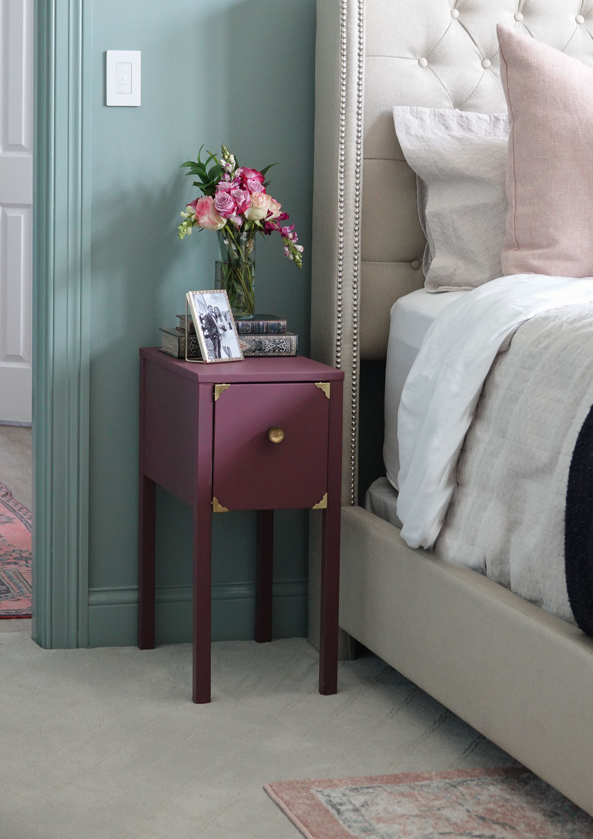
I love mixing in pink hues and navy with the Sea Glass color.
This relaxing color is perfect for bedrooms and bathrooms.
Do you have a perfect paint color you would love for me to add to this series?
Comment below and let me know! I’m always looking for new paint colors to share.
Want to learn more about other great paint colors? Check out the previous colors of the week:
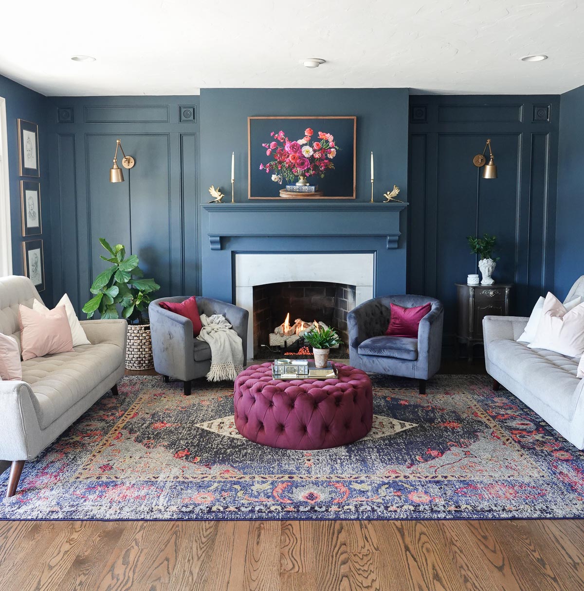
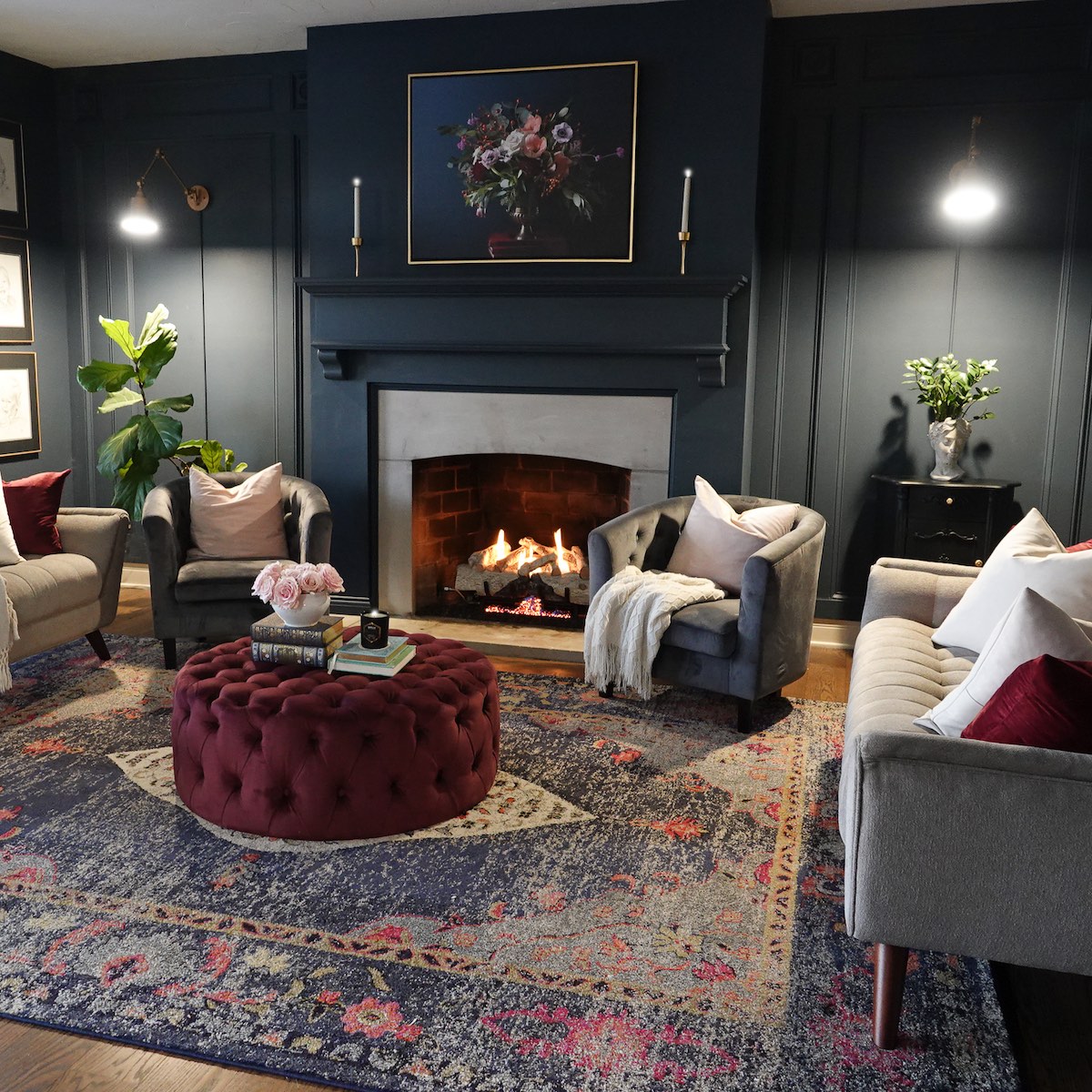
I am always switching things up, so the fact that I’ve had this same navy on my walls for over five years really means this is the best navy paint color.
This is the first of many paint color posts. Each week, I plan to share a paint color of the week to help you find the right color for your next project.
The Best Navy Paint Color
This navy is Valspar’s Night View, and I believe it is the perfect shade of dark navy blue.
Navy’s dark tones capture the eye and cause brighter colors to pop. It compliments all styles of decor and is a wonderful color to add to any space. However, it is a very dark color that should be balanced to ensure it doesn’t overwhelm.
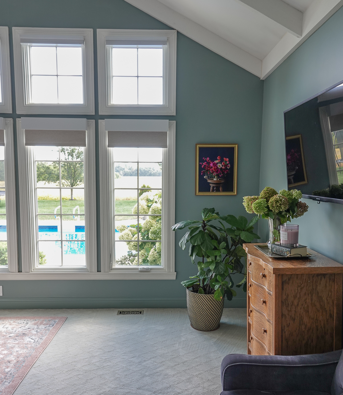
It helps that I have a large wall of windows in our living room which allows plenty of natural light to flood in.
If you want to use Night View in your home but don’t have a lot of natural light, consider balancing the darker space with a lighter, brighter space.
Our kitchen is the opposite of moody and the contrast of the crisp whites provides some relief.
Brighten up moody paint with brighter colors and neutrals. Notice the various shades of pink and burgundy along with the lighter sofas and pillows. The metallic gold also adds another dimension of color and shine.
Moody colors bring sophistication to your room, and they look extra special in the evening.
I painted everything in this perfect navy blue – the air vent, the outlets, and even the trim. I typically use an eggshell/satin finish for my walls and a semi-gloss for trim colors. Keep in mind that you really don’t need much paint for the trim, so only buy a pint of the trim paint.
Why Use Navy Color in Decor
The color blue is one of the world’s most popular colors with nearly half of men (42%) and one-third of women (30%) claiming blue as their favorite color. It is the color of skies and oceans and is often described as being tranquil, peaceful, secure, and full of serenity. Blue can lift our mood and improve the energy of a space.
From a color psychology perspective, blue is typically associated with stability and trustworthiness—there is a reason blue is universally appealing.
Different blue tones evoke different feelings:
DARK BLUE: trust, dignity, intelligence, authority
If you have researched classic navy paint colors, then I’m sure you are familiar with Benjamin Moore’s Hale Navy. It is also a beautiful rich blue and very similar to Valspar’s Night View.
Here’s a side-by-side of the two true navy paint colors. On the left is Night View and on the right is the popular navy loved by interior designers.
They are very similar, and when it comes down to finding the right navy, I would select Night View because the cost of Valspar paint is significantly less than that of Benjamin Moore. Also, Valspar paint provides good coverage and a beautiful finish.
Night View is a beautiful hue that would look great on an accent wall, cabinetry, piece of furniture, or even your front door.
Here’s a sneak peek of some of my upcoming favorite paint colors. Do you have a perfect paint color you’d love for me to add to this series? Comment below and let me know!
Want to learn more about other great paint colors? Check out the previous colors of the week:
I have installed removable wallpaper many times in our home, and today I’m going to share how to hang removable wallpaper.
Removable (also known as peel-and-stick) wallpaper is a fantastic solution for renters, those with commitment issues, or for people like me who live with someone who thinks wallpaper is a nightmare.
Steve spent one summer while in law school removing wallpaper from an apartment complex. Luckily removable wallpaper is THE EASIEST thing to remove, so even he’s on board with peel-and-stick wallpaper.
I recently removed removable wallpaper from our kitchen nook, and it was all down in under 10 minutes with NO damage to the walls. Now, hanging it is a different story, but with some time and patience, you too can have beautifully papered walls (without the commitment)!
Hygge & West gifted me with this gorgeous wallpaper. All opinions are 100% mine.
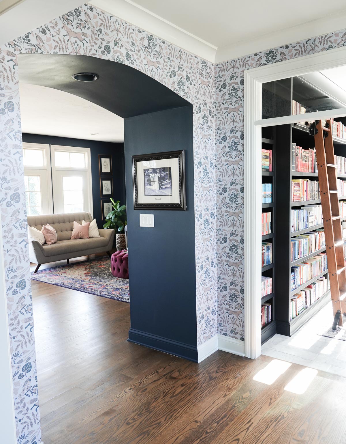
I added Hygge & West’s Piedmont in Mist to our entryway. Entryways (or foyers), hallways, and bathrooms are my favorite spots to add wallpaper.
Here’s a before of our entryway:
And the beautiful after:
How to Hang Removable Wallpaper
Supplies:
Tape Measure
Level
Razor Knife
Scissors
Pencil
Smoother (I would recommend a plastic smoother)
Removeable/Peel-and-Stick Wallpaper
Hanging the Wallpaper
Recruit a Friend
You may want to recruit a friend to help because removable wallpaper can be tricky. It doesn’t give like traditional, pasted wallpaper. Think of it as a giant sticker – it doesn’t shift. You will find that you will have to apply and remove it over and over until you get it in the correct spot.
Strategize Where to Begin
You want to be strategic about where you begin installing the wallpaper. I began on the wall at the front door and then worked on the opposite wall. I left the sidewalls for last so I could hide where the wallpaper didn’t match above the doorway.
Pre-Cut the Wallpaper
You will have to do this one at a time – don’t try to pre-cut the wallpaper at once. I allow several inches at the top and bottom and check measurements twice.
Begin at the Top
Start from the and move down and take your time. It is important to get that first-panel level because otherwise, you’ll see a slow slope as you move around the room.
I like to work in 2 – 3 foot sections. I remove the first 2-3 feet of backing, and once I’m confident where it is and have it smooth, I move on to the next section.
Use the smoothing tool to remove bubbles. You can push bubbles down or out to the sides.
Trim Excess Paper
Trim excess paper at the ceiling and baseboard with a straight edge (I used my smoother)and sharp X-ACTO (I switched out my blade fairly often).
Repeat
Repeat the process. Pay attention to the repeat and line up as closely as possible – you shouldn’t need to overlap.
Tips & Tricks
Don’t get discouraged. Like with everything, practice will make you better. Allow yourself plenty of time so you don’t feel rushed.
Cut the paper in the corners. I know this is added work and more room for mistakes, but I found the paper bubbles in the corners if you don’t cut the paper.
If you’re hanging paper on an edge without trim, fold the paper around the wall so you can have and easy line to cut using scissors. Be sure to not allow even a small amount to hang over or you will risk the wallpaper getting snagged/pulled.
Get creative when you are hanging the last pieces and the pattern doesn’t meet. I ended up with a rabbit/quail hybrid, but luckily I had planned ahead and it’s hidden in a spot most people won’t see. I cut out some leaves and berries to hide the seam.
Small projects always lead to bigger projects. After I hung the paper, I didn’t love the color of the trim or ceiling, so I ended up repainting both!
Do you have any additional tips for how to hang removable wallpaper? Share them in the comment section!
Today we’re talking about decorating with white. Nothing says bright, fresh, and clean like white. It’s a versatile neutral that works well with any decor style.
I used this month’s color on our kitchen table, and it brightened the entire space.
Why You Should use White in your Decor
Having a white base and decorating with white always looks polished, and it works with almost any other color imaginable.
White is a color of protection and encouragement, offering a sense of peace and calm, comfort and hope, helping alleviate emotional upsets. It creates a sense of order and efficiency.
The color white is cleanliness personified, the ultimate in purity. White is traditionally worn by western brides while doctors wear white coats.
White is bright and can create a sense of space, and designers often use the color white to make rooms seem larger and more spacious.
Besides making a space look larger, white is a base that allows you to seamlessly cover up slight cracks or worn areas either in your home or on furniture. White disguises the areas you don’t want on display.
Using white in decor is a balancing act. Too much white can cause feelings of isolation and emptiness. White can be too pristine and immaculate and make you feel as though you can’t make a move for fear of creating a mess. It can also come across as empty and unfriendly.
Is White a Color?
This is a loaded question, and answers may vary depending on who you ask.
In art, white is the absence of all color and black is the presence of all color. To artists, black is considered a color, white is generally not.
In light, the opposite holds true. Black is the absence of color, and white is the presence of all color. To scientists, white is a bunch of colors, and black is not.
Let’s discuss this further – light appears colorless or white. Sunlight is white light that is composed of all the colors of the spectrum. A rainbow is proof. You can’t see the colors of sunlight except when atmospheric conditions bend the light rays and create a rainbow.
However, if we’re going to be technical, white (and black) are not colors – they’re shades. They do function like colors in that they evoke feelings. And in the decor world, white is an important color – even if it’s not represented on the color wheel. White is an essential ingredient of any decor palette.
The Color Theory Behind White
So today, we are going to consider white a color. White is the lightest color and can have either warm undertones or cool undertones.
Warm Undertones Warm whites have an undertone color of yellow, orange, and red.
Cool Undertones cool whites have an undertone of blue, green, and purple.
Warm whites will be easier to blend with cream and beige, and white cool whites will mix best with shades of gray. Whichever undertone you choose, be sure to stick with it throughout your space.
If you’re unsure about the undertone of something, simply hold it up to a swatch of pure white.
History Behind White
In ancient Egypt and ancient Rome, priestesses wore white as a symbol of purity, and Romans wore a white toga as a symbol of citizenship.
The Pope, the head of the Roman Catholic Church, has worn white since 1566, as a symbol of purity and sacrifice.
Greek and Roman temples were faced with white marble, and beginning in the 18th century, with the advent of neoclassical architecture, white became the most common color of new churches, capitols, and other government buildings, especially in the United States.
However, the history of white pigment is a dark and morbid one. Lead white was one of the earliest and most reliable whites discovered and was in use since 400 B.C. Lead white’s victims included not only the manufacturer workers and artists who used it, but also those who applied it as face makeup. Its toxicity sickened and killed a lot of people.
At the end of the 19th century, lead white was still the most popular pigment; but between 1916 and 1918, chemical companies in Norway and the United States began to produce titanium white, made from titanium oxide. It had twice the covering power of lead white and was the brightest white pigment known. By 1945, 80 percent of the white pigments sold were titanium white.
White & Black
Pairing black and white together is a classic move that creates a sophisticated atmosphere. It is clean, sleek, and a little dramatic.
If you are considering using chalk paint on your cabinets, this is a must-read. Don’t make my mistake! Learn from why I repainted my chalk-painted cabinets.
When we first moved into our home, I painted our kitchen cabinets with chalk paint. This is what they looked like before (the first time I painted them):
And here is a photo of how our kitchen cabinets originally looked when we first moved into our home:
Why I Repainted our Chalk Painted Cabinets
The chalk paint itself has held up really well. There was little to no chipping. Chalk paint is amazing for DIY projects because it requires no prep work and eliminates the need for priming.
However, I made one mistake. Unfortunately, it was a big mistake – so big that I had to repaint the cabinets.
I used wax as my sealer.
It is hard to see in photos, but the clear wax was next to impossible to clean in the kitchen. Dirt, grease, dust, and grime were getting caught in the crevices, and the wax did not clean up easily.
I had to repaint my cabinets.
I used chalk-type paint again, and I painted right over the previously painted cabinets sealed with wax. I would recommend using sandpaper and/or a coat (or two) of primer if you paint over cured wax.However, most likely you are not painting over the wax and will not need a primer. To apply the paint, I used a brush for the crevices and a roller for the flat areas.
How to Correctly Seal Chalk-Painted Cabinets
I painted everything with two coats of paint (allowing the first coat to completely dry before I added the second coat) and finished with two coats of sealer. I applied the matte sealer the same way I applied the paint, but you can also use a water-based sealer like a polyacrylic (found at any hardware store).
I have already noticed such a difference between the sealer and the wax. Now when my kids sit at the bar, I don’t have to worry as much. All the dirt they kick up can now be easily wiped away!
If you are considering painting your cabinets with chalk paint, don’t make my mistake (which is why I repainted my chalk-painted cabinets).
Use a top coat other than wax in the kitchen.
I know people often love the look of dark wax to provide that more lived-in, distressed look. However, try antiquing your cabinet doors with a dark glaze so you don’t have to use wax as your sealant.
Did you know you can also apply chalk paint in a sprayer? I HIGHLY recommend this method when painting cabinetry to avoid brush marks and for a smooth finish.
*This post contains affiliate links and is a sponsored post by Amy Howard at Home. I take pride in reviewing only products that fit my brand and will be beneficial to my readers. And while this post is sponsored, all the opinions are my own.
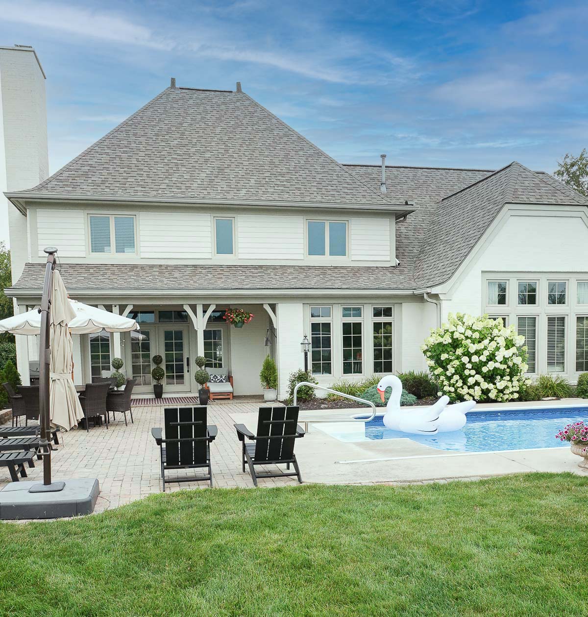
Windows provide our homes with light, warmth, and beauty. They make us feel less confined and help bring the beauty of the outside in. Although windows are such an important part of our homes, homeowners often feel overwhelmed when it comes to window replacement.
This is a sponsored post written by me on behalf of Universal Windows Direct. All opinions are 100% mine.
We all have a long list of home improvement projects, but we should value windows higher than we do.
Window Replacement is an Investment that will Pay Off
Since your home is most likely your biggest investment, replacing old windows should be at the top of your list of projects. This wise investment will keep your family and possessions safe, reduce your energy costs, allow you to enjoy the beauty of the landscape surrounding your home, and increase your home’s value.
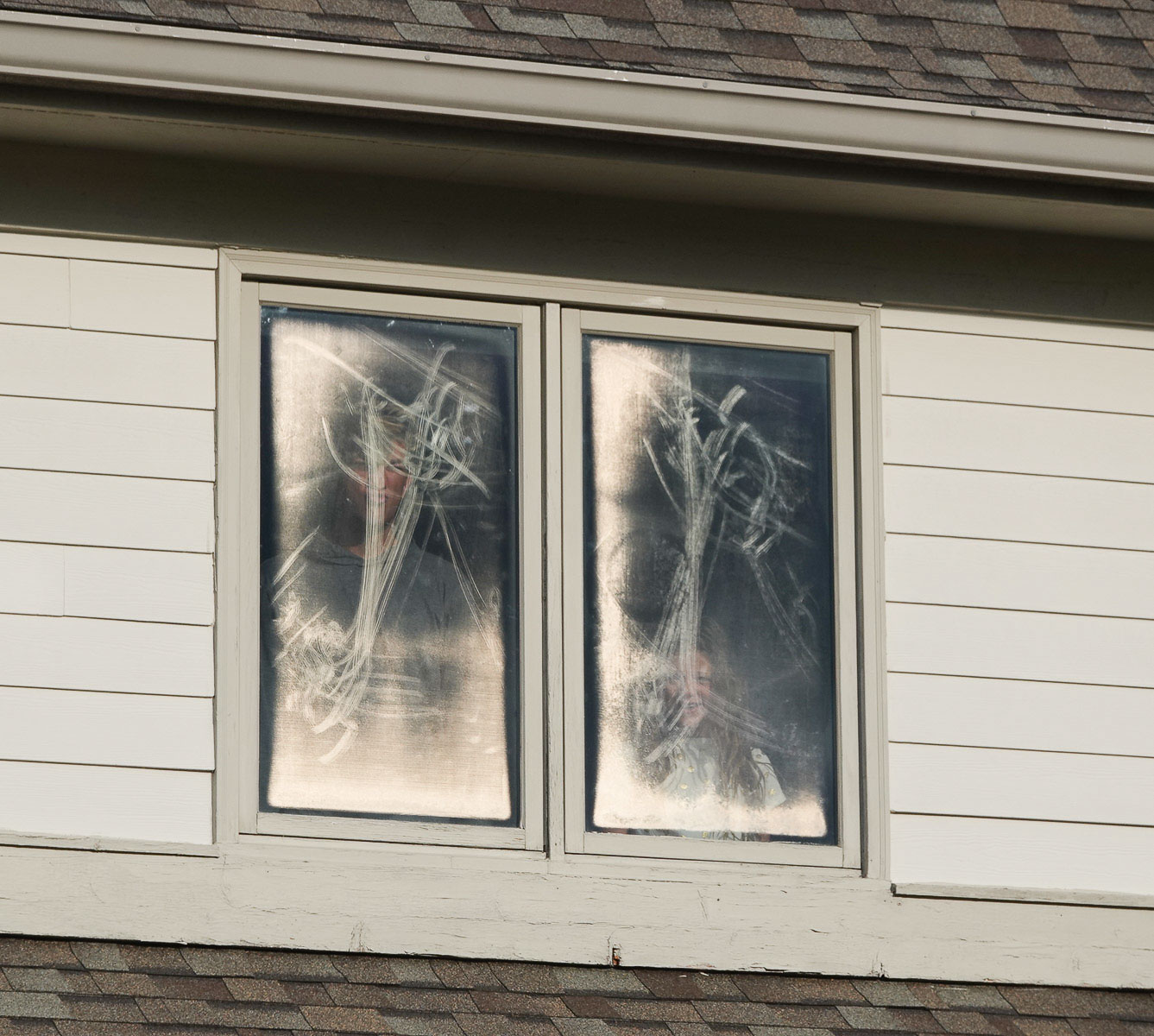
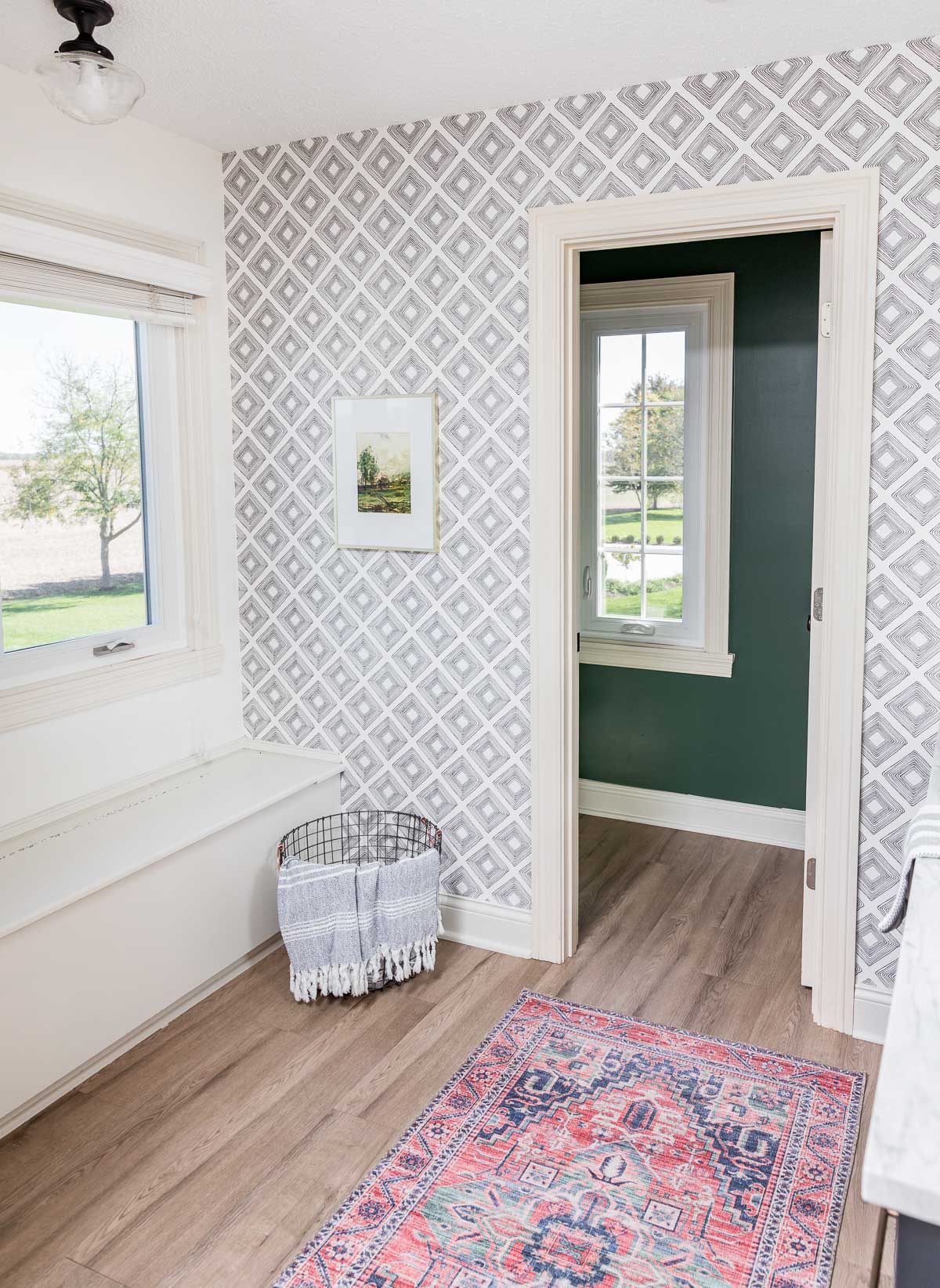
When we bought our home, we knew several of the windows needed replacing. The seals were broken, they were ugly and hard to see through, and there was a lot of air seeping in – and out.
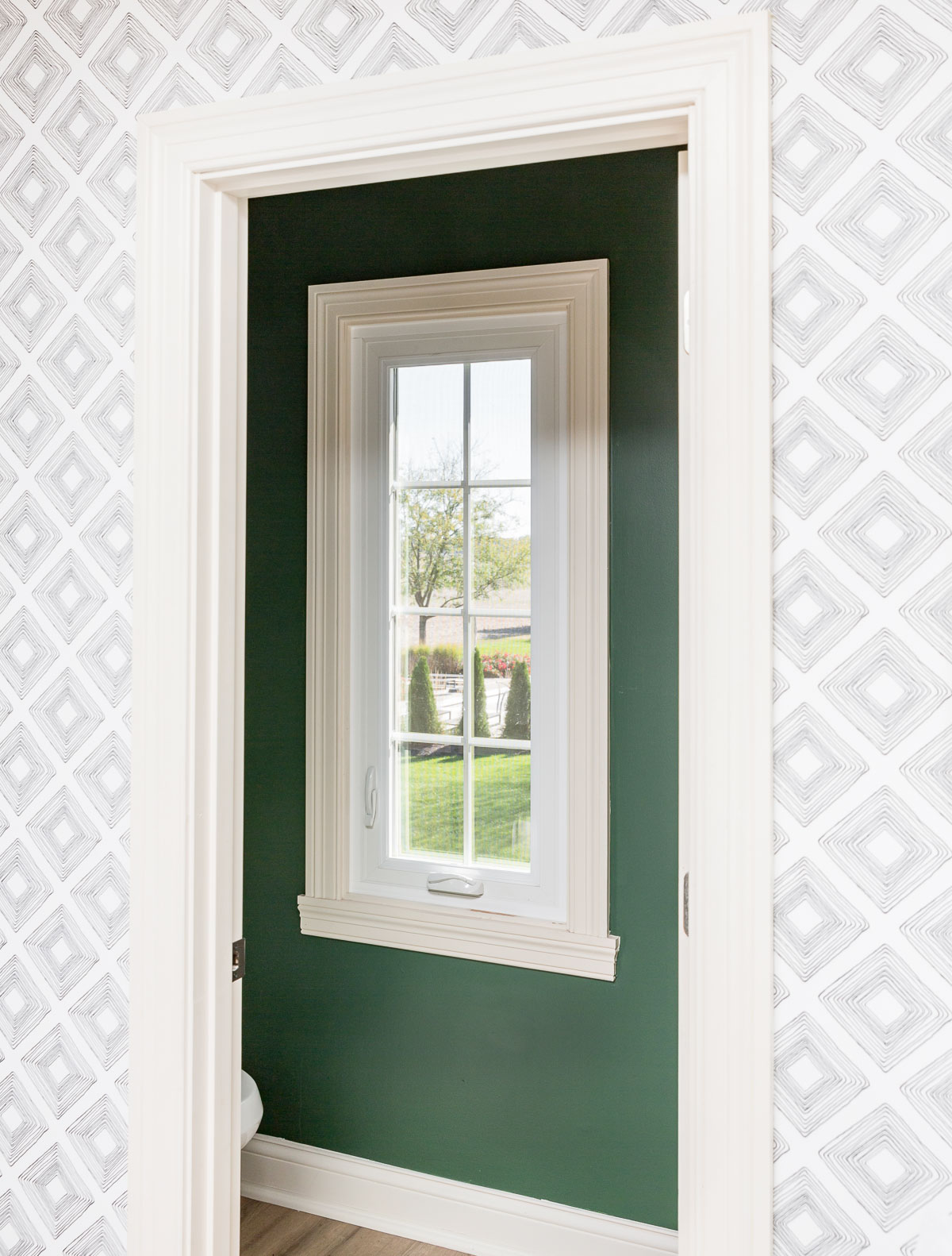
Before photo of our casement windowsAfter photo – notice how beautiful the casement windows are now!
Replacing Windows with Universal Windows Direct
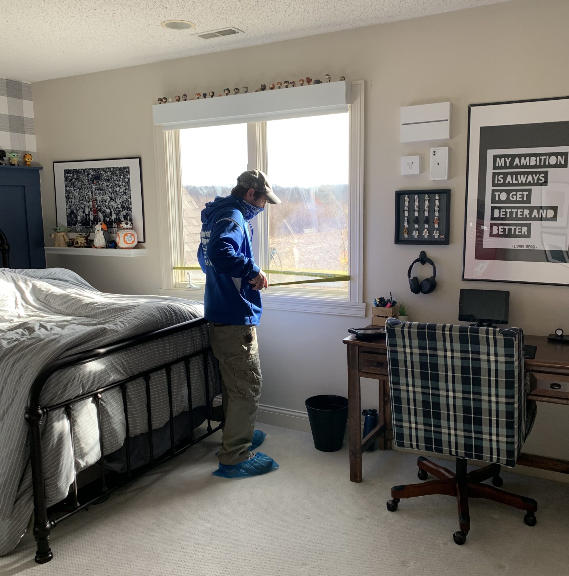
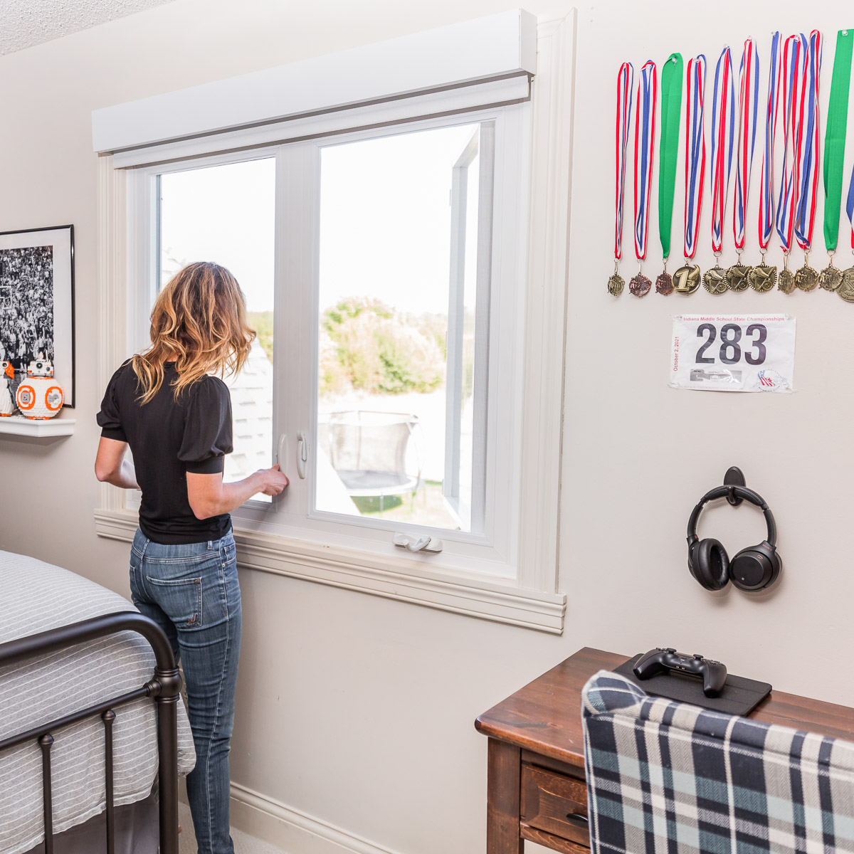
We replaced seven windows in our home with Universal Windows Direct – three in our boys’ bedroom, three in their bathroom, and one in our main bathroom.
The process began with a UWD representative who came over and talked me through exactly what our needs and wants were. They come to you so you can discuss everything in the comfort of your home.
We discussed color selections, and he provided me with a detailed training session on all UWD has to offer in terms of windows and why we should select them for our window replacement.
We discussed everything from the window frame material to the window replacement cost which includes windows’ cost, installation costs, and warranties. UWD also replaces entry doors and patio doors.
Once I had made all the selection decisions, someone from UWD returned to measure all the windows so they could order our custom windows. He sent the measurements in, and the windows were ordered to be custom-made for our home.
Installation
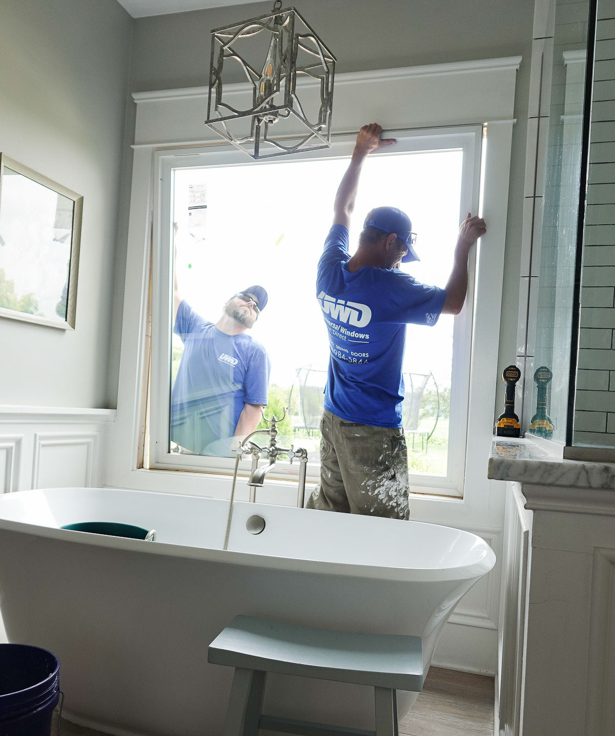
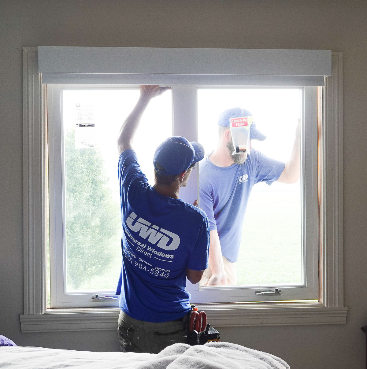
Several months later, the windows were in, and the install took place.
The window installers were efficient and worked hard to make the process as easy as possible for our family. It was fascinating to watch them remove the old window frames and replace them with the new UWD windows.
Due to the supply chain shortages, the entire process was slower than normal. The windows came in first, but we did have to wait a bit longer for items like the window cranks and screens.
The new windows from Universal Windows Direct are so much nicer than those we had before. We can actually see through the windows, and we don’t have to worry about cold or hot air seeping in – or out! It’s nice feeling confident about the energy efficiency of our windows going into winter.
I love how the windows open to allow for easy cleaning. Before, I had to step out on our roof overhang to clean the exterior of the windows.
Universal Windows Direct is located nationwide if you want to check them out for your window replacement project.
Are you new to my blog? Go HERE to see my home tour and HERE to shop for items I use in our home.


