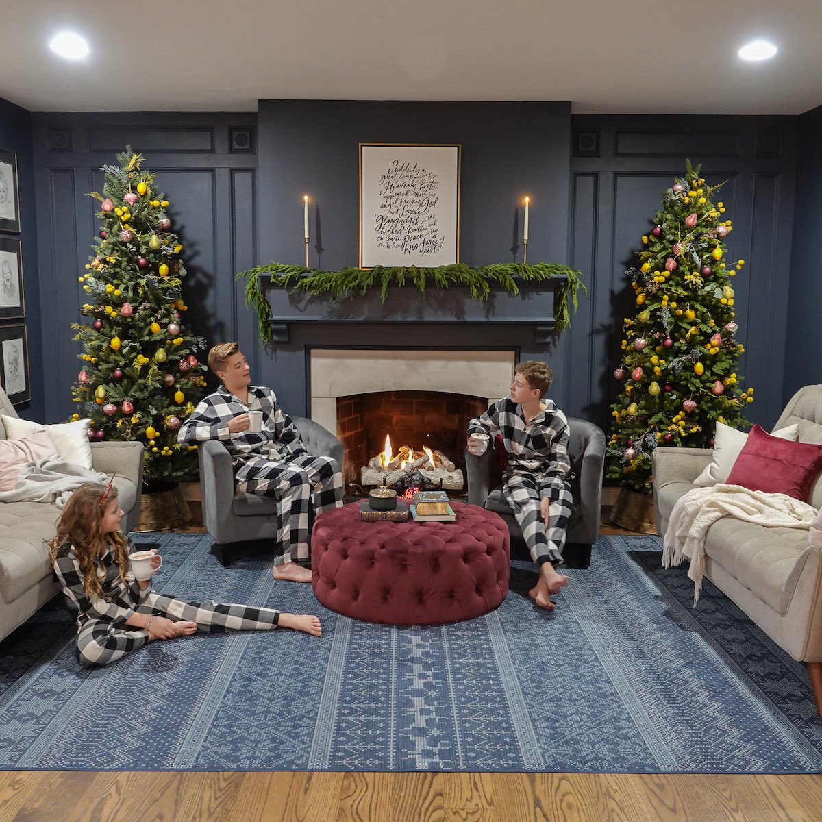
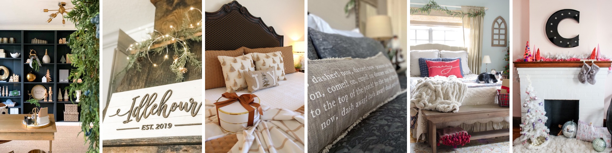
Today I’m sharing some simple but unique Christmas decor inspiration. I’m excited to be a part of the annual Holiday Home Tour organized by 11 Magnolia Lane and Evolution of Style.
At the end of this post, you’ll find 29 other bloggers sharing this holiday decor inspiration! If you’re stopping by from 11 Magnolia Lane, hello!
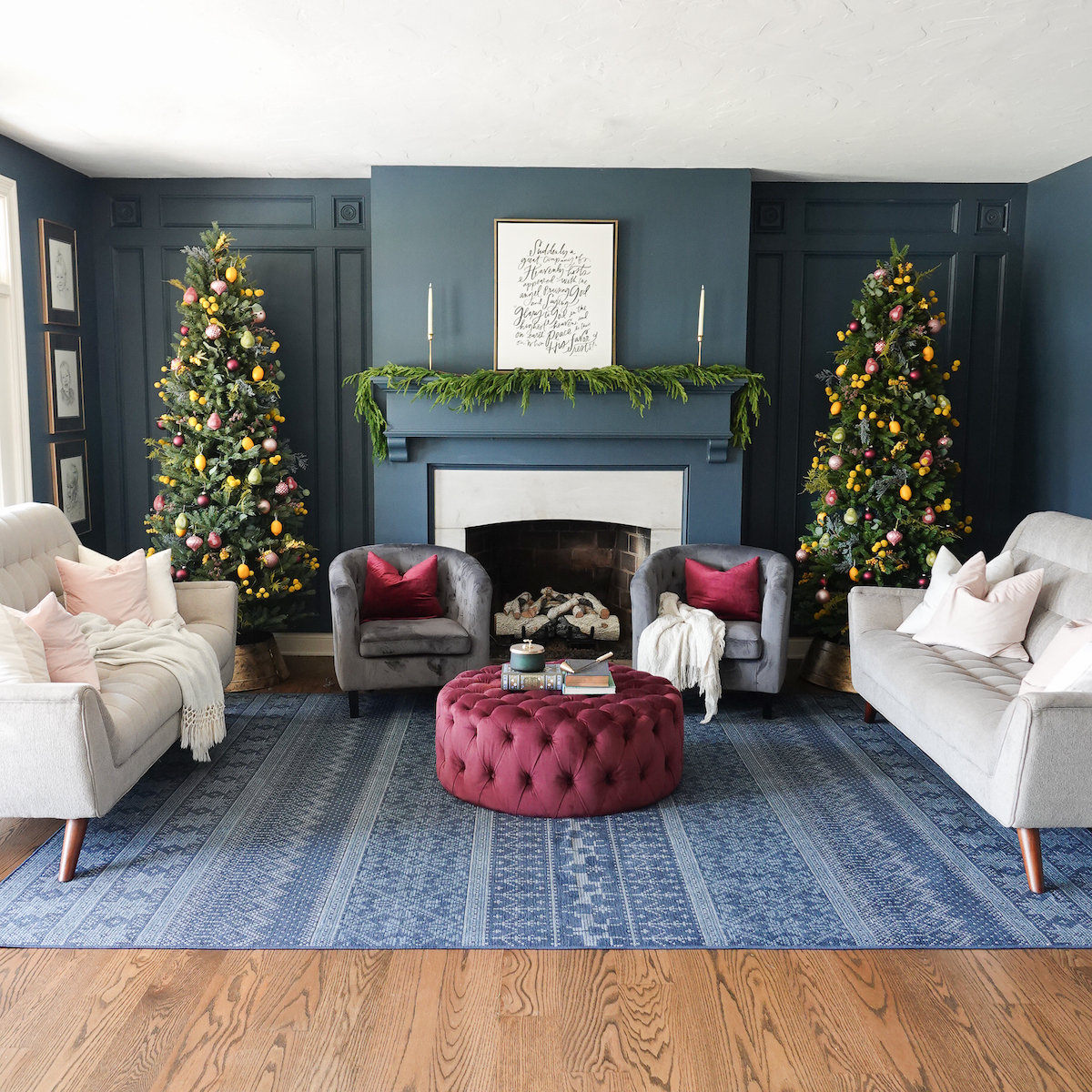
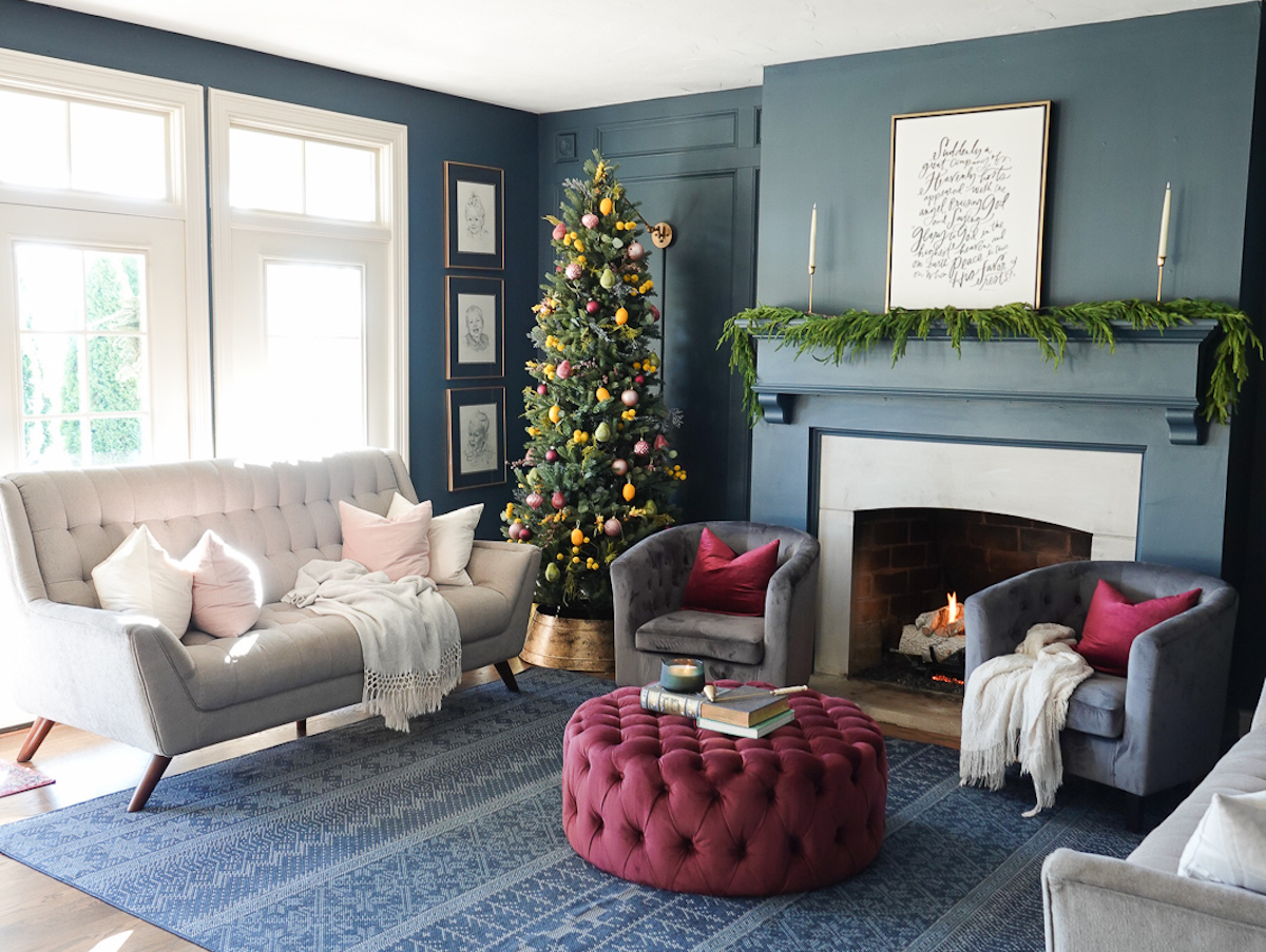
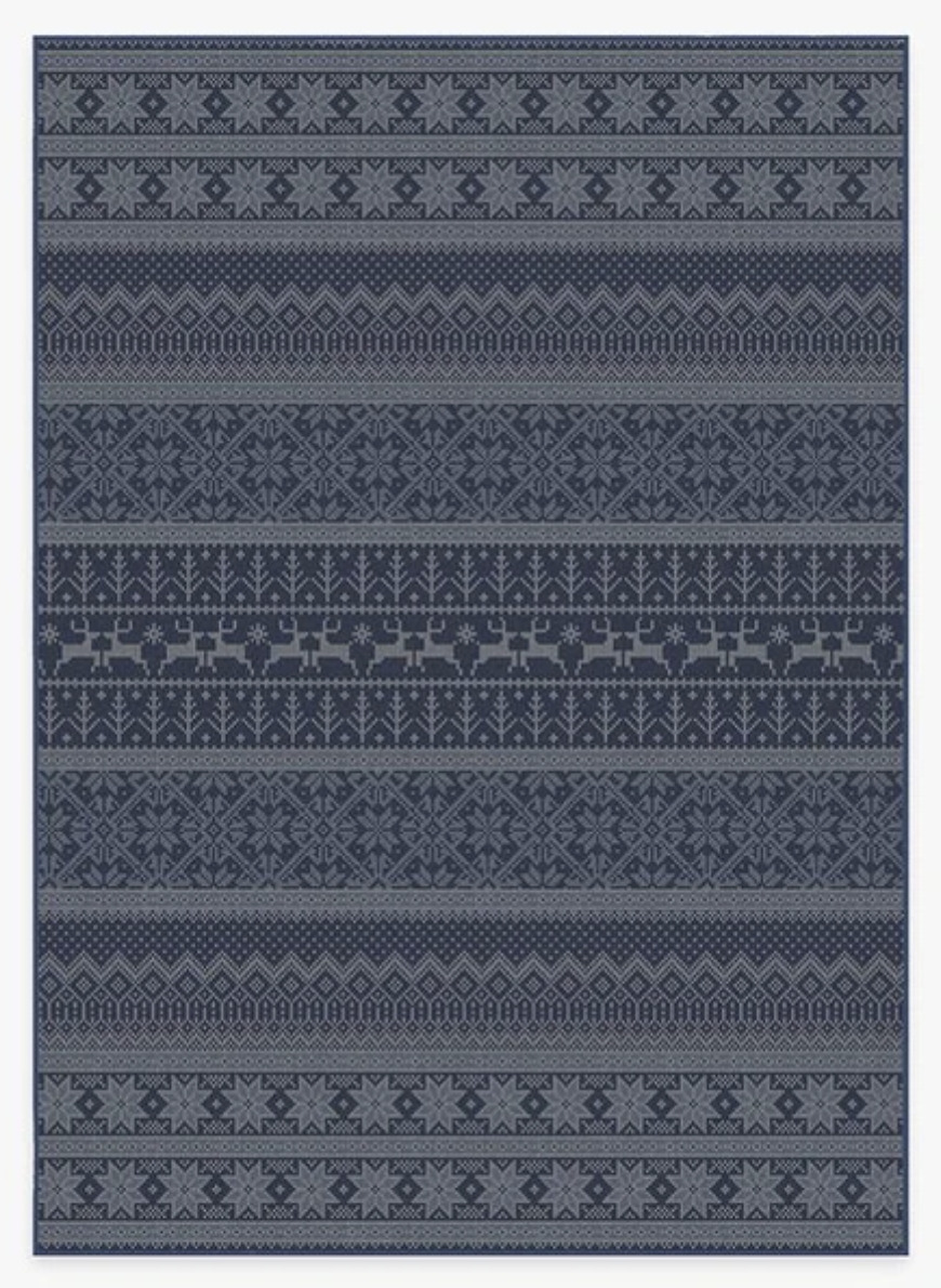
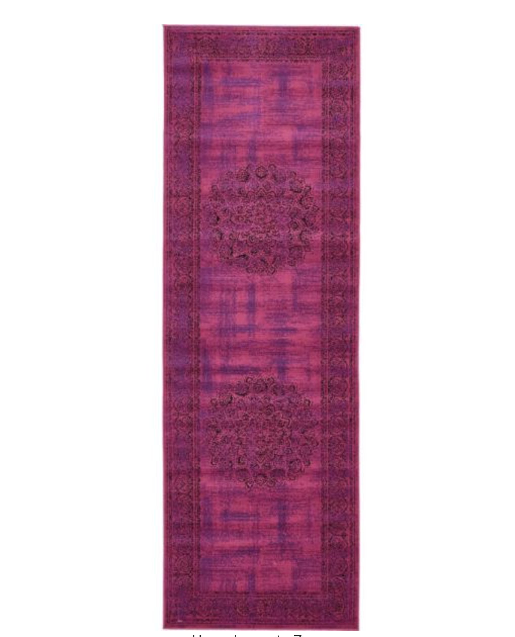
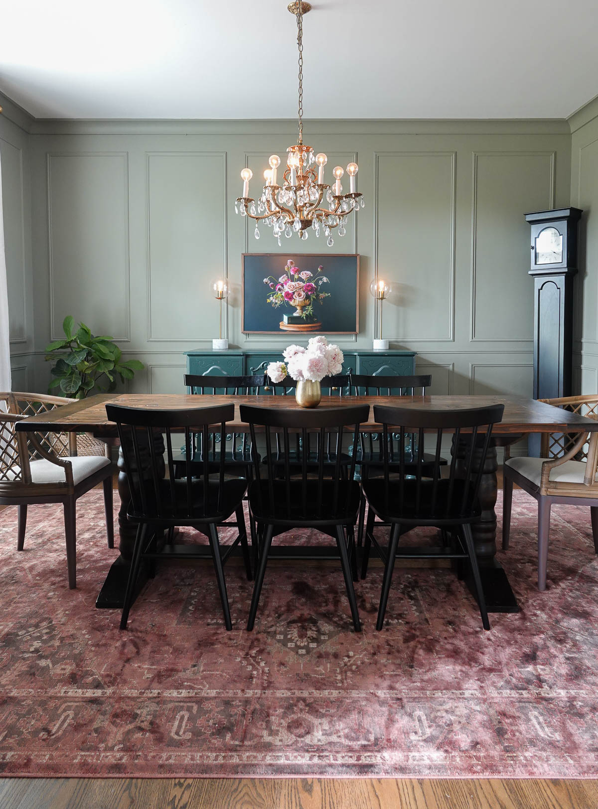
I decided to keep our Christmas decor simple this year and I added holiday artwork, faux greenery to the mantel, two trees, and a sweater-inspired rug.
If you want to learn more about my colorful Christmas trees you can go here. They’re not the traditional Christmas colors, but I love the lemons and the sophisticated fun they bring to the room.
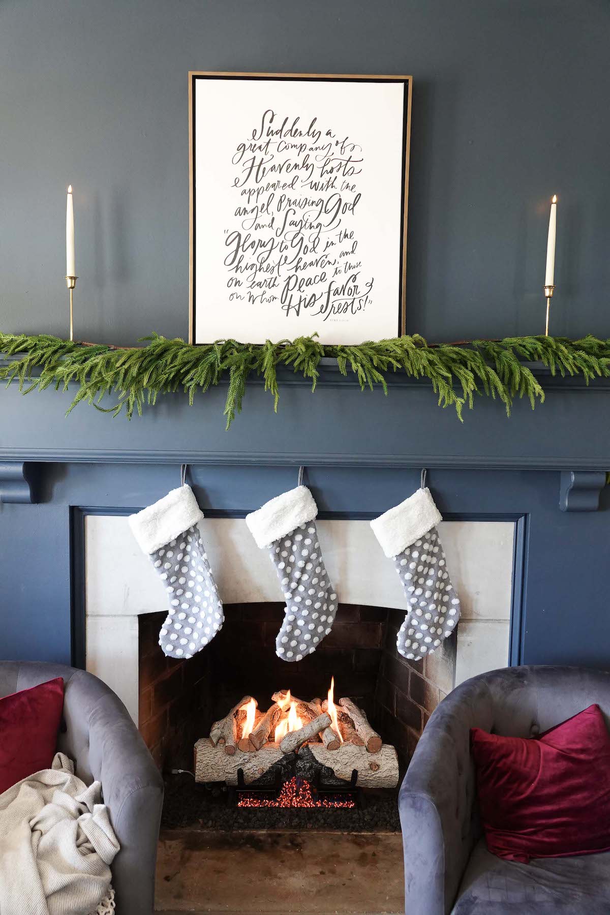
Closer to Christmas, I will add these cute polka dot stockings. I found them at Hobby Lobby a few years ago.
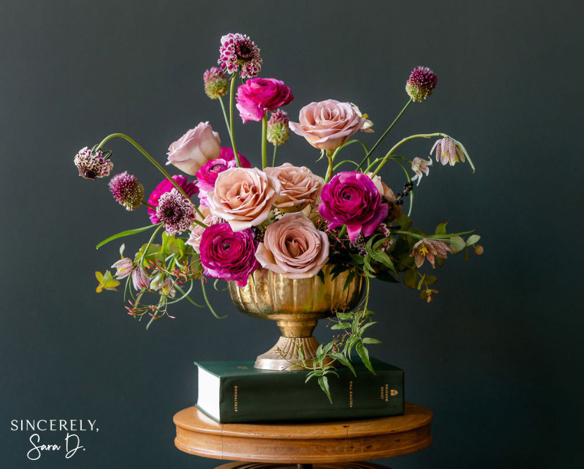
You can find this gorgeous hand-lettered art here, and it comes in a large variety of sizes, colors, and framing options. Use code SINCERELY for 15% off!
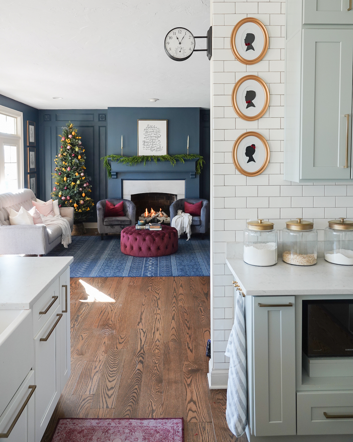
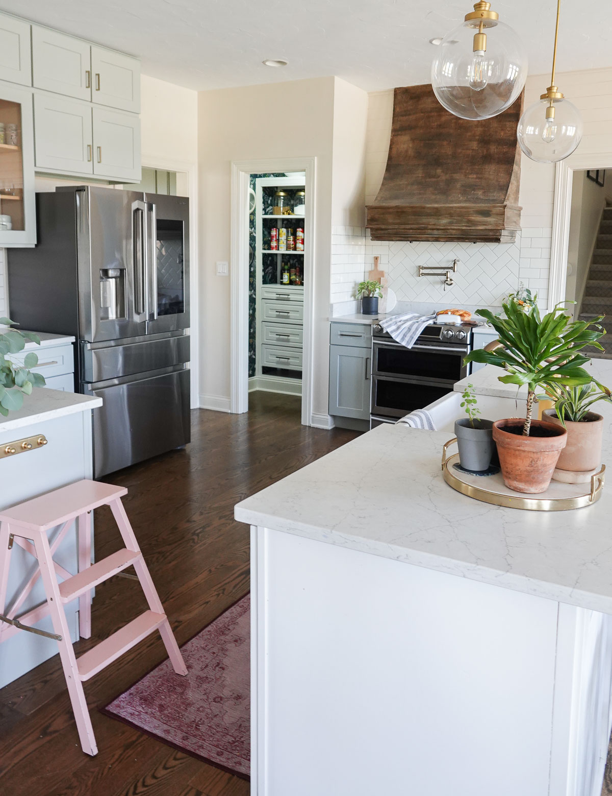
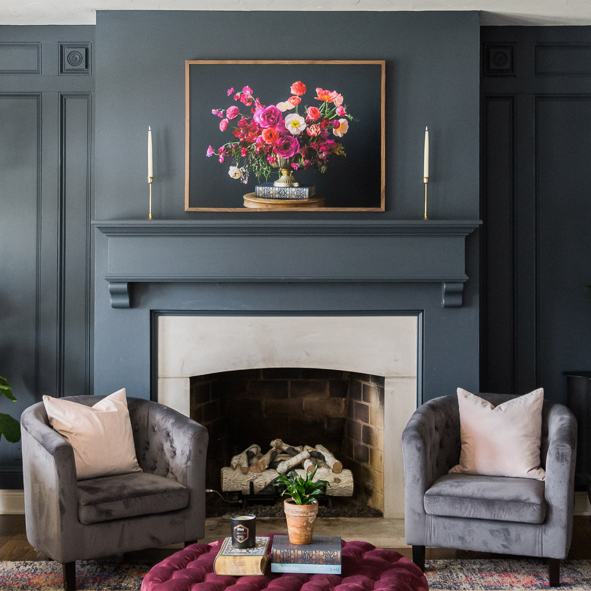
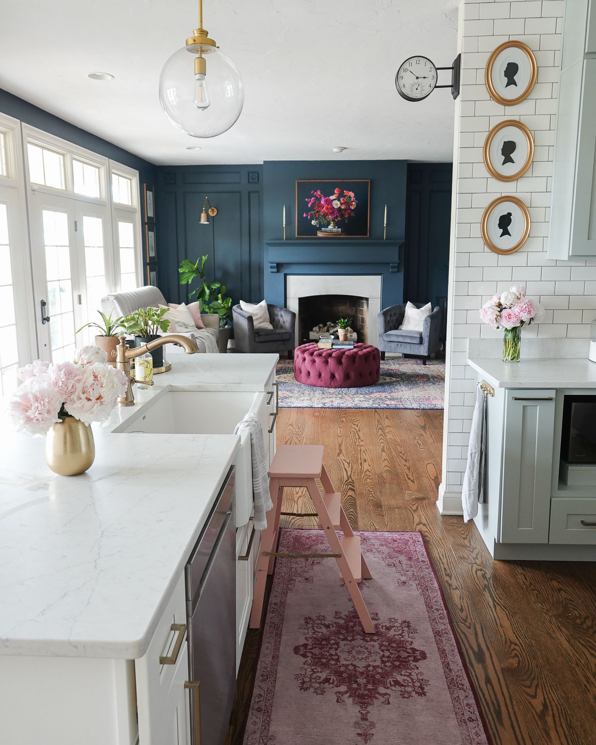
I love the contrast between our light kitchen and the moodiness of the living room.
I’ve decided less is more this holiday season and am keeping our home festive but simple.
Merry Christmas from my family and don’t forget to visit This is Our Bliss.
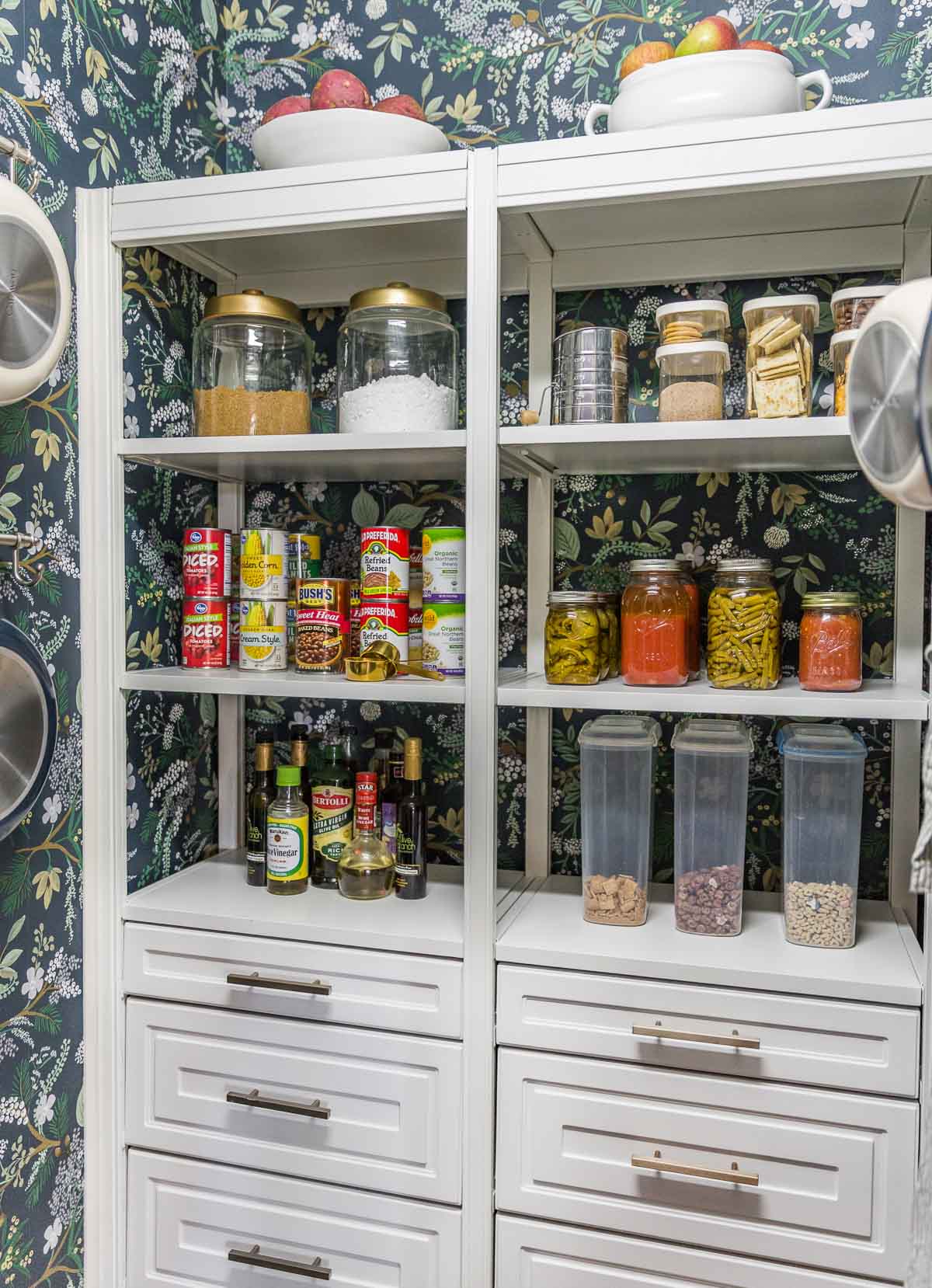
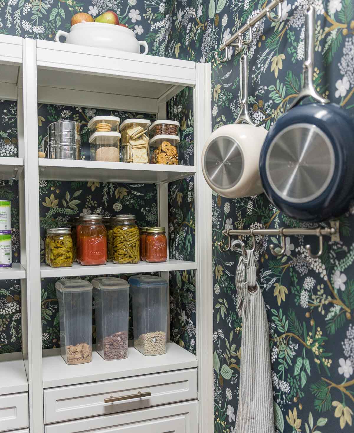
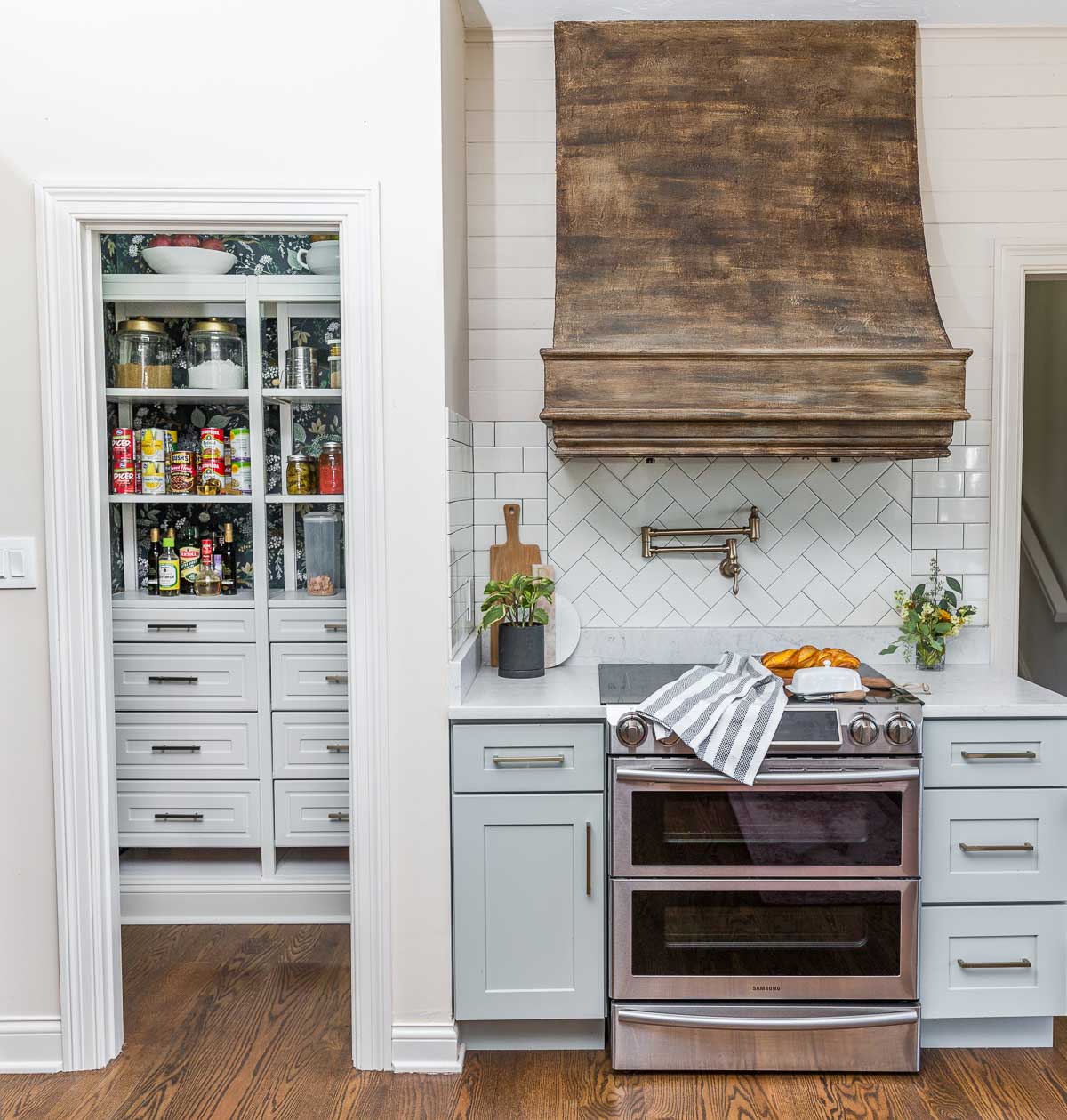
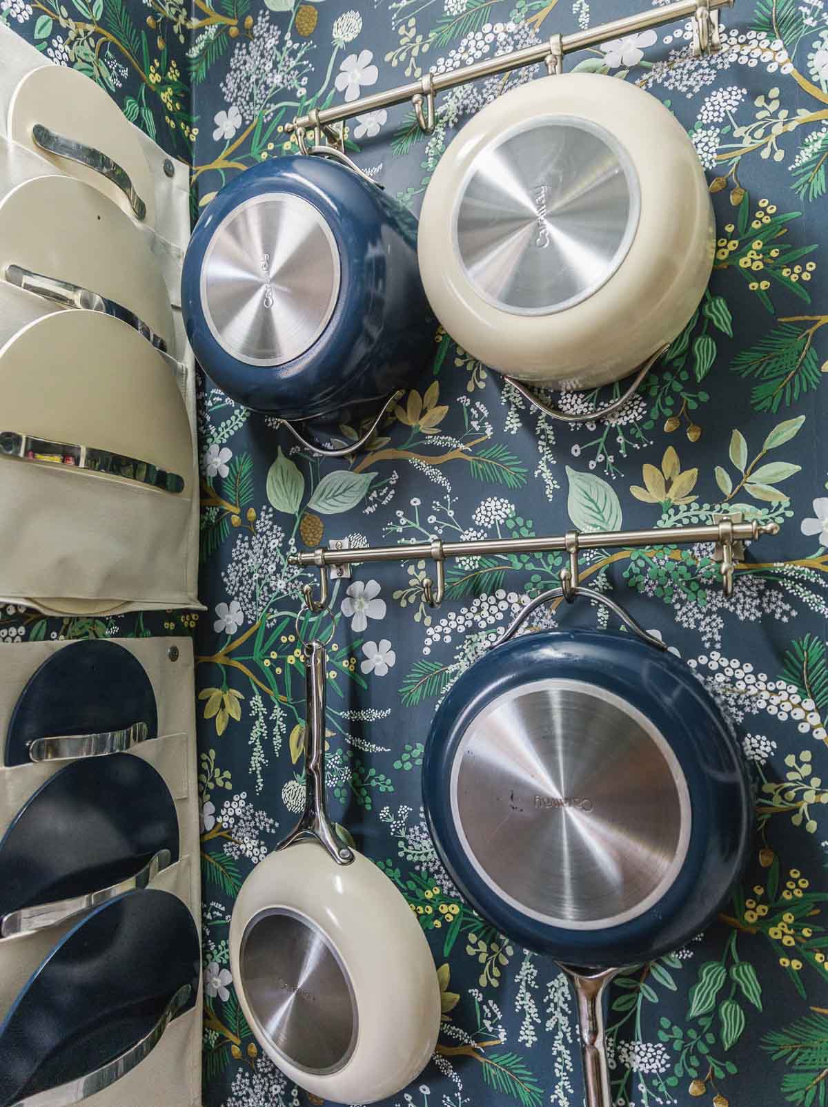
I have been a fan of Liberty Hardware for years and love their gorgeous hardware. They recently released Closets By Liberty – storage systems that magically organize any closet or pantry. Today I’m sharing my DIY Pantry Makeover, and it’s a good one!
This is a sponsored post written by me on behalf of Liberty Hardware. All opinions are 100% mine. Thank you for supporting the brands that allow me to create unique content while featuring products I love!
Closets by Liberty has 6-foot, 8-foot, and 10-foot storage systems, and they also have a special 4-foot system designed specifically for linen closets and pantries. I used the smaller 4-foot system for our own pantry closet, and it’s perfect for small pantry makeovers.
DESIGN
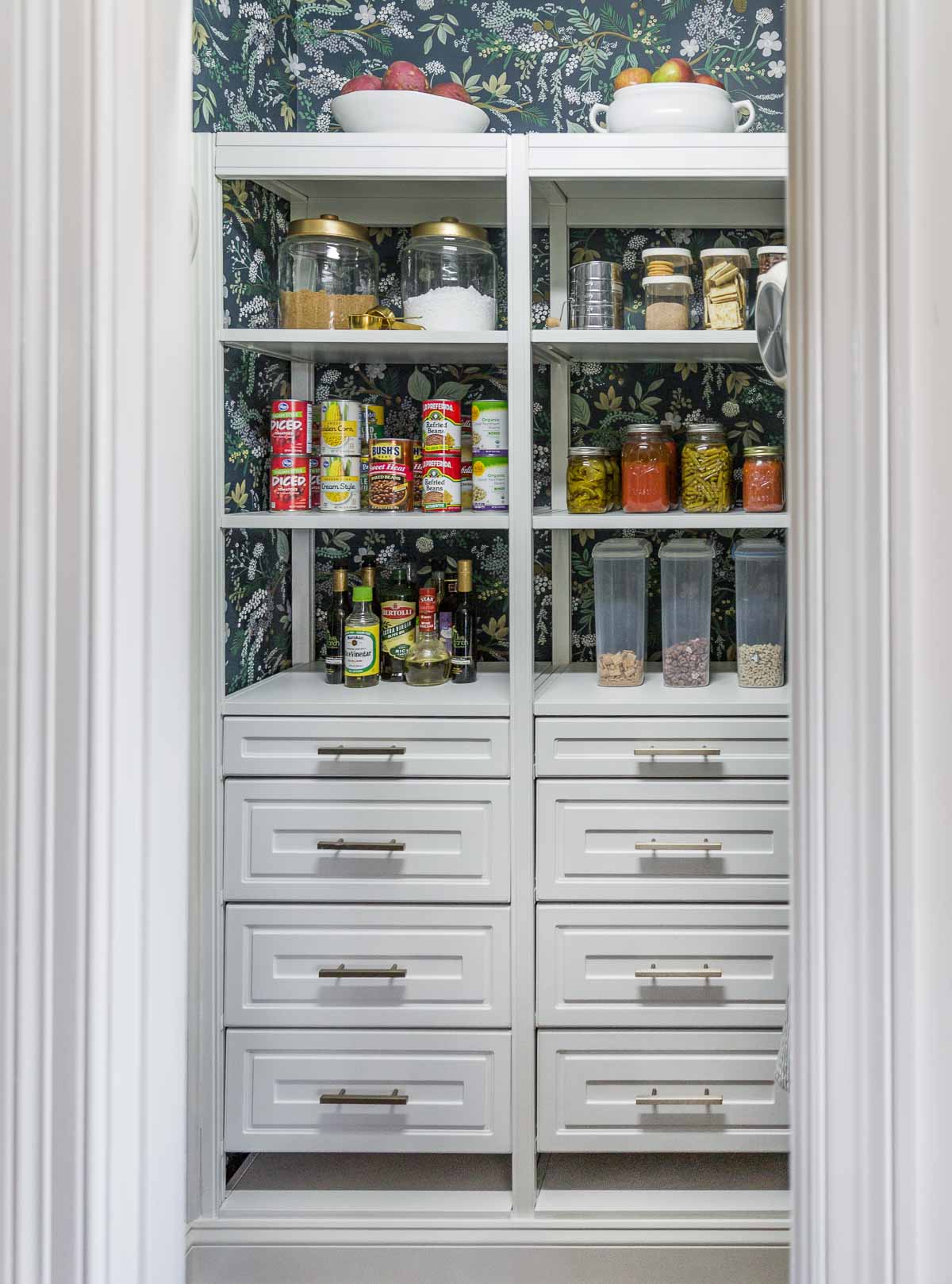
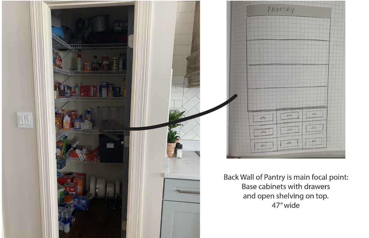
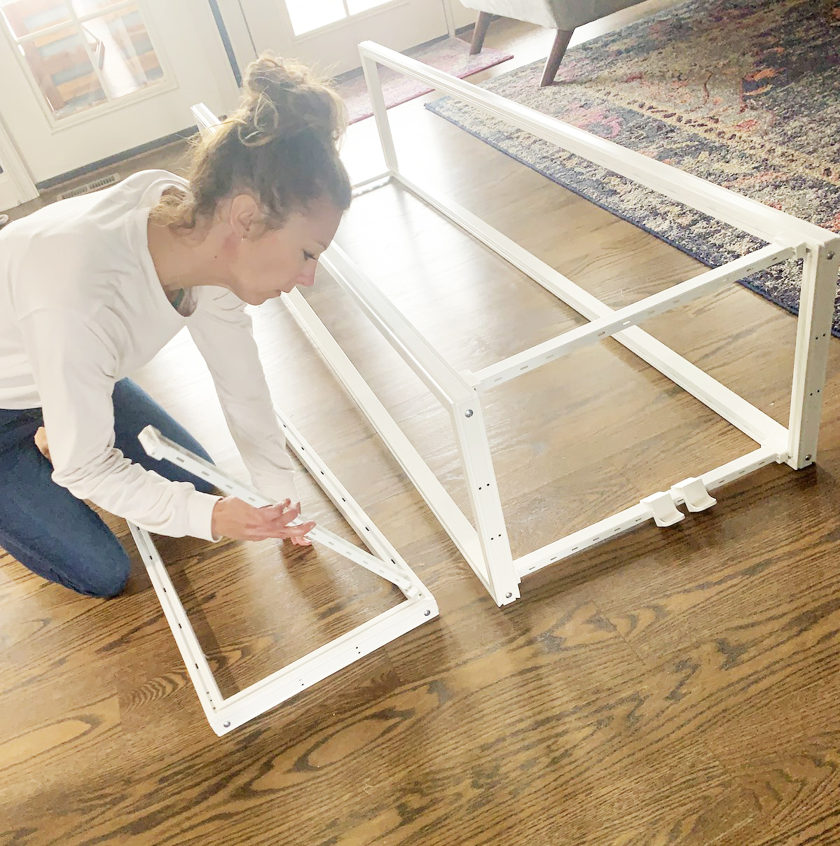
I began with the 4-Foot Linen and Pantry customizable closet organization system in class white. It’s 24″ and comes with 10 shelves. I had a dream for our pantry and sketched this mini butler pantry idea several years ago. Thanks to the pantry system, I was able to make my dream a reality and design a mini butler’s pantry (and say goodbye to the wire shelves).
BUILD
Each system comes with a tower that is VERY easy to assemble. It was so easy that I assembled it solo. You can customize the tower with rods, shelving, and drawers.
The tower system is sent in boxes that are labeled for easy assembly.
This is a DIY I recommend for anyone because the installation was very simple and the instructions are easy to understand.
The tower system can easily be changed to adjust to your needs, and it provides a high-end look without the designer’s price.
I built the entire system on my own. The hardest part of the entire project was removing our baseboards. Apparently, the builder installed the baseboard BEFORE the flooring which meant it was almost impossible to remove them.
Luckily Steve managed to figure out how to remove them, and I had my dad help me cut and install the new baseboards. We also added baseboards around the front of the system to make it look even more built-in (along with some cove running up either side of the system).
ENJOY
The end result is a gorgeous and functioning way to organize your pantry (or closet). The pantry shelves support up to 400 pounds which is a good thing considering I have two teenage sons. We require a lot of pantry items in this home!
I removed the pantry door to allow us to better utilize the space. Before, the door swung in and one entire wall was wasted. Thanks to such a pretty system that hides clutter, I had no problem removing the door because it deserves to be seen, and I love the open pantry and all the extra space!
I also added removable wallpaper to the walls around the storage system, and our pantry makeover project couldn’t look cuter.
Where would you use Closets By Liberty in your home? Check out their website for lots of storage ideas, inspiration, and where to purchase their systems!
I hope I helped inspire you with some pantry organization ideas.
Go create something!
Are you new to my blog? Go HERE to see my home tour and HERE to shop for items I use in our home.
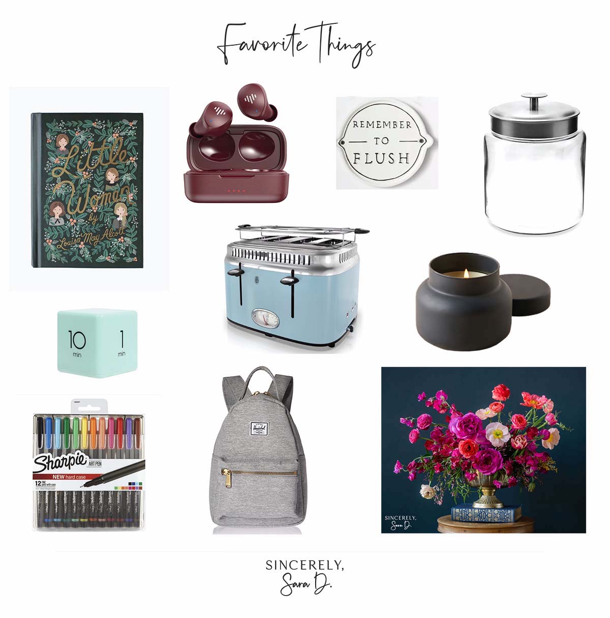
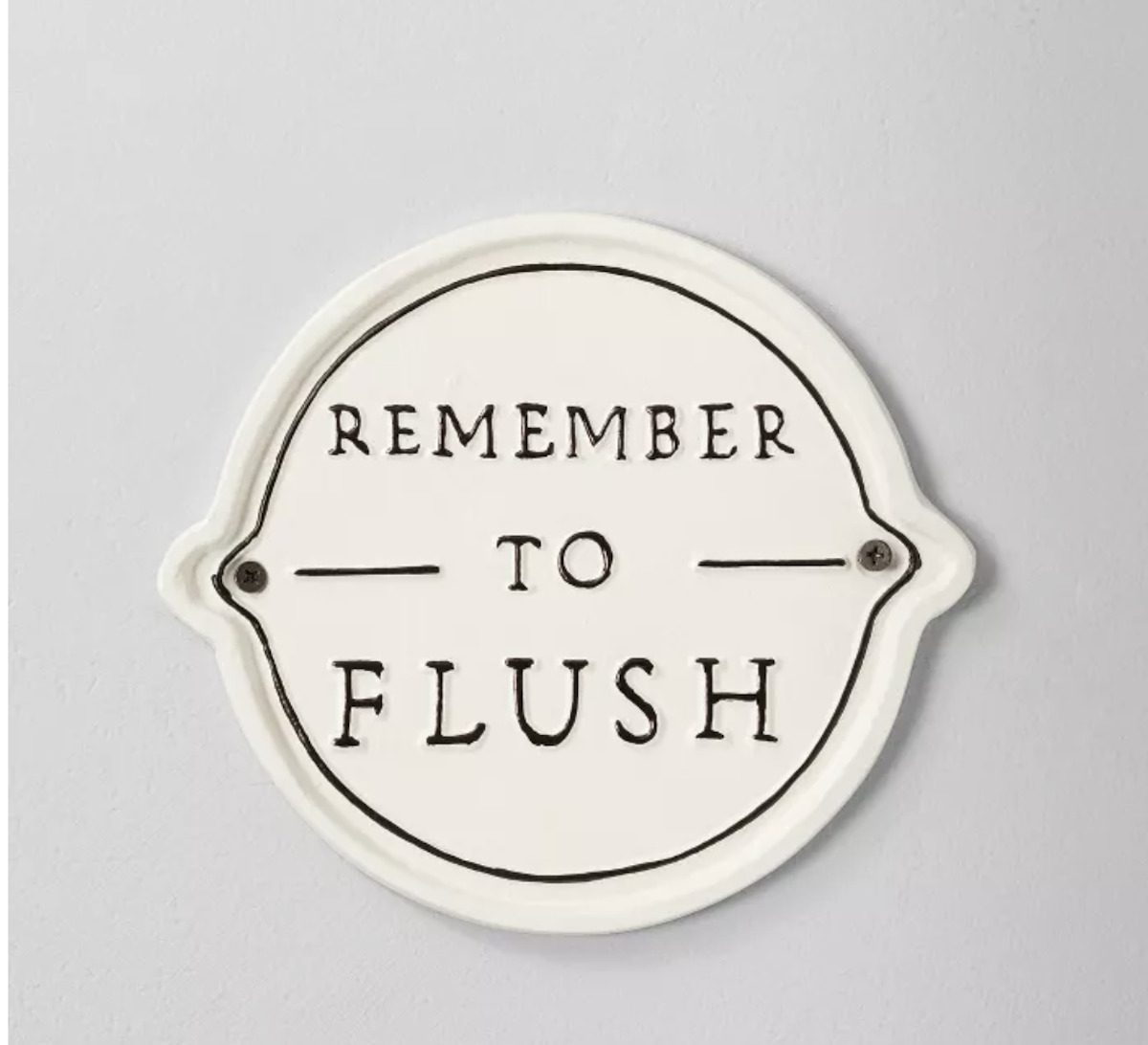
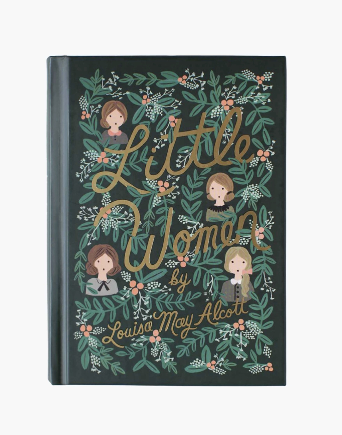
I’ve partnered with a large group of blog friends, and we’re all sharing products we love. I rounded up some of my favorite things, and today I’m sharing Christmas gift ideas for her.
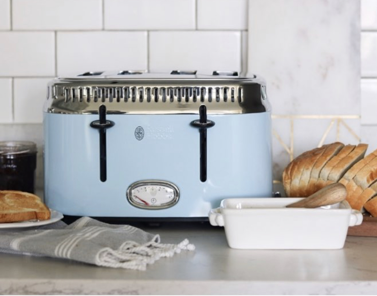
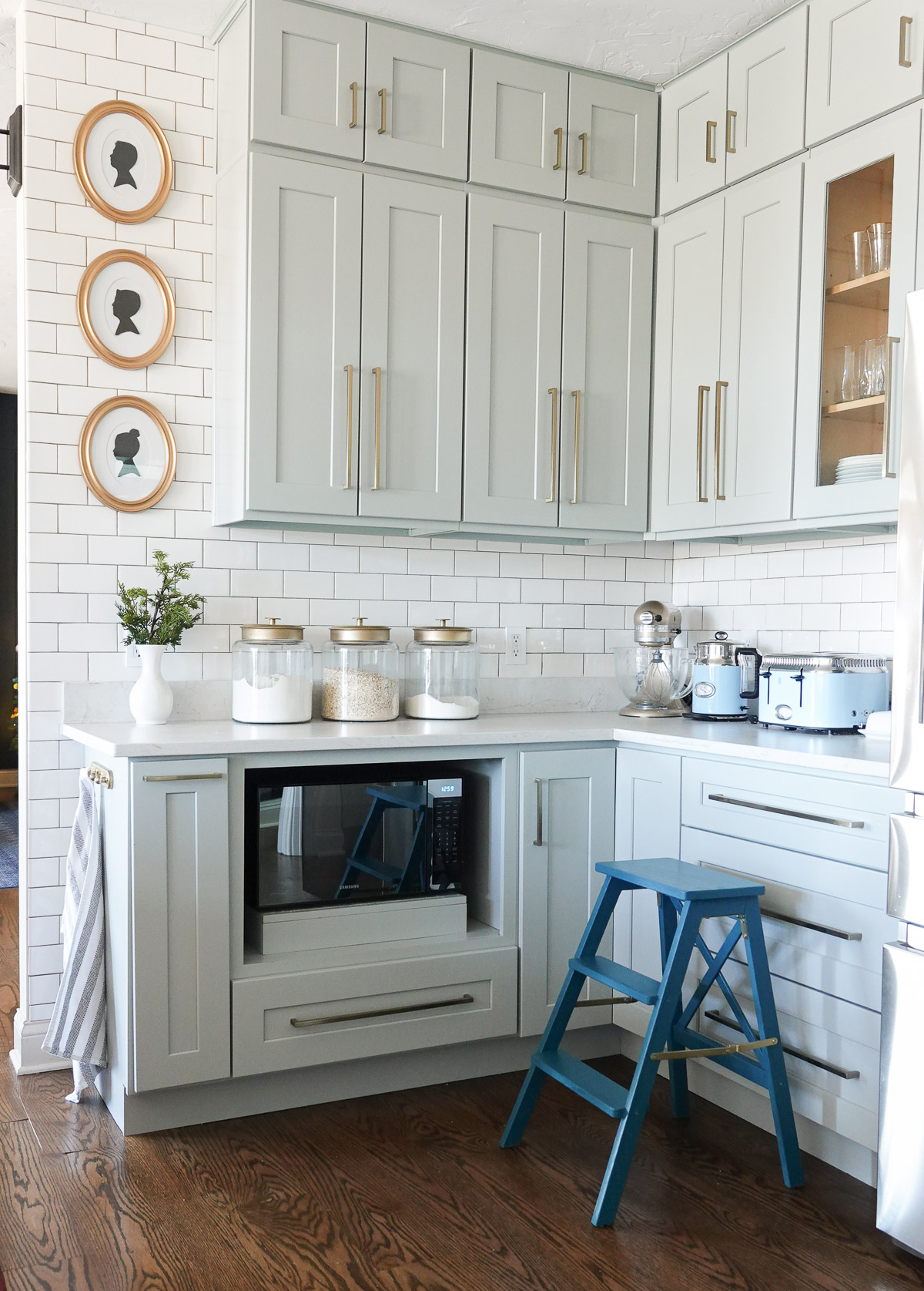
We’ve had this retro toaster for over three years, and it not only works great, but it’s beautiful! This toaster comes in a variety of colors, and it’s so pretty you’ll want to leave it out on the counter.
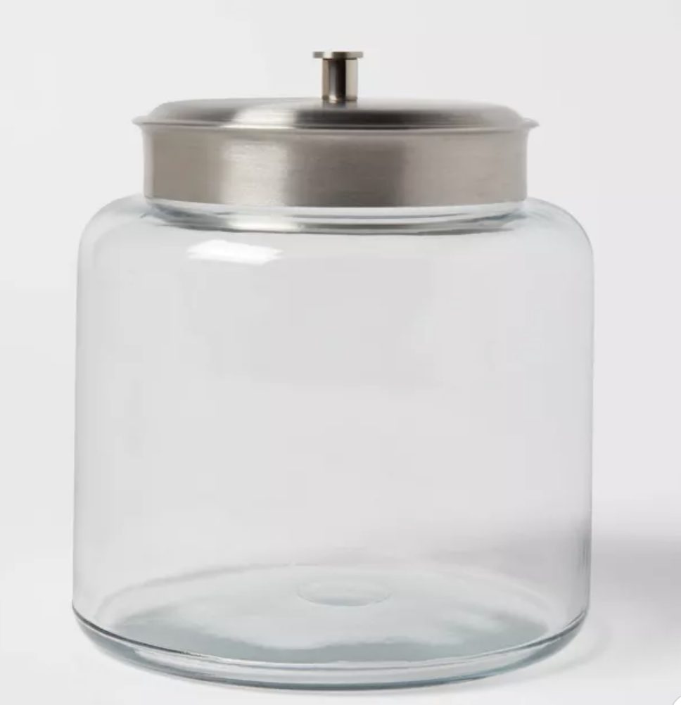
Fill a glass canister with cookies or candy canes for the perfect hostess gift that will be used year-round. I used glass canisters to store oatmeal, sugar, and flour. I sprayed the lid with a metallic gold to glam it up.
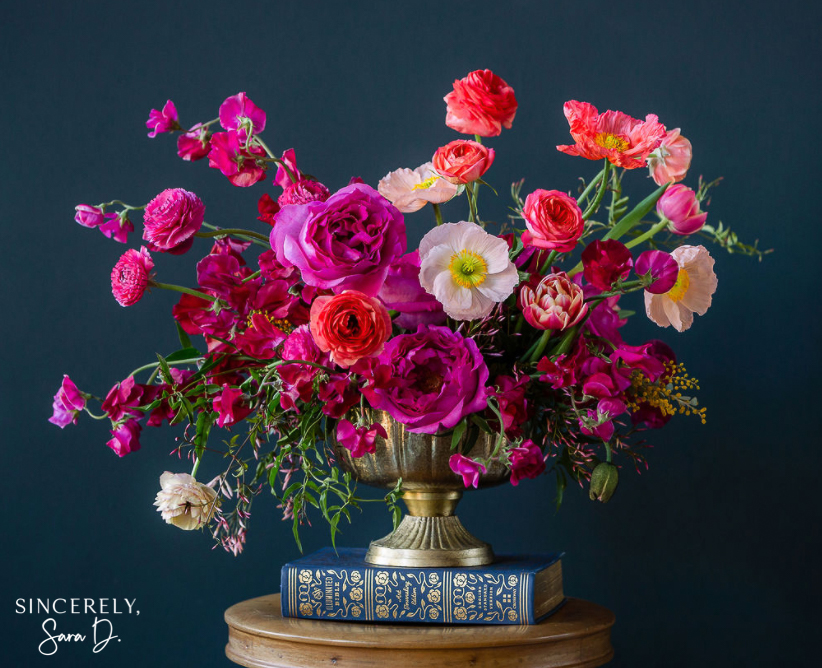
Give her the gift of flowers that last forever. This floral art is my favorite piece from a collection I created with a local florist and photographer. We have several different options, and you’re sure to find something she’ll love!
Trust me, this candle is extra special with the most amazing scent you’ll ever smell! Not only is it beautiful, but it is the best smelling candle she’ll ever own. I have this candle on my wish list every year.
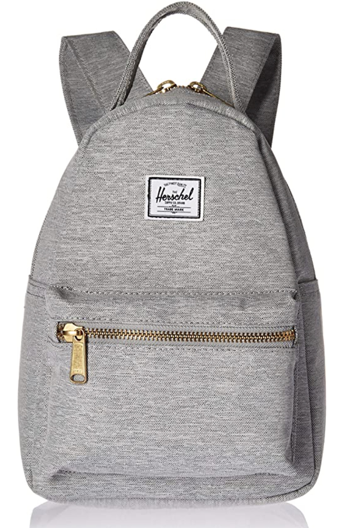
Anyone who is on the go will love this mini backpack. I used it during our sports seasons as a purse. It’s small enough that it doesn’t take much space but large enough that I can put a few water bottles in it. It also comes in a huge variety of colors and sizes.
This cube timer is perfect for helping my daughter stay on task in the mornings. You can set it on various times, and it will motivate you to get whatever it is you need to get done, done!
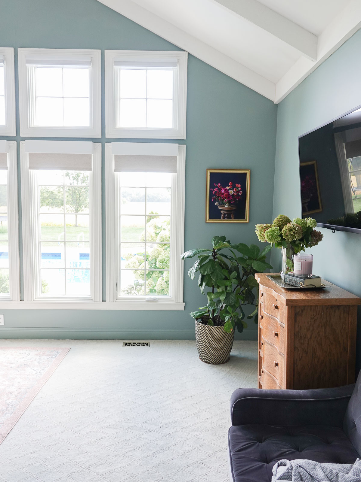
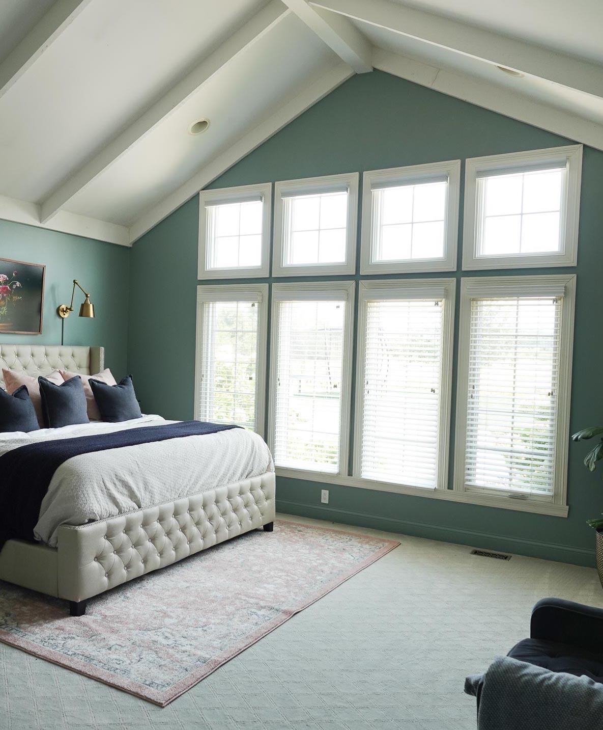
If you haven’t considered decorating with teal, you should! Although teal was a fad color during the 1990s, it is making a big comeback.
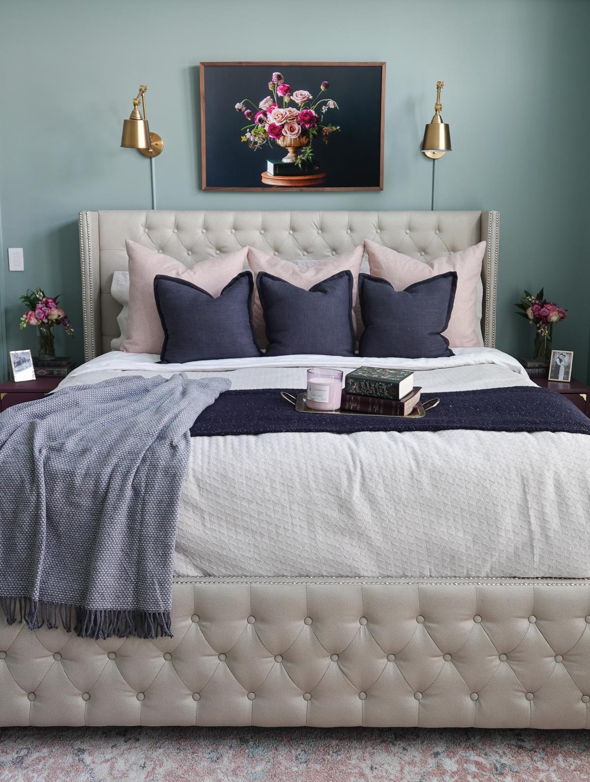
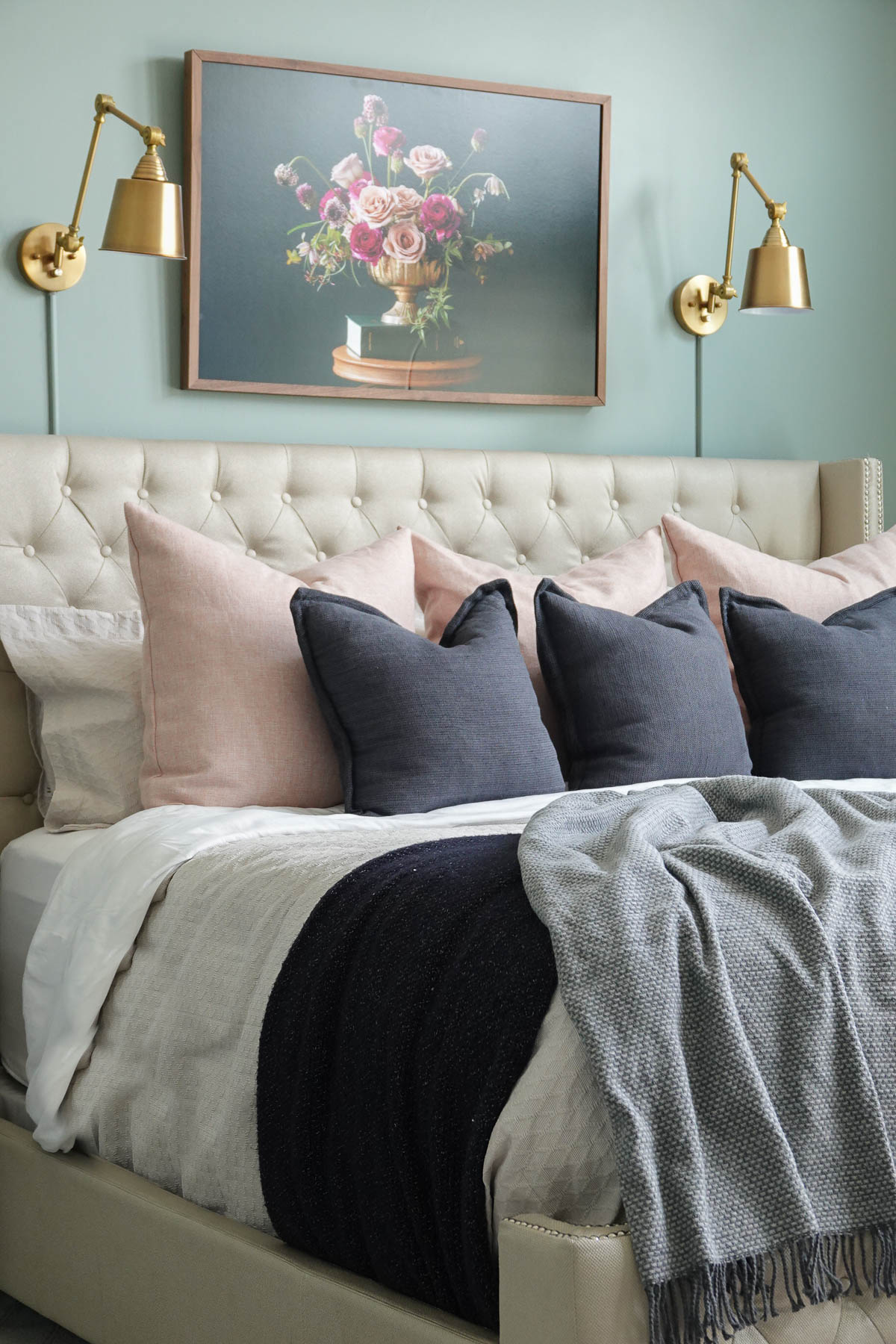
Our teal bedroom wall color changes from blue to green depending on lighting/time of day.
The color teal is a blue-green shade reminiscent of lush greenery or the ocean, It is a more muted, richer alternative to turquoise, and teal brings a calming look to any space.
Teal is one of those shades of blue that can feel daring and a little unexpected. A blend of green and blue, teal is a bold color that feels like a punchier, sassier version of blue.
This pretty color gets its name from a bird that has the shade around its eyes. A teal is a freshwater duck commonly found in parts of Eurasia, and it’s a fairly newer color that didn’t have a name until the early 20th century.
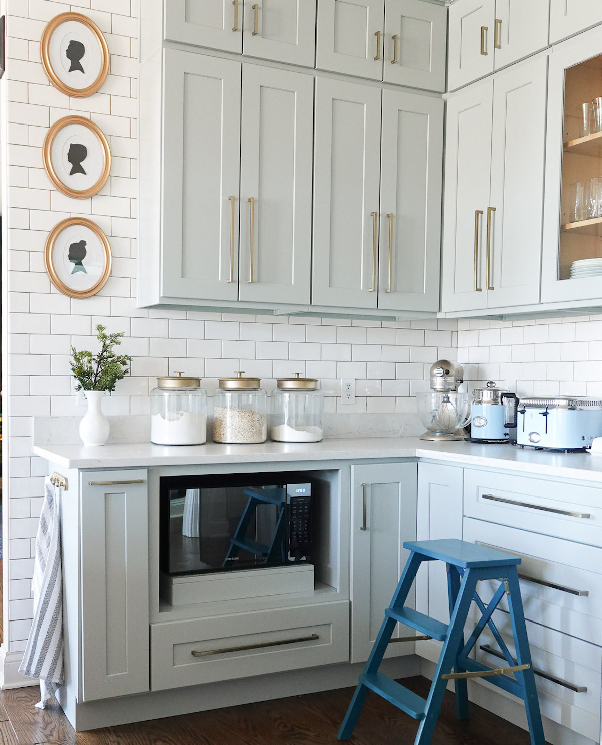
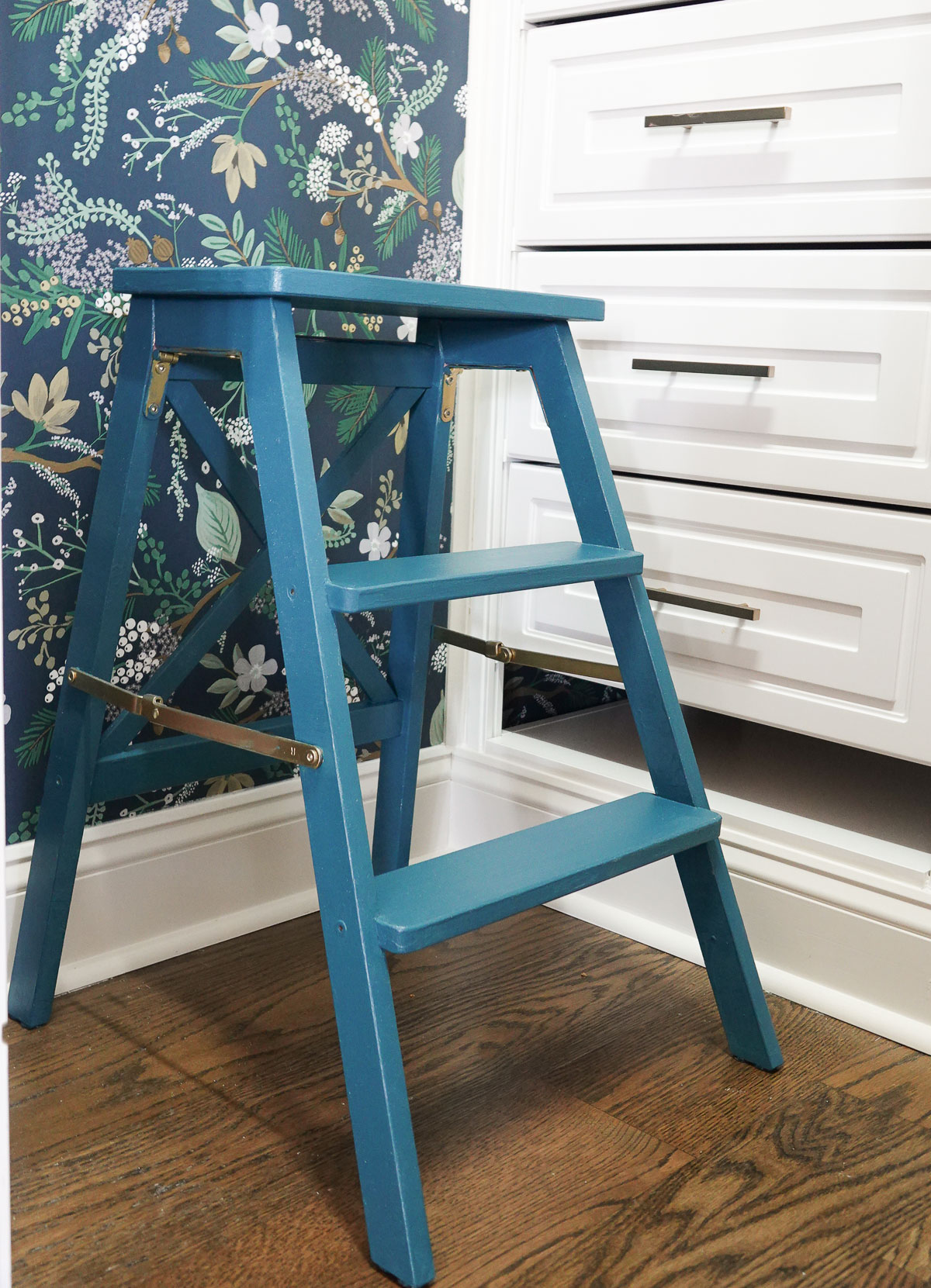
I painted my kitchen step ladder, and the color makes a huge impact in my kitchen.
The step ladder now looks like it was made for my pantry.
Let’s go back to talking about decorating with teal, and discuss why it’s such a great color to use in your home.
When it comes to teal, we are evenly divided along pretty deep lines. One half the world sees teal as blue-green and the other insists it’s green-blue. And the great thing is that both sides are right because color is always subjective – what you see is what you get!
The bedroom walls are a medium teal color.
COLOR THEORY
The soothing blue-green shade of teal evokes tropical lagoons and dense jungles. From oceans to peacock feathers, teal is a common sight in the natural world.
Polls show that blue and green are Americans’ favorite colors, and teal is the happy medium. Teal combines the stable tranquility of a royal blue with the optimism and nature that are inherent in green.
Teal blends blue’s tranquil stability with green’s optimism and healing properties. Teal is the color of restfulness and mental and spiritual balance. The color’s understated elegance encourages a calm, reflective mood.
With its lower saturation, teal is a much calmer shade than turquoise, whose brightness gives it a certain energy.
The color teal can be made by mixing blue and green into a white base. To deepen the hue, it can also be mixed with a black or grey base.
SHADES AND TINTS OF TEAL
There are two variations of teal – teal blue and teal green.
This bluish-green color comes in dark shades, light shades, and everything in between.
COLORS THAT GO WITH TEAL
When in doubt, consider colors with similar undertones to your favorite shade of teal. Richer, deeper shades of teal pair perfectly with bold greens while bright, medium shades of teal are great with blues or cool neutrals.
Teal + Green – Since teal has green undertones, paring green with teal can create a monochramtic and tasteful space.
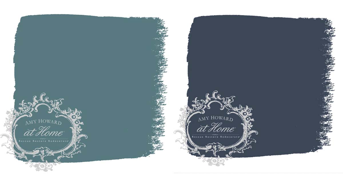
Teal + Navy – Navy brings sophistication to any space but teal keeps it from being too dark and/or traditional.
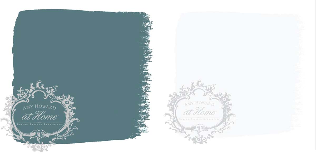
Teal + White – Pairing white with a white is safe and a sure bet. A lighter shade of teal may seem too childlike to bring into your room, but the truth is that when paired with more sophisticated hues like gold and white, it becomes incredibly chic.
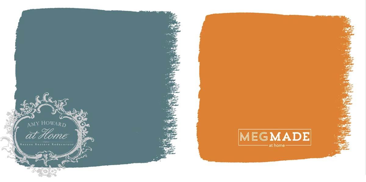
Teal + Orange – These colors are opposites on the color wheel which means they know how to play well together. Teal and orange are cheerful colors, and the result is a happy space.
One Step Paint Color Palettes:
Hopefully, these palettes are the inspiration you need to go paint some furniture pieces!
Try adding pops of teal to a neutral room. Paint a piece of furniture using Thanks a Latte, paint your walls teal, or add teal curtains (or other teal accessories).
Are you new to my blog? Go HERE to see my home tour and HERE to shop for items I use in our home.
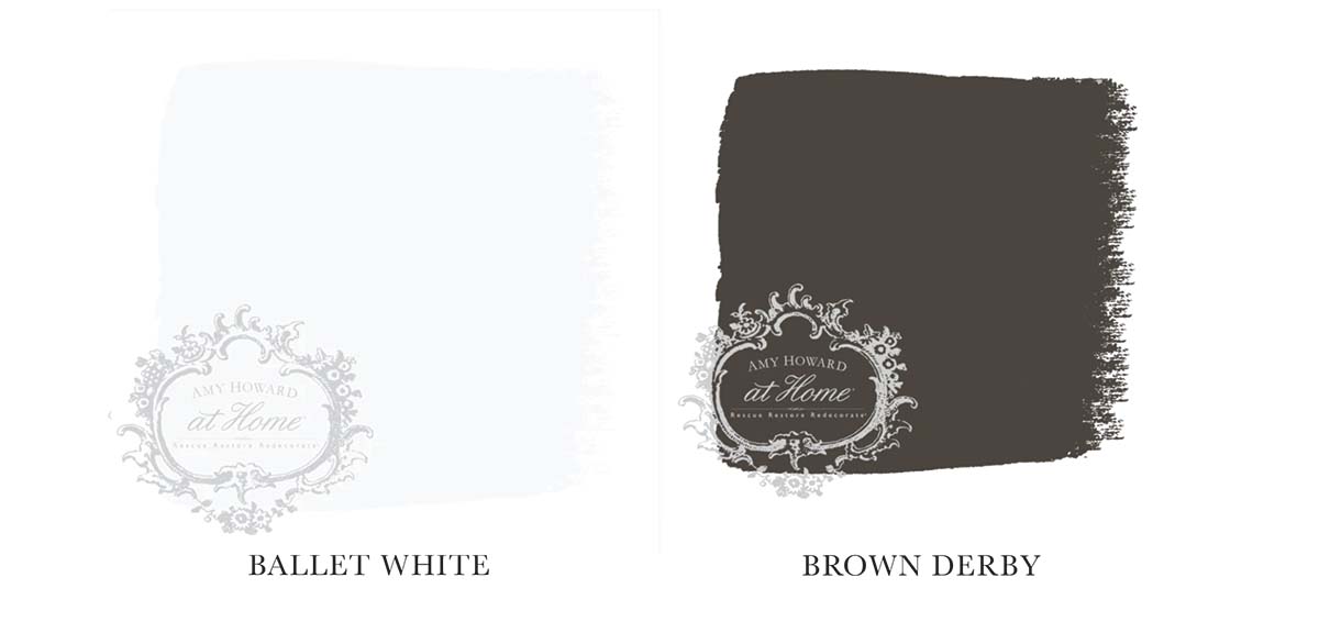
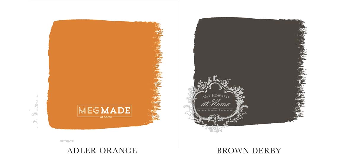
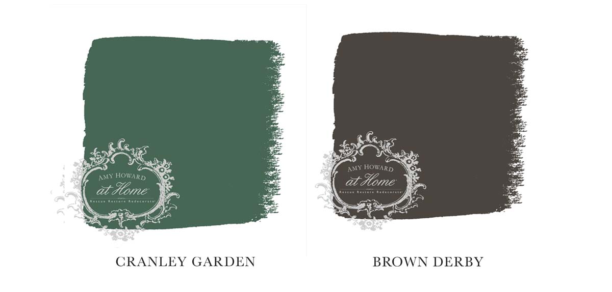
Today we’re talking about decorating with brown. Now before you decided to leave, brown is a hardworking neutral that works with just about every color. When used in the right environment, it can create a warm, stable feeling in any room.
An excess of brown can create a dark, heavy feel in your space which is why it’s important to integrate shades of brown into a color palette with colors and shades that complement it. It’s all about knowing the colors that go with brown, and the best ways to incorporate them.
The Color Theory Behind Brown
Despite all of these meanings and uses, you won’t find brown on the color wheel or in the rainbow. It’s a composite color made by combining usually 3 other colors (black, red, and yellow for example, or red, yellow, and blue in certain ratios). Together with low brightness or low saturation, we get brown, instead of a clear shade of another color. Its composite nature makes it a natural background color, and you can find a shade of brown to complement any other color well.
Brown is the color of earth, wood, stone, wholesomeness, reliability, elegance, security, healing, home, grounding, foundations, stability, warmth, and honesty, is a natural, neutral color that is typically associated with the seasons of fall and winter. It is a warm color that stimulates the appetite. While it is sometimes considered dull, it also represents steadfastness, simplicity, friendliness, dependability, and health.
Brown is believed to help create a wholesome feeling, a connection with the earth, and a sense of orderliness and convention. Brown is a stable and grounded color that is known to make people feel safe and comfortable.
Brown & White
White goes with just about every color, and brown is no exception to that rule. Pairing any shade of brown with a white will give you a classic and clean contrast that works well in a room like a formal dining room or living room. If white and brown are your two main colors in any room, make sure you vary the shades to keep it interesting and from being too monochromatic.
Brown & Orange
Since brown and orange are such similar colors you might shy away from pairing them together – but don’t! When placed in a primarily brown space, orange accents will serve as the perfect energizer for the room. A pop of orange in a brown room is very sophisticated and glamorous, especially against darker woods. For a more warm, sophisticated color scheme, you can try pairing a dark chocolate background with orange and cream accents.
Brown & Green
Brown is a color perceived as natural and neutral so pairing it with green plays just makes sense. Lighter shades of green like mint soften the darker furniture in a room. Using darker shades of green paired with dark brown accents or wooden furniture creates a darker, moody vibe that would work for a den or office space. There are few combinations of green and brown that wouldn’t compliment each other thanks to the two colors being natural in nature.
Brown & Yellow
Consider pairing yellow with brown. Pairing brown with yellow creates a contemporary vibe in a bedroom or sitting room. Using the 60-30-10 rule would work well when pairing yellow and brown. 60% of the room should be a neutral shade such as white, with 30% of the room decorated in various shades of brown, while 10% is reserved for yellow accents.
Brown & Purple
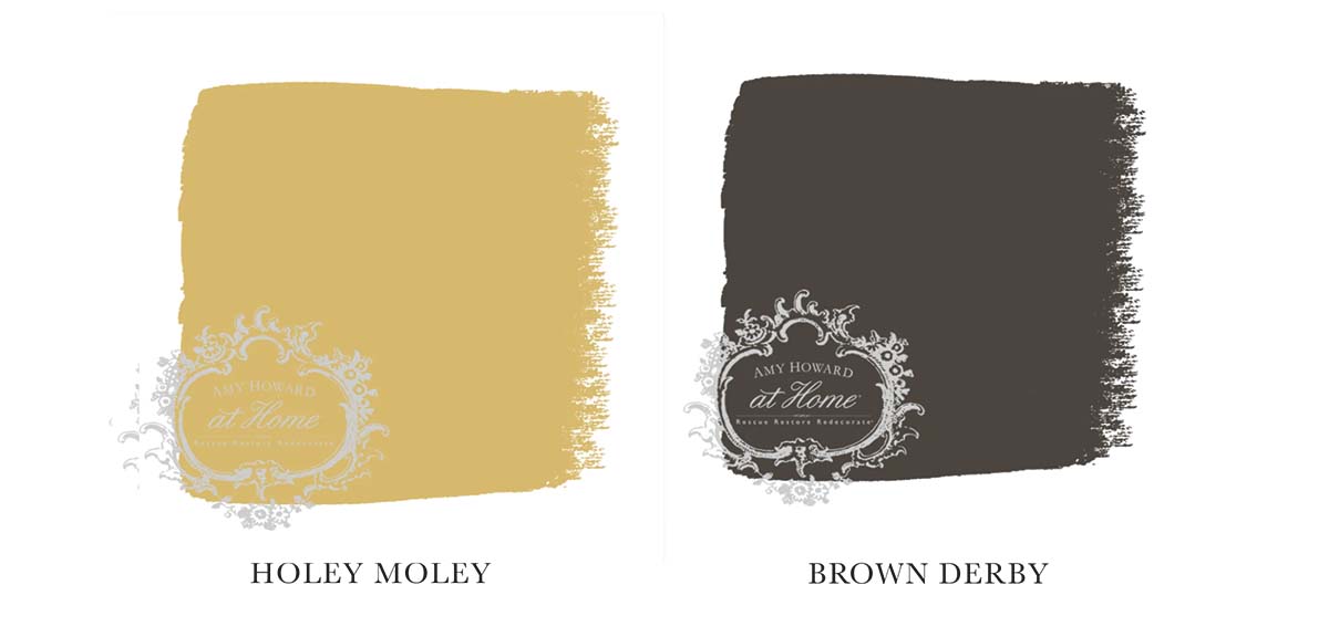
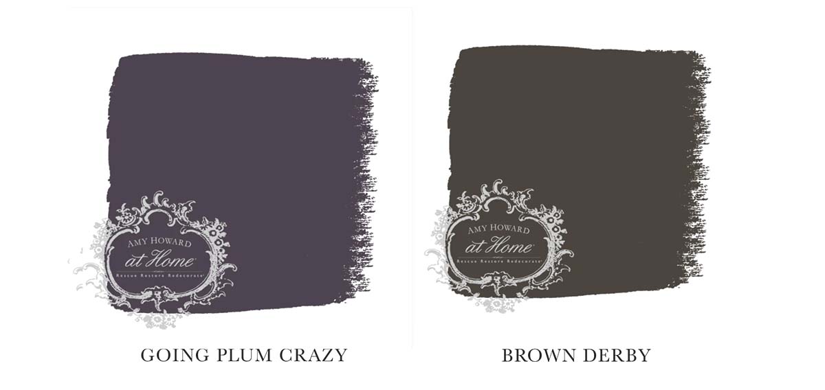
A more unexpected pairing is brown and purple. Deeper shades of purples and browns can make larger spaces feel warm and rich. When pairing purple and brown, always focus on the opposites. Darker woods like walnut pair well with pastel purples, and lighter brown woods pair well with deep shades of purple like plum or bright shades like amethyst. Brown and purple work very well in a room with gold accents and the colors can create a cozy, moody, and luxurious space.
Brown & Blue
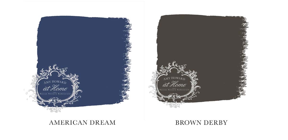
You won’t find brown on the traditional color wheel, but since its closest shade is orange, blues is an obvious complementary color for brown. Combining blue and brown tones can make a relaxing environment. Brown paired with dark navy blue makes a room feel refined with the dark colors, whereas pale blue paired with beige or a lighter wood creates a more serene environment. The cool tones in shades of blue mix well with the warm browns of darker wooden furniture without leaving the room feeling too dark or heavy.
Brown & Pink
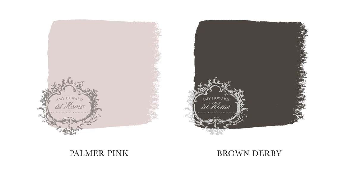
Brown and pink may be an unlikely pair, but they work really well together. Pairing brown with shades like rose or fuchsia creates a feminine space without overdoing it. If you’re going ahead with a pink room, the natural order would be to start with a brown base and brown or wooden furniture, using shades of pink as your accents in things like pillows, curtains, or artwork.
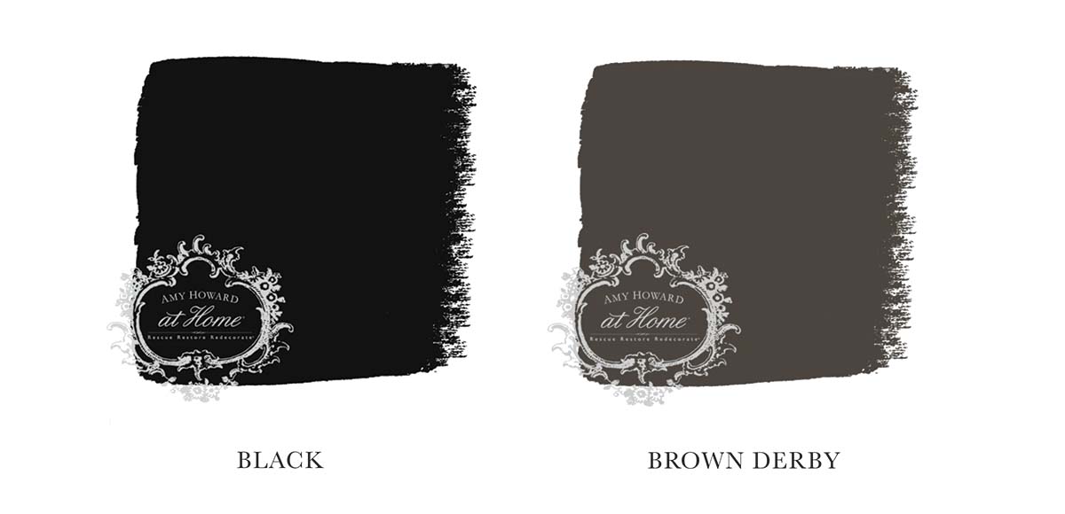
Brown & Black
Brown and black are neutrals that work well together and create a classic color palette in any room. When using black as one of your main colors, you must make sure to balance it well. Lighter shades of brown work better so the room doesn’t appear too dark. In spaces with black furniture, brown accents can add depth and interest to the room, while black can create drama against brown furniture.
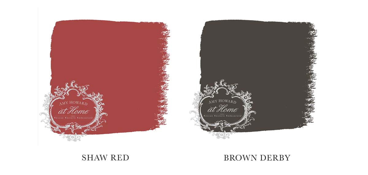
Brown & Red
When it comes to pairing brown with red, it’s all about the shade of red that you choose. A room such as a home library or study might call for a moody color palette centered around darker hues of red, whereas a clean, modern bedroom can benefit from a pop of color in the form of a bright red throw blanket or reading chair.
The color brown is a wonderful neutral that can both carry or accent a room design. From deep rich chocolate to soft, muted taupe, brown is the great equalizer and goes with everything.
If you want to see more info on the color of the month club or purchase any of the specific paint colors I mentioned, go to Amy Howard Home.
Go create something!
Are you new to my blog? Go HERE to see my home tour and HERE to shop for items I use in our home.
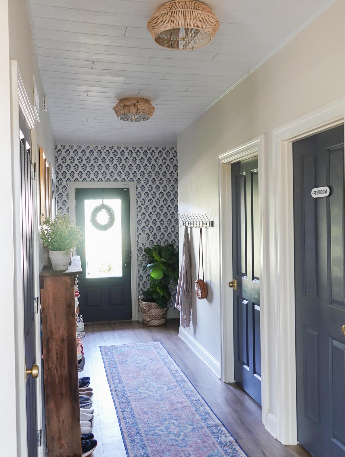
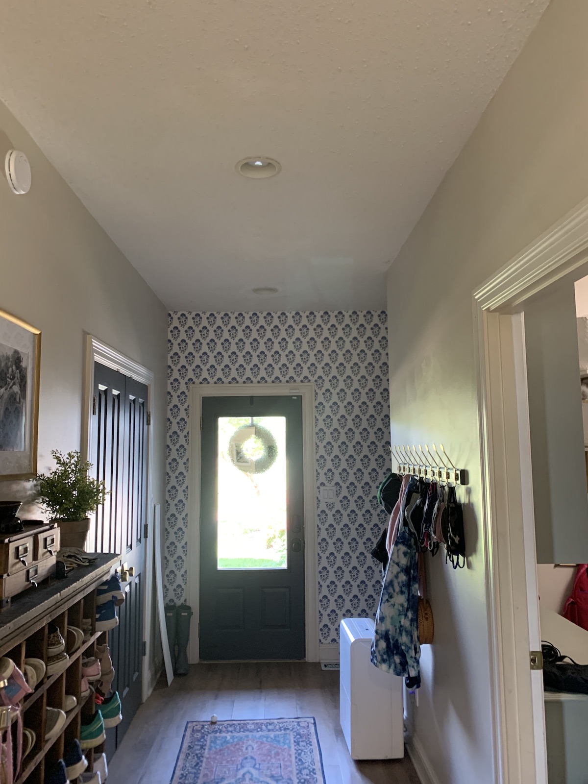
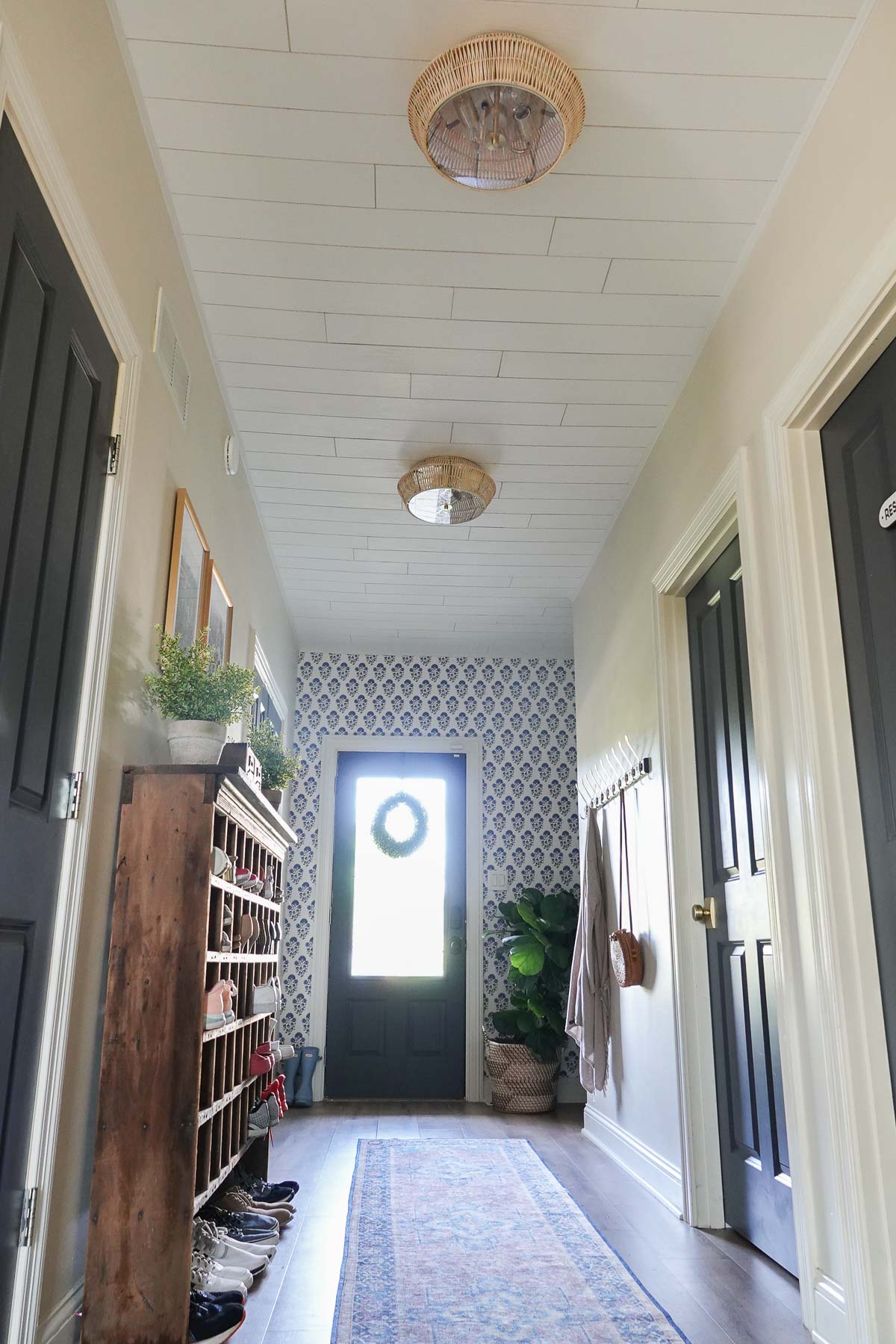
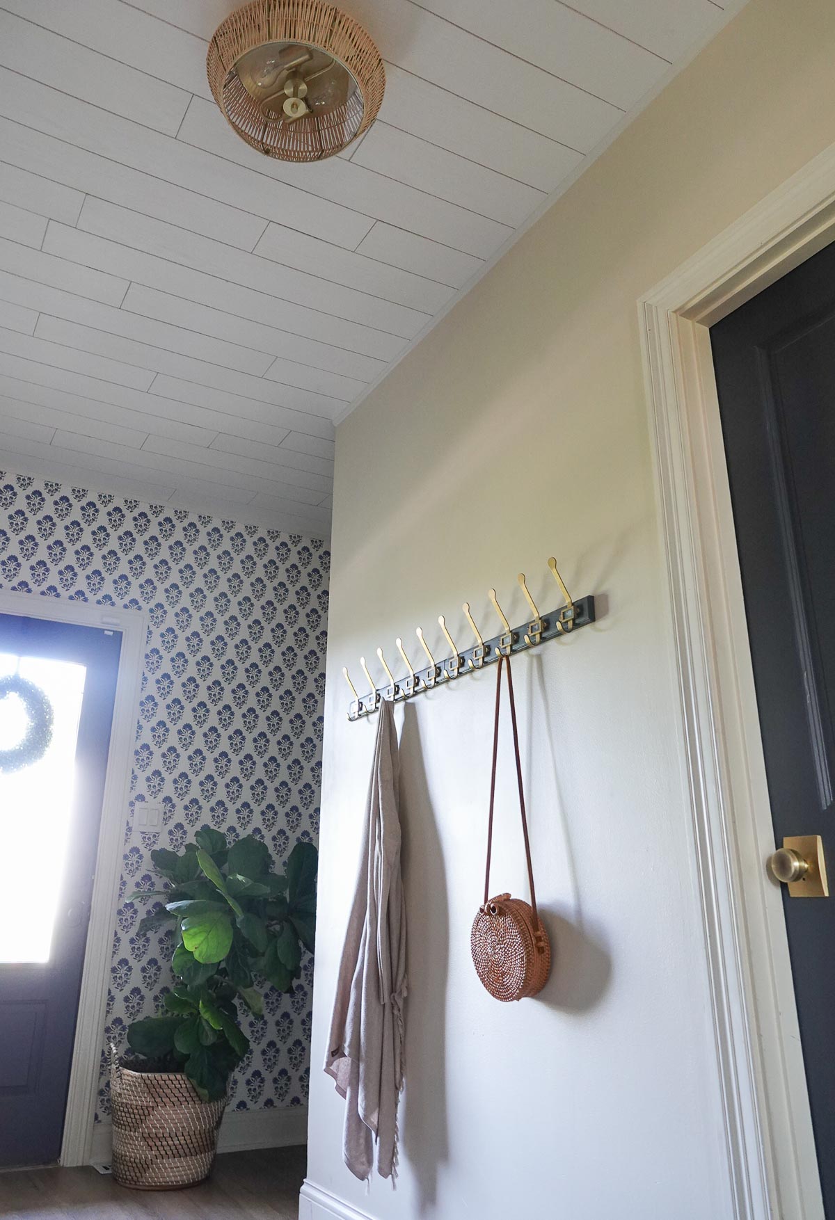
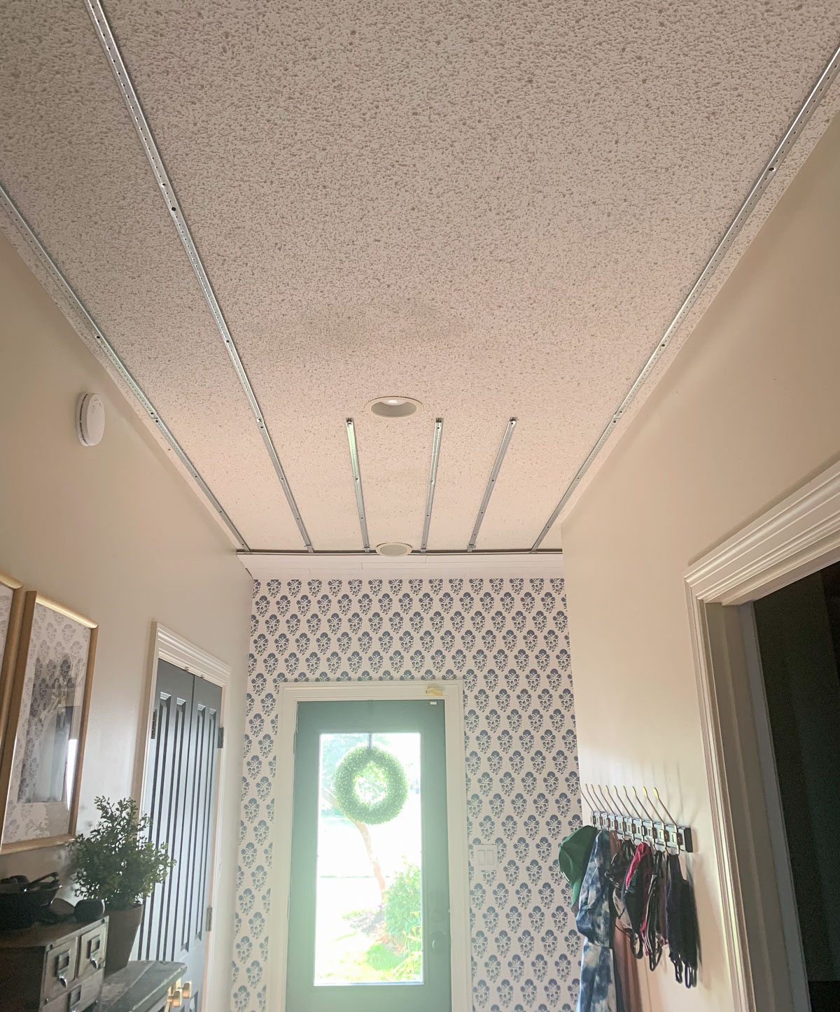
We have some popcorn ceilings in our home and have slowly been removing them as we can. Popcorn ceiling removal is such a pain, and it makes a huge mess. We began looking for other solutions for our popcorn texture ceiling, and we found a product that did not require hours and hours of scraping and lots of dust and was our popcorn ceiling fix!
This post is a sponsored post by Armstrong Ceilings. I take pride in reviewing only products that fit my brand and will be beneficial to my readers. And while this post is sponsored, all the opinions are my own.
Amstrong Ceilings has a product that allows you to cover up the popcorn texture ceiling by installing a surface mount ceiling. We added the Country Classic Plank White to our home.
Here is a before and after of our back entry looking into our kitchen:
And here is another before and after of our ceiling:
Now, this was NOT an easy project, but am I happy with the end result? Absolutely!!
We began working on this early in the summer thinking it would take a week or so, but it has taken us until the start of fall to complete this project.
This crazy long timeline is not the fault of the product, but of our schedules and the space we selected. We were in the middle of a ridiculously busy time with our three kids, so we spent a lot of time dividing and conquering this past summer.
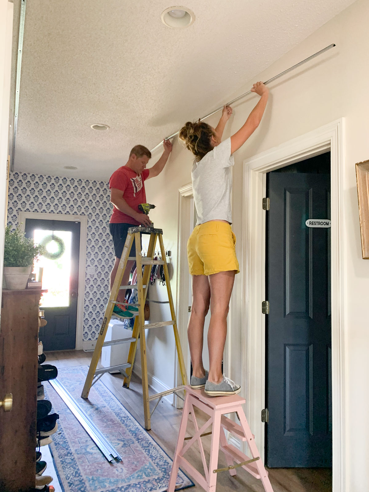
We found this project required more than one set of hands for installation, so it was hard to find a time where we both were around to work on it together.
We also ran into bizarre issues – issues that most rooms would not have. This space gave us every obstacle possible. But despite all our problems, we found solutions. And I’m going to share everything we learned from this project.
Popcorn Ceiling Fix
How to Install the Surface Mount Ceiling:
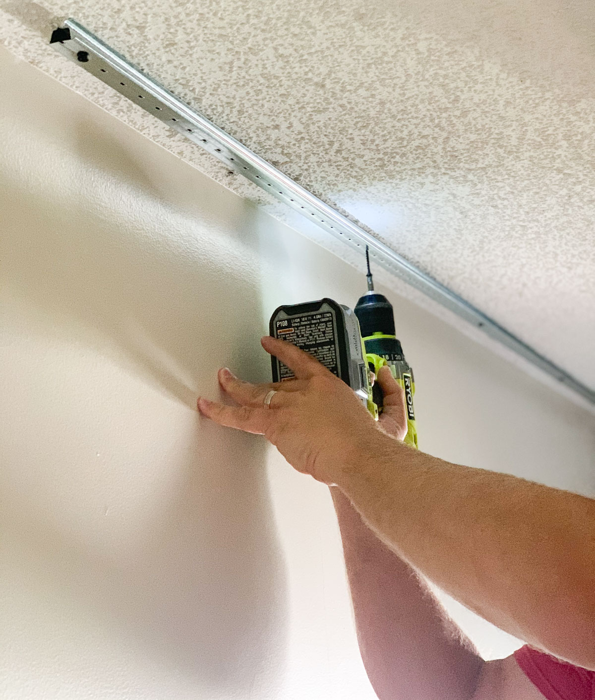
Locate Ceiling Joists
In order to install the track for the surface mount ceiling, you’ll want to find the joist so you can attach the tracks to it. With our long space, we definitely need the ceiling planks to go across the short end. Unfortunately, our tracks ran in the same direction we needed our tracks to go.
We went ahead and installed the tracks the way we needed them to go and hit as many joists as possible.
Install Track
Installing the tracks isn’t hard, but it was helpful to have two sets of hands. To install, you screw the first to of track 2″ from the sidewall and the other tracks about a foot apart.
We found cutting the tracks to be a problem. Tin snips or a hand saw were suggested, but we found it impossible to not bend the tracks in the process of cutting. The tracks are pretty flimsy (which is fine because the ceiling tiles are SO light). However, keep in mind the tracks will bend out of shape and require some maneuvering.
Install Planks
Installation of the planks isn’t hard, but there is a lot of cutting involved. We wanted our planks to look random so we cut the planks at different lengths so no seams were the same.
Each row of planks is held up with a clip which makes that part of the installation very easy.
You do have to familiarize yourself with the plank edges because they will have to go the same way throughout the entire installation.
The product is very light and since they are mineral fiber planks, cutting will make a mess (we used a chop saw).
Add Trim
You will need to add trim around the ceiling. Originally I had wanted a thick crown molding, but we soon realized that would not work since crown molding require nailing in the ceiling.
We could not nail into the mineral fiber planks for fear of damaging them, and they would obviously not hold the molding.
Instead, we opted for a thin molding that does the job.
You can see in the above left photo the damaged area caused by water damage. I unsuccessfully attempted a popcorn ceiling patch. The spray didn’t match, and the brighter white was almost more visible than the water leak stain.
The above right photo shows how much more beautiful our ceiling looks now!
Problems We Encountered:
Joists Went the Wrong Direction
As I mentioned earlier we decided to install the track opposite of how the directions suggested (instead of with the joists). Although it wasn’t ideal, our tracks are firm and in place.
Mineral Fiber Planks are Delicate
Cutting the planks is messy, and I am concerned about how delicate the planks are. I worry about damaging some planks (like if one of my kids throws a ball up into the ceiling). Luckily there are ways to replace a single damaged plank without taking down the entire ceiling, and Armstrong has a video detailing how to do this.
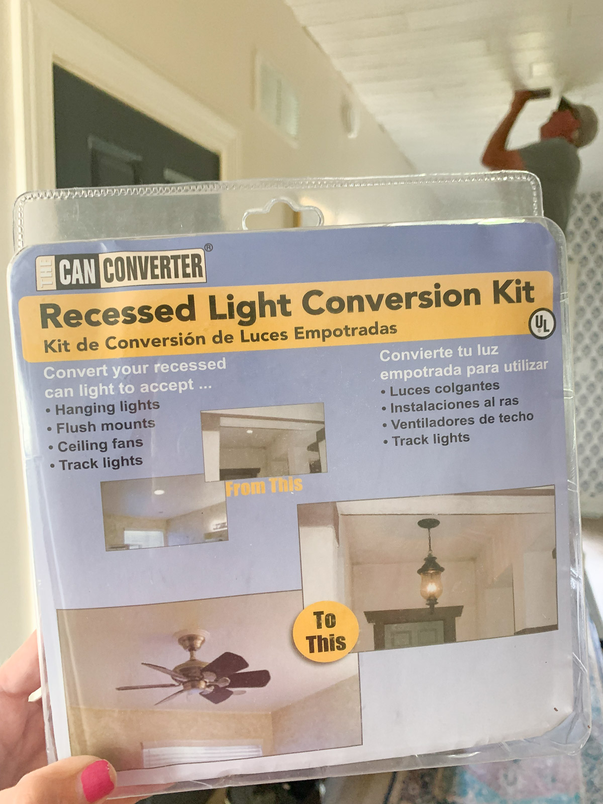
Recessed Lights
We had four recessed lights, and the surface mount ceiling mean we had to either purchase new recessed lighting that would fit the new height or buy a completely different lighting solution. I used this as an opportunity to replace two recessed lights with two flush-mounted lights (this was done fairly easily with a lighting convert kit). I decided to cap off the other two since we did not need additional lighting since the flush-mounted lights provided plenty for the space.
Ceiling Met Stairway
At the opposite end of this entryway is our stairway. This complicated installation because we needed to find a large L-shaped trim piece to complete both sides. This piece took us months to find, but I finally found a solution meant for tile, but it worked! It has a 2-inch lip and a 3-inch lip, and you can find it HERE.
So, while this was a difficult project for us, I do think our lack of time and crazy obstacles are not the norm. This ceiling would be a fantastic solution for an unfinished basement (such a great way to add a pretty ceiling).
Also, I was worried about bringing the ceiling down a bit, but it is not noticeable AND now the ceiling is SO MUCH PRETTIER!
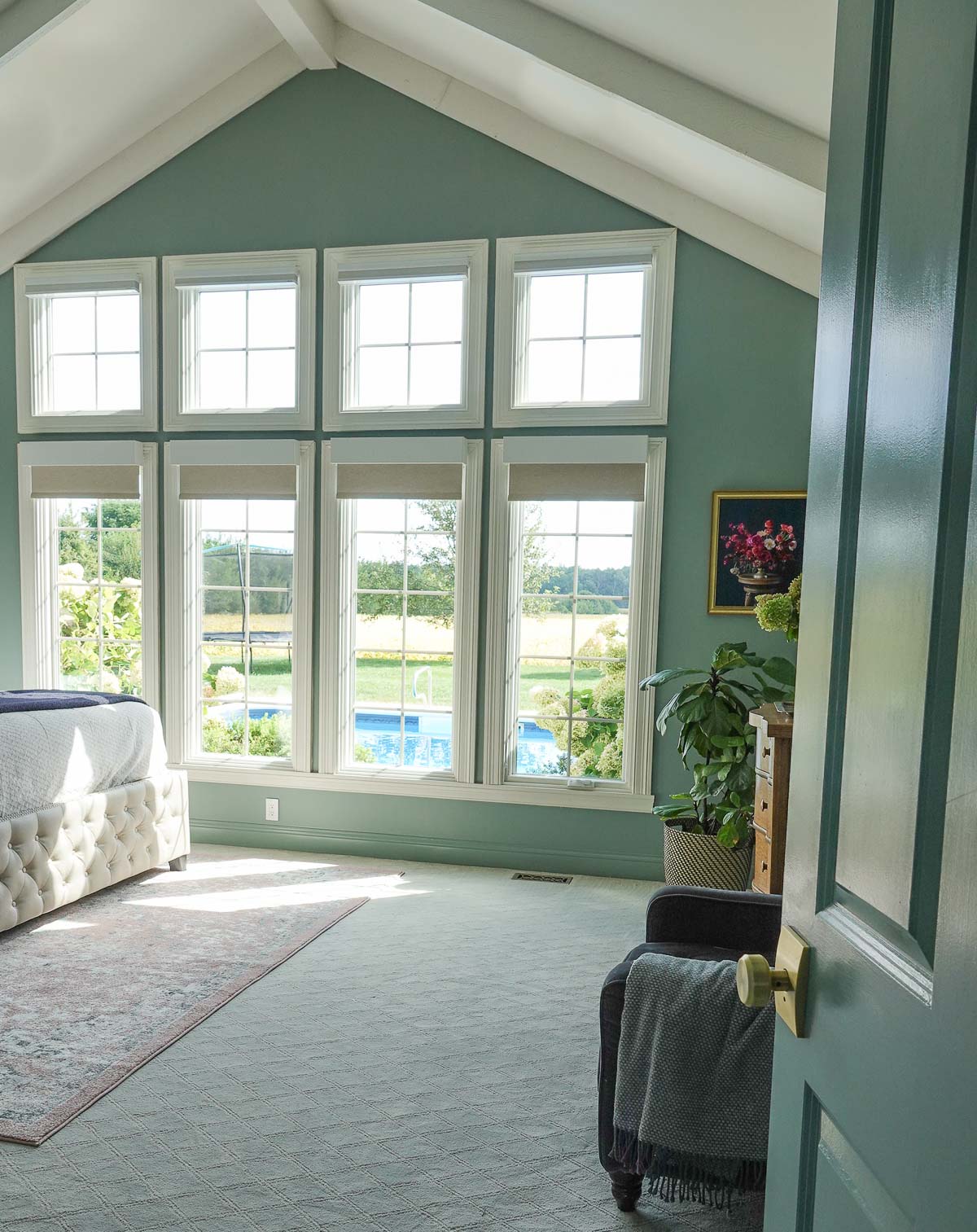
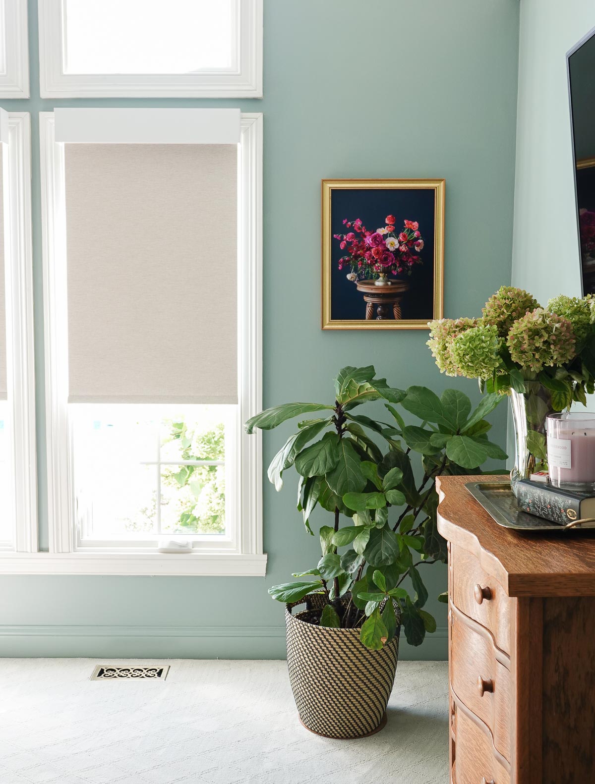
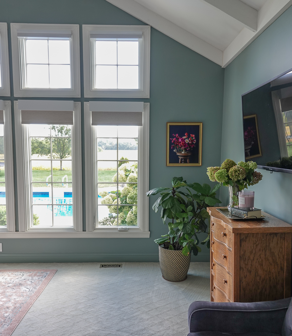
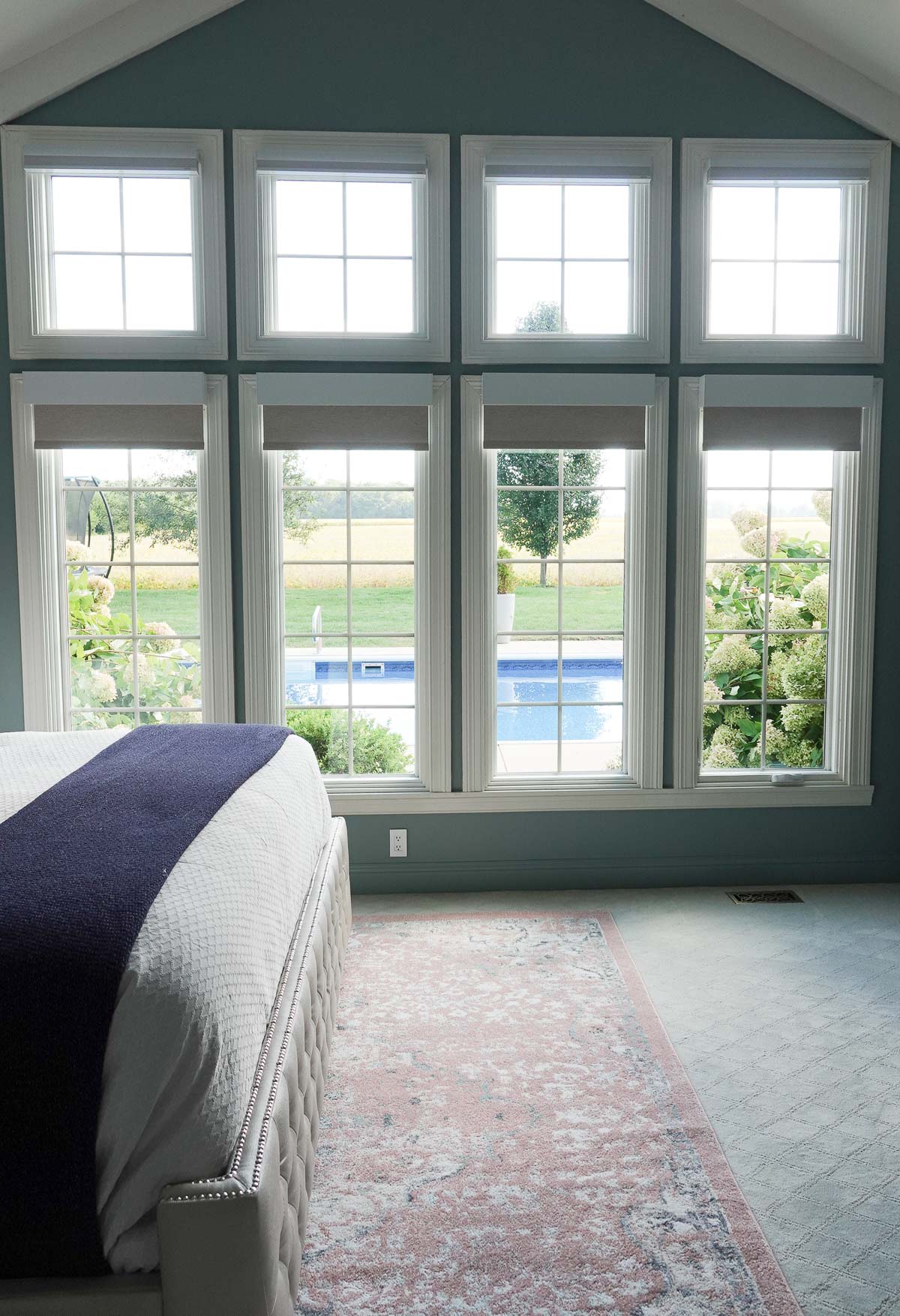
I often share how much I love Lutron’s smart lighting, and they also offer the best smart shades. Serena Smart Shades by Lutron Electronics are absolutely amazing because they:
Optimize the natural light in your home.
Fully customizable.
Require no wires.
Crazy smart.
This is a sponsored post written by me on behalf of Lutron. All opinions are 100% mine. Thank you for supporting the brands that allow me to create unique content while featuring products I love!
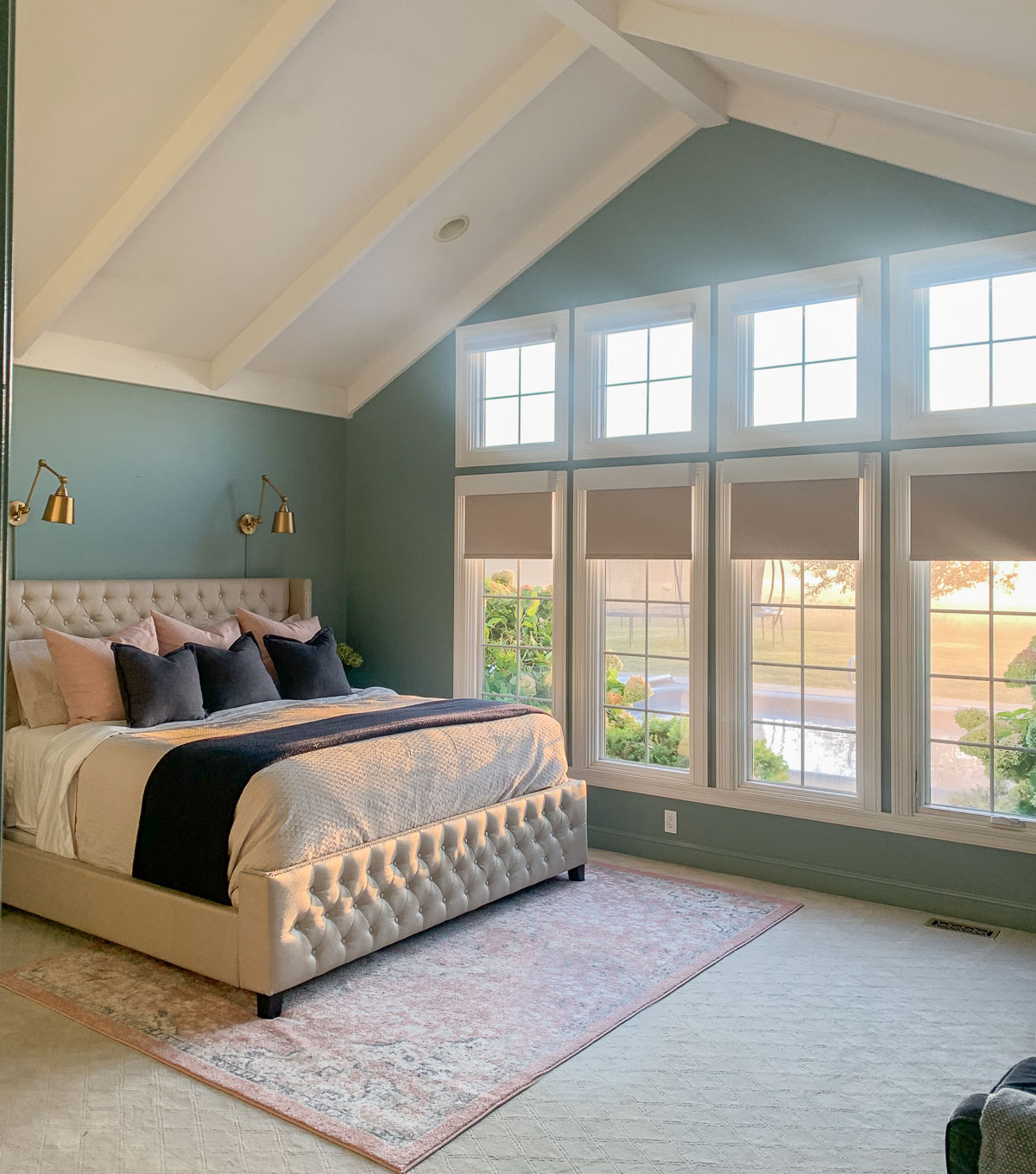
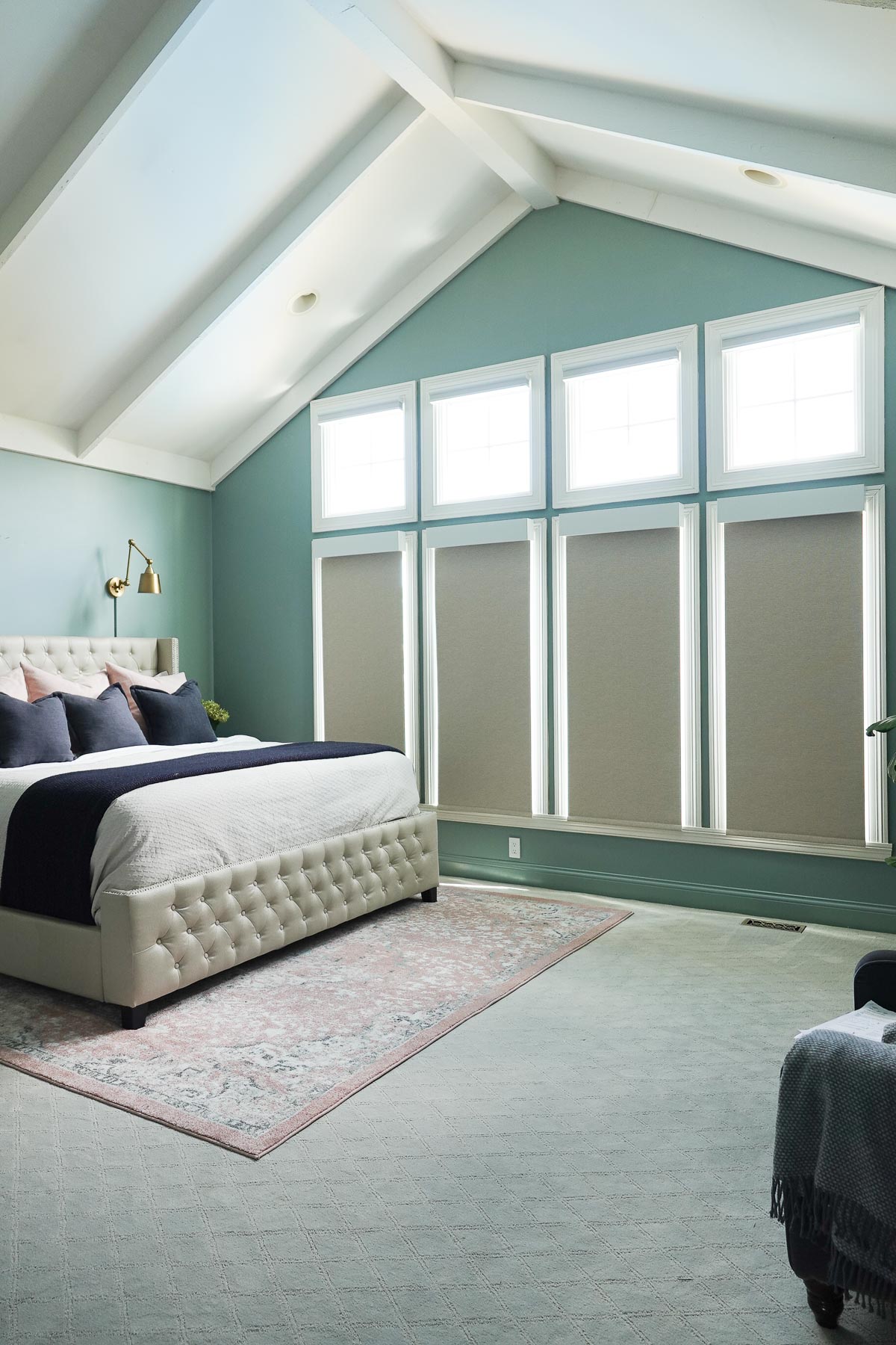
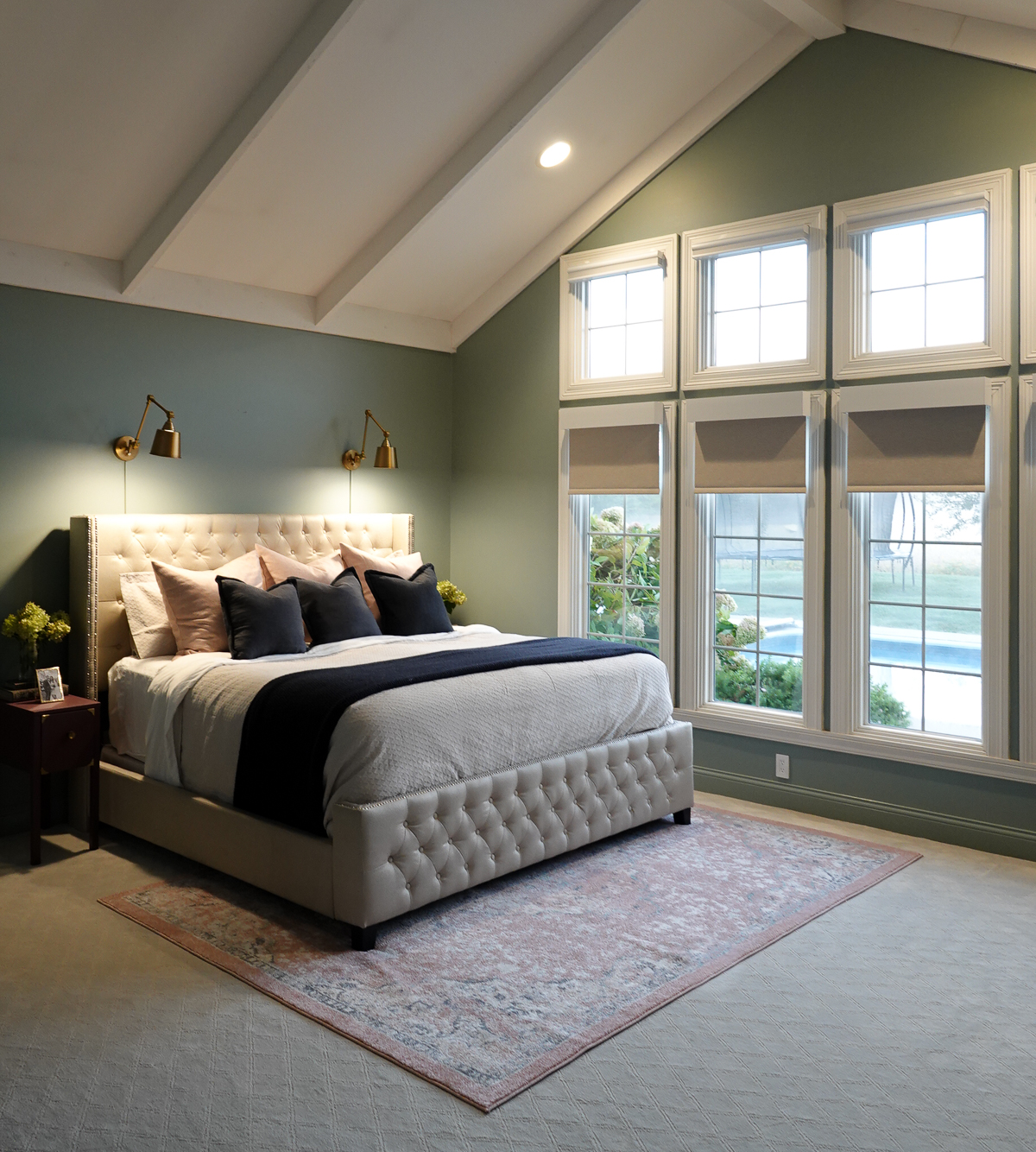
Previously, we had classic wooden blinds. They were hard to clean, required manual opening and closing, and obstructed the view.
Thanks to our new Serena Smart Shades, we no longer have to worry about dust collection, I can schedule my shades to open and close every day, and my view is amazing!
Optimize the Natural Light in Your Home
With the touch of a button, the shades can easily be adjusted to create your comfort zone by effortlessly optimizing your home’s natural light.
The shades can be stopped at any height.
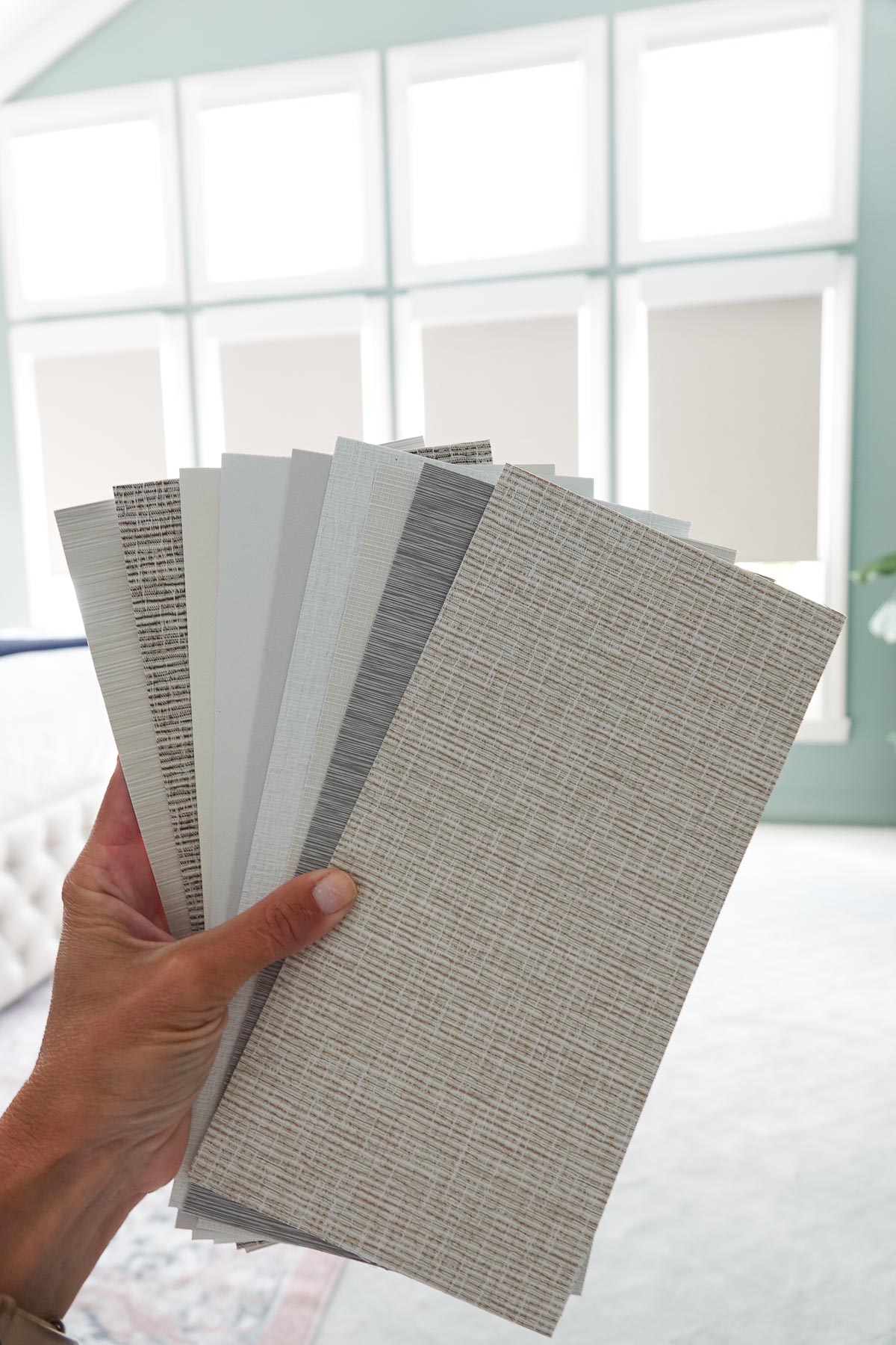
Fully Customizable
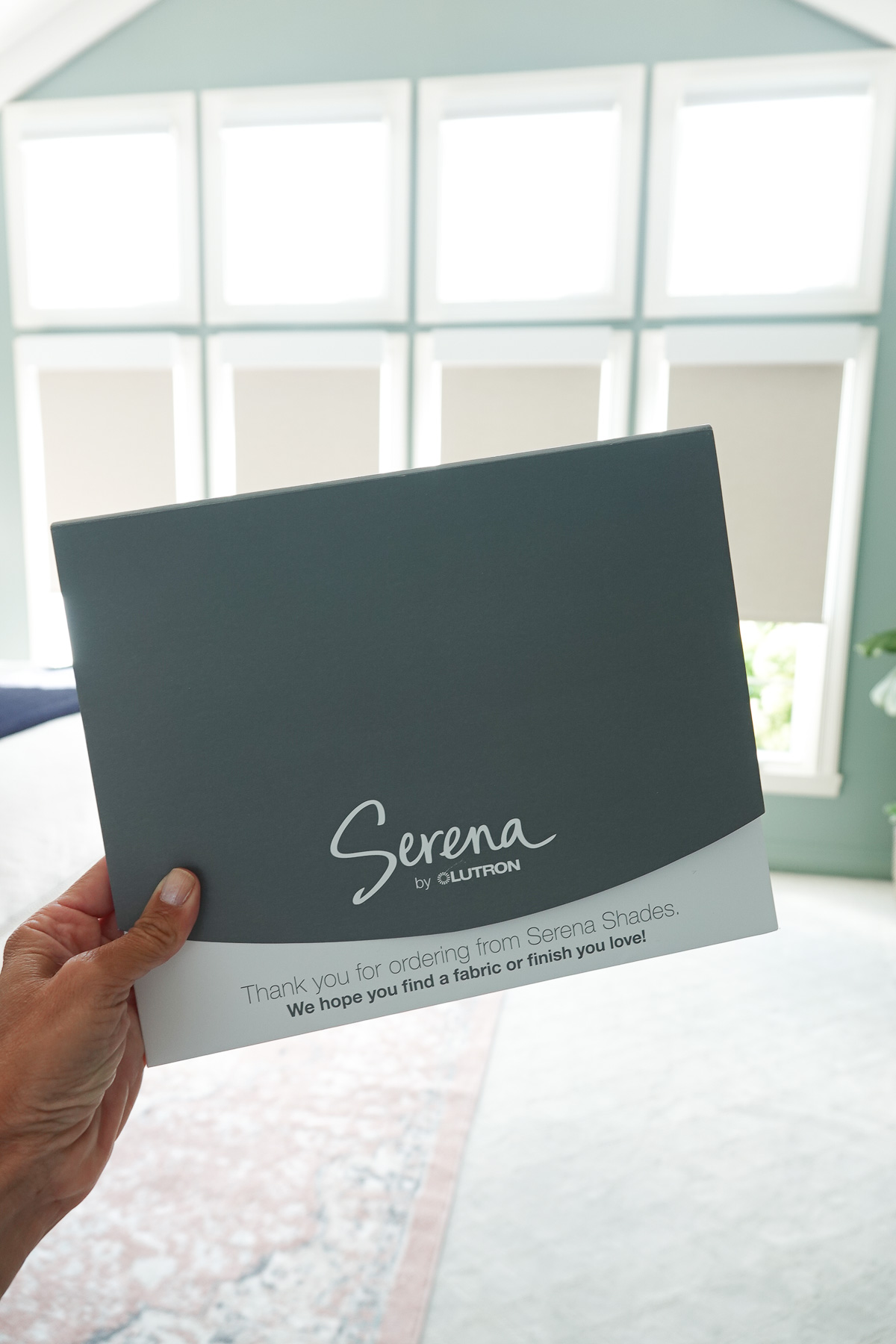
Serena Shades are available in a variety of styles and offer a large selection of fabric colors and textures. They also offer three different fabric filter options.
On the website, you can order fabric samples to make sure you select the perfect fabric for your space. The website also walks you through the complete process – everything from measuring your windows to installing the shades.
Require No Wires
The Serena Shades operate without wires so no hard-wiring is required. They operate on batteries and they are ultra-quiet as they open and close.
Installation was easy and only required two screws for each of our shades.
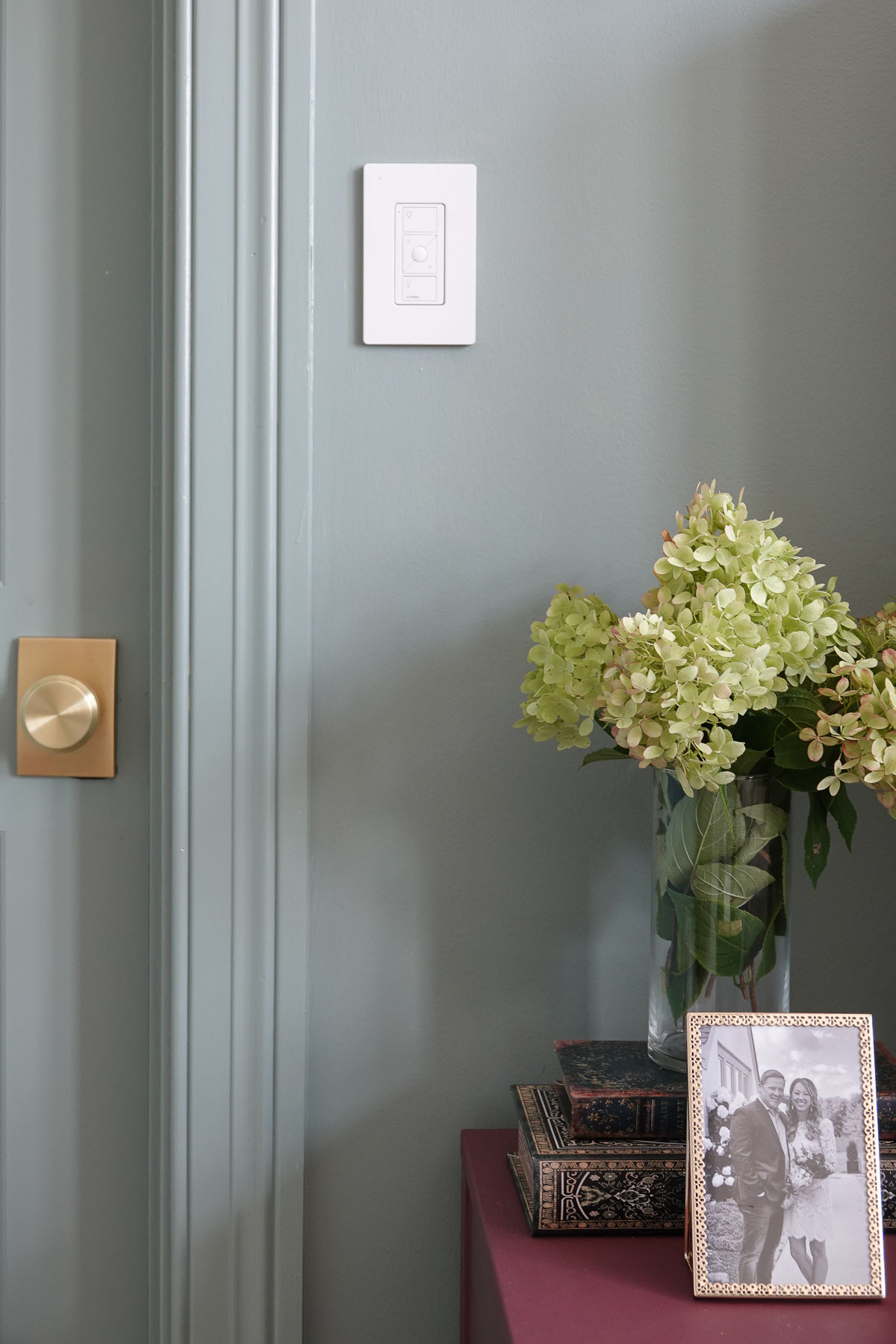
Crazy Smart
The Serena Shades are crazy smart – so smart they can be controlled from anywhere in the world using the Lutron App and Smart Bridge.
I can also operate my shades (and lighting) using the wall switch.
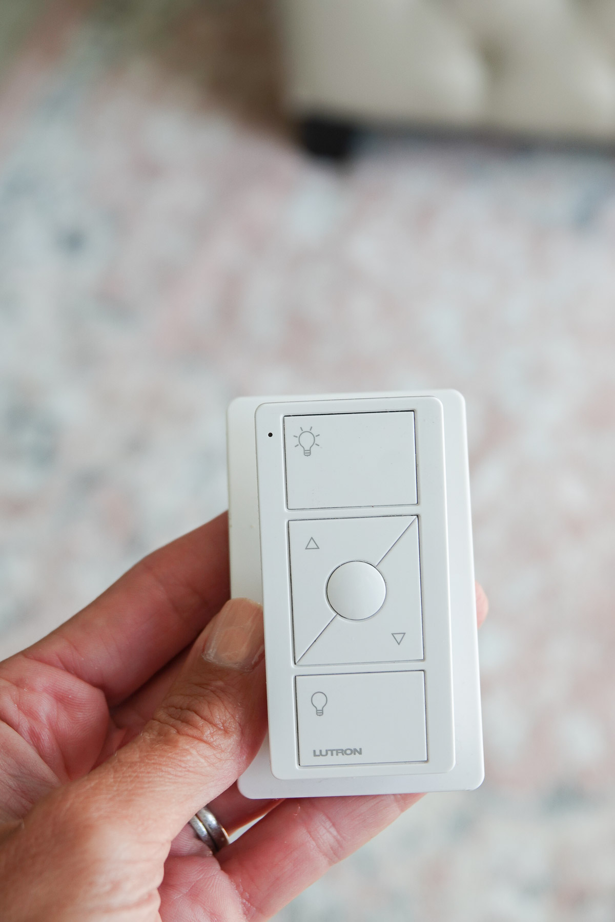
I keep a Pico Smart Remote on my nightstand which operates the Lutron products.
You can also use a smart assistant like Google or Alexa to open and shut the shades (and turn the lights on and off).
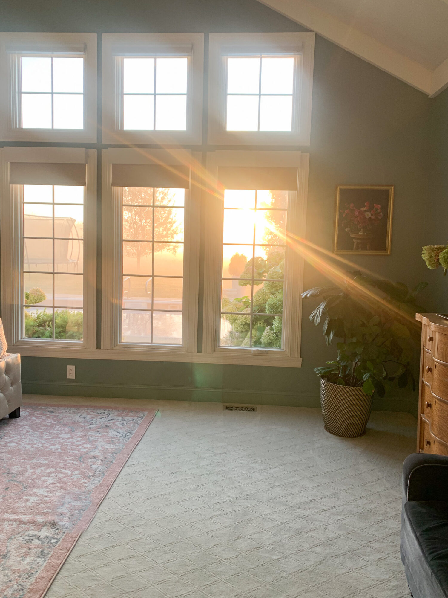
I had no idea how much we were missing out until we installed our new Serena Shades. I now can fully watch the most beautiful sunrises and bring the beauty of the outside in.
I highly recommend these smart shades.
Serena by Lutron is aesthetically timeless, long-lasting, and worth the investment.
Go create something!
Are you new to my blog? Go HERE to see my home tour and HERE to shop for items I use in our home.
Today we’re discussing decorating red because it is such a powerful accent color. Red captures attention and is the color of extremes. It’s the color of passionate love, seduction, violence, danger, anger, and adventure. Our prehistoric ancestors saw red as the color of fire and blood – energy and primal life forces – and most of red’s symbolism today arises from its powerful associations in the past.
It is one of the most visible colors, second only to yellow – which explains why it is used on fire engines and stop signs to trigger alertness.
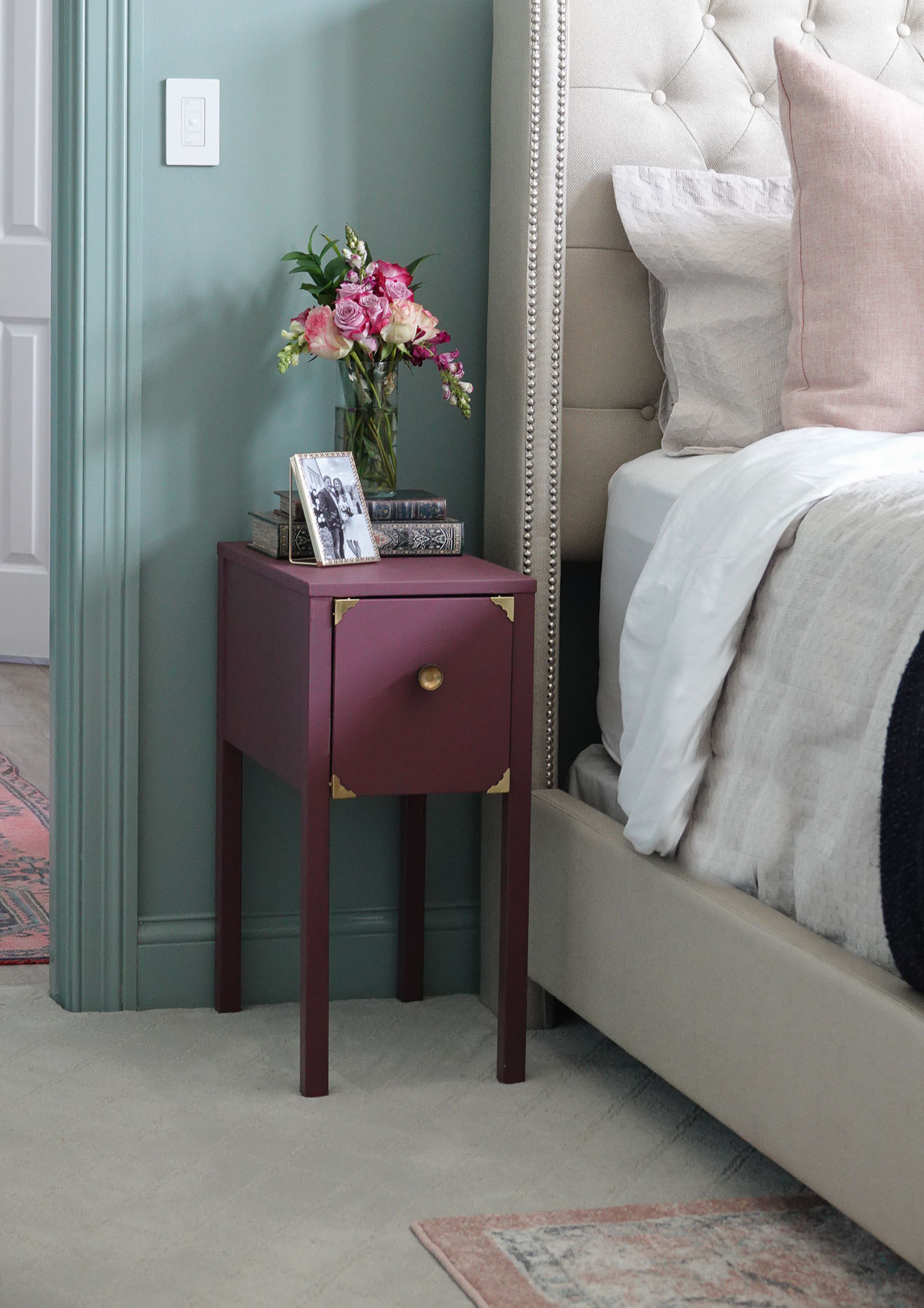
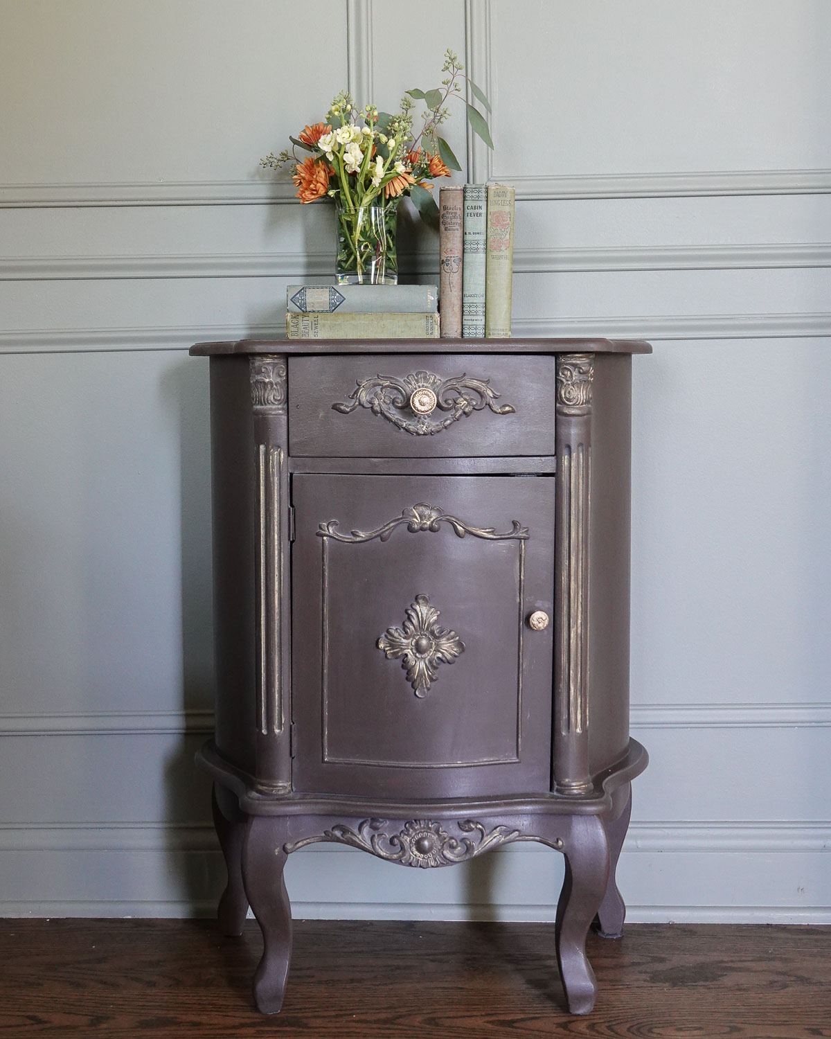
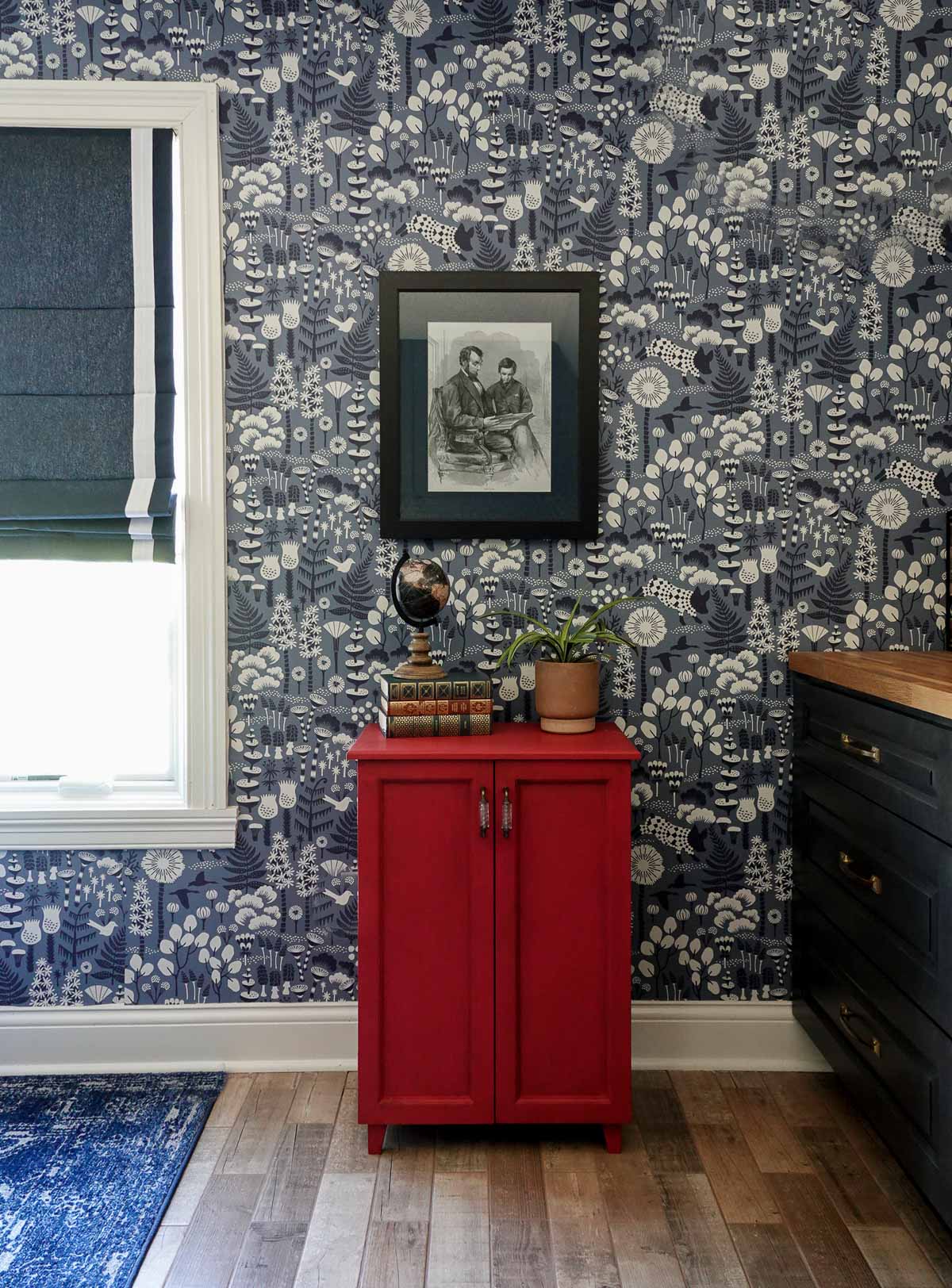
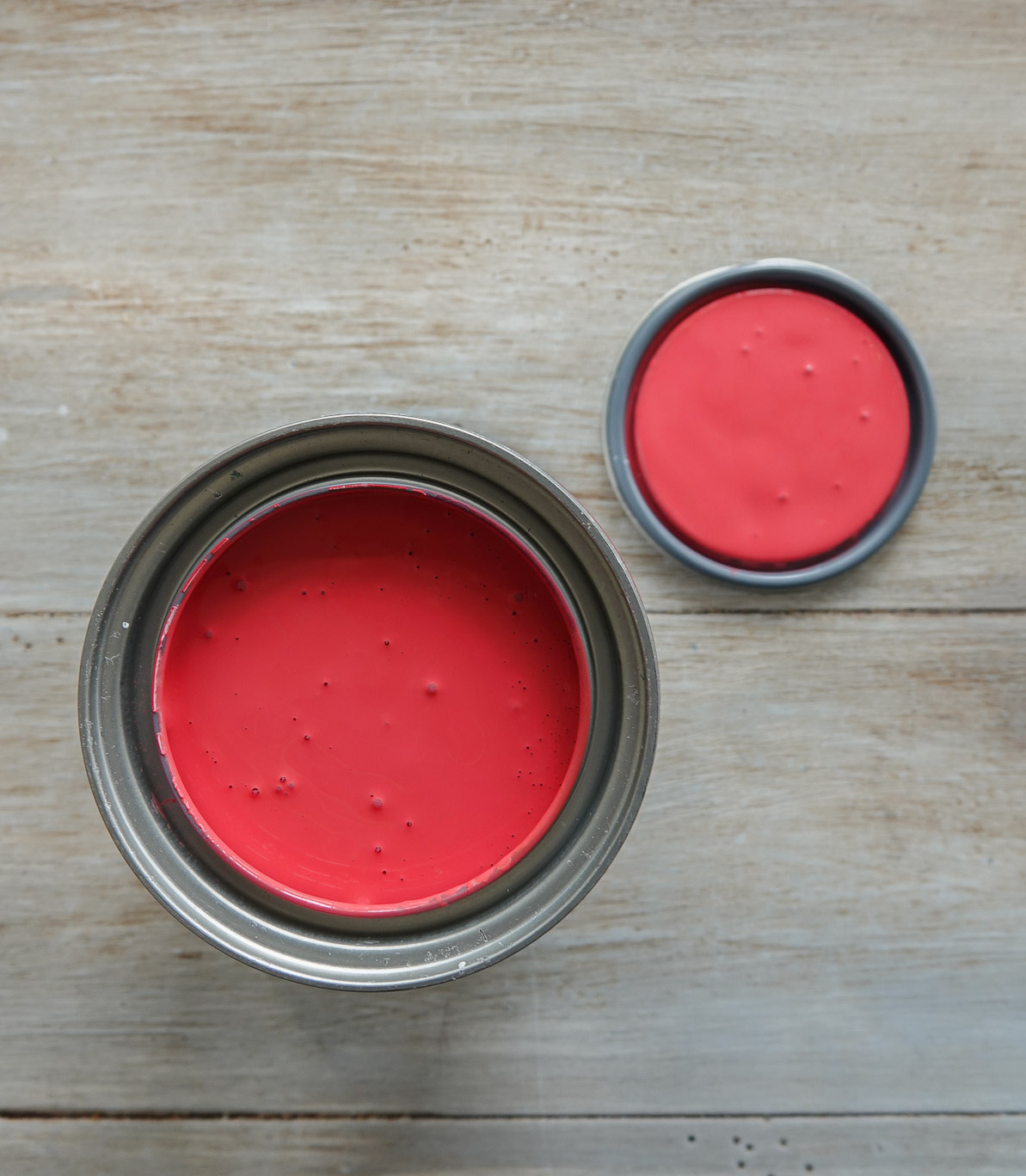
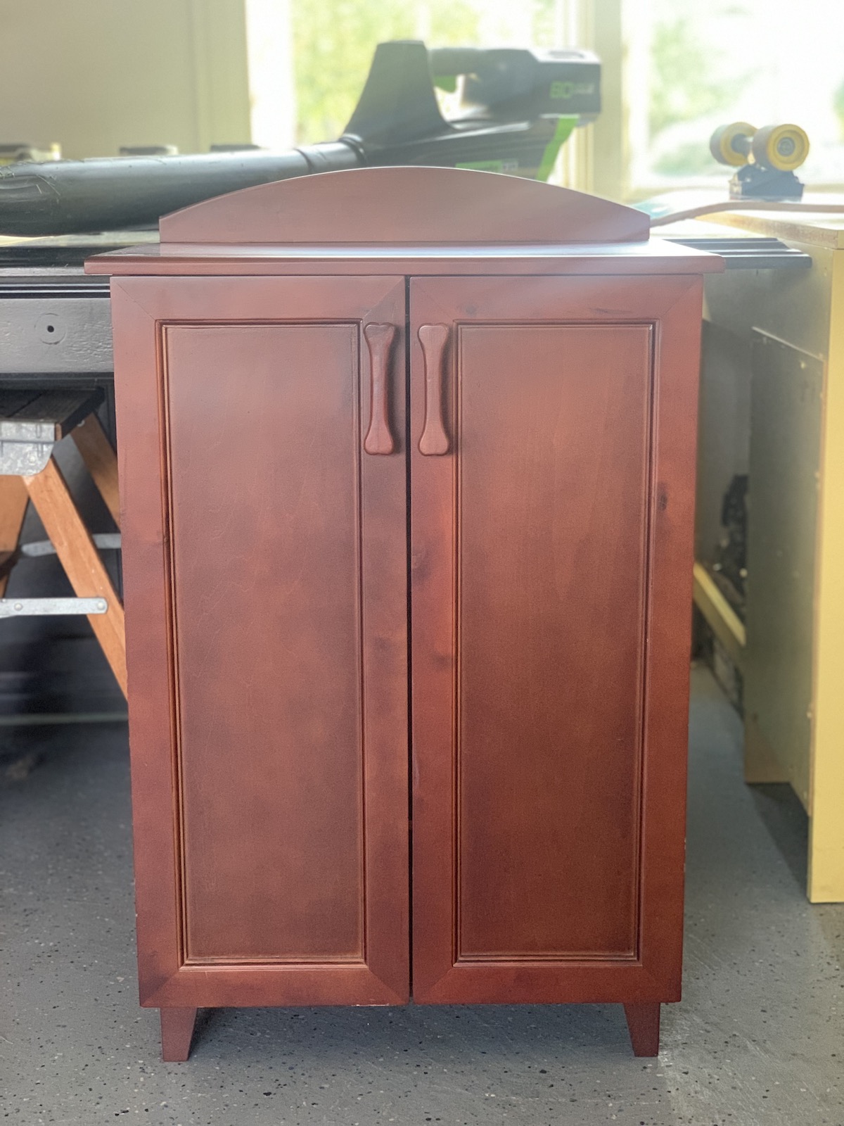
The cabinet I showed earlier is one I found at a roadside sale for $10. It’s amazing what some paint can do (and new hardware):
RED COLOR THEORY
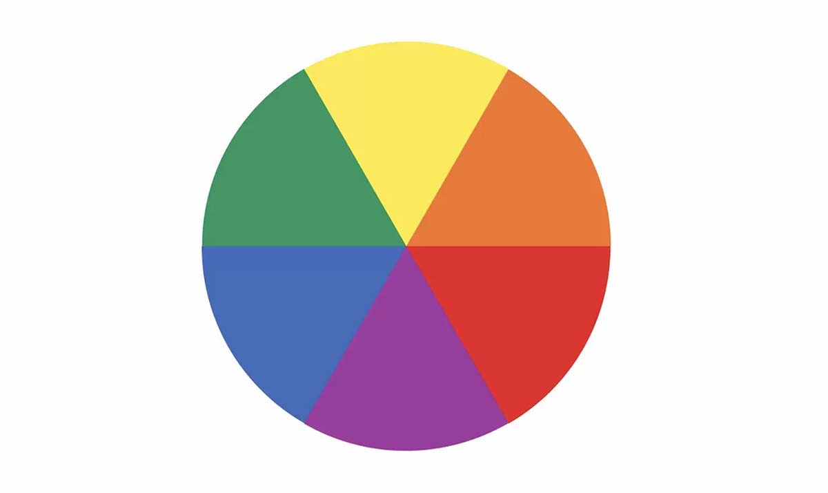
On the color wheel, red is a warm, primary color and sits between blue and yellow. Primary colors are the 3 pigment colors that cannot be mixed or formed by any combination of other colors. All other colors are derived from these 3 hues.
The three secondary colors (colors created when primary colors are mixed) are green, orange, purple. And there are six tertiary colors, which are colors made from primary and secondary colors, such as blue-green or red-violet.
Warm colors include red, orange, and yellow (and variations of these three colors). Warm colors are the color of fire, fall leaves, sunsets and sunrises, and are generally energizing, passionate, and positive.
Generally speaking, the most complementary colors are those that stand opposite each other in the color wheel, such as red and green, blue and orange, purple and yellow.
Red has the longest wavelength of any color. It’s the first color babies can see, and it’s the very first color to vanish as the sunsets.
Red calls us to action, gets us motivated, and wearing red lets people know we feel confident. Red is associated with luxury – think about a red Ferrari.
Red also has negative connotations in that it can indicate anger and red is associated with financial loss.
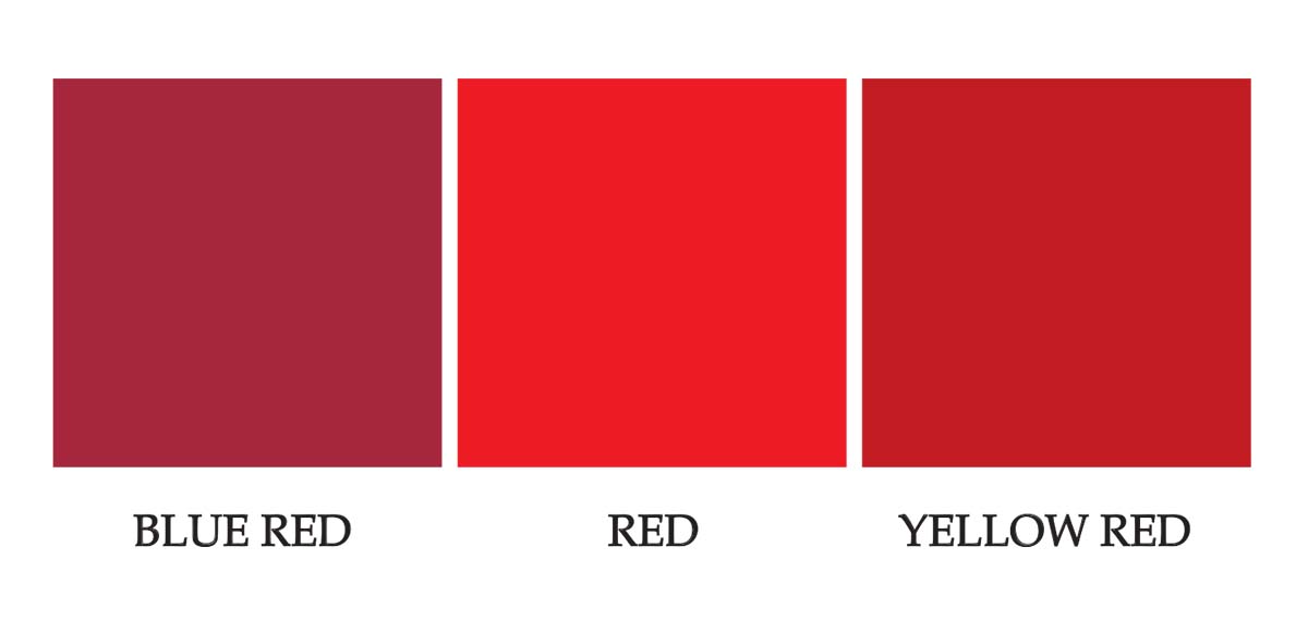
SHADES AND TINTS OF RED
Blue-based reds are berry reds.
Yellow-based reds are tomato reds.
Generally, females are more attracted to blue reds while males prefer yellow reds.
DECORATING WITH RED
In design, red can be a powerful accent color. It can have an overwhelming effect if it’s used too much in designs, especially in its purest form. It’s a great color to use when power or passion want to be portrayed in the design. Red can be very versatile, though, with brighter versions being more energetic and darker shades being more powerful and elegant.
LESS IS MORE WITH RED
Red is the perfect way to add a splash of color to any space and is a beautiful accent color. Use it to enhance a room by painting a piece of furniture or adding it as a decorative piece (think artwork, vases, and throw pillows).
There’s a reason so many flags are red, white, and a deep, navy blue. Red, white, and blue is a classic combination, but because red and blue are both primary colors, the combination can be overwhelming. A more sophisticated combination is primary red and a deep navy blue.
Red and Turquoise
Red and turquoise the perfect combination for people who want bold decor. These two vibrant shades are loud on their own but somehow, they neutralize each other when styled together. Turquoise is an example of a tertiary, and they tend to work well with red.
Red and Green
Since red and green are complementary colors, it’s only natural that they pair nicely in your home. The colors create levels of high contrast but be careful to not make your space look too jolly. Try mixing several different greens versus only the primary green.
Red and Orange
Try mixing colors with red on the same color spectrum – like orange. The result is warm and inviting.
Red, Black, and White: Retro Classic
Black, white, and red is a reliable color combination that results in a sweet, retro attitude. It is a classic approach to decor.
Red and Blush
If you want a modern decor look, try mixing red and a subtle blush. The blush acts as a neutral so the red stays the center of attention.
Red and Purple
Located on the opposite ends of the color spectrum, red and purple aren’t the first two colors you’d think to put together. This unlikely duo can really work but make sure the two colors are in the same tone range. If you select a red and purple with the same saturation, it will look balanced in the room.
What is your favorite combination with red? Want to learn more about the color of the month club or check out all of Amy Howard at Home’s
Go create something!
Are you new to my blog? Go HERE to see my home tour and HERE to shop for items I use in our home.
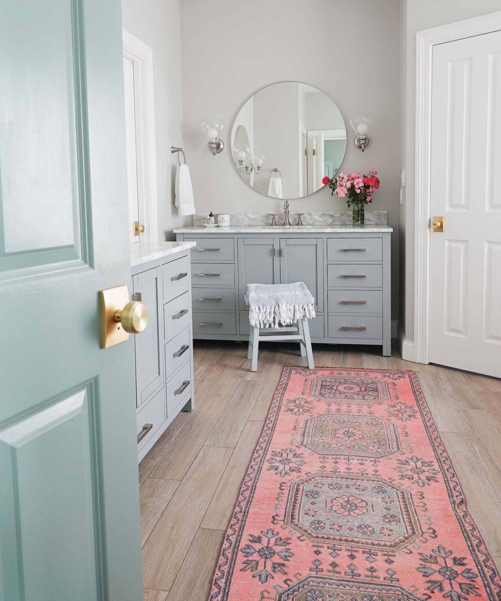
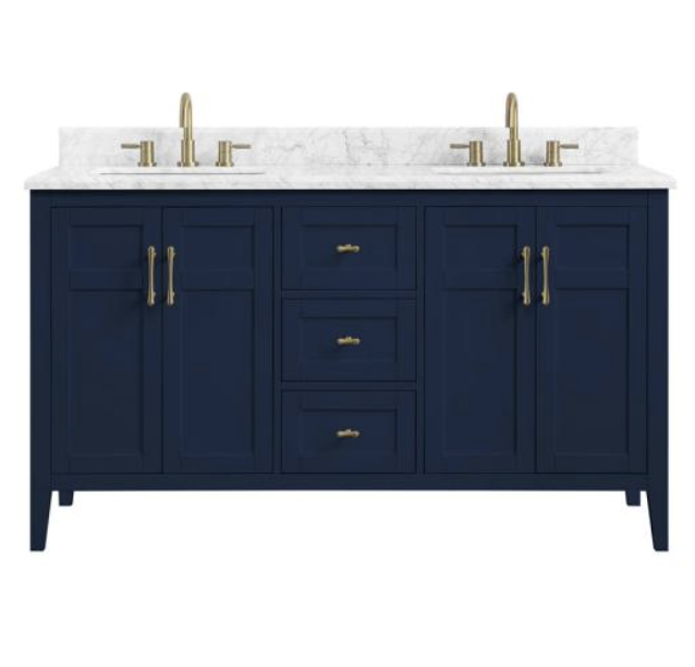
Like so many of you, I LOVE marble. It is one of the oldest and most beautiful stones on the market for countertops, and its popularity began in ancient Rome and Greece where marble was used to construct everything from sculptures to massive pillars. Its timeless and unique beauty seemed to be an obvious choice for our bathrooms, but unfortunately, I have bathroom marble regrets.
*If you are determined to have marble in your bathroom, I share ways to maintain your marble and ways to remove stains from your marble towards the bottom of this post.
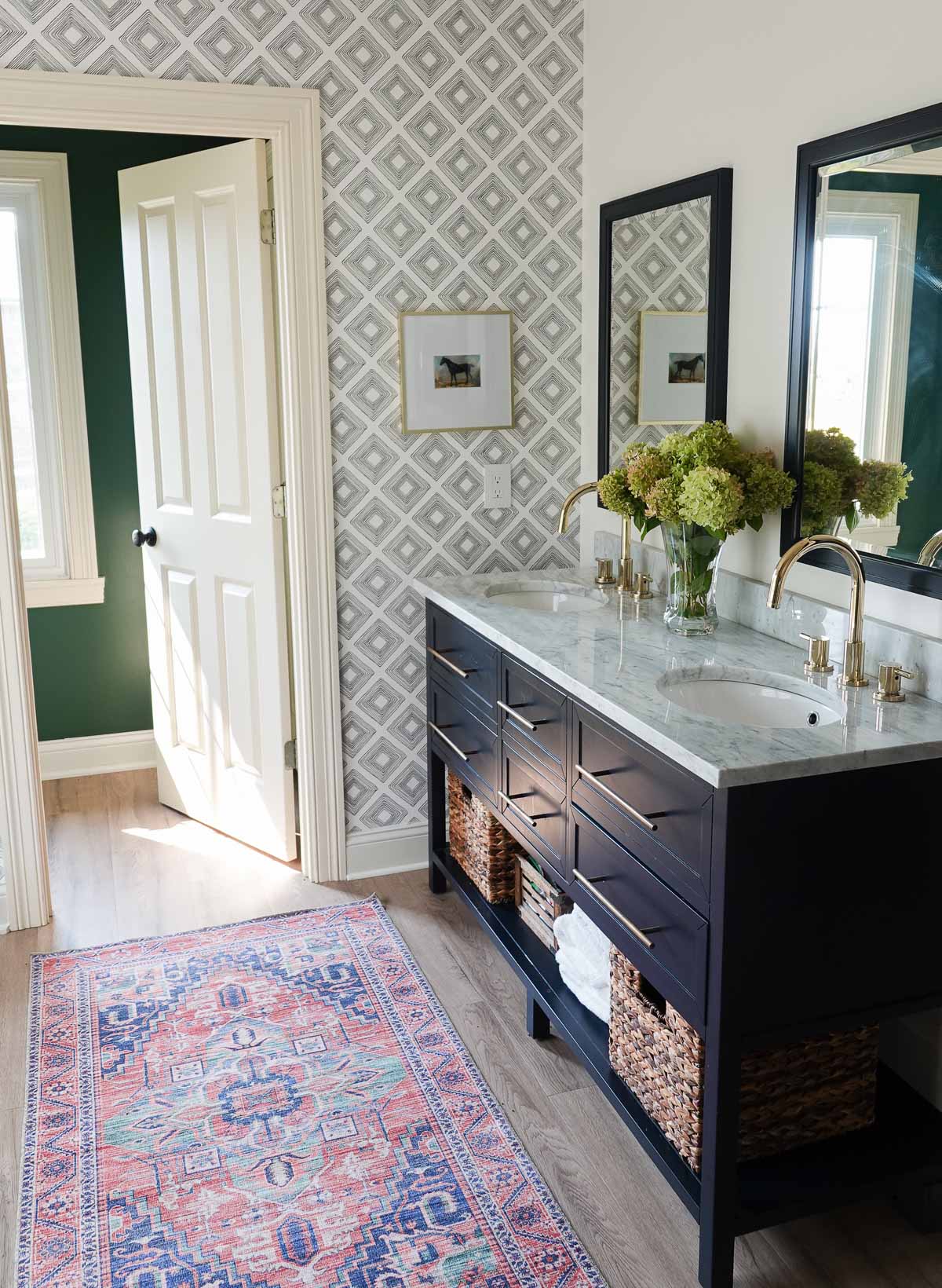
All of the bathrooms in our home were very outdated, and due to a major leak, our master bath was our first major home remodel.
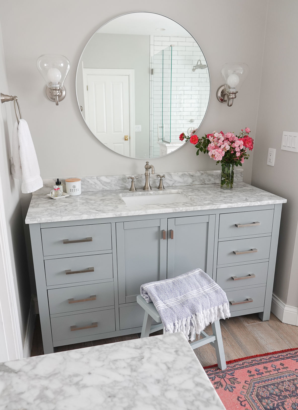
We remodeled this space over four years ago, and you can see more details on the renovation HERE. We found our vanities online, and they came with beautiful marble countertops.
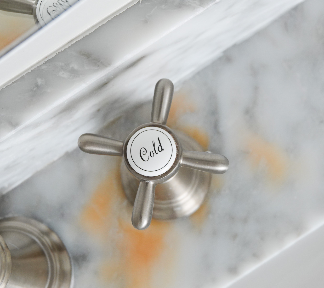
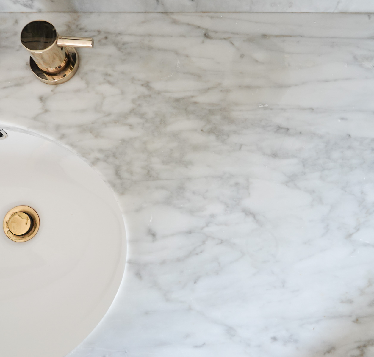
In the last year, an orange stain has begun around one of the faucet handles and continues to grow. I have tried all kinds of online remedies (see 5 Ways to Remove Stains from Marble at the end of this post). This staining can happen because white marble often contains small deposits of iron. If the marble becomes wet long enough to allow moisture to leach through the marble, the iron deposits will oxidize creating yellow/orange/brown stains.
Obviously, there is a leak around the faucet handle, and unfortunately, we haven’t had any success trying to fix the leak – or the stain.
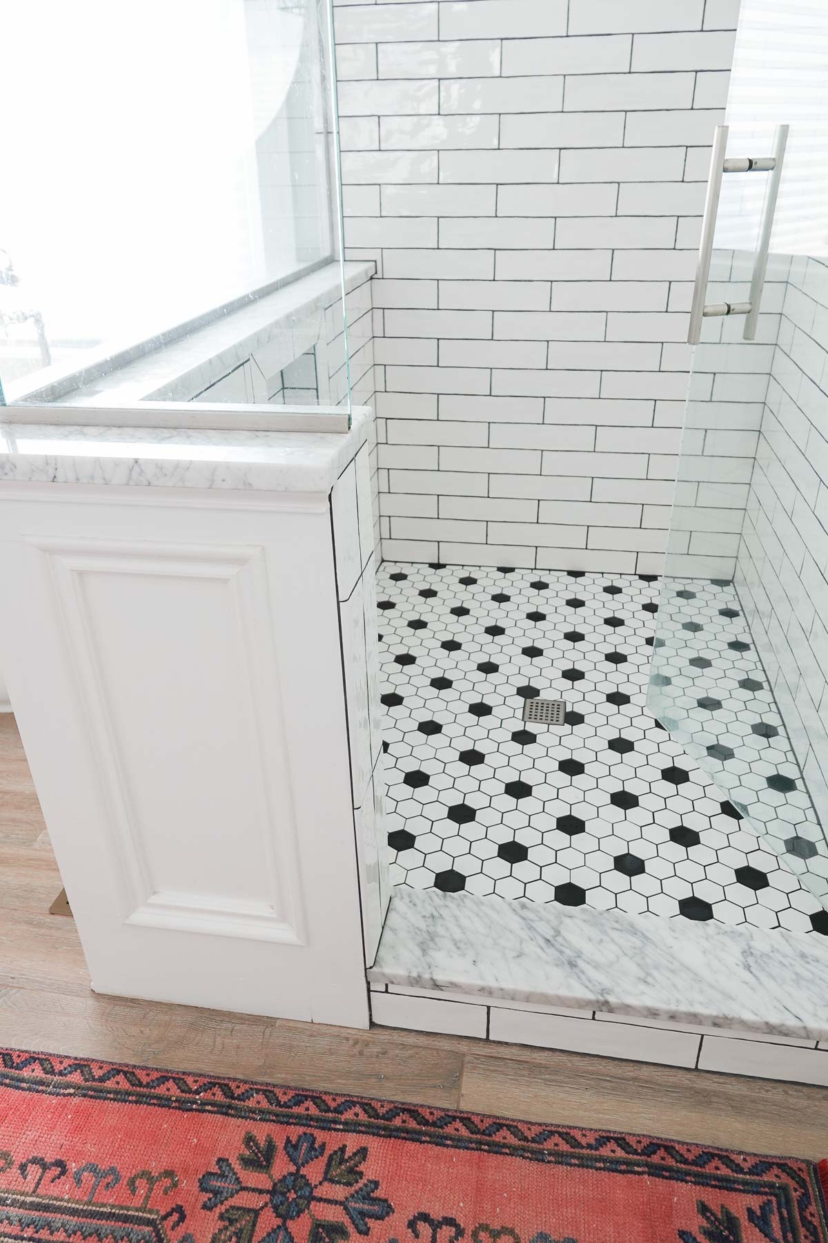
We added marble to our shower as well – on the ledge and the shower door threshold. It has held up really well, and I do wonder if it is because we purchased the marble from a local custom stone shop. It is MUCH thicker than the marble that came on the vanities.
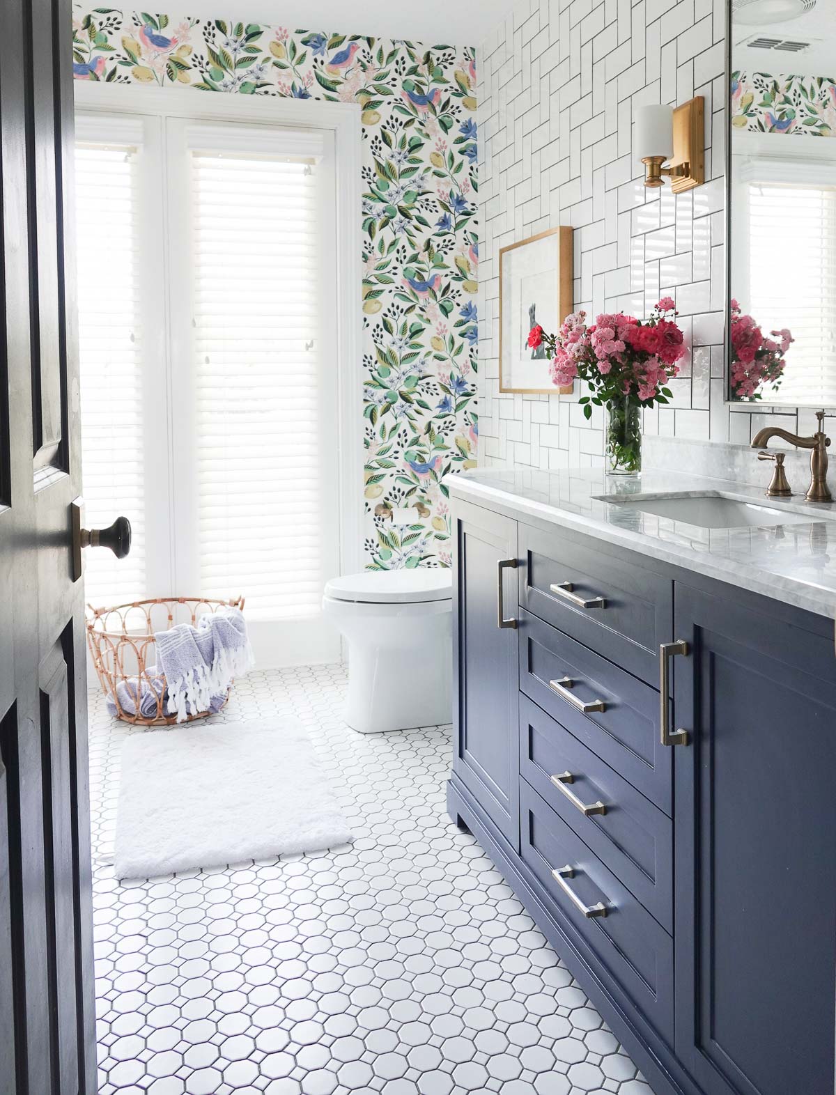
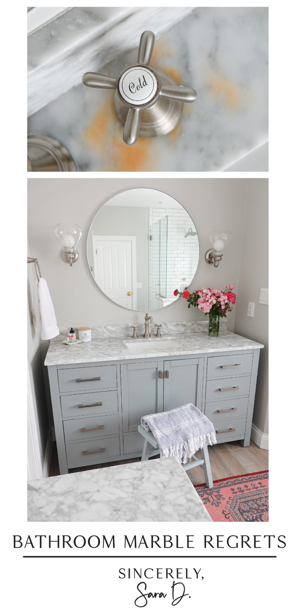
Because we remodeled all of our bathrooms within a few years of each other, I kept adding marble countertops since I wasn’t having any problems. I added it to my daughter’s bathroom, and although her stone doesn’t have the orange staining, the stone has begun to fog up around the faucets and sink area.
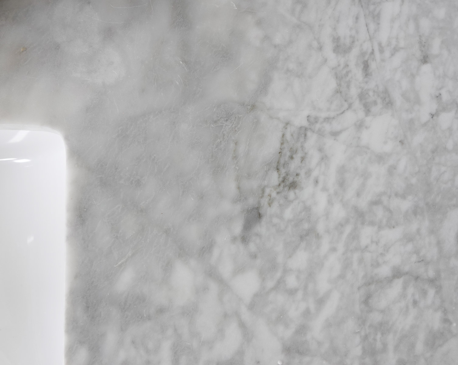
I also added a marble vanity top to my boys’ bathroom.
This time we’re seeing the stone darken around the faucet and sink area.
However, if you are determined to have marble countertops in your bathroom (or kitchen), there are ways to avoid my mistakes and keep your marble beautiful.
How to Maintain Beautiful Marble:
1. Clean immediately
Stains are going to happen, and it is important to maintain marble by cleaning up any stains that happen as quickly as possible. At the end of this post, I share 5 ways to remove stains from marble.
2. Use Marble Polish
To get shine, you need to incorporate marble polish into your cleaning process. Simply wait for the marble to dry after cleaning and then apply marble polish to the surface.
3. Use Sealer
Once a month, in order to reduce stains and etching, you should use a sealer on your marble. This keeps stains from penetrating your marble and staining. By doing this, you’re effectively maintaining your marble by giving it its own shield for protection. Most people report this effectively keeps stains from seeping into the marble and permanently damaging it. *Let’s be honest though, who has time to do this once a month?
I installed marble tile flooring in our front room, and it has held up well – so far!
5 Ways to Remove Stains from Marble:
Unfortunately, these methods didn’t work for me, but hopefully, you find success with them!
Rubbing Alcohol
If your marble has a light stain, mix a few drops of dish soap, 1/8-cup of rubbing alcohol, and water. Pour in a spray bottle and spray on the surface. It will remove light stains and add shine to your counter.
Corn Starch
If the stain has set in, use a spray bottle with distilled water to spray the spot. Cover the wet stain with a solid layer of cornstarch and allow it to sit for at least 24 hours. Repeat the process as necessary. If the grease stains your counter, use the cornstarch immediately using a mild soap and water to clean the spot after 15 minutes.
Hydrogen Peroxide
Cut a piece of gauze the size of the stain and saturate it with hydrogen peroxide. Place the pad on the stain and seal it with plastic wrap and tape. Add a weighted object on the gauze to add pressure and let it sit for at least 24 hours. If the stain is not completely gone, repeat the process. If you have dark-colored marble, test this method in an inconspicuous location as the peroxide could lighten the marble significantly.
Baking Soda
Create a paste using baking soda and water. Spray the spill with water and then apply the paste. Cover with plastic wrap for at least 24 hours, allowing the baking soda to dry. This should pull up the stain but the process may need repeating.
Liquid Soap And Flour
Place a cup of unbleached flour in a bowl and add three tablespoons of mild liquid soap. Add some water to make a thick paste. Add the paste to the stain and cover with plastic wrap for 24 hours to lift the stain and then wash with soapy water.
Go create something!
Are you new to my blog? Go HERE to see my home tour and HERE to shop for items I use in our home.
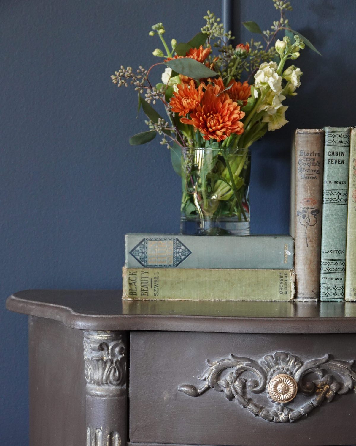
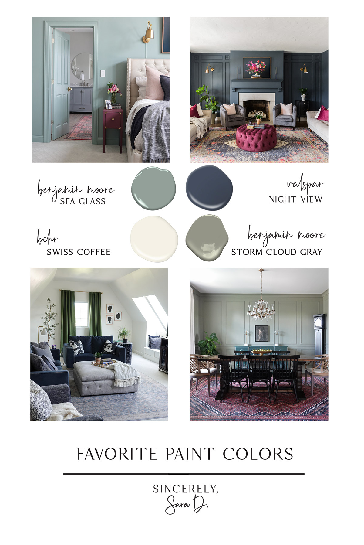
I appreciate and admire warm, neutral home decor, but I personally crave and use bold color in our home. Today I’m sharing my current favorite interior paint colors and the color palette in our home.
Favorite Interior Paint Colors:
Sea Glass by Benjamin Moore
Night View by Valspar
Swiss Coffee by Behr
Storm Cloud Gray by Benjamin Moore
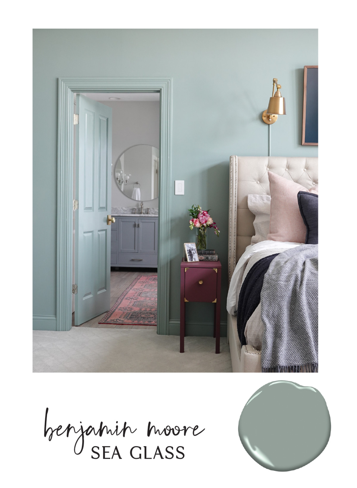
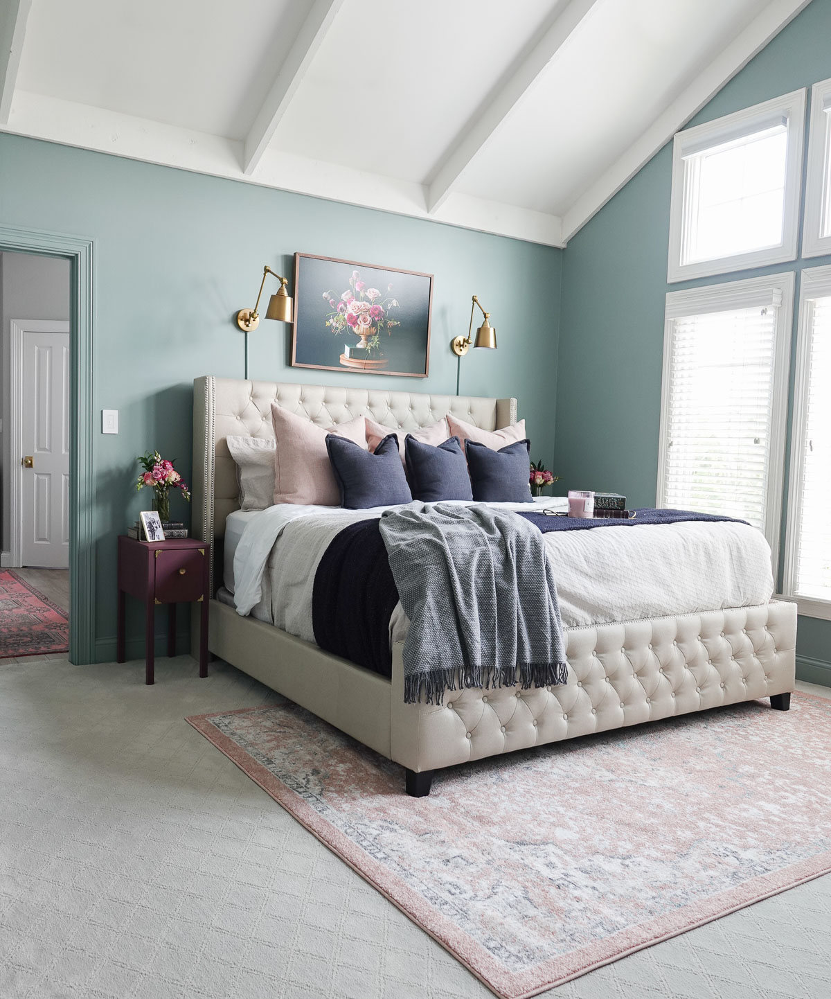
Sea Glass by Benjamin Moore
This color doesn’t photograph well – it is much more beautiful in person. It is a tricky color in that it changes from looking more blue in the evening and more green with lots of natural light. It is, however, a very relaxing color and perfect for a bedroom or bathroom. It also makes a great accent color, and I’ve noticed similar colors are being announced as next year’s color of the year.
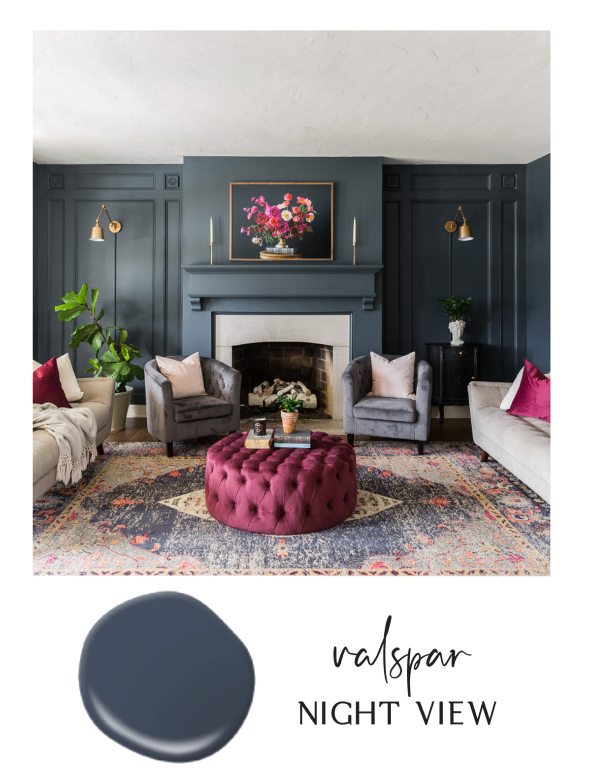
Night View by Valspar
I have had Night View in our living room for years, and it is the perfect navy. It is sophisticated and rich and looks beautiful paired with deep pinks and burgundy. This color really would work well in any space, but make sure you have plenty of natural light unless you are okay with a darker space.
Swiss Coffee by Behr
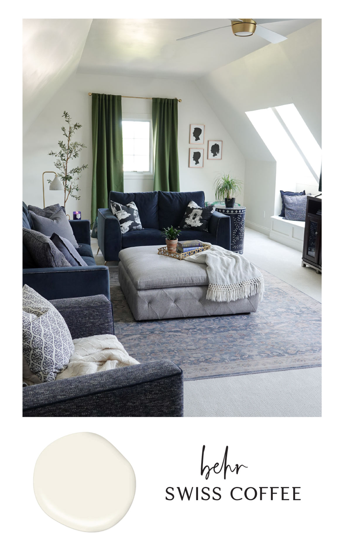
Swiss Coffee is the perfect warm white and a beautiful neutral paint color. It isn’t stark but it also isn’t cream and provides a neutral backdrop. It is welcoming and adds warmth to any space. I have it in our family room, stairway, and all throughout hallways. This color would also work well on trim and cabinetry and can be used with any accent color.
Storm Cloud Gray by Benjamin Moore
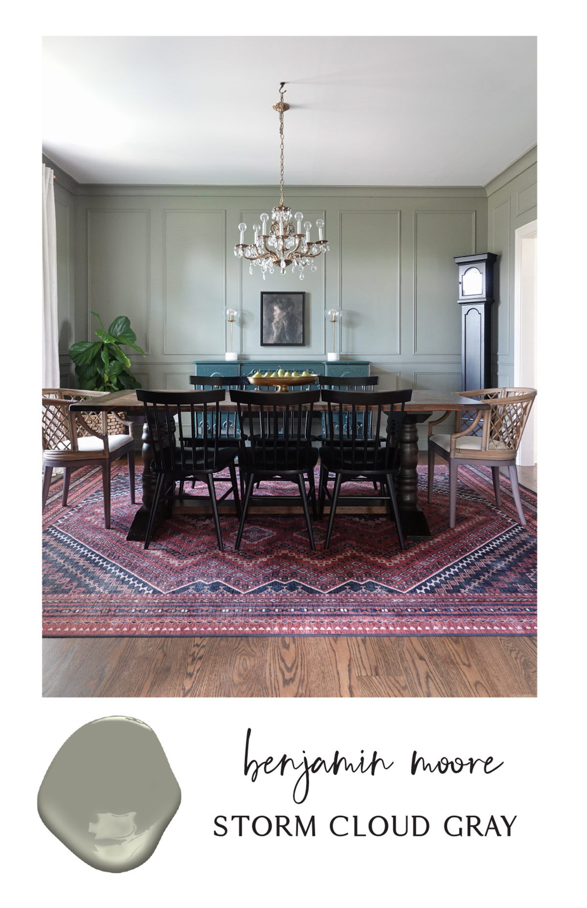
Despite the name, Storm Cloud Gray has strong green undertones. If you love moody colors, this paint color is for you. It is a very sophisticated color and works well in dining rooms and bedrooms. I like to pair it with other shades and pops of greens as well as pinks and burnt reds.
Have you used any of these paint colors in your home? What color trends are you loving right now?
Go create something!
Are you new to my blog? Go HERE to see my home tour and HERE to shop for items I use in our home.
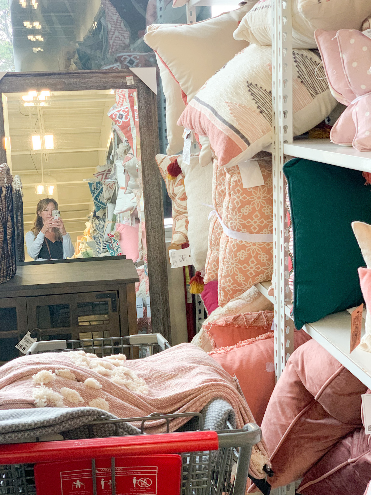
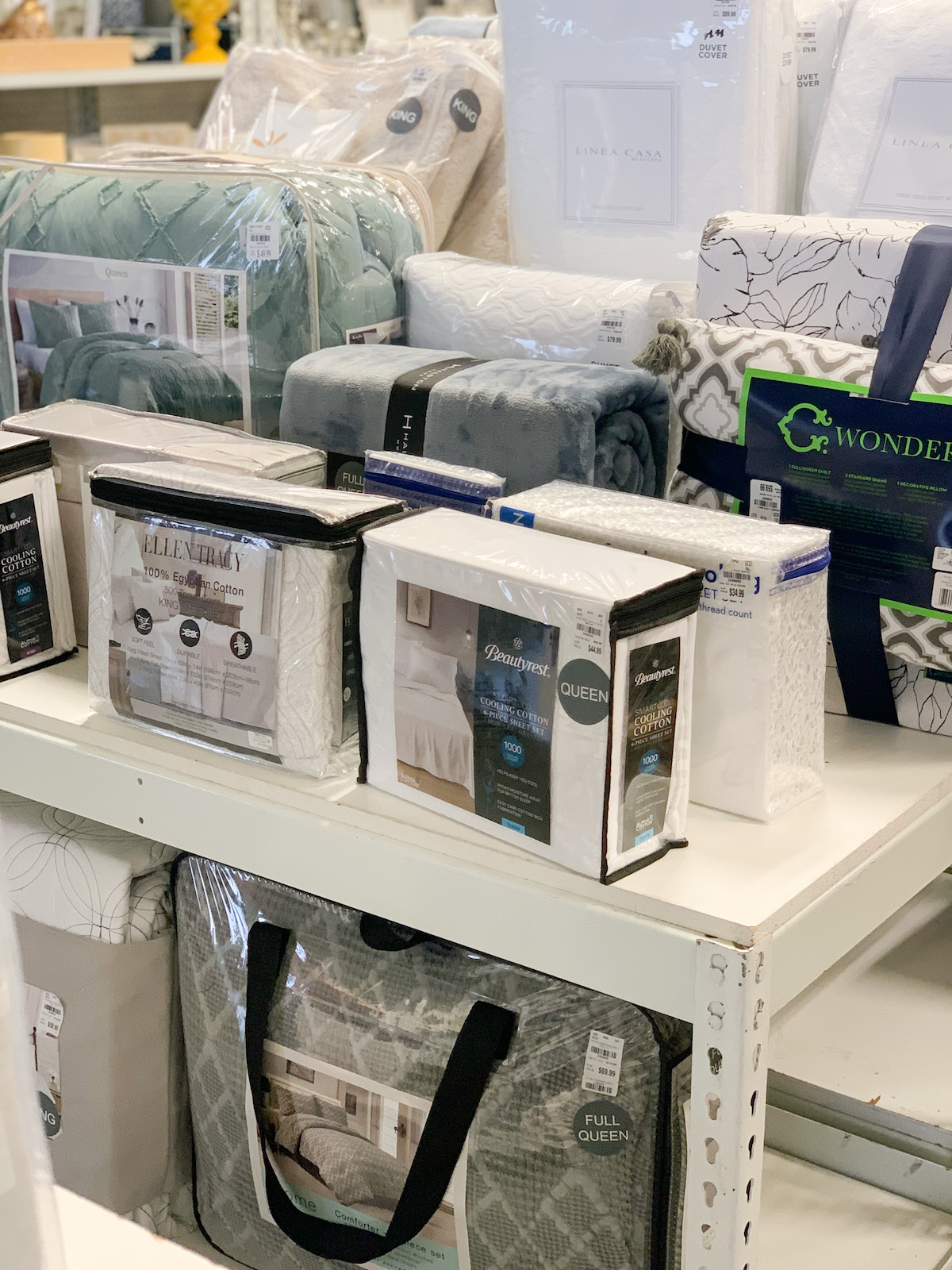
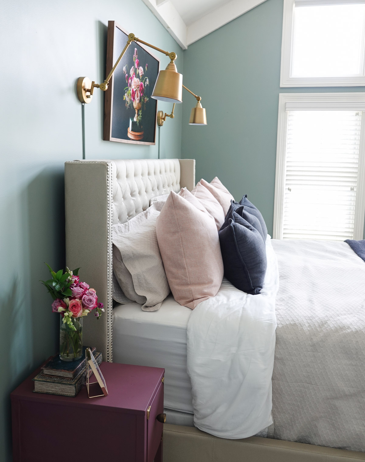
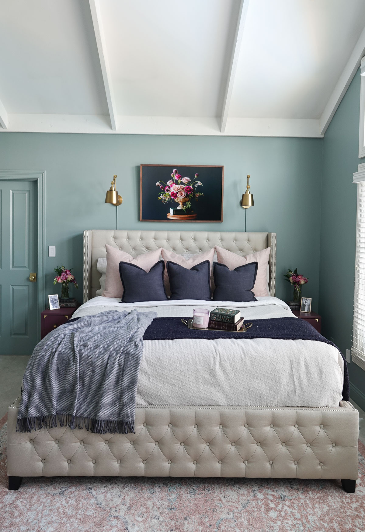
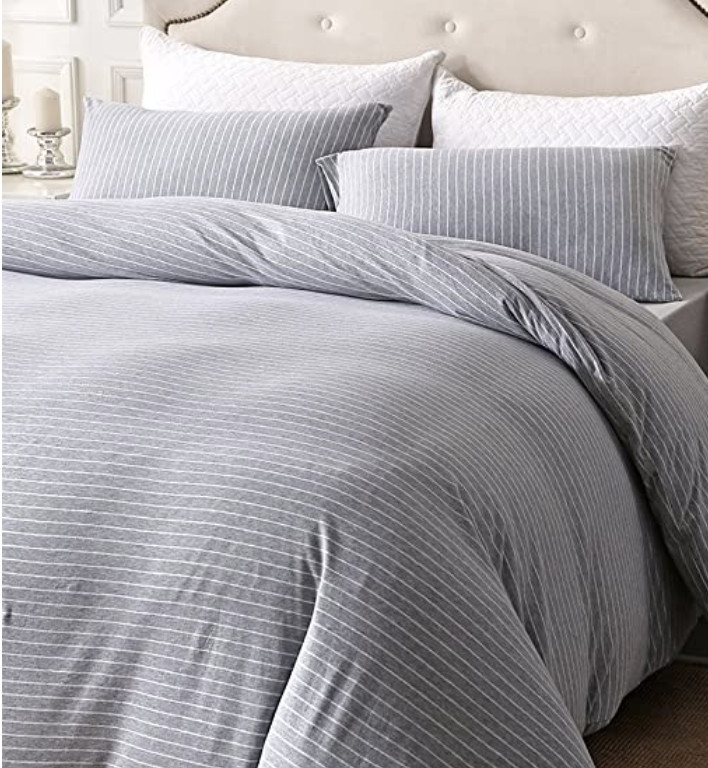
We spend about a third of our lives sleeping, so we should not only have comfortable beds but beautiful beds as well. Here are 4 steps to How to Make a Beautiful Bed, and you can find everything you need at Tuesday Morning.
This post is a sponsored post by Tuesday Morning. I take pride in reviewing only products that fit my brand and will be beneficial to my readers. And while this post is sponsored, all the opinions are my own.
Tuesday morning has great deals (20-60% less than department stores) and high-quality brand-name items so you can create a beautiful bed without spending a fortune.
Tuesday morning has everything you need to make a beautiful bed. They offer a huge variety of throw pillows, sheets, blankets, sheets, comforters, and duvets at amazing prices.
I love to create a high-end look without spending a fortune, and Tuesday Morning is the perfect place to shop. I found so many things to create a beautiful bed.
How to Make a Beautiful Bed:
1. Hide the Box Spring.
If your box spring is visible, cover it with a fitted sheet or bed skirt. A fitted sheet is great if your bed has a platform, but if under your bed is visible, try a bed skirt. We all have used under the bed to hide things, and a bed skirt tidies it all up just by hiding it!
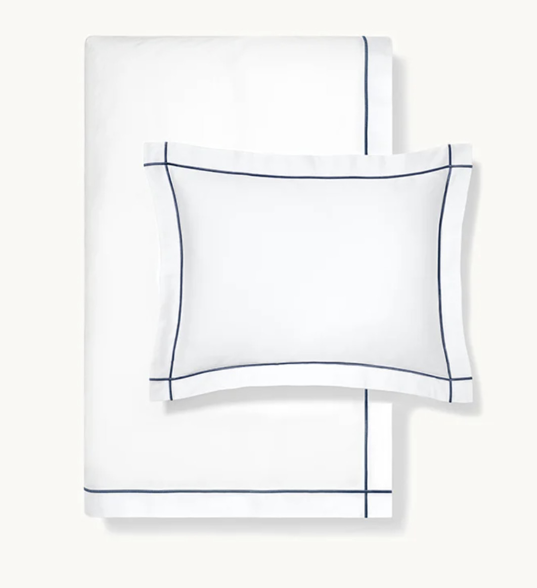
2. Use Sheets that Fit.
Select sheets that fit your bed, and make sure to pull the fitted sheet all the way around the mattress so you have a tight fit (don’t allow any part of the mattress to be visible). Not only does this look nice, but it makes sleeping much more comfortable.
Also, if you have sheets with a pattern, make sure the flat sheet is patterned size DOWN. You’ll want to fold that sheet back.
Layering not only provides the option for the perfect sleeping temperature, but they provide all the elements needed to make a beautiful bed. There are so many options:
Duvet – A duvet is a quilted blanket filled with a natural or synthetic filling (down or down-alternative) and is protected by an interchangeable cover.
Comforter – A comforter is one complete, quilted piece.
Quilt – A quilt is comprised of three layers—two layers of fabric with batting in between—stitched together, often with a decorative design.
Coverlet – A coverlet is a bed covering with sides that hang down a few inches past the box spring, but don’t touch the floor.
Blanket – A blanket is any bed covering thicker than a sheet, including quilts, duvets, and comforters.
Throw Blanket – A throw blanket is a small decorative blanket, often that are used for extra warmth when lounging on top of the bed.
While a comforter is essentially a thick, one-piece quilted blanket that tops your bedding, a duvet is an insulated sewn bag that you wrap with a cover so that the duvet stays clean
Layers allow for various patterns, colors, and textures.
4. Layer Pillows
As with layering blankets, layering pillows allow for a comfortable night of rest and also make a beautiful bed complete. I hide my sleeping pillows behind my pillow shams and like to add two more layers of pillows. Again, this allows you to play around with different colors, patterns, and textures.
For a king-size bed, I love to play with throw pillows in threes. However, for smaller beds, try adding pillows in doubles. Repetition is great for those who love the look of order.
Tuesday morning has several options for hiding those box springs, a huge variety of sheet options, and plenty of throw pillows and blankets so you can create your own beautiful bed.
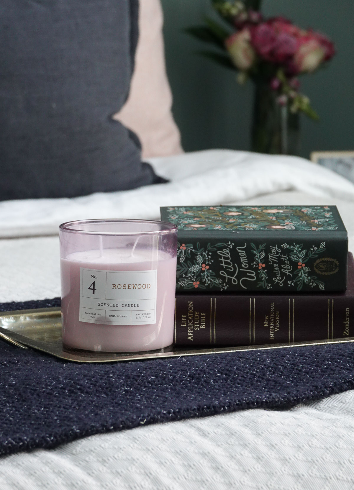
Tuesday Morning also has lots of other home decor items (go here to see what I found for my kitchen) like frames, vases, and these vintage-looking books that provide storage.
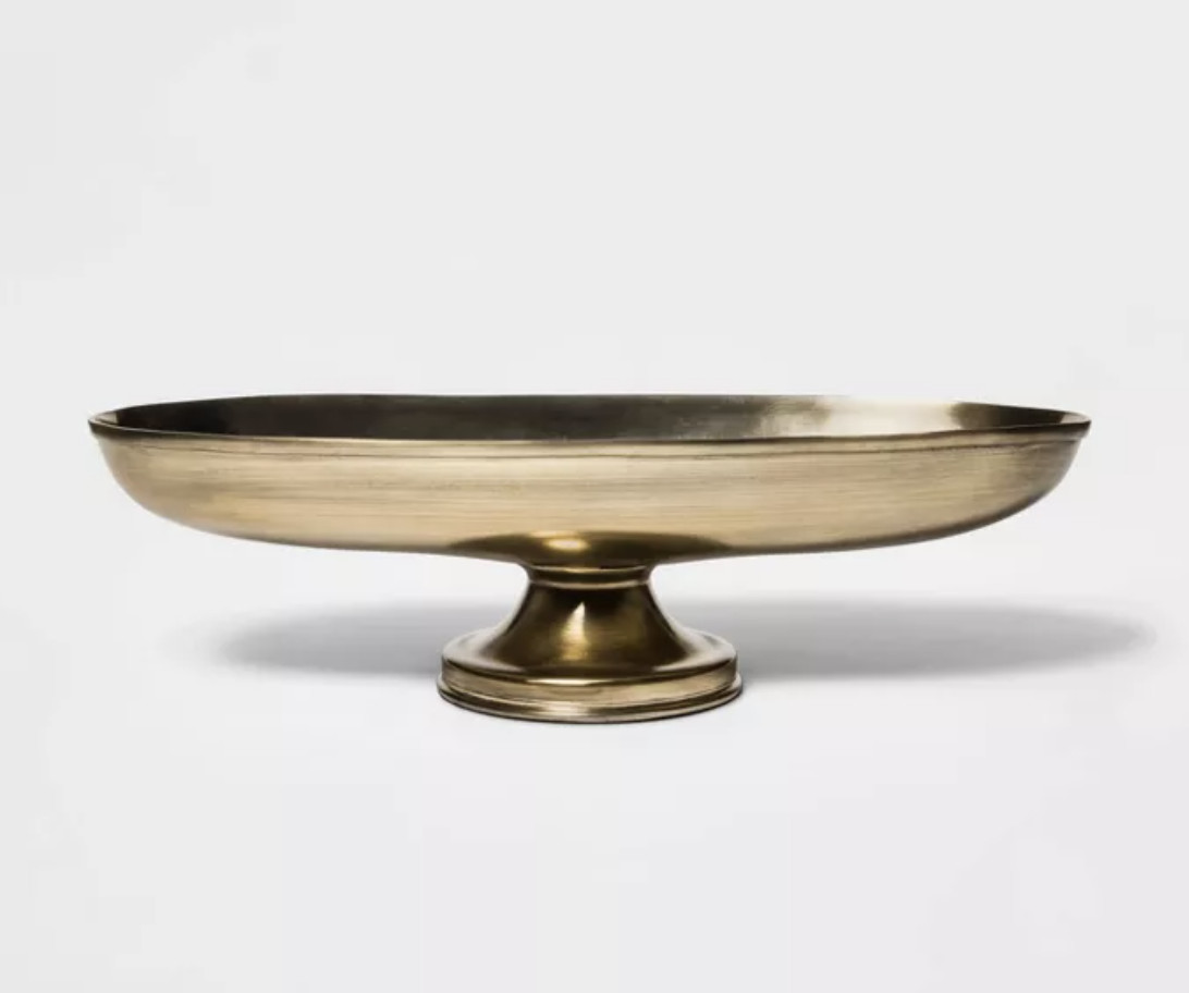
I also found this cute brass tray and rose-scented candle from Tuesday Morning.
I’d love to know – what are some of your favorite Tuesday Morning finds?
Go create something!
Are you new to my blog? Go HERE to see my home tour and HERE to shop for items I use in our home.
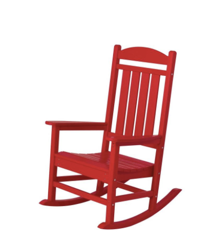
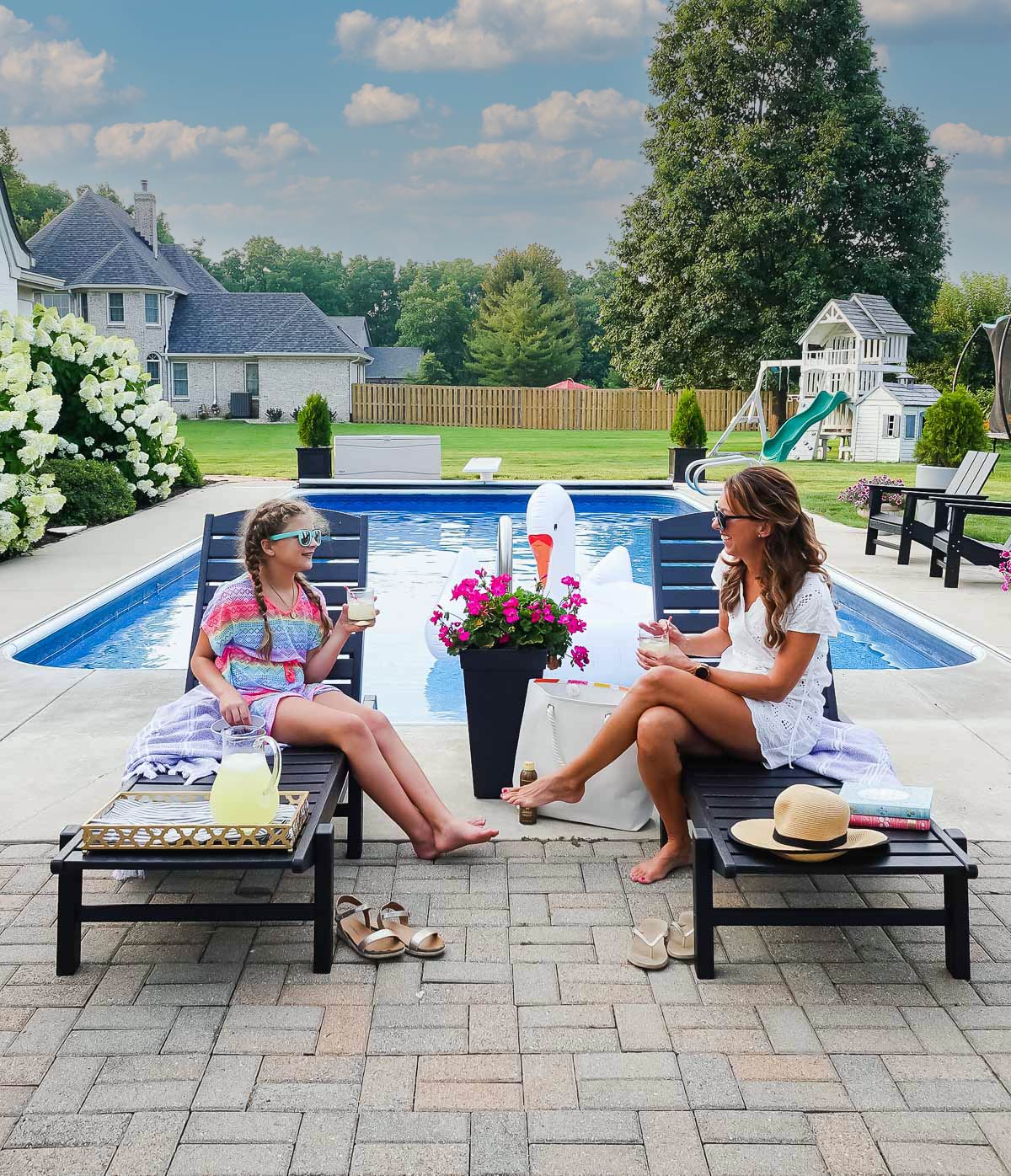
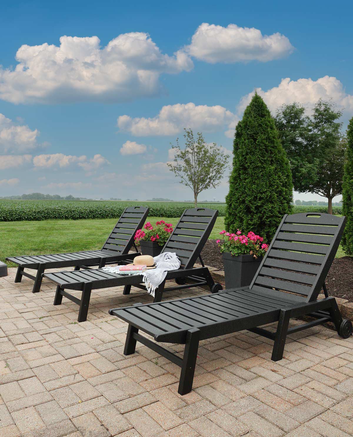
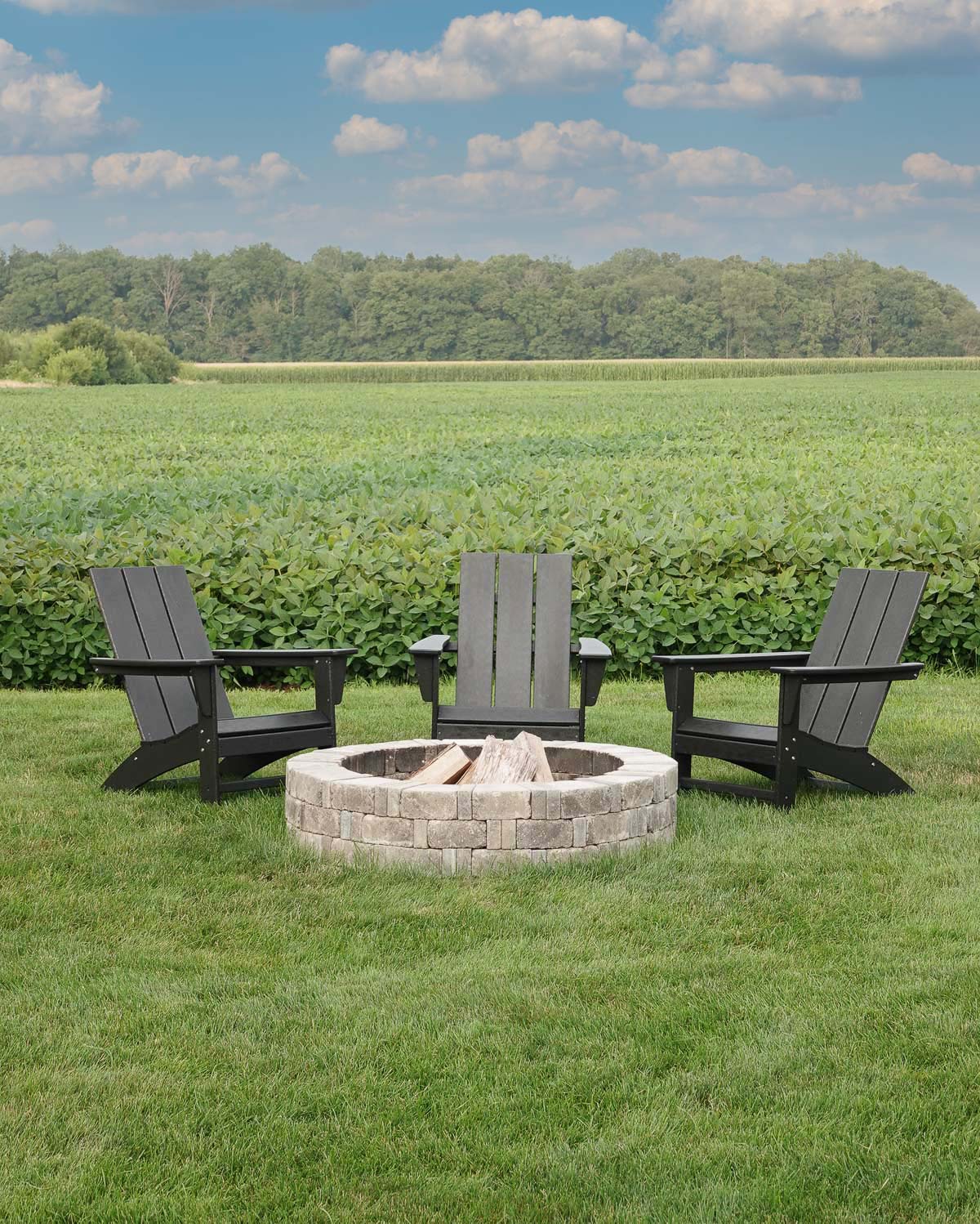
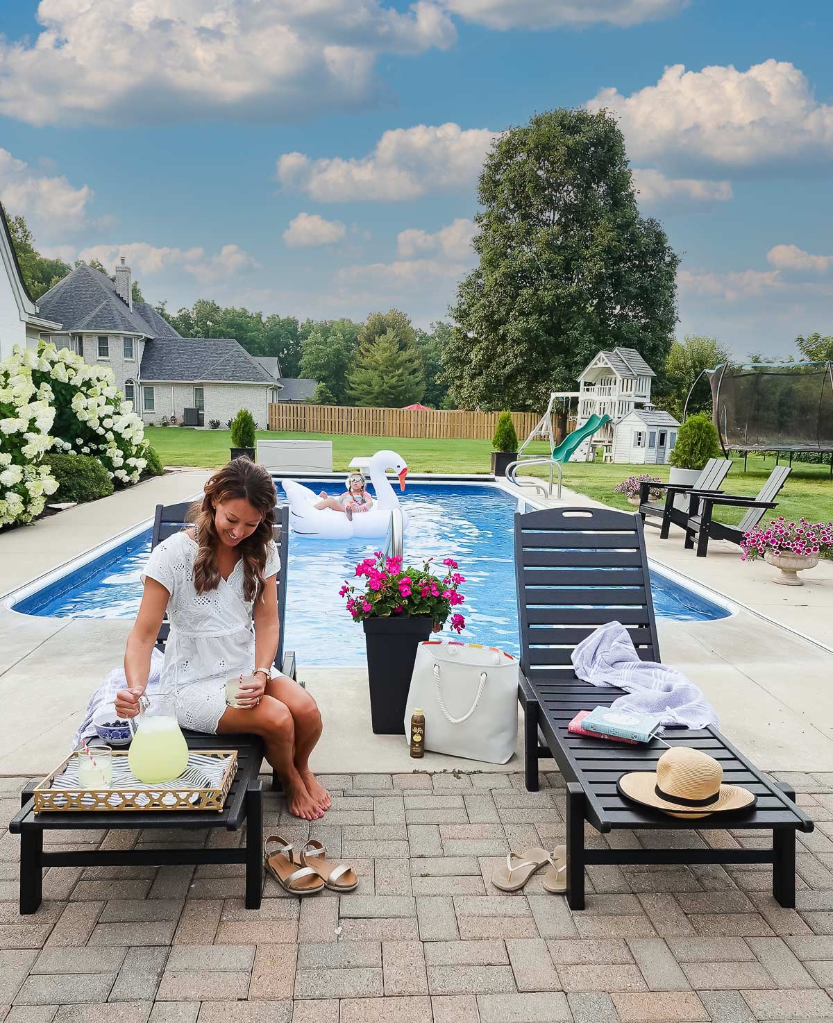
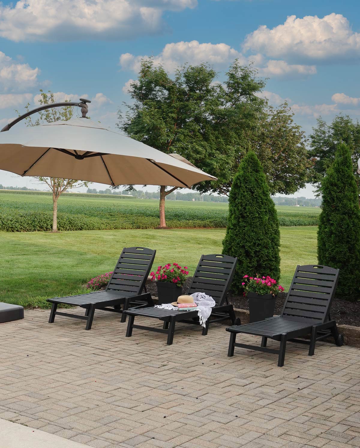
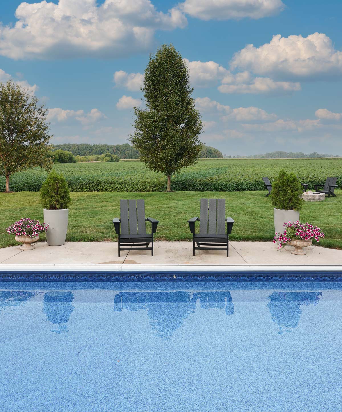
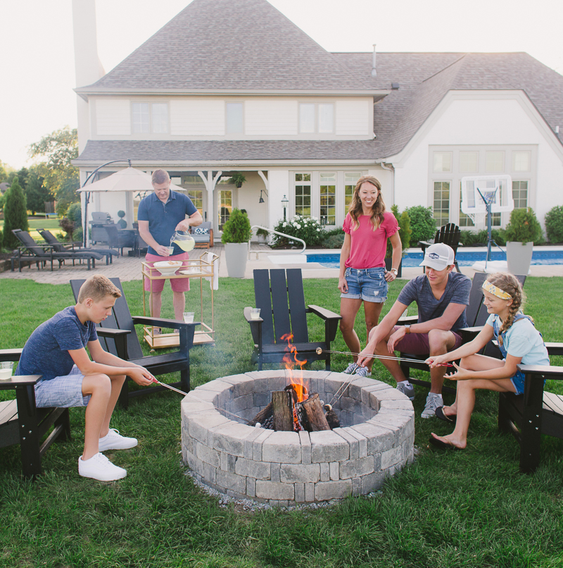
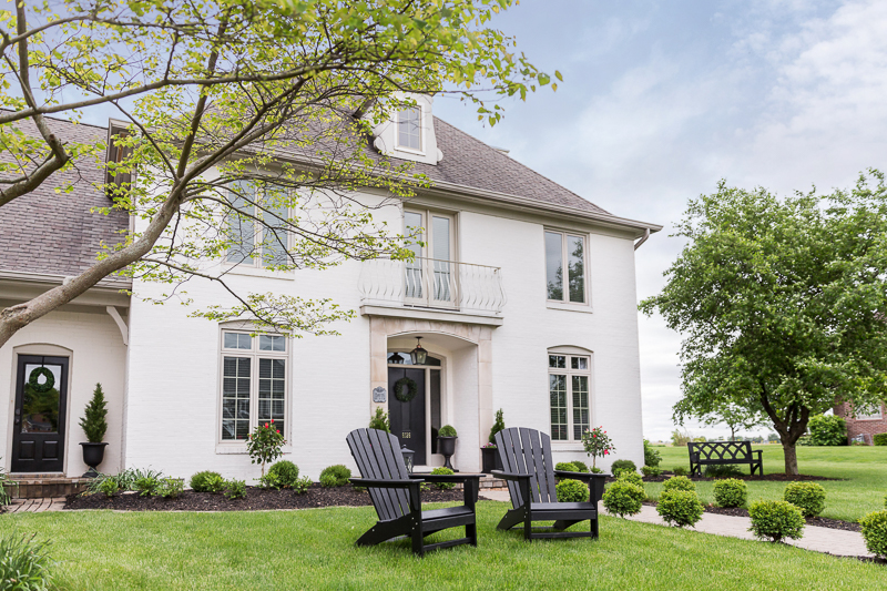
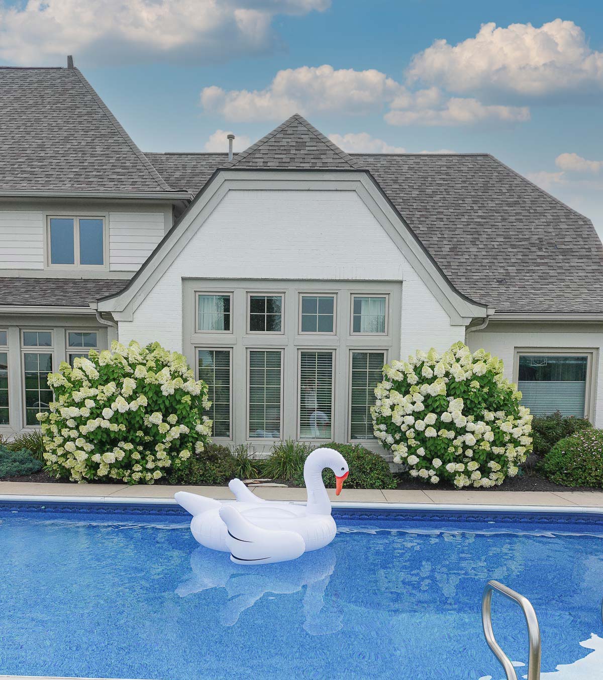
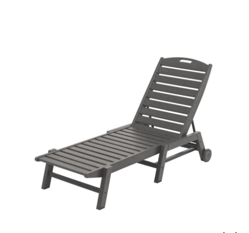
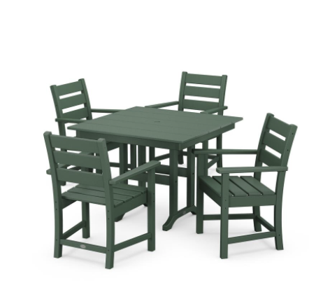
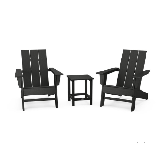
For the past three years, I have been adding POLYWOOD furniture to our outdoor living spaces, and POLYWOOD is the best outdoor furniture. This furniture is amazing and worth the investment.
POLYWOOD requires no maintenance, is sturdy, eco-friendly, and comes in a large selection of colors and styles.
This is a sponsored post written by me on behalf ofPOLYWOOD. All opinions are 100% mine. Thank you for supporting the brands that allow me to create unique content while featuring products I love!
Why POLYWOOD is the best outdoor furniture:
Low Maintenance
We live in Indiana, and we have very harsh winters with plenty of snow and ice. In the past, I have had to spend my spring repainting and restaining outdoor furniture. However, my POLYWOOD sits outside all winter long and still looks amazing and requires no maintenance from me — no painting, staining, or waterproofing.
Sturdy
POLYWOOD outdoor furniture is made from high-density polyethylene (HDPE) that replicates high-quality lumber in dimension, weight, and strength. The furniture is cut and assembled just like the wood versions with the only difference being the use of RPL.
Eco-Friendly
POLYWOOD is made in America (Syracuse, IN and Roxboro, North Carolina), and its product is made from recycled plastic bottles. POLYWOOD was the first to create outdoor furniture from recycled plastic materials. Their mission is to recover and transform landfill-bound and ocean-bound plastic (POLYWOOD recycles an average of 400,000 #2 plastic containers per day) into durable outdoor furniture that will last for generations, and their product comes with a 20-year warranty.
Large Selection of Colors and Styles
I selected a more traditional look and color for our home, but POLYWOOD offers a large selection of colors and styles including blue, teal, tangerine, red, sand, mahogany, lime, lemon yellow, green, black, Aruba blue, slate grey, and white.
I love the look of the classic black, and so far we have seen no fading with the color (and we’ve had POLYWOOD chairs in our front for three years).
We also have POLYWOOD Adirondack chairs in our front yard (see more on the front yard HERE), and they look as good as the first day we got them (three years ago)!
And on a completely separate note, check out my limelight hydrangeas! They are the easiest things to grow and make your yard look amazing!


