Decor

Beautiful Cabinet Color

Beautiful Cabinet Color

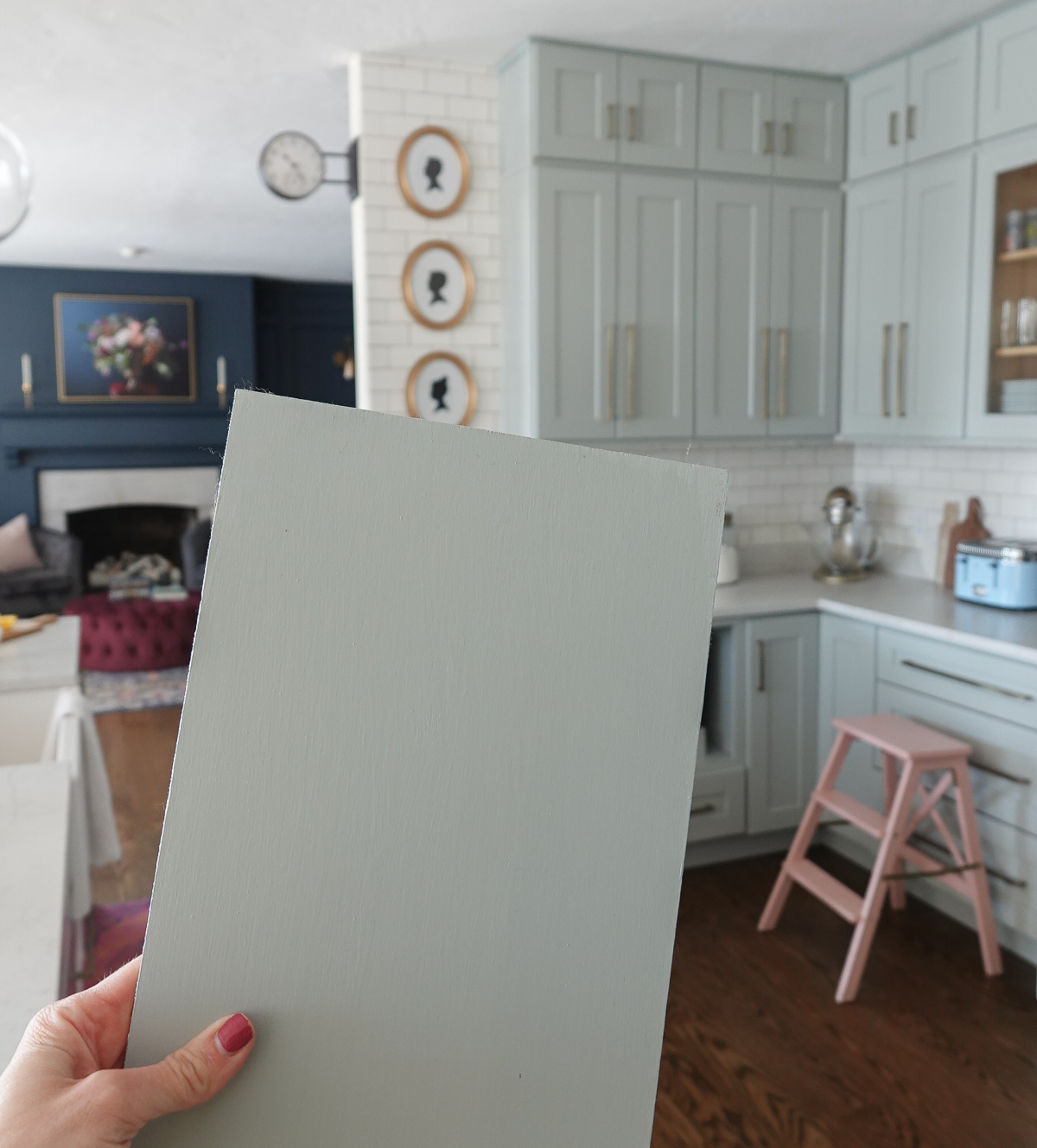
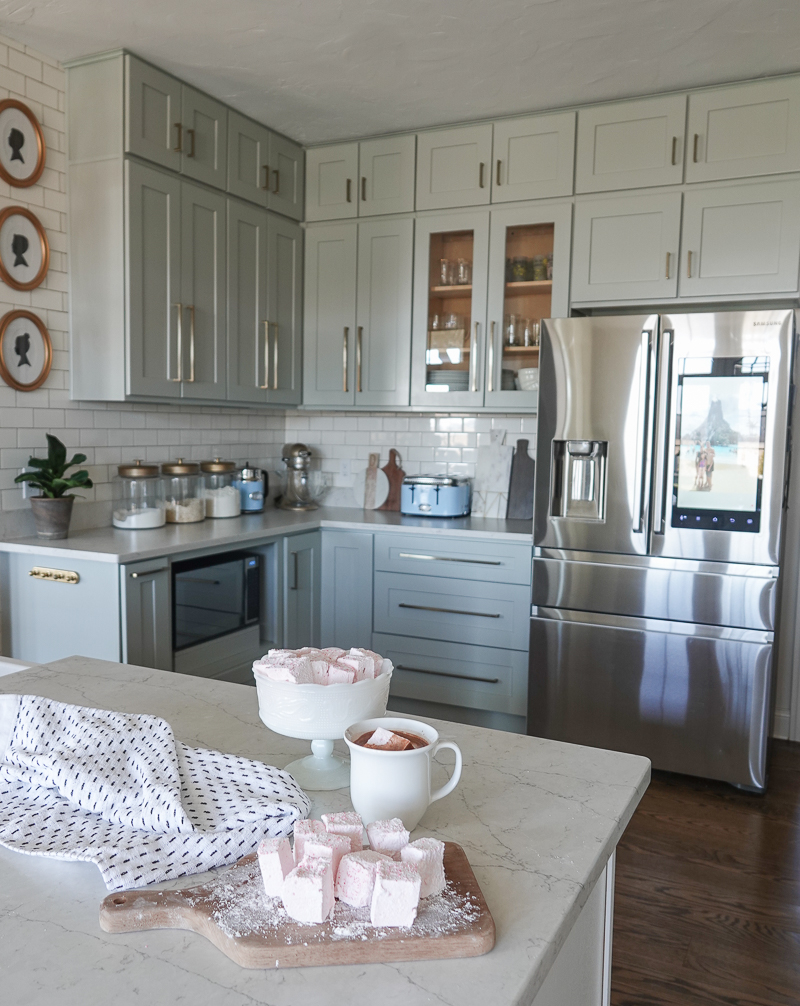
I am asked all the time about the color of our kitchen cabinets. Unfortunately our cabinets came finished in this beautiful cabinet color, and although I had them color-matched, I was never able to direct you to a specific brand or color – until TODAY!

I partnered with Amy Howard Home to share their Color of the Month, and I was thrilled when I opened up the can.

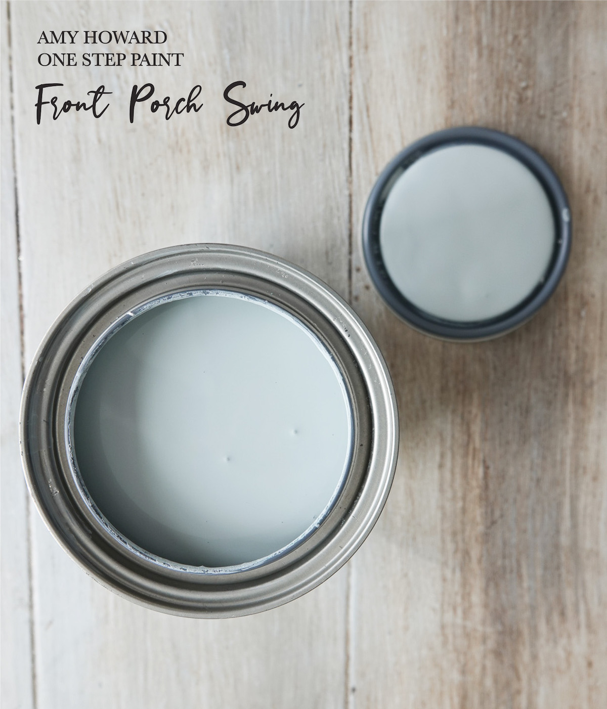
This month’s Color of the Month is Front Porch Swing, and it is a beautiful, bluish-gray which is almost an EXACT match to my kitchen cabinets!

In order to gain access to this color and any of the past colors, you will need to join The Color of the Month Club. The Color of the Month Club is a monthly subscription where Color of the Month subscribers will receive a new color every month exclusive to the club.

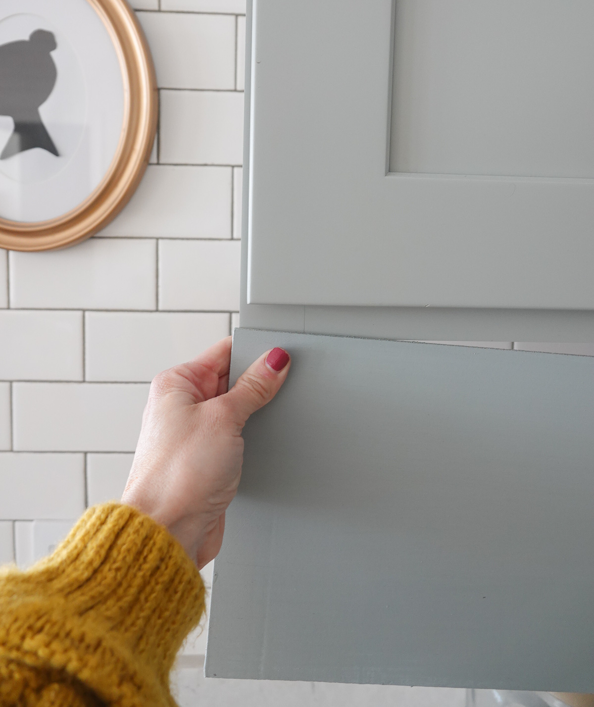
It’s just slightly bluer and a little darker, but it’s REALLY close.

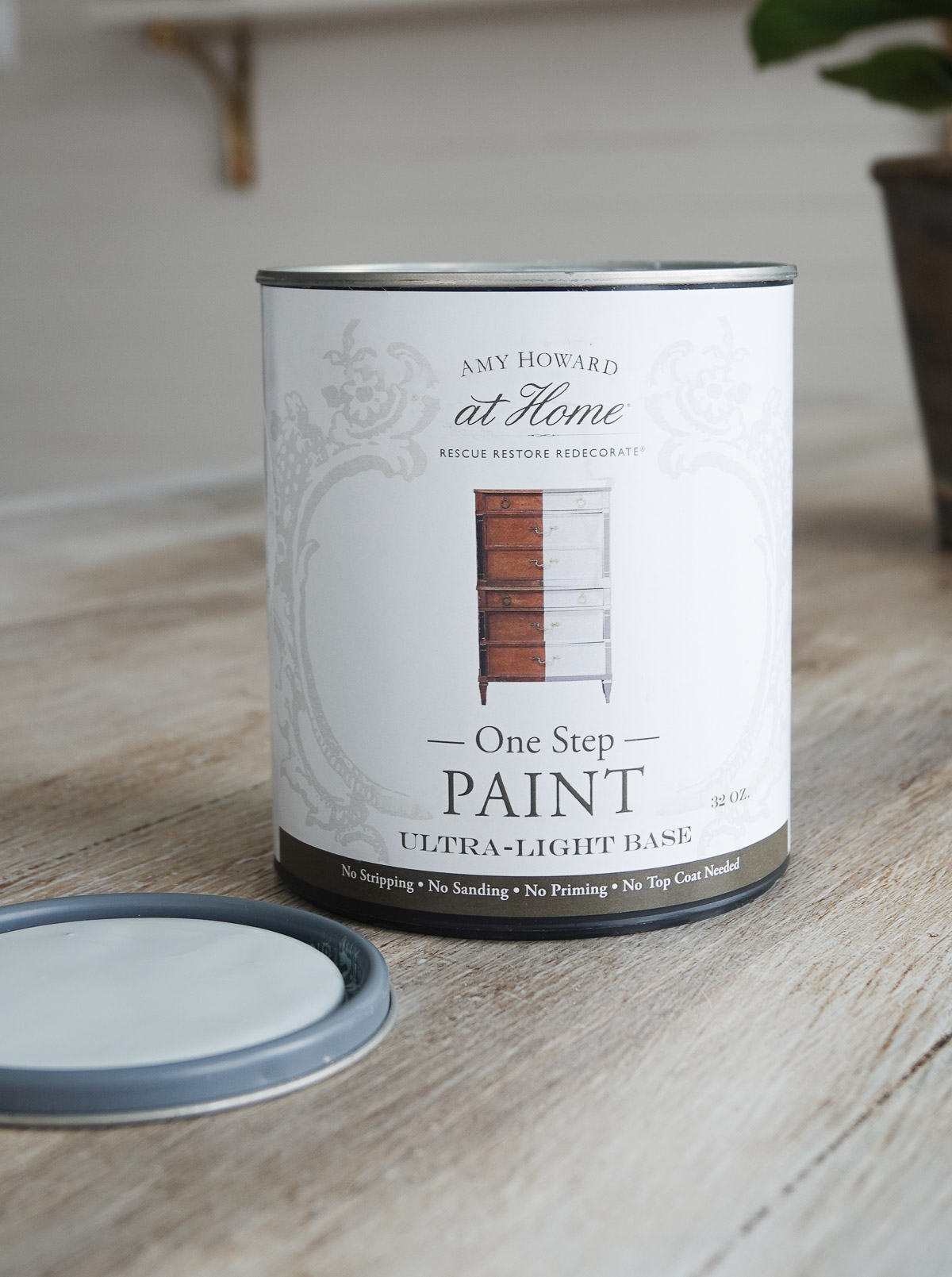
This paint (Amy Howard Home One Step Paint) is like magic. It goes on smooth and requires no sanding, prepping, or priming. I have One Step Paint on our laundry room cabinets, and it has held up so well for years. I like to seal it with this Matte Sealer. One Step Paint is perfect for everyone from beginners to professionals.

This post contains some affiliate links for your convenience. Click here to read my full disclosure policy.

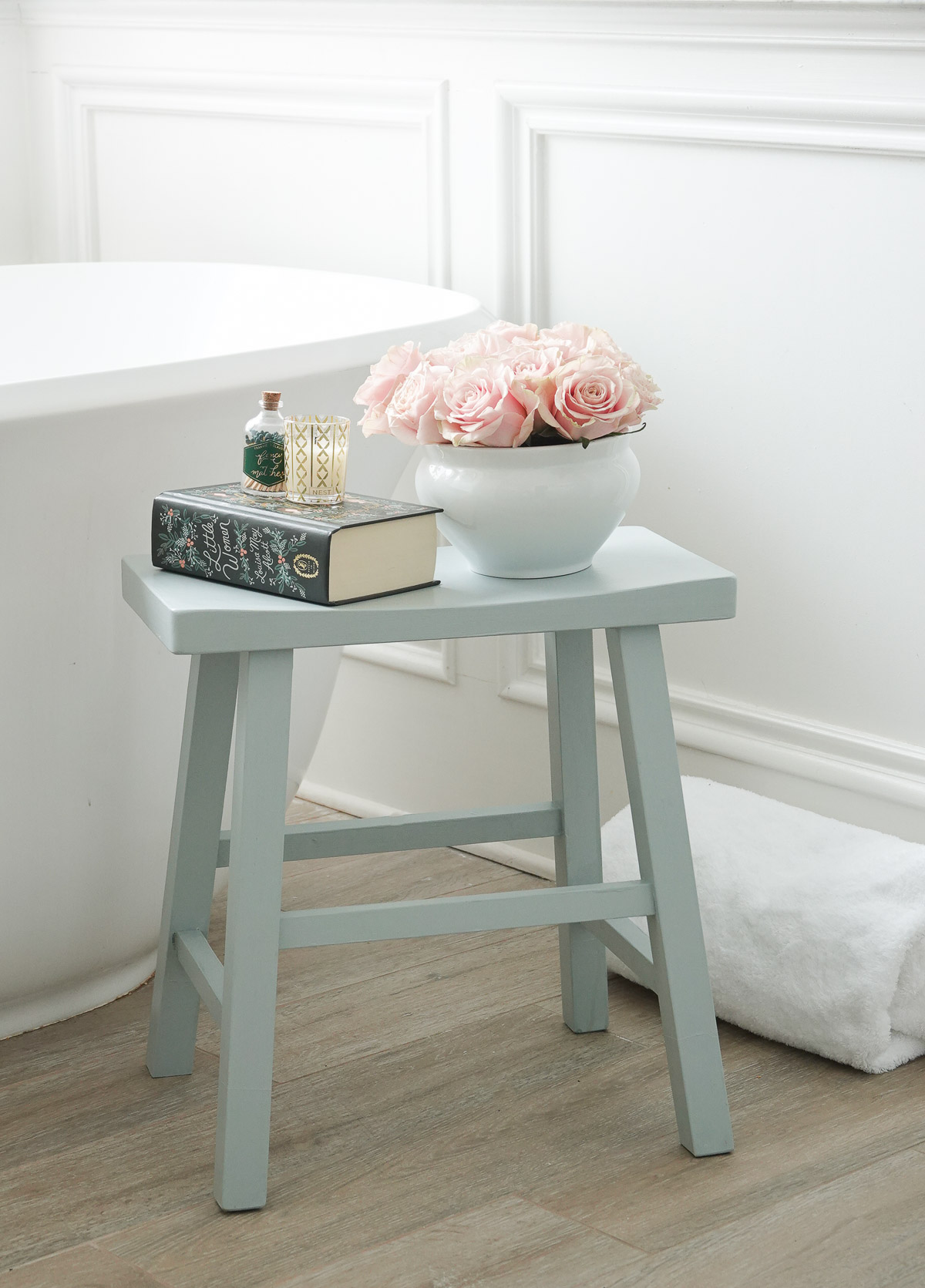
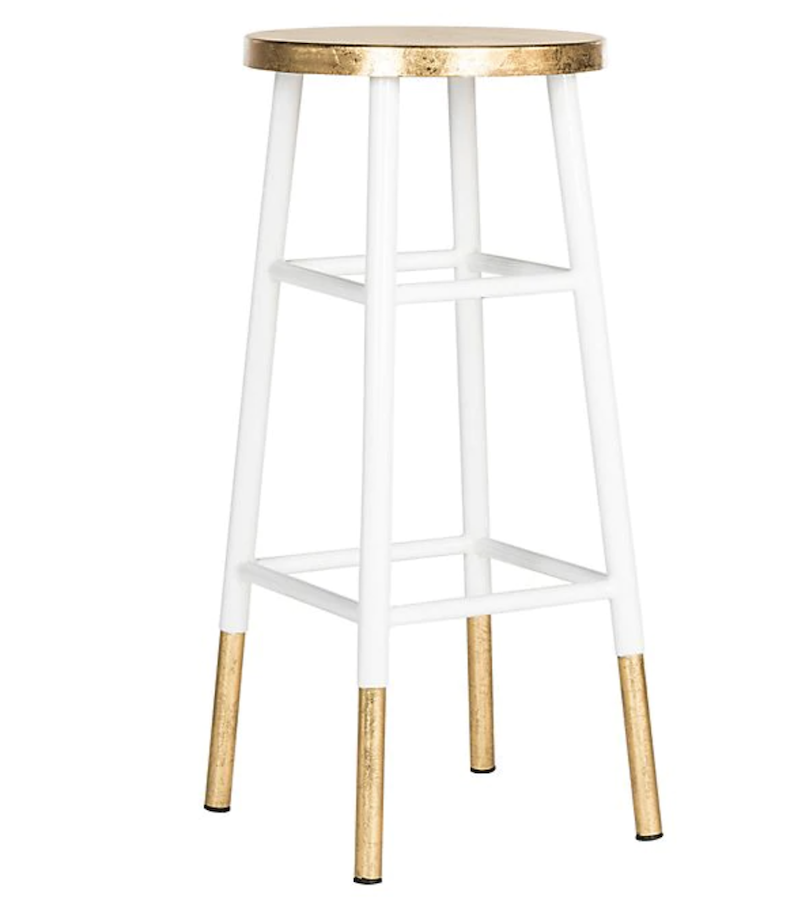
I painted a stool (which you can find HERE) in the color Front Porch Swing, and it is SO pretty!

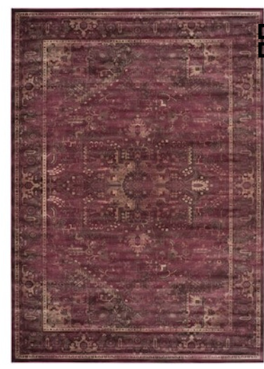
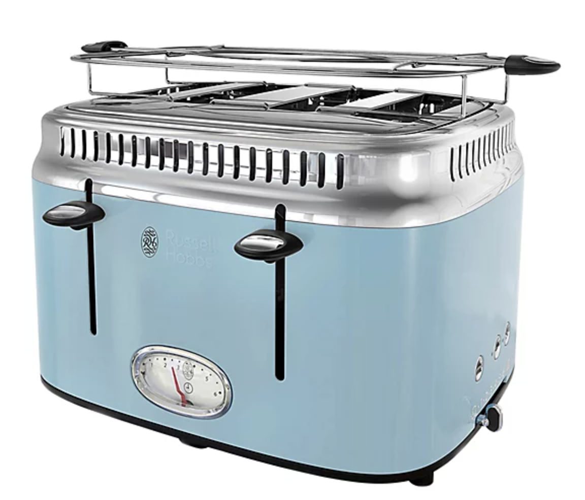
If you’re not already decorating with blue gray, you’ll want to consider adding it into your decor – and possibly even your cabinets since it is a beautiful cabinet color. It’s a color that works with most decor styles and brings calm to any space.

Let’s talk about the color theory behind blue gray.

Blue gray is a simple as mixing a little blue with a little gray.

Image Via The Virtual Instructor

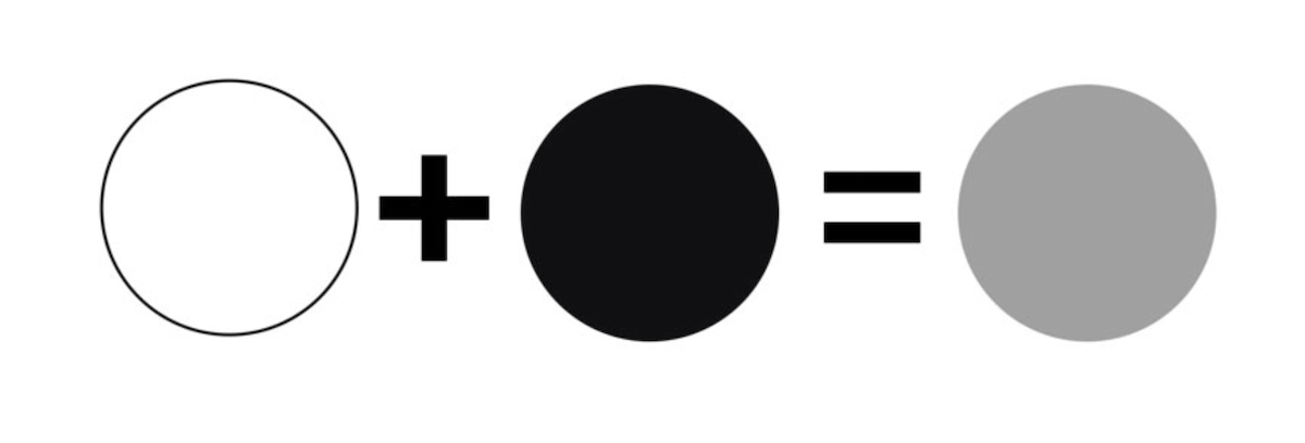
Gray is an intermediate color between black and white. It’s a neutral color or achromatic color that means without color because it’s derived from white and black.

Now, gray doesn’t stop here. There are cool grays (like the blue gray we’re discussing) and warm grays.

Image via The Virtual Instructor

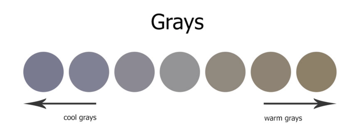
When infused with blue, gray has the ability to take on the hues of these colors in a way that gives gray a completely fresh look.

Blue is the perfect addition gray. It’s a primary color and can build a sense of calm. It’s the most loved color which is why it’s so great for decorating.

History of blues and grays…

A little history behind gray: in the Middle Ages, gray was the color of undyed wool and the most common color worn by the peasants on the poor.

During the Renaissance, gray began to play an important role in fashion and art. Black became the most popular color of the nobility, particularly in Italy, France, and Spain, and grey and white were harmonious with it.

Grey became a highly fashionable color in the 18th century, both for women’s dresses and for men’s waistcoats and coats. It looked particularly luminous coloring the silk and satin fabrics worn by the nobility and wealthy.

The grey business suit appeared in the mid-19th century in London; light grey in summer, dark grey in winter; replacing the more colorful palette of men’s clothing early in the century.

Fast forward to now, and gray has reigned high in home decor for close to a decade now.

Using blue gray in decor

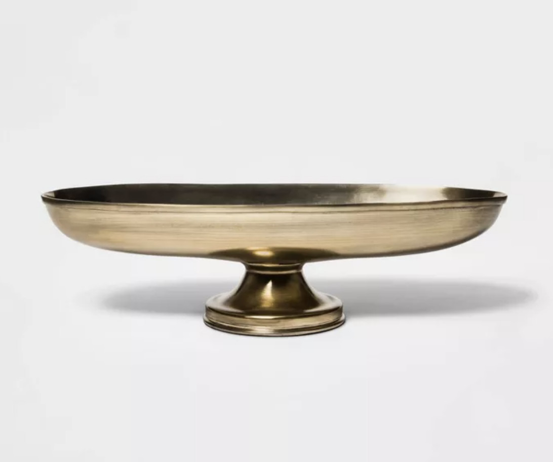
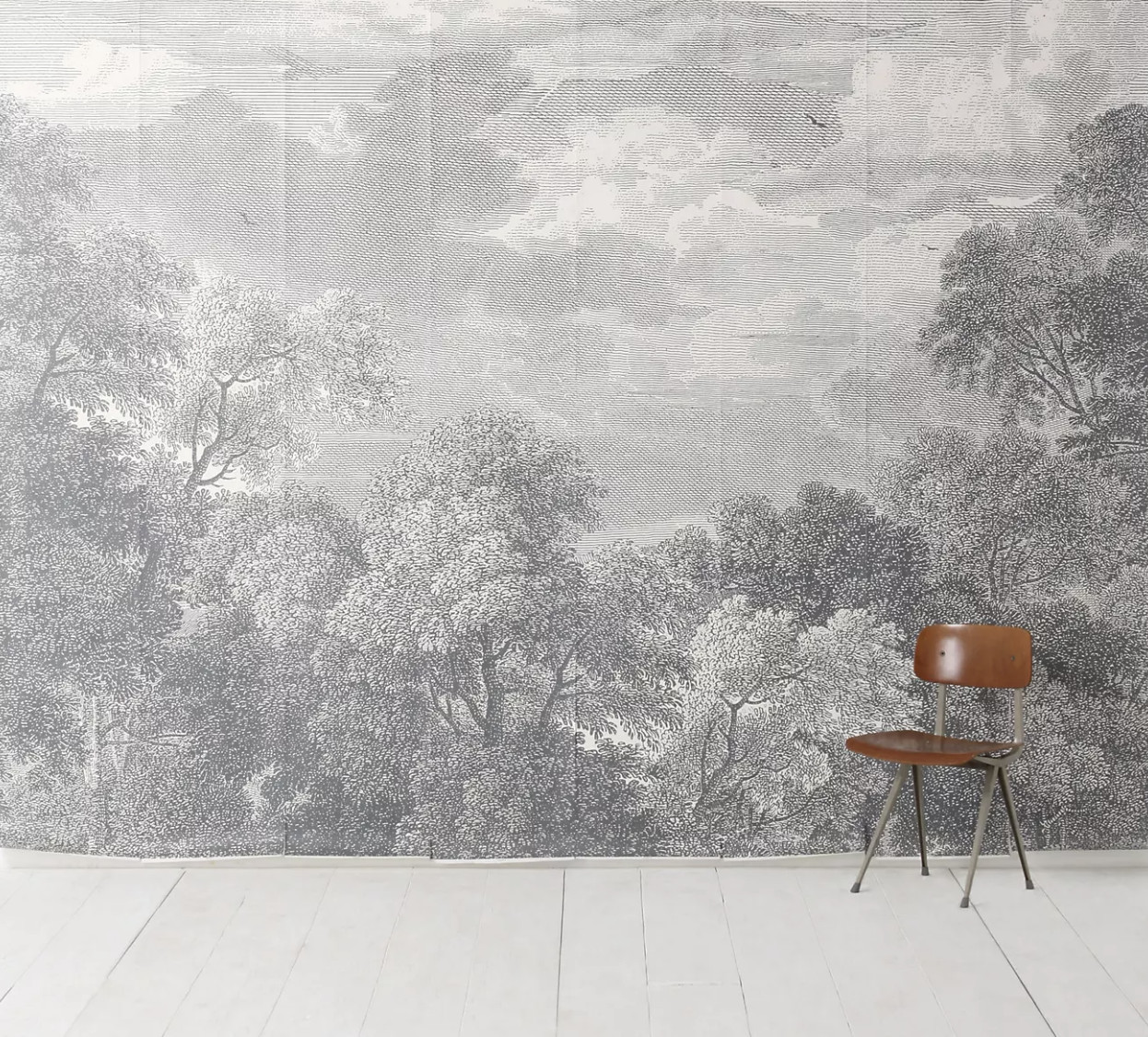
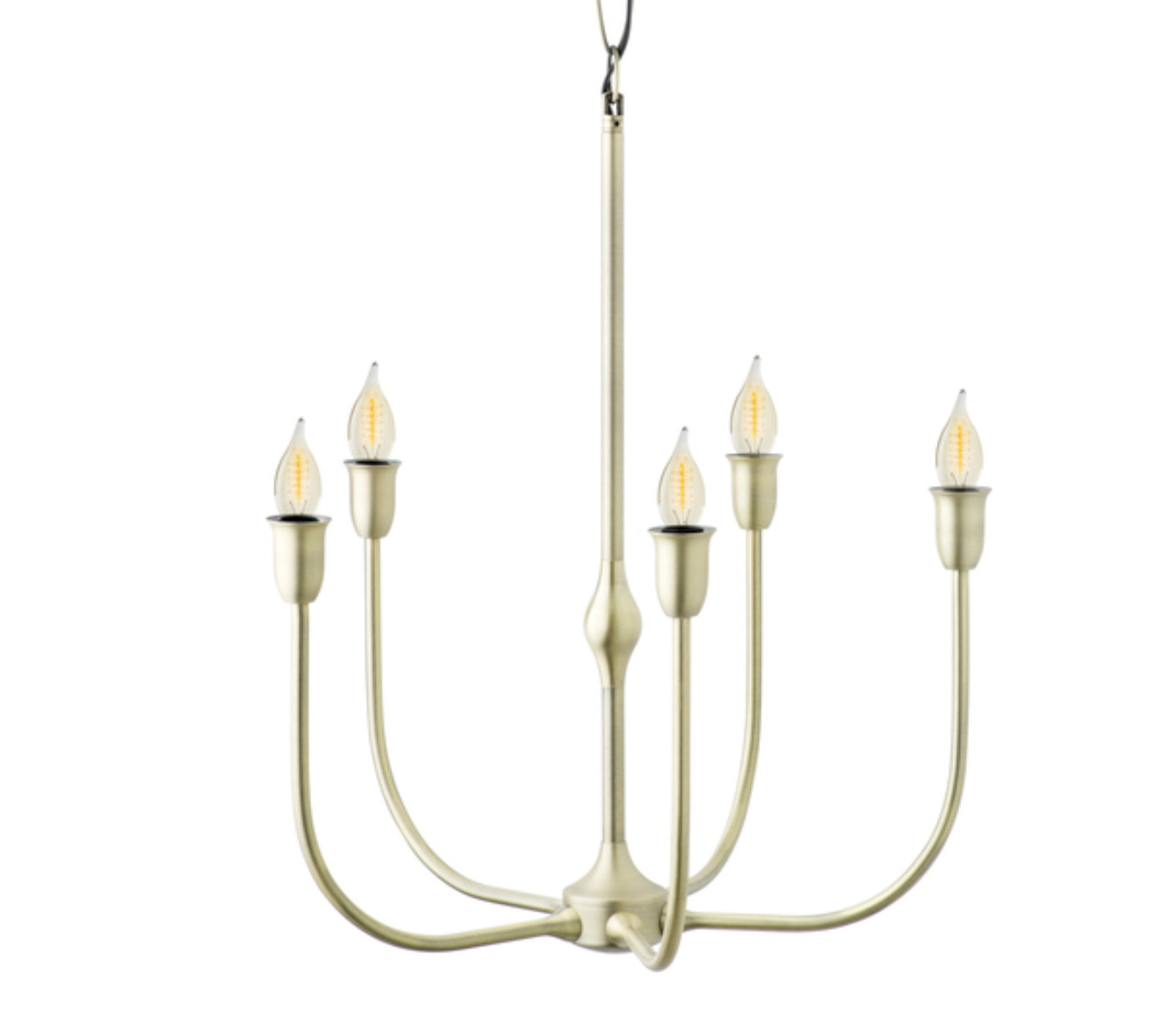
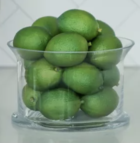
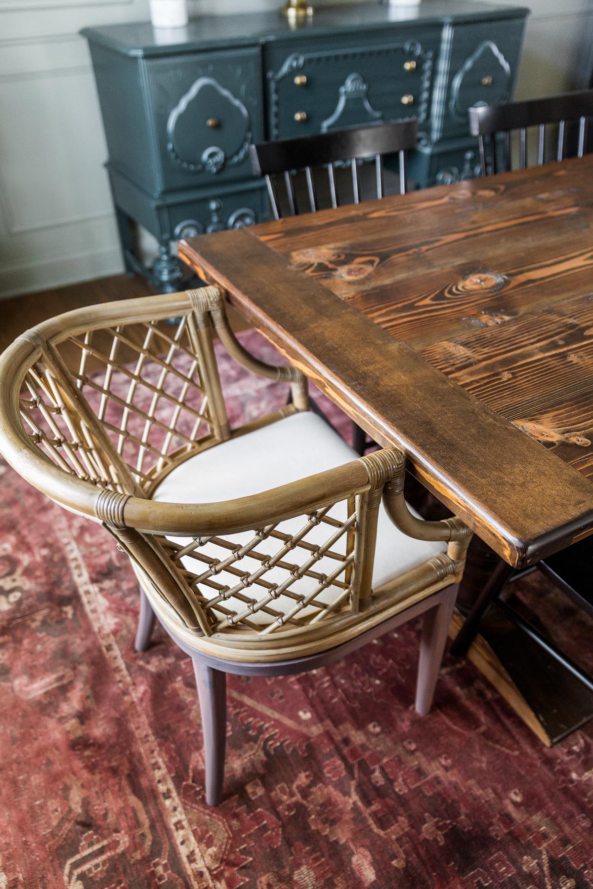
Blue Gray works well with many different colors and your options are really endless since it often acts as a neutral.

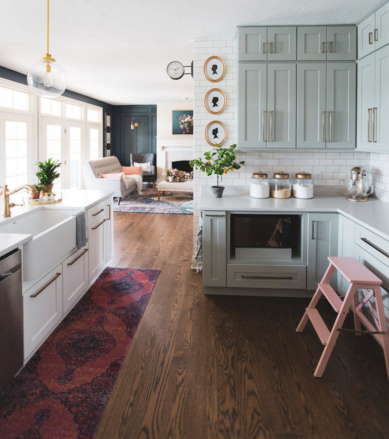
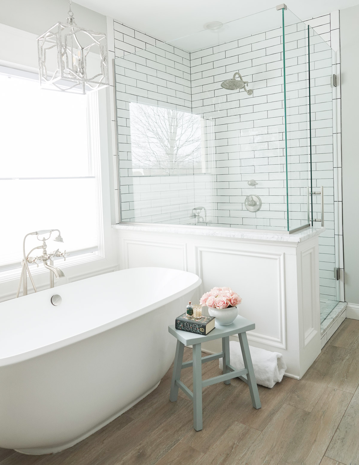
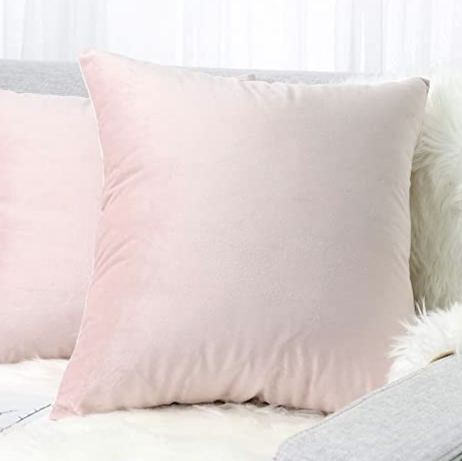
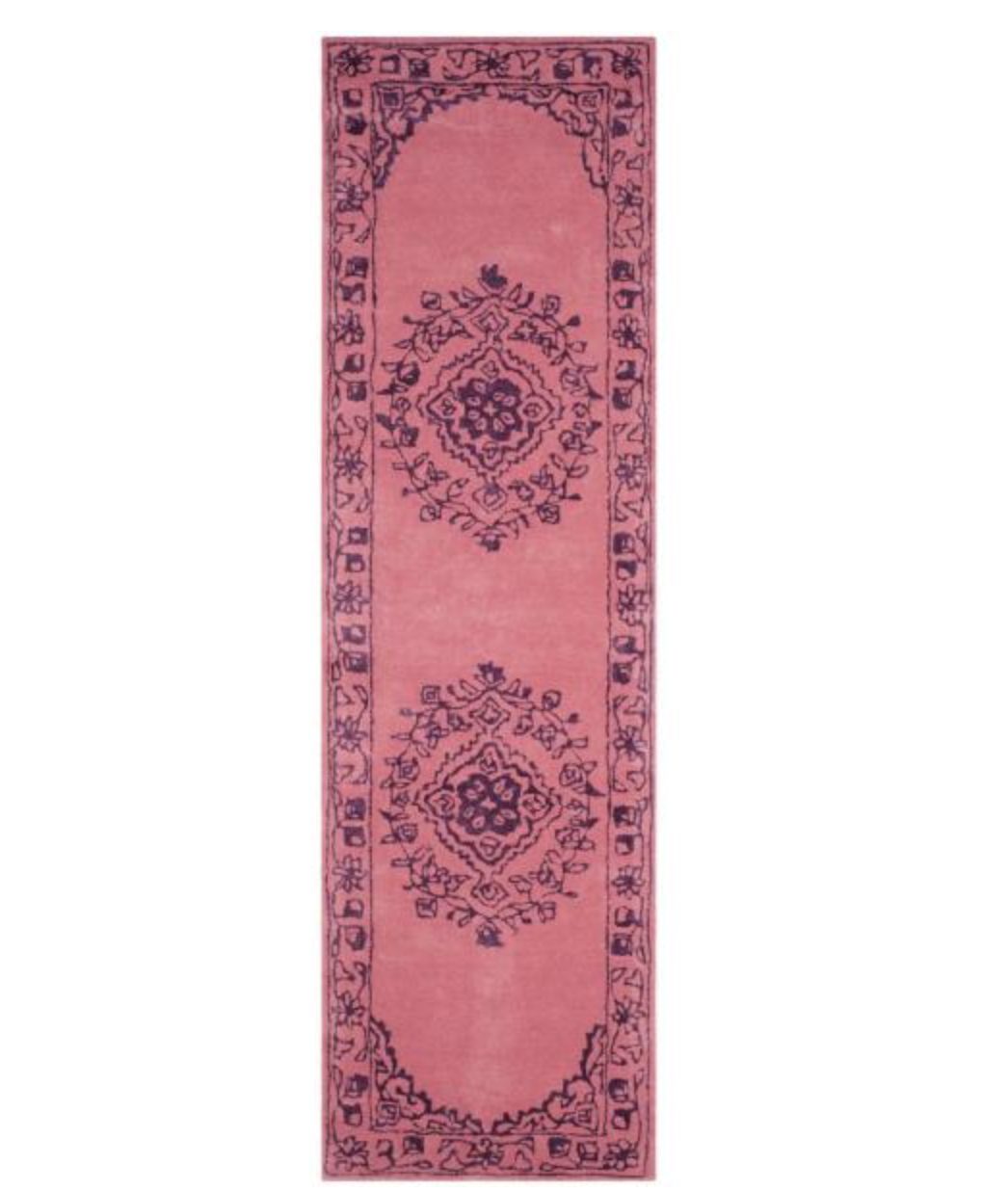
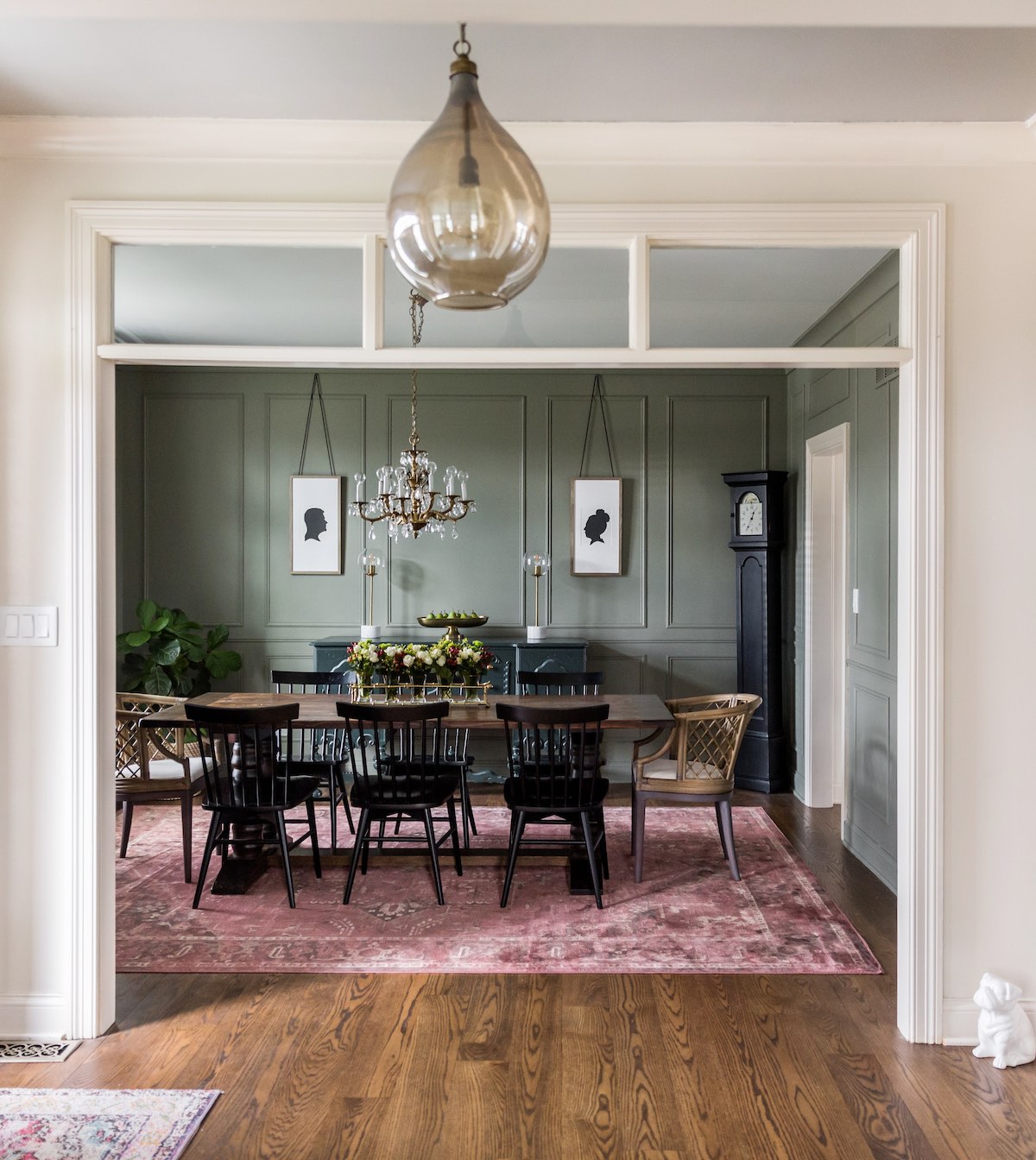
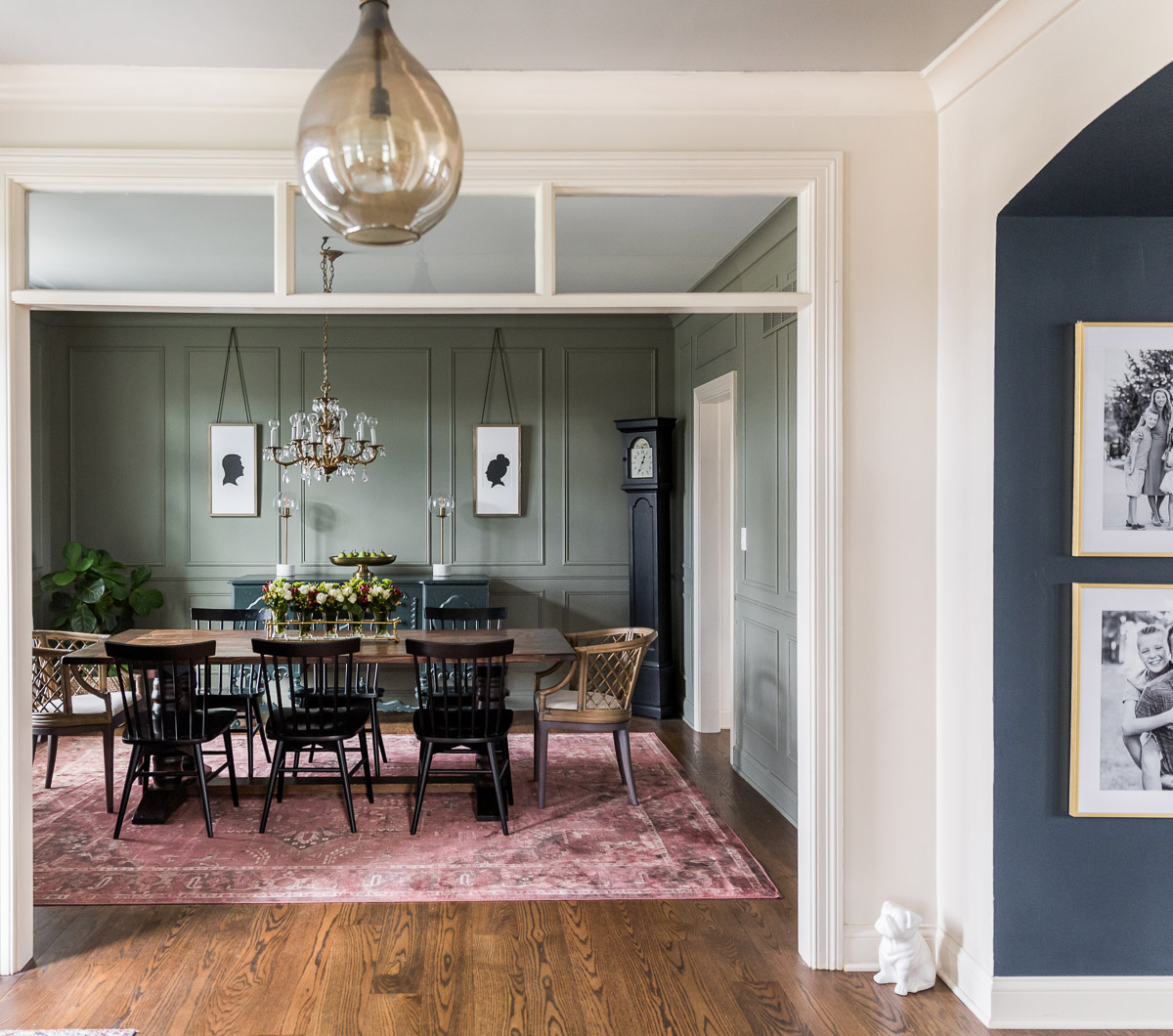
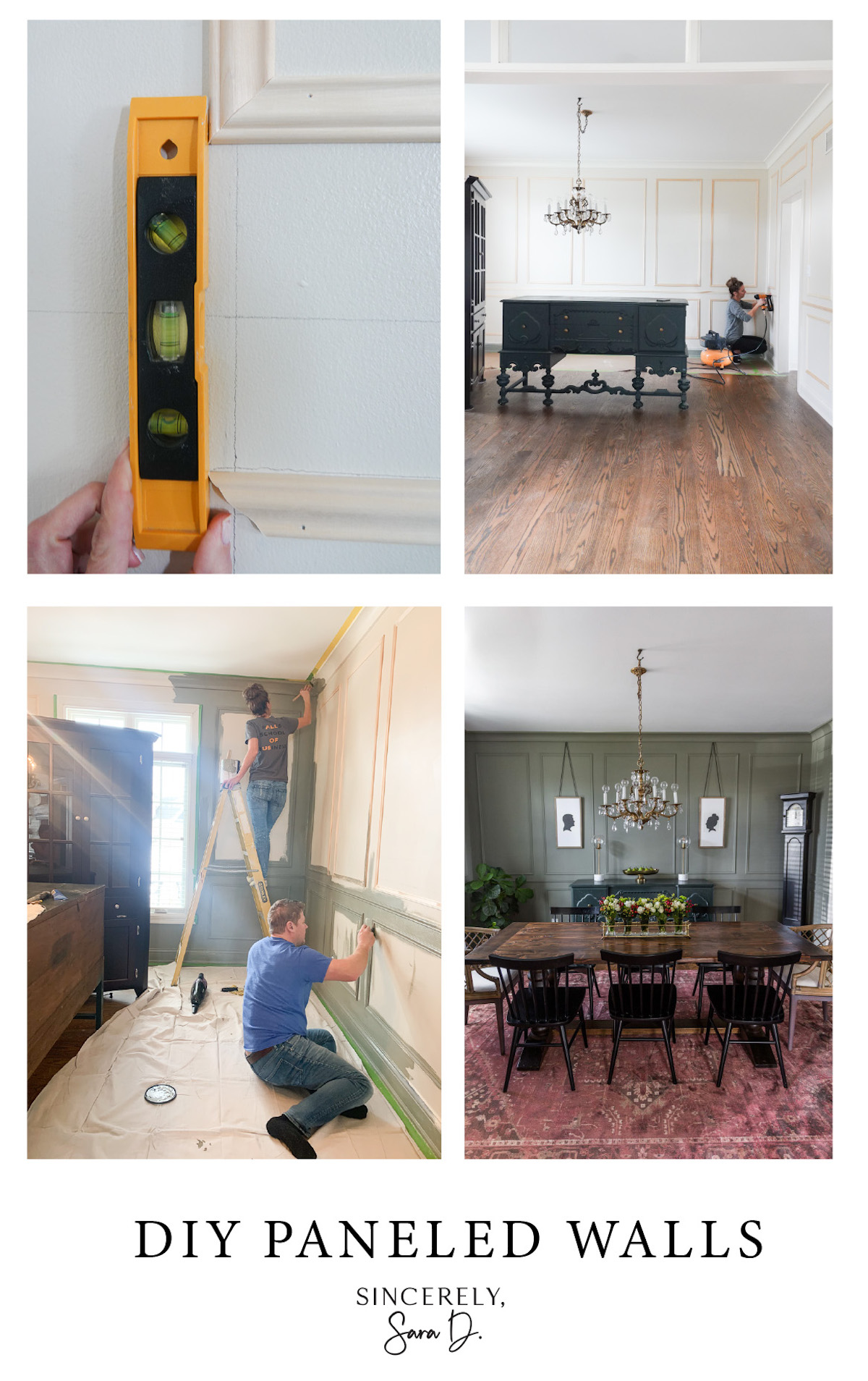
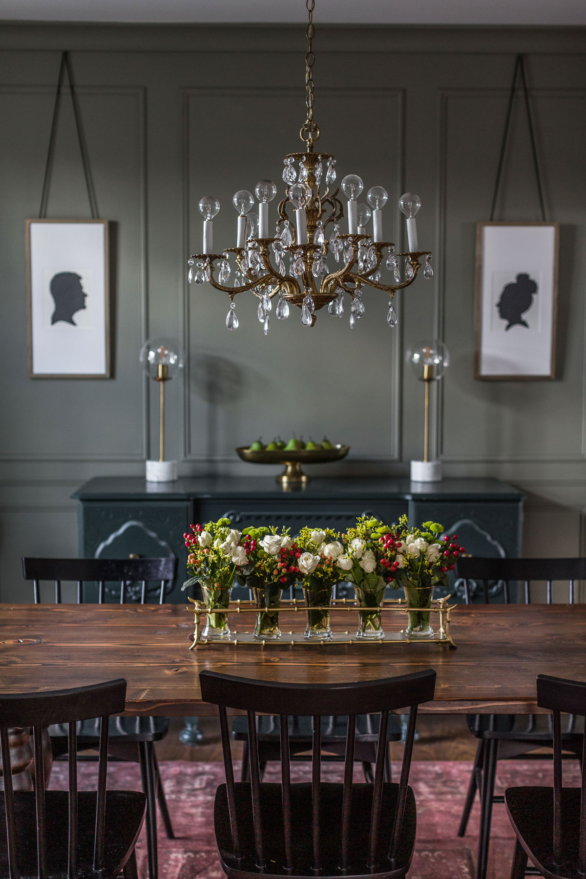
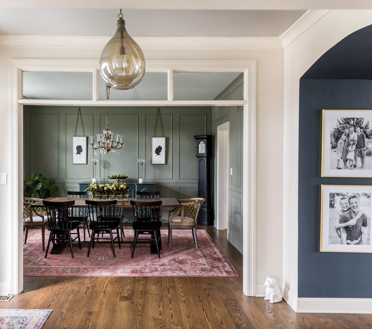
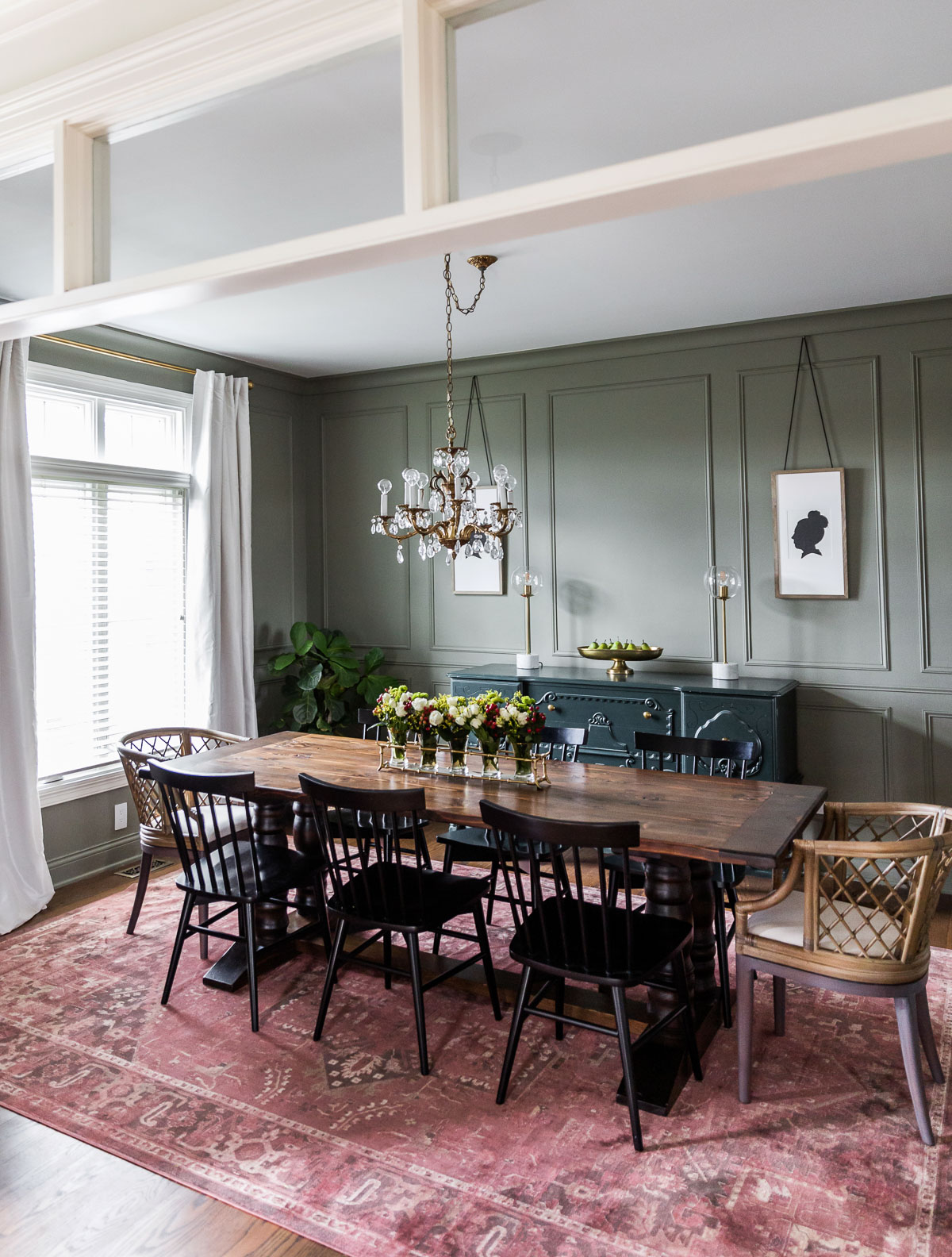
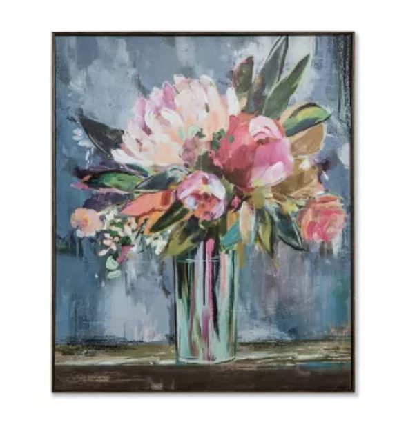
As I mentioned earlier, I have blue gray cabinets in our kitchen. I crave color, so I added pops of pink and love the contrast of the cabinets with the darker navy walls in the next room.

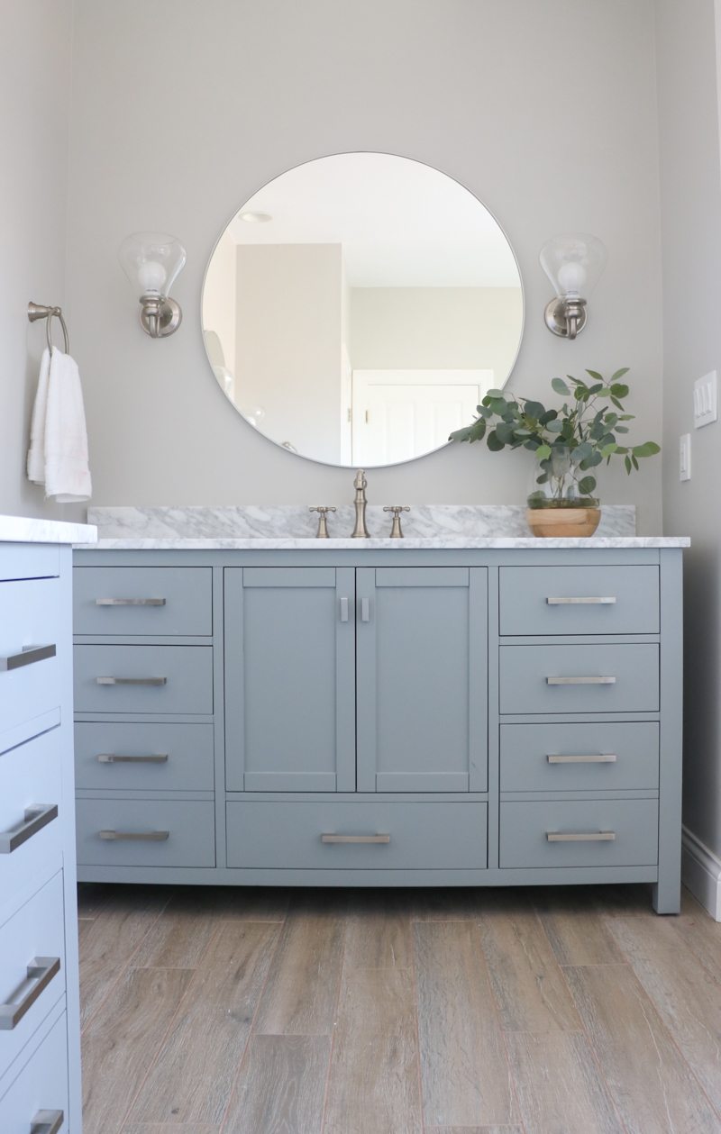
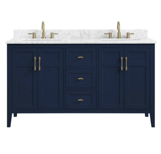
Blue gray looks gorgeous with natural woods. Notice how the vanity highlights any grays in the wood floor.

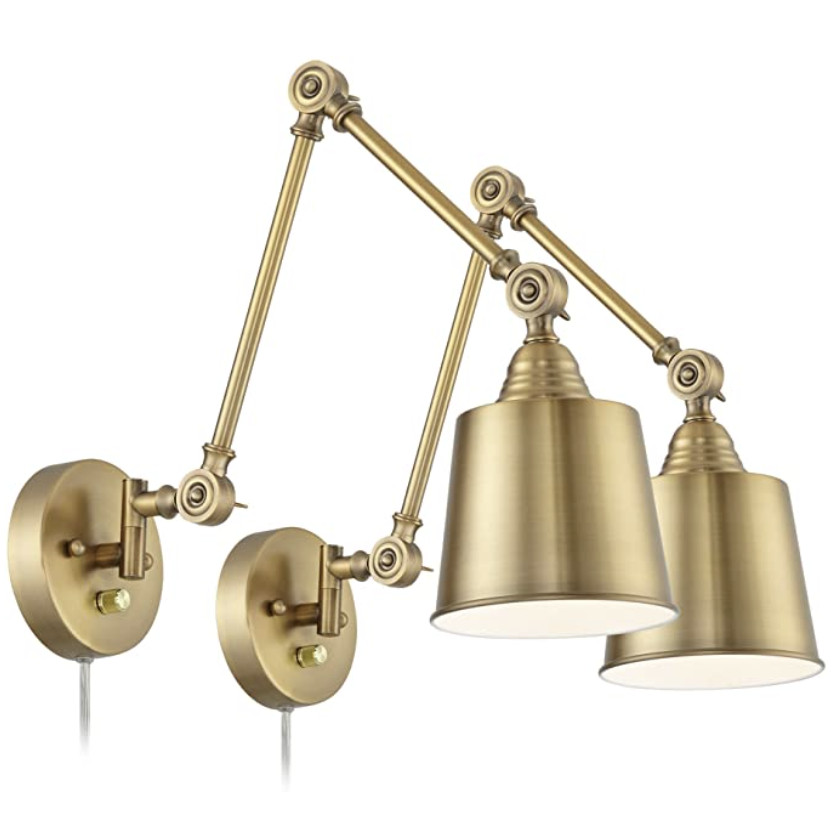
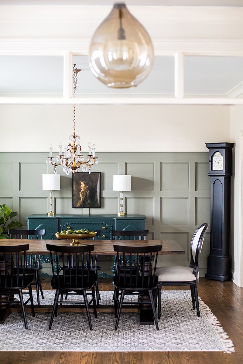
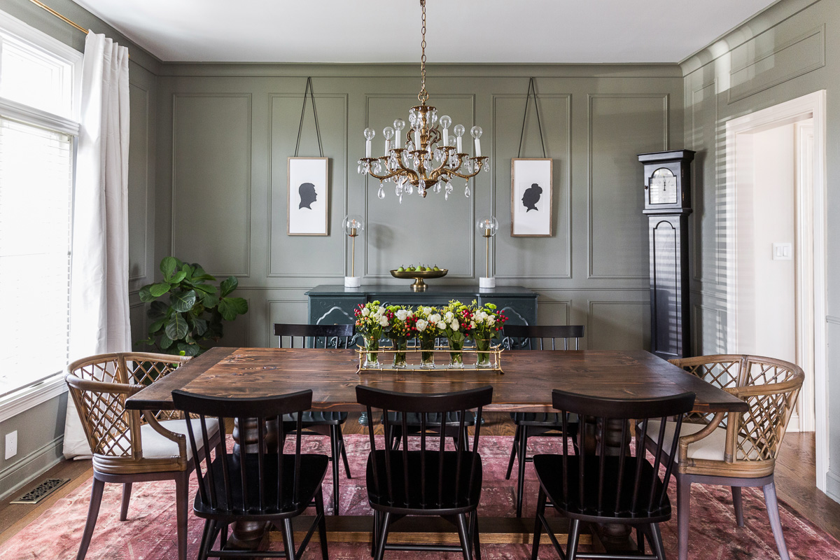
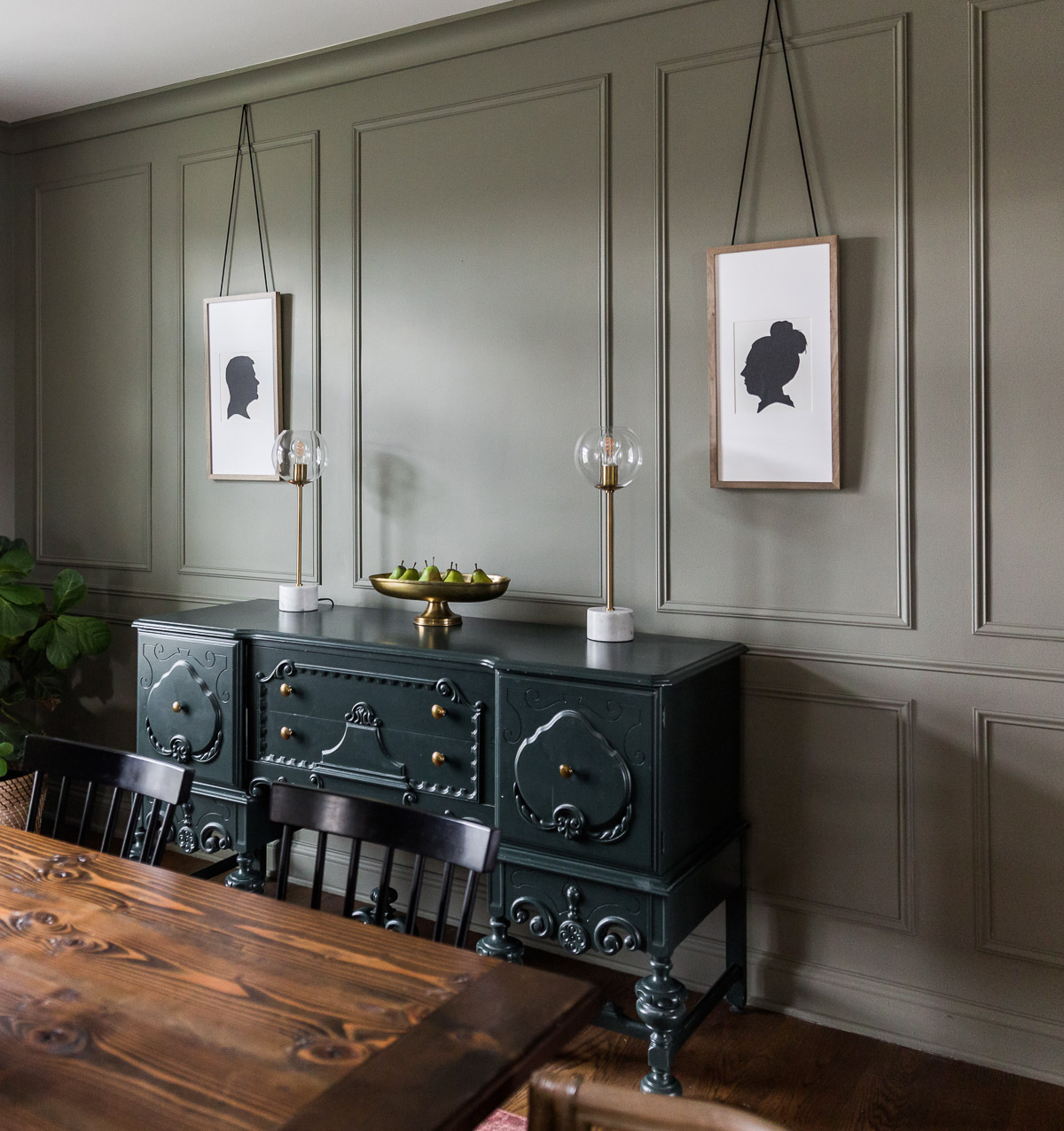
Blue gray also work well with black. The addition of black doesn’t make this space less dark, but it adds a touch of sophistication – especially with the black and gold combo.

I created color palettes using Front Porch Swing and other Amy Howard One Step Paint colors.

One Step Paint Color Palettes:

The first is color combo is very soothing.
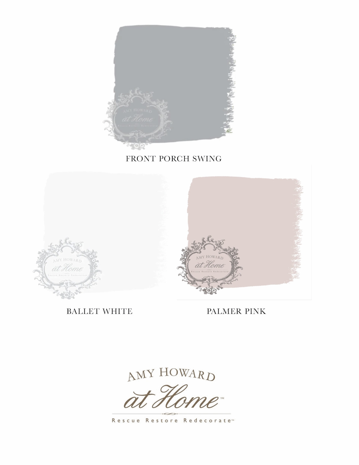
Front Porch SwingBallet WhitePalmer Pink

This next color palette adds some more blues to the mix and a green (which remember is created using blue and yellow).
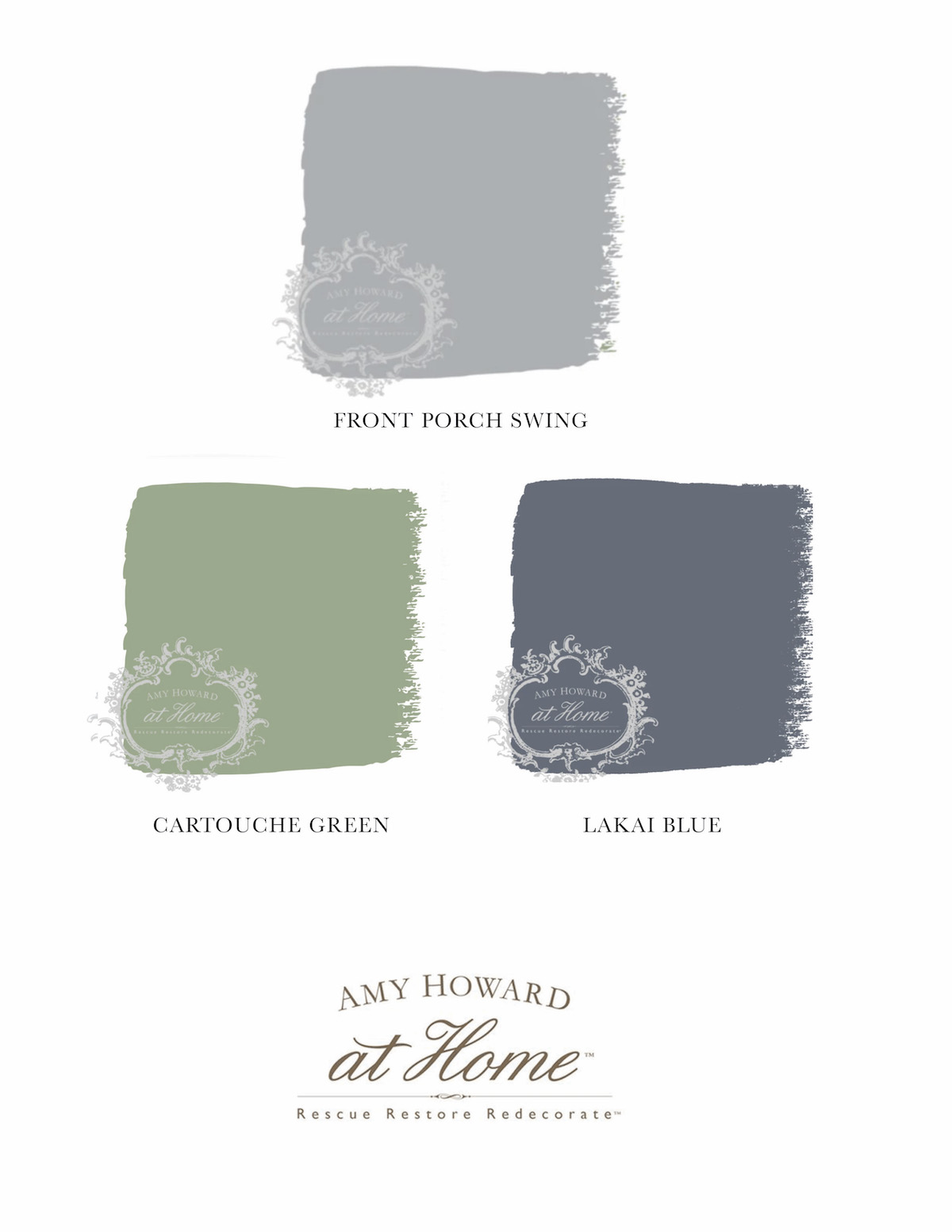
Front Porch SwingCartouche GreenLakai Blue

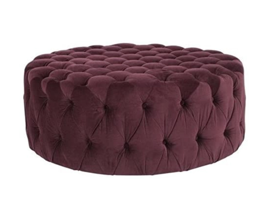
The final palette is a little more bold, and although there’s another blue, I’ve also added a pinkish red.
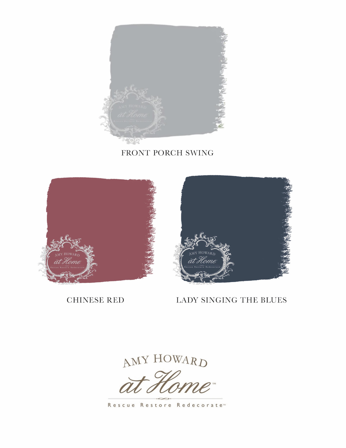
Front Porch SwingChinese RedLading Singing the Blues

Where would you add blue gray to your home?

Go create something!

Are you new to my blog? Go HERE to see my home tour and HERE to shop for items I use in our home.

Find me on Facebook | Instagram | Twitter Pinterest

Shop the Post
Decor

DIY Paneled Walls

DIY Paneled Walls

Before I share how to DIY paneled walls, I wanted to show the prep work we had to do first – which is most likely not something you will need to do.

One of our first projects in our home was a square paneled wall. When I designed the wall, I never considered it going beyond the back wall. As time went on, I really wished the wall treatment continued throughout the entire room. There really wasn’t a way to extend it since the square sizes wouldn’t work on the other walls. So, Steve and I decided to start over, and I wanted to create a less heavy paneled wall that was truer to the design aesthetics of our “French Chateau” in central Indiana.

We removed all the old wall treatment and was left with a wall that required quite a bit of repair work. However, once the wall was fixed, it was go time!

DIY Paneled Walls Tutorial

Supplies for Paneled Walls:

  • 1-1/4-in x 8-ft White Hard Unfinished Chair Rail Moulding
  • Compound Miter Saw
  • Finish Nailer and nails
  • Level
  • Pencil
  • Wood Filler
  • Tapping Block

To begin, drawing out a plan is key. I used graph paper, and I found it very helpful. Start with the chair rail between 30-36 inches high (from the floor) and go from there.

I drew the entire plan on my walls which proved to be very helpful. I ended up tweaking the design in that I originally had 6 inches between the panels and sides, but I ended up enlarging the panels and created 5 inch gaps.

I used painters tape (over my pencil lines) so I could better visualize the space.

It may seem like overkill, but I also wrote the dimensions for the panels on the walls. This helped cut down on the time since we were able to cut the panels in batches knowing the sizes of all the panels, but I’ll talk more about that in a minute.

Cutting the Panel Pieces:

To cut these panels, you will be creating picture frames. You will cut each end at a 45 degree angle.

It gets a little confusing – especially if you’re using chair rail molding like mine that isn’t symmetrical on both sides. Make sure you are keeping the same side out when you create the frames.

How to Install a Panel:

We began with the top of each panel and made sure it was level before nailing it down.

We used a nail around every 10-12 inches.

Once the top was level and secure, we moved on to the sides. We only added nails to the top of the sides so there was a little wiggle room when adding the bottom piece.

Be sure to use the level when adding every piece.

Once you have the bottom piece level and in place, you can go back through and add the additional nails to the sides.

Once all the panels are installed, you will need to go through and fill the nail holes and evaluate if you need to caulk. Once the wood filler (and caulk – if needed) is dry, it’s time to paint!

Helpful Hints:

Here are several helpful hints to make the installation go smoother and faster:

  • Write down the panel piece dimensions so you can cut them in batches.
  • Use a labeling system to keep all the panel pieces organized.
  • Create a spacer to aid in keeping panels from going wonky.

We created a little spacer (piece labeled “s”) to help the long panels from staying straight. We checked to make sure they weren’t being inverted (or vice versa) before nailing down.

The spacer only works if your panels are all equally distant.

  • When cutting in batches, use the wall to save time on measuring each piece.

We used the wall to help us determine length of the panel pieces. We lined up the saw and then placed the panel pieces against the wall. It proved to be more accurate for us than marking each piece.

  • Level, level, level!

I used the level constantly and found it helpful to match up one panel to another.

  • Work with a partner.

I recruited my dad to help me with this project, and I don’t think I could have done this alone.

He did the majority of the cutting while I worked on the installation.

Buy a Tapping Block

My dad introduced me to the tapping block, and it was SO helpful. There will be times you need to move the piece just a smidge, and this tool will help you do that!

  • When planning the paneling design, consider the height of doorways and windows.

The tops of my panels are flush with the top of my window for a cohesive look.

Installing the Chair Rail

Our Chair rail met in the corners of the room. To have it match up neatly, use a 45 degree angle to miter the piece.

I hope this post was helpful, and I’m going to share a few more photos showing how we dealt with obstacles such as a return vent.

Here’s an overall shot of the space.

And here is how I dealt with the gap on top of the doorframe.

A special shoutout to my dad for all his time and expertise with this project!

And Steve was sweet enough to spend his weekend helping me paint.

We love the final product!

The walls are painted in Benjamin Moore’s Storm Cloud Gray.

Go create something!

Are you new to my blog? Go HERE to see my home tour and HERE to shop for items I use in our home.

Find me on Facebook | Instagram | Twitter Pinterest

Shop the Post
Decor

Elegant Dining Room

Elegant dining room decor

Our elegant dining room decor refresh is exactly what I envisioned for the space – timeless, sophisticated and full of color.

This post is a sponsored post by SAFAVIEH. I take pride in reviewing only products that fit my brand and will be beneficial to my readers. And while this post is sponsored, all the opinions are my own.

The previous space was pretty, but Steve and I created our first ever wall treatment and had made some mistakes.

It bothered me that the panels didn’t go all the way to the ceiling or all the way around the room. We couldn’t figure out a way to continue the pattern all the way up or around, so we started over.

Our home is considered French chateau in style (I know, a french chateau in Indiana is funny). But, I do love the charm and sophistication of our home’s exterior and wanted to stay more true to that look in the interior as well.

So we created traditional, french-inspired paneled walls and painted the entire wall from crown moulding to baseboards in Benjamin Moore’s Storm Cloud Gray.

To complete the space, there were a few pieces I wanted to add.

I partnered with SAFAVIEH to create the elegant dining room I had envisioned.

Vintage-looking Rug

The Raspberry vintage-looking rug from SAFAVIEH is even more beautiful in person. It’s soft, luxurious, and has a low pile which works well in our dining room.

Rattan Accent Chairs

SAFAVIEH’s Rattan accent chairs add a modern look to the more traditional space and add the texture it was lacking before.

Modern Marble and Brass Lamps

I discovered these modern marble and brass lamps from SAFAVIEH and knew they would fit seamlessly into the space. The vintage-style globe adds to the traditional decor while the modern marble base adds modern sophistication.

The silhouettes were a DIY, and you can see the tutorial for creating your own silhouette art HERE.

The buffet is a piece we picked up at a thrift shop years ago, and it’s painted in Clark + Kensington’s Pine Grove.

I love combining painted pieces with natural pieces.

Go create something!

Are you new to my blog? Go HERE to see my home tour and HERE to shop for items I use in our home.

Find me on Facebook | Instagram | Twitter Pinterest

Shop the Post
Decor

Homemade Marshmallows with Samsung

This time of year is always a little dull, so Lena and I decided to have some fun and make homemade marshmallows, in partnership with Samsung. We’re hot chocolate drinkers here, and although these marshmallows are delicious on their own, they’re amazing in a warm cup of hot chocolate. Lena suggested we make pink marshmallows, but you can customize the marshmallows any way you want.

This post is a sponsored post by Samsung. I take pride in reviewing only products that fit my brand and will be beneficial to my readers. And while this post is sponsored, all the opinions are my own.

To begin, we searched for marshmallow recipes on our Samsung Family Hub Refrigerator. Using the touch screen, we were able to find a recipe in seconds. Besides searching for recipes, the Family Hub assists in meal planning, keeps our family organized with a calendar, plays music via Spotify and Pandora apps, and even brings entertainment through TV mirroring with if you have a Samsung TV.

I love that our stainless steel refrigerator is counter depth and classy in design, so it fits in well in our kitchen. When we remodeled our kitchen, this fridge was one of the first things selected for the space. There’s plenty of room to house the food needed for our family of five (which includes two teenage boys), and the self-filling water pitcher is one of my favorites while the rest of the house loves the Flex Zone drawer, which we made into a drink drawer (the best fridge organization).

Our Samsung family fridge looks beautiful in our kitchen (it helps that it is a fingerprint resistant refrigerator), and is the heart of our home.

This was my first time making homemade marshmallows, and it was easier than I expected (and a huge hit with the kids)!

Homemade Marshmallows Recipe

MARSHMALLOWS

  •  3 envelopes Unflavored Knox Gelatin
  •  1/2 cup Cold Water
  •  1 tablespoon Vanilla
  •  2 cups Granulated Sugar
  •  2/3 cup Light Corn Syrup
  •  1/4 cup Water
  •  Dash Salt
  •  Square Baking Pan (8×8″)
  •  Plastic Wrap
  • Cooking Spray
  • Food Coloring (optional)
  • Candy Sprinkles (optional)

MARSHMALLOW DUST

  •  1/2 cup Powdered Sugar
  •  2 tablespoons Corn Starch
  1. Spray an 8×8″ baking pan with cooking spray and cover with plastic wrap (this keeps the plastic wrap in place). Then spray down the plastic wrap again (to keep the marshmallows from sticking).
  2. Pour the vanilla and the ice cold water into a mixing bowl.  Sprinkle the envelopes of Knox Unflavored Gelatin onto the water in the bowl.  Gently whisk with a fork until there are no longer any large clumps of gelatin.  Allow the gelatin to sit while you make the syrup.
  3. In a saucepan, add sugar, light corn syrup and water.  Bring to a boil while stirring.  Allow the mixture to come to a hard boil for one minute and then remove from heat.
  4. Turn whisk on low and slowly pour the sugar syrup into the mixing bowl with the (hardened) gelatin. Add a pinch of salt.
  5. Turn the whisk on high and allow the marshmallow mixture whip and thicken for around 10 minutes. It will turn white, and this is when I added food coloring to make our mixture pink.
  6. Pour the marshmallow mixture into the prepared pan. Add sprinkles to the top if desired. Spray a piece of plastic wrap and then cover the top of the marshmallows.
  7. Allow the marshmallows to completely cool and firm up at room temperature overnight.
  8. To create the Marshmallow Dust, mix the powdered sugar and cornstarch in a bowl.
  9. Spread out a piece of parchment paper and cover it with a small amount of the Marshmallow Dust.  Turn out the marshmallow block from the pan.
  10. Spray a sharp knife and use it to cut the marshmallows into individual marshmallows.
  11. Toss the marshmallows into a bowl with the Marshmallow Dust and cover on all sides.
  12. Store Marshmallows in an airtight container and enjoy!

Our Samsung Family Hub Refrigerator is my favorite appliance I’ve ever owned. Besides being able to access recipes easily, we can view our family calendar and store enough food to feed two teenage boys who are home all the time right now.

What’s your favorite feature of the Samsung Family Hub Refrigerator?

Are you new to my blog? Go HERE to see my home tour and HERE to shop for items I use in our home.

Find me on Facebook | Instagram | Twitter Pinterest

Shop the Post
Decor

Decorating with Green

Decorating with green has been a design favorite for centuries – the Victorians favored deeper green tones like sage and brunswick green for their interiors. In the 1950’s, aqua and mint green were paired with baby pink to achieve the ideal Americana aesthetic for kitchens and Cadillacs. In the 1970s, avocado became the height of fashion and enjoyed immense popularity (even in appliances).

I partnered with Amy Howard Home to share their Color of the Month. This is a new monthly subscription where Color of the Month subscribers will receive a new color every month exclusive to the club. This month’s Color of the Month is Hunt and Polo, and it is a beautiful, deep green – which is why we’re talking about all things green!

I transformed a $10 thrift store find this month’s One Step Paint color, and the result is so elegant!

It looks perfect in my office – I love the green with the raw wood and blues and grays.

And now, we’ll go back to talking about decorating with green, and why it’s such a great color to use in your home…

Green is a color of balance and harmony. It lends us a clearer sense of right from wrong since green incorporates a balance of both the logical and emotional. Green is one of the most-seen colors in nature reflecting life, rest, and peace. It is also a sign of growth, whether that’s in a physical object like plants or in our income and wealth.

COLOR THEORY

On the visible spectrum, green sits between blue and yellow. In painting and printing, green is a secondary color, meaning that it is created by mixing two primary colors—yellow and blue.

Primary Colors: Red, yellow and blue
In traditional color theory, primary colors are the 3 pigment colors that cannot be mixed or formed by any combination of other colors. All other colors are derived from these 3 hues. 

Secondary Colors: Green, orange and purple
These are the colors formed by mixing the primary colors.

SHADES AND TINTS OF GREEN

Green can vary in both shades (in which the green is mixed with black for a darker green) and tints (which are mixed with white, to produce a paler result). But, there are also a broad range of green varieties that are mixed with other colors, such as yellow, blue, gray, and brown.

  • Yellow-greens such as chartreuse (named after the French liquor which shares the distinctive color) and lime green have a lively, energetic feel.
  • Blue-greens such as sea green, aqua and teal have a more subtle energy which helps designs to feel calmer and more chic. These colors are associated with emotional healing.
  • Gray-greens like seafoam and sage are wintery and more somber than their yellow- and blue-green relations.
  • Brown-greens like dark olive have a formal and dignified air, which explains why they are often selected for military uniforms. Olive green is the traditional color of peace.

Overall, if you’re looking to portray health, rest, and to relieve stress, green is your color. It is the most restful color for the human eye; it can improve vision. While green does have minor negative aspects like over-possession and materialism, it has a more positive affect than most other colors.

COLORS THAT GO WITH GREEN

  • monochromatic green color scheme uses tints, tones, and shades to create an entirely green palette.
  • complementary green color scheme incorporates red. Green’s cousins, yellow and blue, are complementary to purple and orange respectively.
  • An analogous green color scheme uses the colors bordering green on either side of the color wheel. In this case, yellow and blue.
  • triadic green color scheme includes orange and purple since they are equidistant from green on the color wheel.

One Step Paint Color Palettes:

The first is monochromatic (I used two greens), but I also incorporated a complimentary shade:

In this next palette, I added a toned down complimentary color (pink) and a creamy neutral – I love using creams and off-whites in our home.

In this last palette, you’ll see the analogous color (Lady Singing the Blues) which is similar in boldness to Hunt and Polo. I added a lighter neutral (Luxe Grey) to add some softness.

Just a random tidbit for you, centuries ago, many of the chemicals used to create thes green pigments were in fact extremely poisonous, with the famous example of Napoleon having apparently been slowly poisoned by the arsenic-rich green wallpaper used in his room in St. Helena. Although the wallpaper has since been proven not to have been the sole cause of his death, deadly pigments did little to dissuade consumers from the joys of green in their homes.

Go create something!

This image has an empty alt attribute; its file name is saradlogojpgrgb-01.jpg

*This post contains affiliate links and is a sponsored post by Amy Howard at Home. I take pride in reviewing only products that fit my brand and will be beneficial to my readers. And while this post is sponsored, all the opinions are my own.

Are you new to my blog? Go HERE to see my home tour and HERE to shop for items I use in our home.

Find me on Facebook | Instagram | Twitter Pinterest

Shop the Post
Decor

2021 Colors of the Year

I recently shared some 2021 Home Decor Trends, and now we’re going to look at the 2021 Colors of the Year.

Just like with the home decor trends, the colors of the year are embracing that so many of us are spending the majority of time at home. The colors are generally saturated, warm, and inviting and have a lot of personality – something people are adding back into their homes after years of white and gray.

First up, Benjamin Moore.

2021 Colors of the Year:

Benjamin Moore Color of the Year: Aegean Teal

SOURCE: BENJAMIN MOORE

A rich blend of blue-green and gray, Benjamin Moore’s color of the year Aegean Teal reflects balance and natural harmony. The beautiful color is peaceful and soothing – something we all crave after the craziness of 2020.

This is a favorite of mine, and I have blue-green cabinets in our kitchen and laundry room.

Next, get ready for some bold color from HGTV Home by Sherwin-Williams.

HGTV Home by SW’s Color of the Year: Passionate

SOURCE: HGTV HOME BY SHERWIN WILLIAMS

HGTV Home by Sherwin-Williams predicts vibrant, daring colors will reign supreme in the coming year. The brand’s 2021 color of the year, Passionate is a saturated bold and elegant hue.

I’m not quite ready to add a reddish hue to my walls (I did use a similar color a lot in the early 2000s), but I assume I’ll eventually jump on the bandwagon!

Here’s a unique, sophisticated color from Sherwin-Williams…

Sherwin-Williams Color of the Year: Urbane Bronze

SOURCE: SHERWIN WILLIAMS

Tap into nature with a hue whose warmth and comfort breathe down-to-earth tranquility. Urbane Bronze captures that simple sophistication every space is searching for.

Gray undertones balance the earthy brown to create a dark, deeply comforting color that is reminiscent of burnished metal or timeworn stone. Though intensely saturated, Urbane Bronze makes a subtle, sophisticated statement when used as a primary or accent color

I think this color would be gorgeous for a study and/or home office.

And finally, the Pantone color(s) of the year.

Pantone Color of the Year: Illuminating and Ultimate Gray

The Pantone news release announcing the colors described Illuminating as “a bright and cheerful yellow sparkling with vivacity, a warming yellow shade imbued with solar power.” Ultimate Gray, like pebbles, is emblematic of “solid and dependable elements which are everlasting and provide a firm foundation.”

I’m not sure I’ll be using the electric yellow in my home any time soon, but I do see it in more modern decor as well as toy rooms and nurseries!

Which is your favorite?

Go create something!

Are you new to my blog? Go HERE to see my home tour and HERE to shop for items I use in our home.

Find me on Facebook | Instagram | Twitter Pinterest

Shop the Post
Decor

2021 Home Decor Trends

The pandemic has shaped many of the 2021 home decor trends. The crazy amount of time and the number of activities we have all engaged in at home has changed what we want in our homes. For example, there will be a gravitation towards the maximalist look since it’s more functional. Ultra-sleek modern interiors have been a trend, but that look is not realistic with the amount of time we spend on our home. Throughout 2020, families have had to learn how to co-exist under the same roof 24/7. With adults working from home and children learning from home, we accumulate too many things. Besides living with more things, the appeal of open floor plans is beginning to diminish as we find we all need more private, designated areas in our home to complete tasks.

2021 Home Decor Trends:

Saturated Hues

Saturated hues bring a richness and warmth to any space. As for colors, expect shades to warm up in 2021 as people are craving more warmth, comfort, and coziness with everything we’ve been through. On the opposite end of the color spectrum, soft shades of blue have a calming effect that people want, and blues will continue to make an appearance in decor as a result.

Granny Chic and Pattern on Pattern

There seems to be modern revival of what you would typically find in your grandparents’ homes mixed with modern pieces.. Because of the amount of time spent in our homes, 2020 saw a rise in nostalgia in interior design as we look for ways to make our homes cozier and more comforting and Granny Chic is now a thing.

Continuing with the Granny Chic design trend, textiles and draperies are making their way back into spaces. Pattern on pattern is a fun way to tell a unique story in your home while lifting our moods and spirits.

SOURCE: JEWELED INTERIORS

Wallpaper

Wallpaper has been slowly making its way back into homes, and the appeal for it will continue to rise – especially now that there are removable options.

Green Cabinets

White and gray cabinets have reigned in the kitchen for some time, but green cabinets will be more and more common. Since green is a combination of blue and yellow, it works with both cooler and warmer decor.

SOURCE: ROOM FOR TUESDAY

Houseplants

Not only are they beautiful, bringing vibrancy and color to our homes, but houseplants also freshen the air, filtering out pollutants and releasing oxygen. We are all spending more time at home, so we can care for houseplants.

Wicker and Rattan Furniture

Wicker and rattan and warmth to any space as their natural materials welcome the outdoors in and are the perfect accent for houseplants. Also, wicker and rattan have a luxurious yet worn-in look that adds patina to your space.

SOURCE: EFFORTLESS STYLE INTERIORS

Go create something!

Are you new to my blog? Go HERE to see my home tour and HERE to shop for items I use in our home.

Find me on Facebook | Instagram | Twitter Pinterest

Paint

Decorating with Navy

Navy blue is a modern neutral that plays well with just about any color, including every other shade of blue which is why decorating with navy is so easy.

I partnered with Amy Howard Home to share their Color of the Month. This is a new monthly subscription where Color of the Month subscribers will receive a new color every month exclusive to the club. This month’s Color of the Month is Button Up Blue, and it is a beautiful navy blue.

Navy Blue is a very dark shade of the color blue, and it got its name from the dark blue worn by officers in the Royal Navy (which was adopted by other navies around the world).

Blue is one of the world’s most popular colors (with nearly half of men (42%) and one-third of women (30%) claiming blue as their favorite color). It is the color of skies and oceans and is often described as being tranquil, peaceful, secure, and full of serenity. Blue can lift our mood and improve the energy of a space.

From a color psychology perspective, blue is typically associated with stability and trustworthiness—there is a reason blue is universally appealing. By incorporating this shade of blue into your designs, you can create a sense of stability in your space.

Digging even deeper into blue tones, different blue tones evoke different feelings:

  • DARK BLUE: trust, dignity, intelligence, authority
  • BRIGHT BLUE: cleanliness, strength, coolness
  • LIGHT BLUE: peace, serenity, spiritual

Navy’s dark tones capture the eye and cause brighter colors to pop. It compliments all styles of decor, and is a wonderful color to add to any space. However, it is a very dark color that should be balanced to ensure it doesn’t overwhelm.

Navy & White

White is a classic high-contrast partner that compliments navy well. Consider painting furniture or cabinets in Button Up Blue with a backdrop of crisp white walls for an energizing effect. In addition to white, consider cool snow-white, off-whites and creams to partner with navy.

I’ve paired Button Up Blue with various colors from the One Step Paint line (minus gold) for each color palette:

Navy & Yellow

Yellow creates a dynamic color scheme when paired with navy blue. Shades of yellow (soft butter yellow and rich mustard yellow) offer warmth and brilliance as they stand out vividly against the cool deep tones of navy blue. Us this color combination for your space as blue and yellow are opposites on the color wheel and play well together

Navy & Gold

Similar to yellow, gold is a perfect complement to navy blue. Incorporate the color into your navy blue room with metallic gold accents and this hue lightens up dark navy blue colors to ward off a gloomy look. A large gold mirror on a navy blue wall, for example, will reflect light around the space to create an expansive effect.

Navy & Pink

Decorating with Navy

Pink adds a sweet note to the soft navy, and just about any shade of pink works well with navy – everything from the most subtle blush to the loudest fuschia.

Navy & Red

Red and navy is an all-American pairing. It is a classic interior color scheme, and red provides a striking contrast against navy blue – especially in more modern or eclectic designs. Consider pairing navy with more muted shades of red such as salmon, burgundy or brick red to provide a more sophisticated tone.

Navy & Green

Navy and green work well together because green is created from blue (mix yellow with blue and you have green). Both are colors of nature and live together in perfect harmony. The luxurious tones looks gorgeous together – think about more jewel-toned hues of green to make an space feel sumptuous.

Navy & Blue

Mix blues together to create a serene color scheme that is reminiscent of clear blue skies over large bodies of water. For a monochromatic color combination, select lighter shades of navy or for a more tropical look, choose green-tinted colors such as aqua and turquoise.

Go create something!

Are you new to my blog? Go HERE to see my home tour and HERE to shop for items I use in our home.

Find me on Facebook | Instagram | Twitter Pinterest

*This post contains affiliate links and is a sponsored post by Amy Howard at Home. I take pride in reviewing only products that fit my brand and will be beneficial to my readers. And while this post is sponsored, all the opinions are my own.

Shop the Post
Seasonal Decor

DIY Photo Snow Globe

I recently created a DIY photo snow globe for each of my kids, and they were a hit! You can have so much fun customizing these, and they make great gifts.

DIY Photo Snow Globe Supplies

  • Jar (make sure it seals well)
  • Distilled water
  • Glycerin
  • Glitter
  • Photo
  • Laminator
  • Scissors
  • Cardstock
  • Hot glue gun
  • Glue stick
  • Binder Clip
  • Epoxy
  • Painters Tape

I have the step-by-step instructions, but first, you can watch this video:

Instructions for making DIY Photo Snow Globe:

Take a Photo

I just used my phone to take the photos, and I told my kids to act like they were standing outside while it was snowing.

Print Photo

Make sure your photo will fit into your jar.

Glue Photo to Cardstock

This adds a little stability to the photo so it doesn’t wave all over in the water.

Laminate Photo

You will need to make your photo waterproof by laminating it.

Cut Photo

Cut around your photo being sure to leave a little extra around the photo so you don’t break the laminate seal.

Use Large Binder Clips as Photo Stand

Remove the prongs from a large binder clip and this makes a fantastic stand for your photo.

Use Epoxy to Adhere Binder Clip to Lid

I used hot glue on past snow globes, and it doesn’t hold as well as epoxy.

Add Distilled Water to Jar

Distilled water will help with the clarity.

Add a Few Drops of Glycerin

Glycerin will slow down the glitter motion.

Add Glitter

I prefer silver glitter, and add as much as you want!

Add Lid

Make sure to screw lid on tight!

Add a Line of Hot Glue Around Lid

This hot glue will just help seal any gaps your lid may have.

Optional Step:

Tape Off Glass and Spray lid with Waterproof Patch & Seal

I left a little space below the lid for the waterproof patch. If you have a lid that seals well, this probably isn’t necessary, but I wanted to be sure my snow globes didn’t leak.

And that’s it! Enjoy your DIY photo snow globe!

Go create something!

Are you new to my blog? Go HERE to see my home tour and HERE to shop for items I use in our home.

Find me on Facebook | Instagram | Twitter Pinterest

Decor

Create Beautiful AND Livable Spaces

As a blogger and designer, I share beautiful spaces. I love to inspire, but I know sometimes this faux perfection can be exhausting. Today in partnership with STAINMASTER, I’m sharing how to create beautiful AND livable spaces.

This is a sponsored post written by me on behalf of STAINMASTER®. All opinions are 100% mine.

I have a professional photographer, and together we stage photos such as this one of my bedroom. There is nothing wrong with creating a beautiful home (I’m a huge advocate for surrounding yourself with beauty) but you must realize that you LIVE in your home.

I wish our home looked as perfect as my Instagram feed, but the reality is that it never does. I have a messy husband and three kids – one of which is a mini tornado. She manages to leave a messy trail wherever she goes.

You’d never know how much use our stairs see from this staged shot.

Here’s a shot of the same stairway just a few nights ago. My kids were using the stairs as a sledding hill (even my 15 year old jumped in on the fun)! My family is fantastic at testing out the durability of our STAINMASTER flooring.

And here’s me happily fluffing pillows in our very clean guest room.

This is a more honest representation of the space.

It is the security office for my youngest two as they monitor our home.

We selected STAINMASTER® carpet for our home knowing all STAINMASTER® carpets include a *lifetime warranty on stain, soil, static shock and pet urine and can keep up with my crazy family (*as always, check your warranty for more details).

  • Upstairs Carpet: Power Point in White Dove
  • Stairway Carpet: Bora Bora in Harbor Lights
  • Master Bedroom: Braided Opulence in Flannel

Get 10% off Select STAINMASTER Carpet & RUGS!

If you are looking for new carpet, I have coupon from my friends at STAINMASTER just for you! You can get 10% off up to $500 on select carpet and rugs. GO HERE for the coupon and to find the nearest participating retailer to you.


Besides our STAINMASTER carpet, our LVP sees lots of living.

Here’s my perfectly clean laundry room (my laundry for the day apparently consisted of only two pretty towels).

However, here’s what my laundry room looks life in real life when photo shoots aren’t happening (and there was no way I was going to step in this photo and show you what real-life Sara looks like)!

We selected STAINMASTER® LVP for our home in Phenix natural because it provides the look of beautifully realistic wood and STAINMASTER’s durability and easy maintenance.

One evening I found my youngest painting on the laundry room floor.

When I asked her what was going on, she happily replied that she knew the paint would be easy to clean up since it was STAINMASTER flooring.

Our back entry is our mudroom, so it sees the most traffic in our home.

We often think about little kids being rough on homes and flooring, but my teenage boys are doing a fantastic job of making toddlers seem harmless.

I hope sharing my family’s real-life photos were helpful to you. Even influencers can’t live up to the staged social media images we share.

Want some tips on how to choose flooring? Go HERE to see how we thought through our selection process knowing it would create a beautiful AND livable spaces!

Go create something!

Are you new to my blog? Go HERE to see my home tour and HERE to shop for items I use in our home.

Find me on Facebook | Instagram | Twitter Pinterest

Seasonal Decor

Sugared Cranberries

Sugared Cranberries with Our Smarth Fridge

I love making sugared cranberries every holiday season. They are easy, delicious, and so festive, and I’m sharing how we make sugared cranberries with our smart fridge (although you don’t need a smart fridge to make these, it does make it more fun)!

This post is a sponsored post by Samsung. I take pride in reviewing only products that fit my brand and will be beneficial to my readers. And while this post is sponsored, all the opinions are my own.

Our Samsung Family Hub Fridge has plenty of space to store food for our family of five, and we’re obsessed with the middle drawers (which we use as a drink drawer). However, this fridge goes above the normal fridge tasks with its family hub that we used daily to check our family schedule and the weather.

The Family Hub Fridge also offers fun features that makes time in the kitchen fun. Before we began making our sugared cranberries, Lena turned on the holiday music, and we found a recipe for sugared cranberries from Jo Cooks.

For sugared cranberries, you only need three ingredients:

How to Make Sugared Cranberries:

  • Cranberries
  • Water
  • Sugar

To begin, we rinsed two bags of cranberries.

Next, bring the sugar and water to a boil for several minutes.

Add the cranberries to the sugar water.

Be sure to completely cover all the cranberries in the mixture.

Put the cranberries on a cooling rack to dry (around an hour). Adding wax paper under the rack to helps with the mess.

Once the cranberries are sticky, you can add the sugar coating (it’s easiest to mix in a bowl and then return to the drying rack).

Now you have delicious sugared cranberries to eat and/or use as holiday decor! My favorite trick with sugared cranberries is to dress up a store-bought cake with them.

Our Samsung Family Hub fridge definitely makes spending time in the kitchen more fun for our family with features like their easy recipe access and music. We remodeled our kitchen three years ago, and have all Samsung appliances and still love them years later. You can see more on that remodel (and our other appliances) here.

Go create something!

Are you new to my blog? Go HERE to see my home tour and HERE to shop for items I use in our home.

Find me on Facebook | Instagram | Twitter Pinterest

Shop the Post
Seasonal Decor

Twisted Paper Ornaments

Twisted paper ornaments are a great homemade gift idea. You can create the perfect ornament to match any decor style.

This post is sponsored by BabbleBoxx on behalf of JoAnn.

This holiday season will look different, but that doesn’t mean we can’t celebrate. I have always been a fan of handmade gifts, and the twisted holiday ornaments are a fun and easy handmade gift idea. Create some to help spread some joy!

JoAnn has been inspiring creativity for almost 75 years, and they sent me this fun box full of all the supplies needed for the twisted paper ornaments.

I got right to work creating, and here’s what you’ll need to get started:

SUPPLIES:

  • Assorted paper (scrapbook paper works well)
  • Scissors
  • Hot glue gun/glue gun sticks
  • Spray bottle with water
  • Assorted plastic ornaments

DIRECTIONS:

  • Cut your paper/cardstock into 1″ strips (I drew pencil lines on the paper).
  • Using your spray bottle, slightly dampen your strips of paper, one at a time.
  • While the paper is soft and slightly damp, begin to fold and twist each strip. (Be careful not to twist too tight, you don’t want to rip or tear the strips.)
  • Once your strips are twisted, begin by hot gluing a twist to the top of the ornament. Work your way around gluing the twists on the ornament as tight as you can. You want to keep them close and tight, so you don’t see the ornament between.
  • Mix and match colors and patterns to create your own unique design.
  • Once the ornament has been covered, add some ribbon or string to hang.

And that’s it! You have a custom ornament perfect for gift-giving or hanging on your own tree.

JoAnn make crafting easy, and is your one-stop shop for project supplies. They have more than 800 stores across the US and also offer the convenience of online shopping as well.

Go create something!

Are you new to my blog? Go HERE to see my home tour and HERE to shop for items I use in our home.

Find me on Facebook | Instagram | Twitter Pinterest